The network for creativity
Join 1.25M professional creatives like you
Connect with clients, get discovered, and run your business 100% commission-free
Creatives on Contra have earned over $150M and we are just getting started
Back to feedPost

I asked AI (Figma Make) to design the worst possible fintech app.
It delivered: DOGE at $0.000001, an AI screaming “SELL EVERYTHING” with 63% confidence, a portfolio somehow holding 1,337,420 ETH, and a $999.99/month paywall just to see your own balance.
Honestly? Impressive chaos.
then i spent the next few hours redesigning it from scratch — reworking hierarchy, improving accessibility, and asking one simple question:
what does someone actually need from a finance app at 9am?
Turns out, not much:
- know your balance
- understand where your money went
- get one clear, actionable next step
Same features. Completely different experience.
Before → After below 👇👇👇👇
What’s the most infuriating thing a banking app has ever done to you?
(@@@Mine: hiding the transfer limit until after you’ve confirmed the payment.)


The network for creativity
Join 1.25M professional creatives like you
Connect with clients, get discovered, and run your business 100% commission-free
Creatives on Contra have earned over $150M and we are just getting started
Related posts


Just dropped my Design System on Figma Community — for free 🔥People are saying it's too much for a free resource.
Judge for yourself 👇
#UIUXDesign #Crypto

Free and this generous? The community is lucky to have you sharing this!


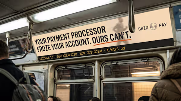
"No dark mode, no neon, no 3D coins" — and the result still looks this sharp?! That subway ad execution is so bold. Restraint as a design brief actually slaps.


Trending


Figma Make
Go from idea to prototype in minutes. What are you designing?
aivideo
AI video tools are moving at warp speed. Which ones are you experimenting with?
illustration
Handcrafted illustration is bubbling up across the web. What are you drawing lately?
aidesignflow
AI tools are redefining design work. What's your current workflow?
freelancerlife
Freelancer life is wins, pivots, and everything in between. What’s yours right now?