The network for creativity
Join 1.25M professional creatives like you
Connect with clients, get discovered, and run your business 100% commission-free
Creatives on Contra have earned over $150M and we are just getting started
Back to feedPost
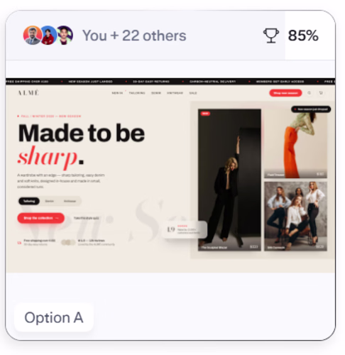
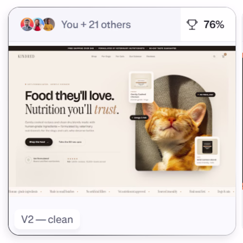
Two polls. Same answer.
Thanks to everyone who voted. Genuinely didn't expect this level of participation.
Clean beats dark. Commercial beats editorial.
85% picked the bold sans over the quiet serif. 76% picked cream and clean over orange and loud.
The pattern is clear. When someone lands on a store, they want to feel oriented immediately. Product visible. Brand legible. No friction.
Good design doesn't make people feel something. It makes them do something.
What does that tell you about how we're building heroes wrong?
Thankyou
The network for creativity
Join 1.25M professional creatives like you
Connect with clients, get discovered, and run your business 100% commission-free
Creatives on Contra have earned over $150M and we are just getting started
Related posts
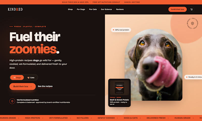
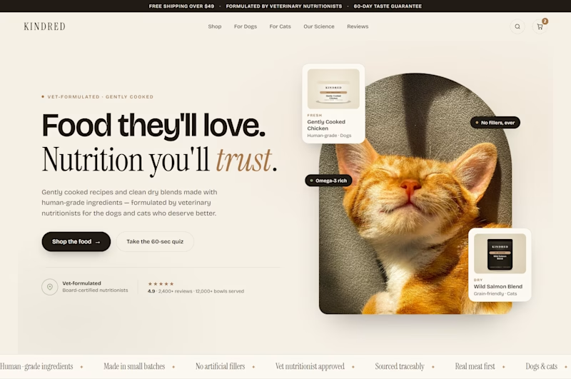
Same brand. Same product. Which one sells more?
Two heroes. Two completely different directions.
V1 — dark, bold, high energy. Orange hits hard. The kind of hero that stops a scroll.
V2 — clean, editorial, refined. Cream and serif. Feels like a brand you'd trust with your pet's health.
I'll let you vote. Drop your answer below.
7 voted
24%
22 voted
76%
29 votes
Closed
I’m building my own Framer template store ✨
But I need your help choosing the hero section design. Which one should I go with?👇
Left or right?
10 voted
37%
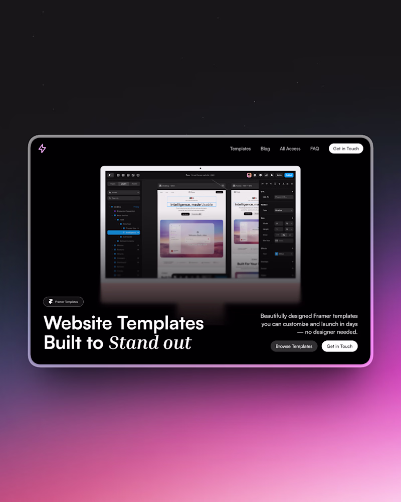
17 voted
63%
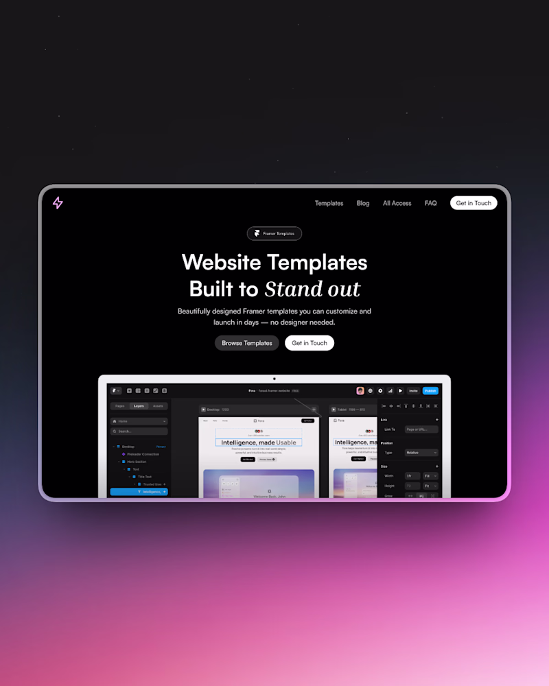
27 votes
Closed
I go with options 2
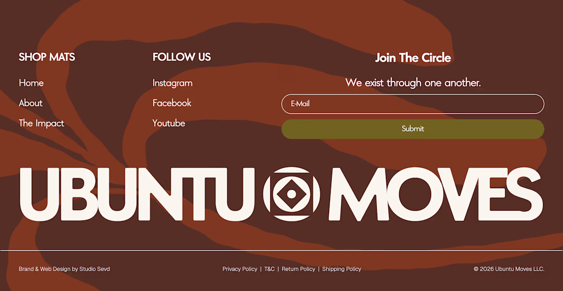
Nice footer brrr, how do u come up with the background texture?
Trending
Claude
Claude has entered the design space. How are you using Claude Design?
Contra University
Learn from expert creatives how to earn more using next-gen AI tools.
creativeaiflow
Creative AI workflows are evolving. What tools do you use, and what are their strengths and weaknesses?
portfolioreview
The best portfolios tell a story, not just show a grid. Share yours for feedback.
freelancerlife
Freelancer life is wins, pivots, and everything in between. What’s yours right now?