The network for creativity
Join 1.25M professional creatives like you
Connect with clients, get discovered, and run your business 100% commission-free
Creatives on Contra have earned over $150M and we are just getting started
Back to feedPost


For real, some designs age like fine wine.
The network for creativity
Join 1.25M professional creatives like you
Connect with clients, get discovered, and run your business 100% commission-free
Creatives on Contra have earned over $150M and we are just getting started




Related posts

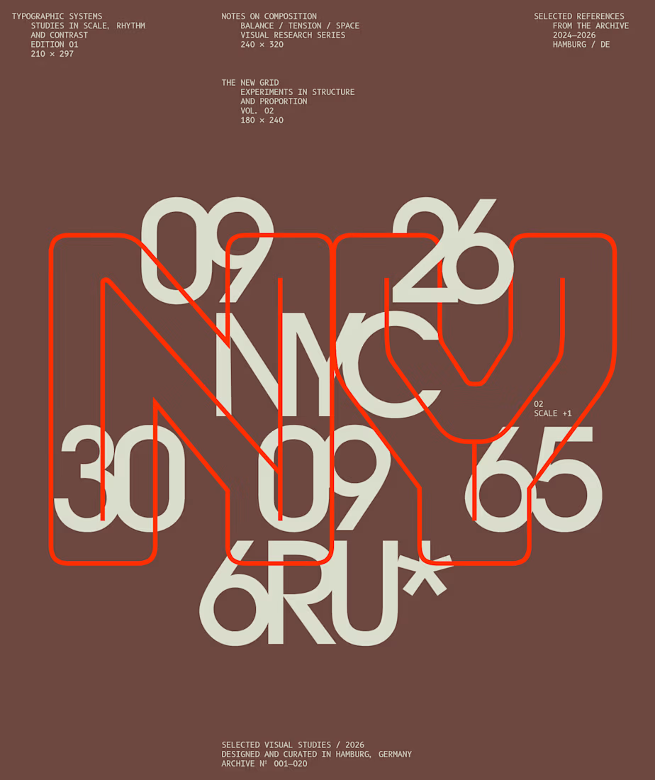
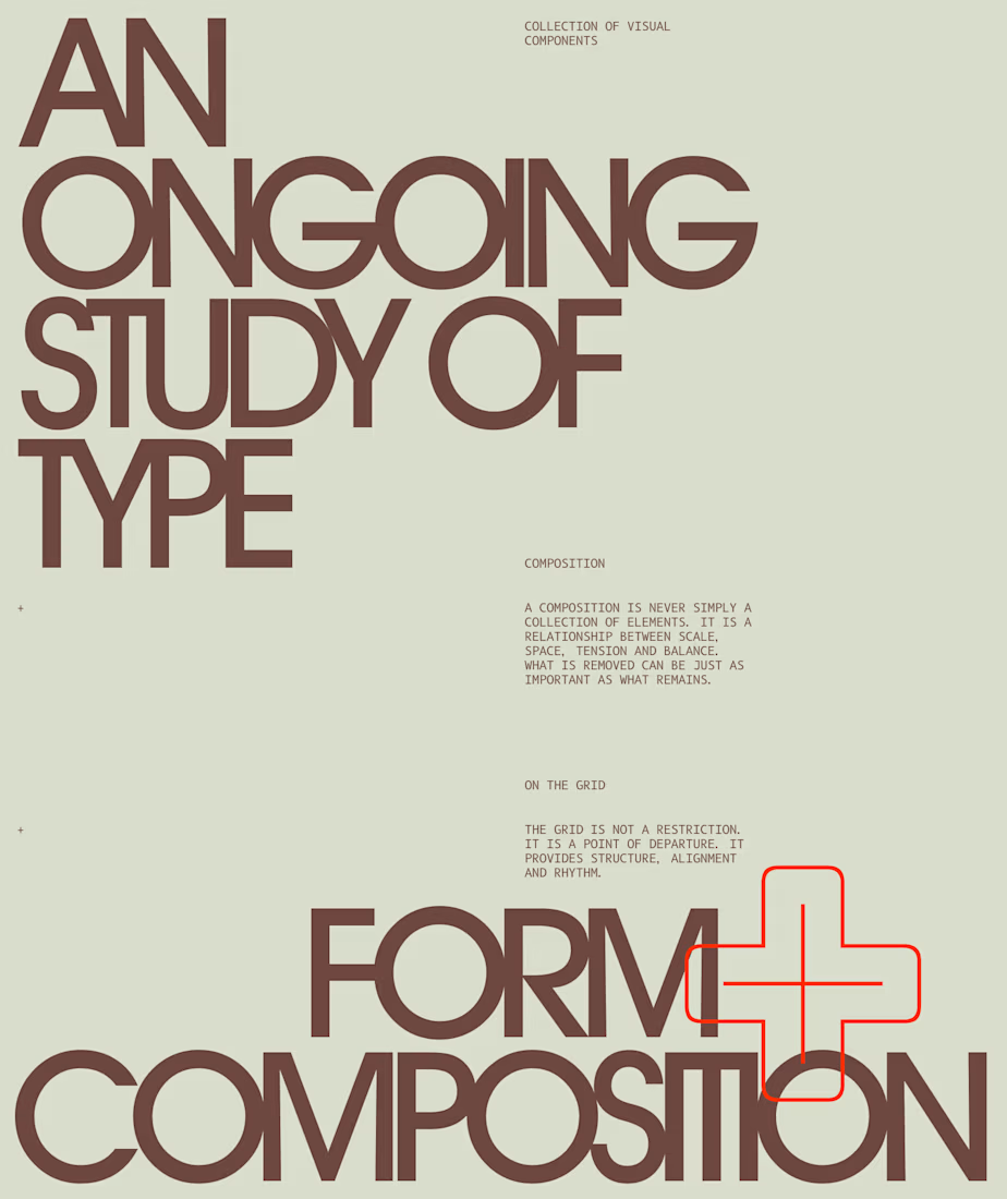
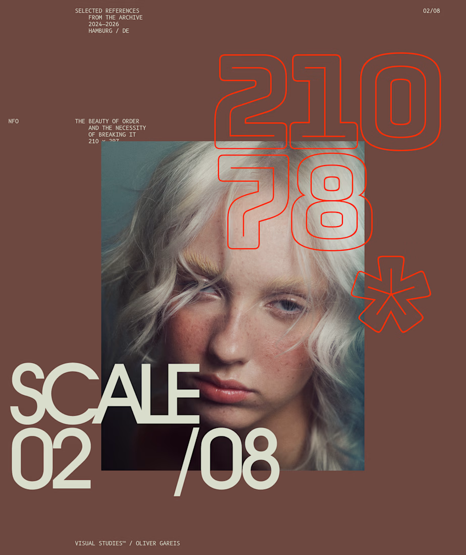
I designed these typographic layouts as part of my ongoing visual series on scale, grid and rhythm
↳ Master typography & layout - The foundation of timeless web design. Join 350+ designers inside my 13-hour online course https://typomonday.com/course


Beautiful wo

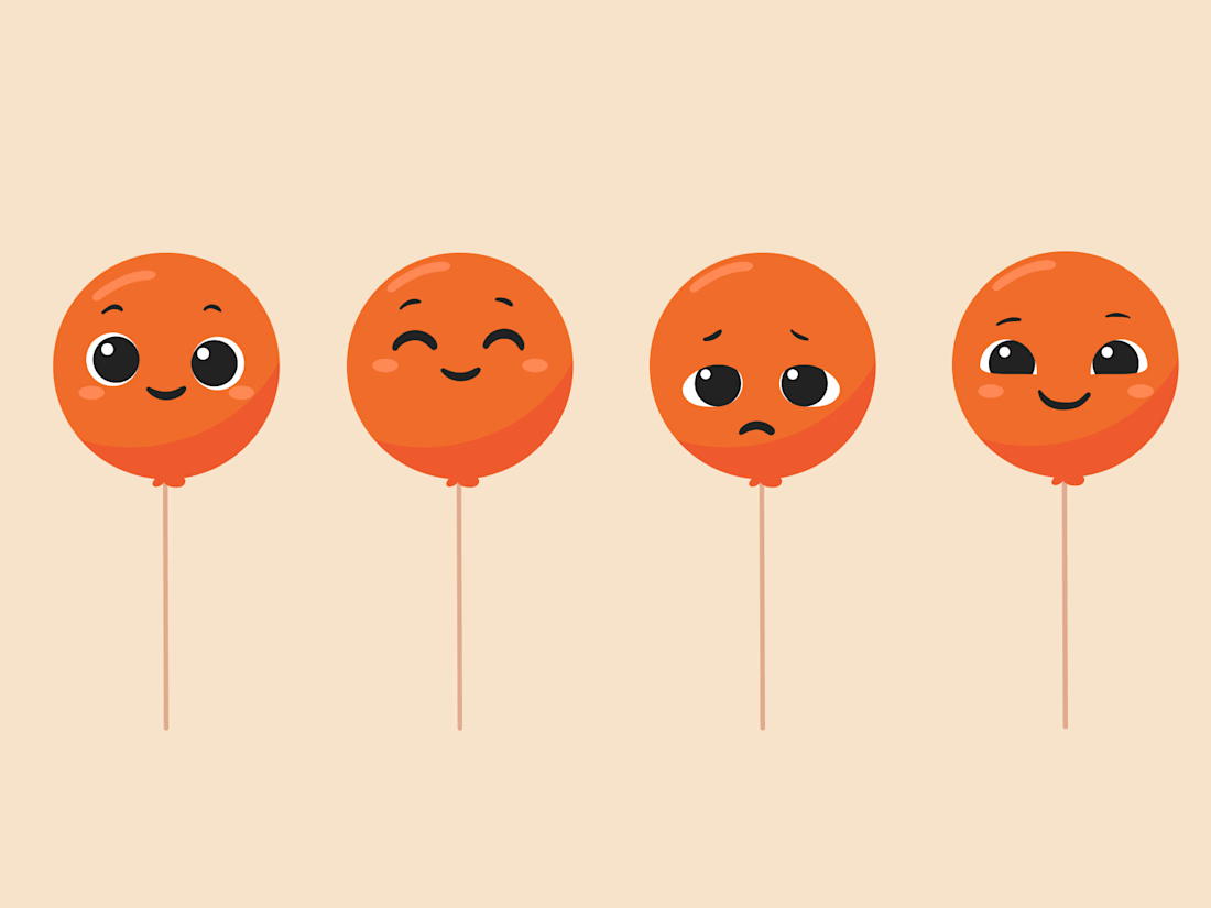
Balloon Mascot expression ranges
Illustrations by @Mary Delaney
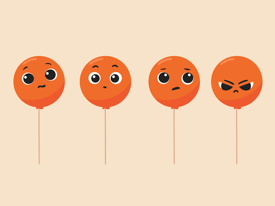
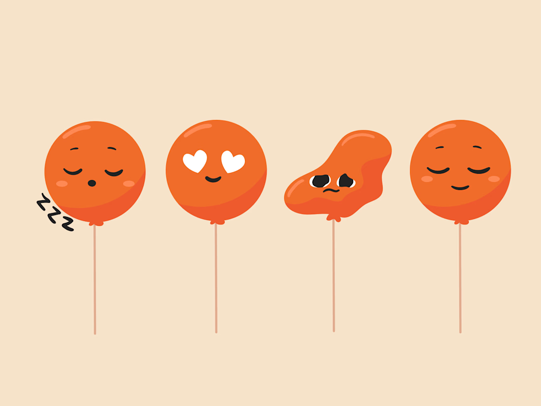

I really love coming across this project in this space


Every letter of the wordmark was uniquely drawn in Adobe Illustrator as a guilloche pattern tile. I then built everything into custom Figma plugins that generate the result, so tash.cards can form unique words for its own communication.

This is striking Nikas! 👏 The layered guilloche lines in pink and blue against the black background look so precise. I like that you build figma plugins so the wordmark can create new words, since it makes the brand flexible and unique. Great work on tash.cards!