The network for creativity
Join 1.25M professional creatives like you
Connect with clients, get discovered, and run your business 100% commission-free
Creatives on Contra have earned over $150M and we are just getting started
Back to feedPost

Revoo | Social Media Design Transformation
Before → After: A design transformation that makes a difference.
I redesigned this Revoo social media post to create a stronger visual impact while keeping the brand direction consistent.
The focus was on improving visual hierarchy, typography, composition, branding, overall communication turning a basic layout into a bold, modern social media creative.
🎨 Designed in Adobe Photoshop
What would you choose: Before or After?
#GraphicDesign #SocialMediaDesign #BrandDesign #VisualDesign #AdvertisingDesign #CreativeDirection #DesignTransformation #AdobePhotoshop #Contra
The network for creativity
Join 1.25M professional creatives like you
Connect with clients, get discovered, and run your business 100% commission-free
Creatives on Contra have earned over $150M and we are just getting started





Related posts

Brand Identity & Packaging Design
A complete visual identity and packaging concept for Cerveja do Bolo, including branded packaging, merchandise, and outdoor signage. I developed the visual direction and applied the brand consistently across multiple touchpoints to create a cohesive and recognizable identity.


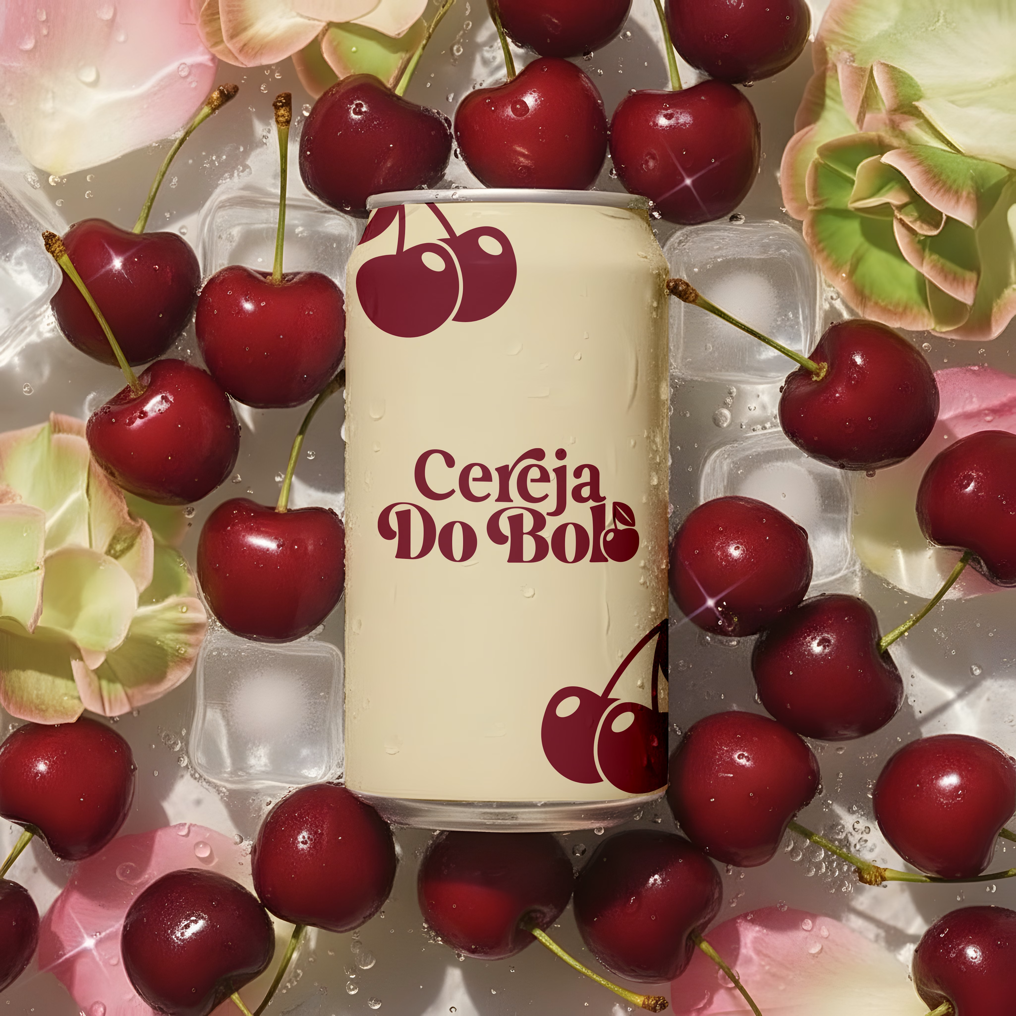
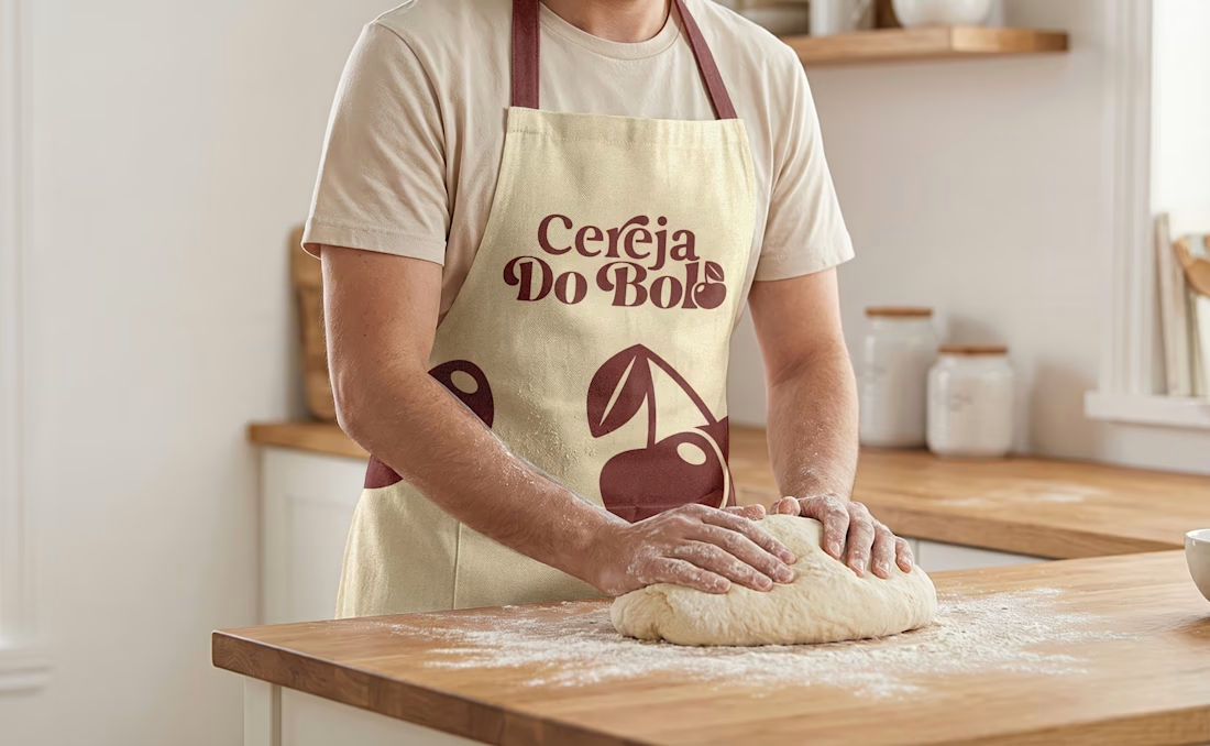
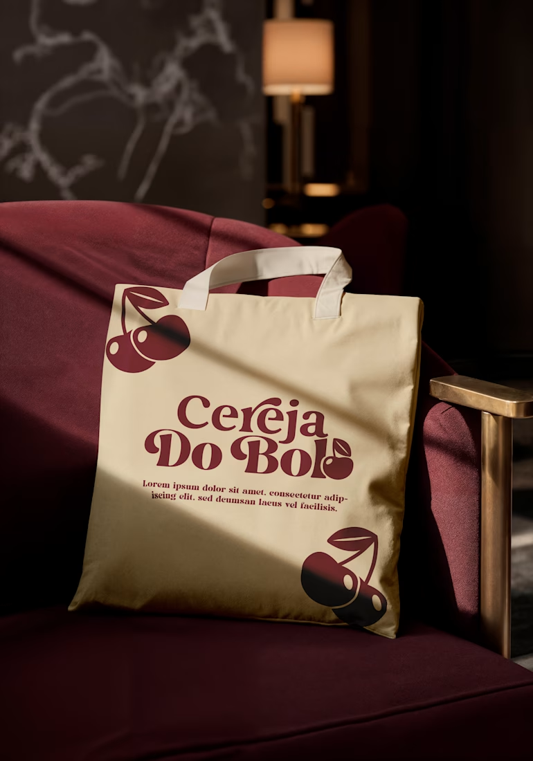
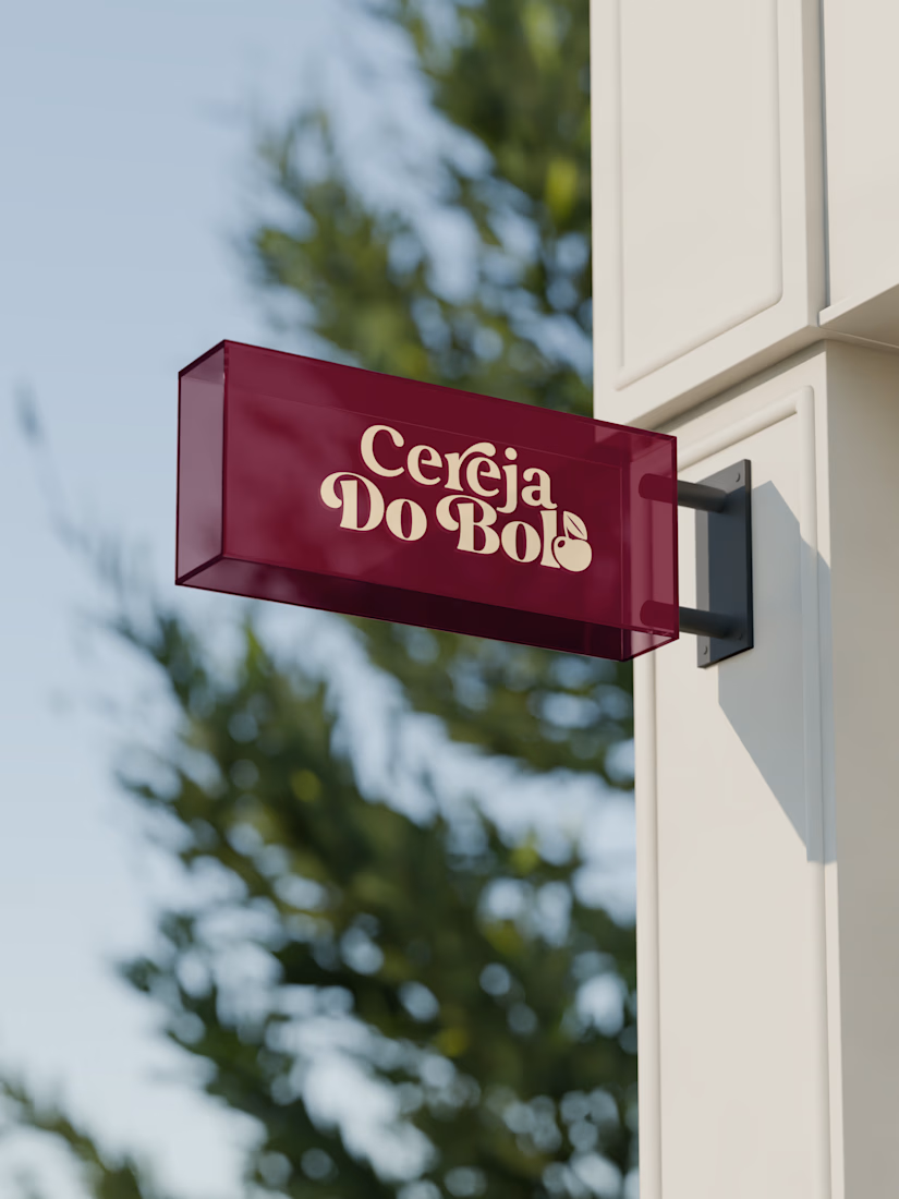

Wow, love it

Which hero direction feels right for this founder-focused brand?
While working on the homepage for Sean Parsons, a brand focused on empowering non-technical founders to launch tech startups, I explored two different visual directions for the hero section. Same message, same structure, just a different mood and color system.
Option 1 - Warm Olive. Dark, grounded, and editorial, giving a warm, established, expert feel.
Option 2 - Light Purple. Clean, modern, and vibrant, giving a fresh, SaaS-like, approachable feel.
Would love your honest UX/UI take, which direction feels more trustworthy, engaging, and aligned with a founder-focused brand, and why?
25 voted
69%
11 voted
31%
36 votes
Closed

I like worm Olive most because it has different personality


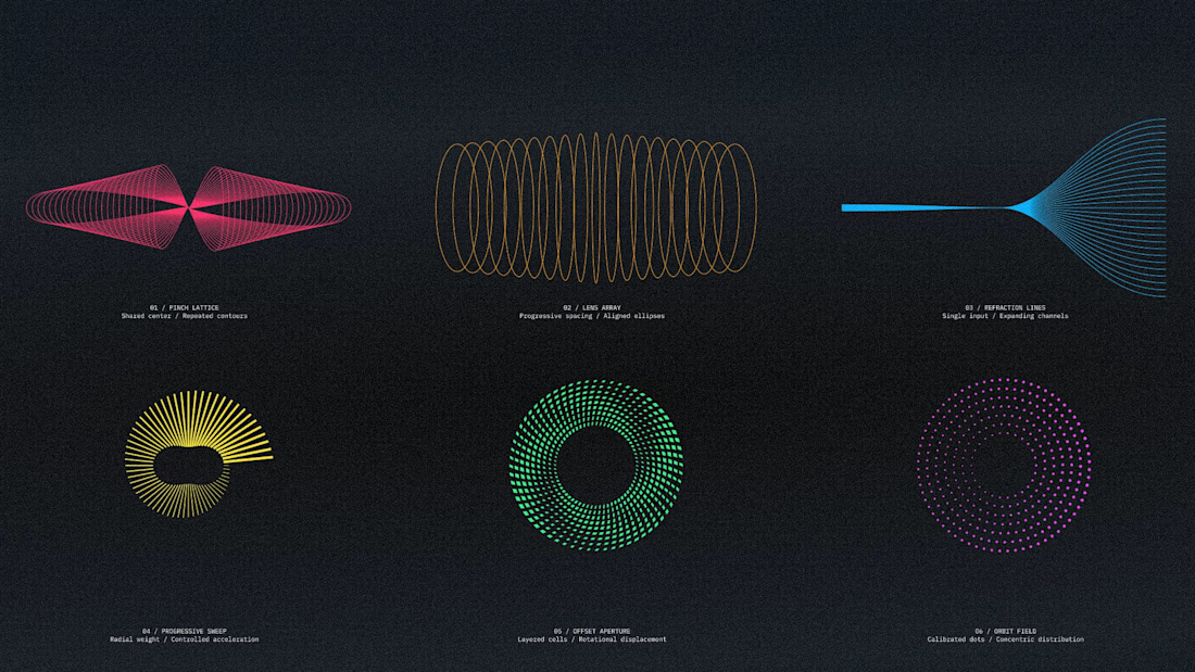
Six vector motifs, each built on one rule.
Shared center, repeated contours. Single input, expanding channels. Rule first, then shape.
That's what makes a system survive a format nobody scoped.

Absolutely stunning!!