The network for creativity
Join 1.25M professional creatives like you
Connect with clients, get discovered, and run your business 100% commission-free
Creatives on Contra have earned over $150M and we are just getting started
Back to feedPost


The network for creativity
Join 1.25M professional creatives like you
Connect with clients, get discovered, and run your business 100% commission-free
Creatives on Contra have earned over $150M and we are just getting started

Challenges
View all


Related posts


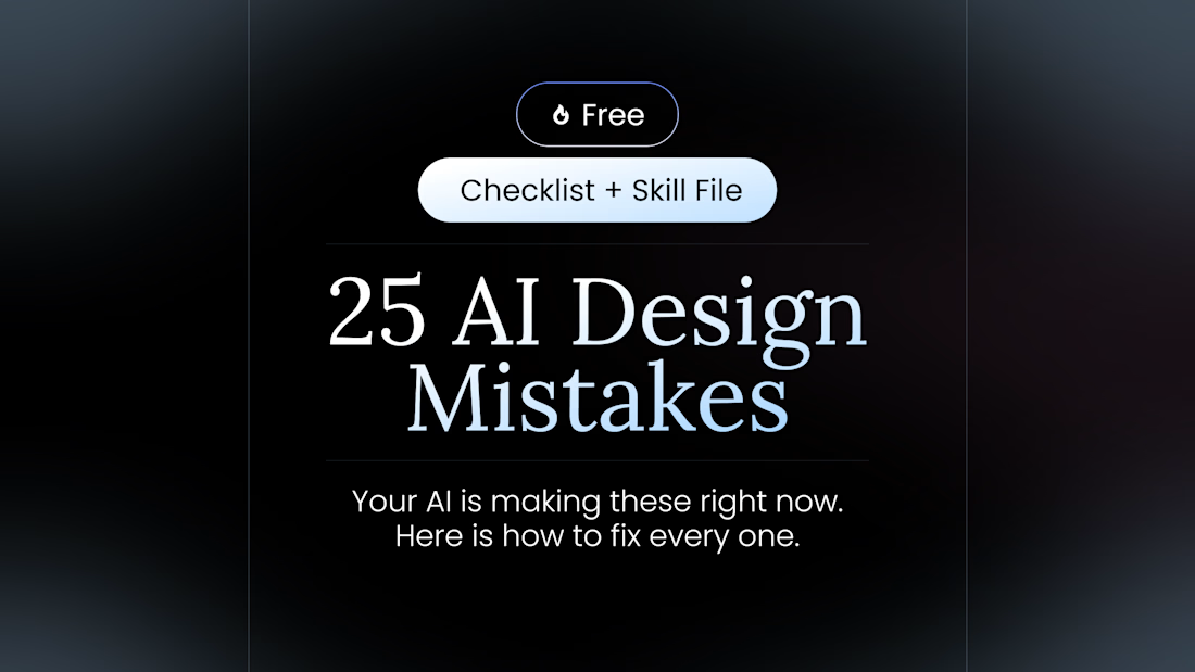
100+ people already use my free skill file to stop their AI from making the same 25 design mistakes.
Drop it into your project and your agent gets better at typography, spacing, color, and dark mode. Link in the comments.


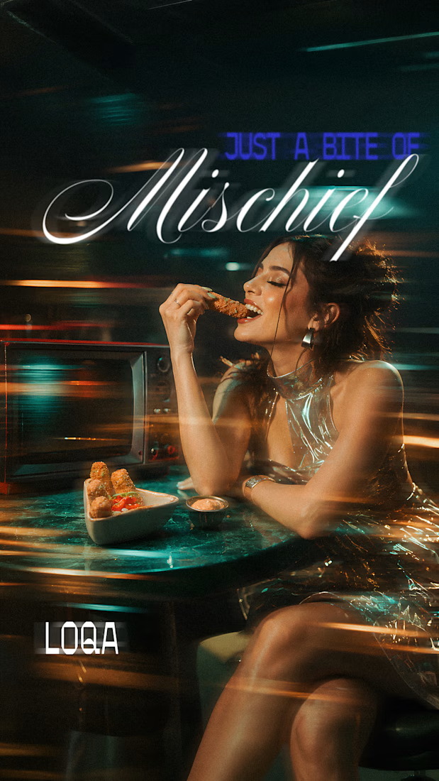
Some more experimental futuristic typography story design for Bar LOQA.


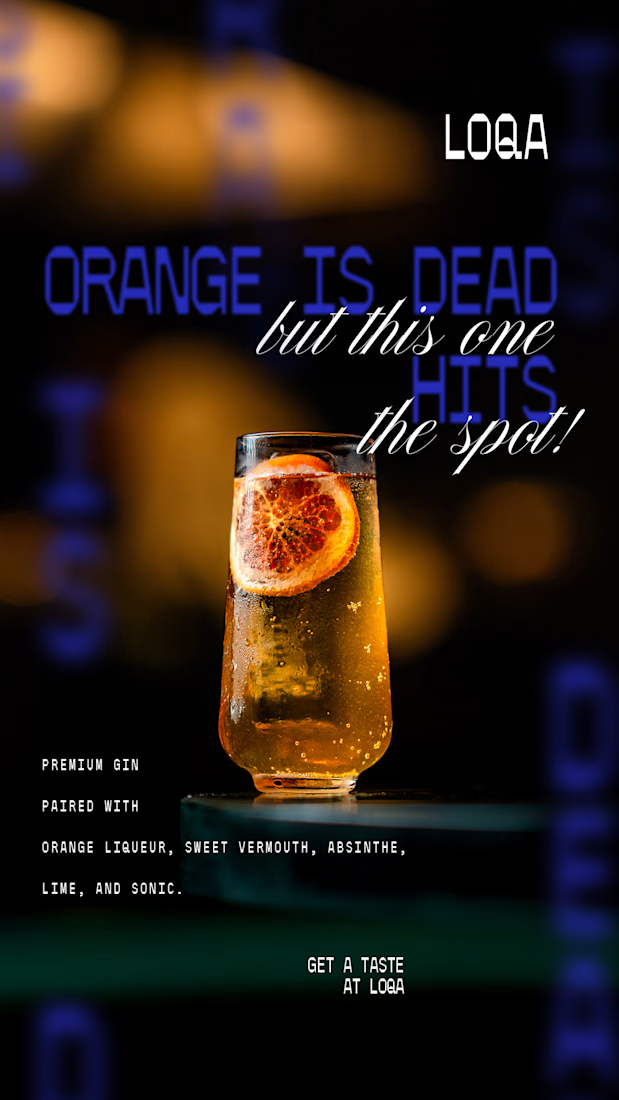
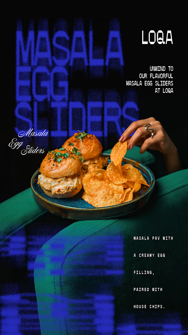
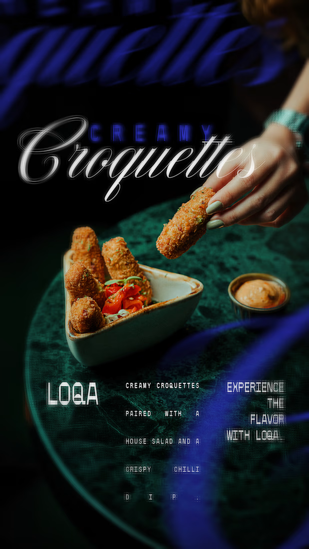

The script lettering over the cocktail sits in the glow without fighting the photo, while the sliders frame gets a much lighter touch. Do you place the type first and crop the image around it, or the other way round?

Heluo Fish I 何羅魚 🐟✨
From the original 3D render to an interactive foil card ,which version do you prefer?
Foil Card 🃏 or 3D Render?

2 voted
50%
2 voted
50%
4 votes
Closed

Both of them are great but I choose Render ❤️