The network for creativity
Join 1.25M professional creatives like you
Connect with clients, get discovered, and run your business 100% commission-free
Creatives on Contra have earned over $150M and we are just getting started
Back to feedPost
Taste Test
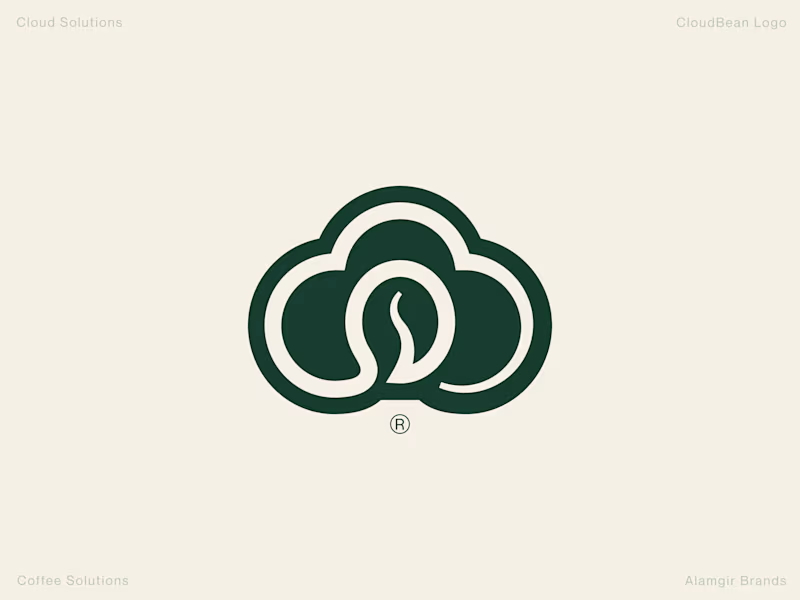
Human Design vs. AI: CloudBean Logo Concept ☁️☕️
When building a brand identity, execution and detail make all the difference. I put together two concepts for CloudBean—one crafted by hand (forest green) and another generated with AI.
The Handcrafted Version (Forest Green): Features a refined, balanced monogram seamlessly integrating the cloud shape with a coffee bean, complete with thoughtful typography styling and a polished mark.
The AI Version (Brown Gradient): Offers a quick interpretation, placing a tilted bean inside an open cloud outline with a standard gradient.
Which direction feels stronger for the brand? Let me know your thoughts in the comments! 👇
#Branding #LogoDesign #DesignProcess #VisualIdentity #Contra

2 votes
Ends in 1d

love this branding design

Thanks
The network for creativity
Join 1.25M professional creatives like you
Connect with clients, get discovered, and run your business 100% commission-free
Creatives on Contra have earned over $150M and we are just getting started



Related posts

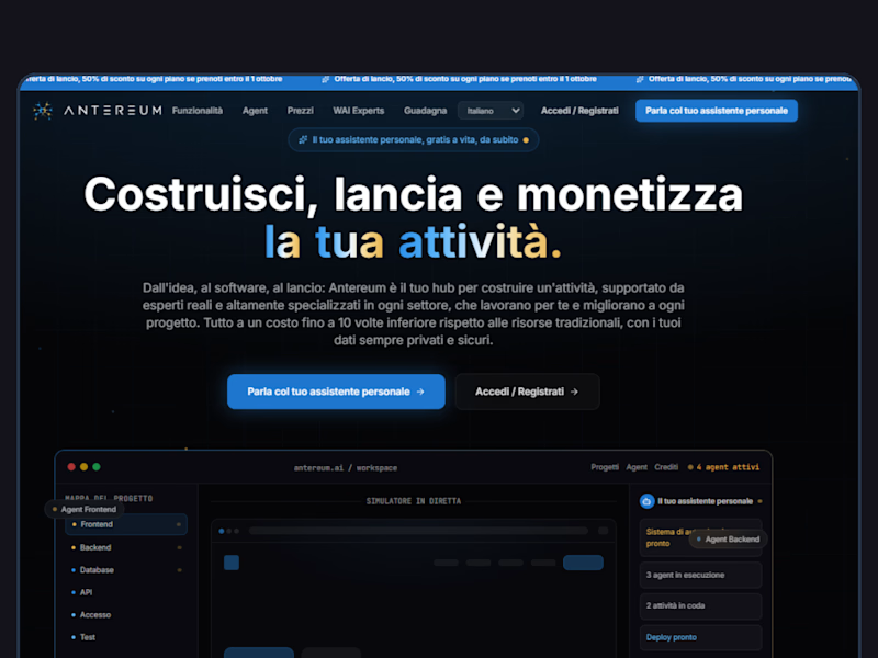
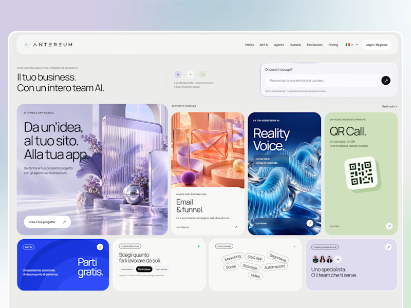
Webiste redesign for Saas company


2 voted
4%
44 voted
96%
46 votes
Closed




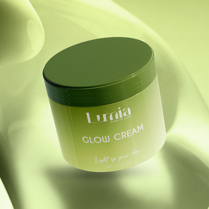
Which packaging color catches your eye first?

6 voted
46%
7 voted
54%

13 votes
Closed

The green version catches my eye first: the dark olive lid gives the lighter jar a clear focal point. I would also test the small white label text at thumbnail size, since the soft lighting reduces its contrast in both versions.