The network for creativity
Join 1.25M professional creatives like you
Connect with clients, get discovered, and run your business 100% commission-free
Creatives on Contra have earned over $150M and we are just getting started
Back to feedPost


The network for creativity
Join 1.25M professional creatives like you
Connect with clients, get discovered, and run your business 100% commission-free
Creatives on Contra have earned over $150M and we are just getting started







Related posts


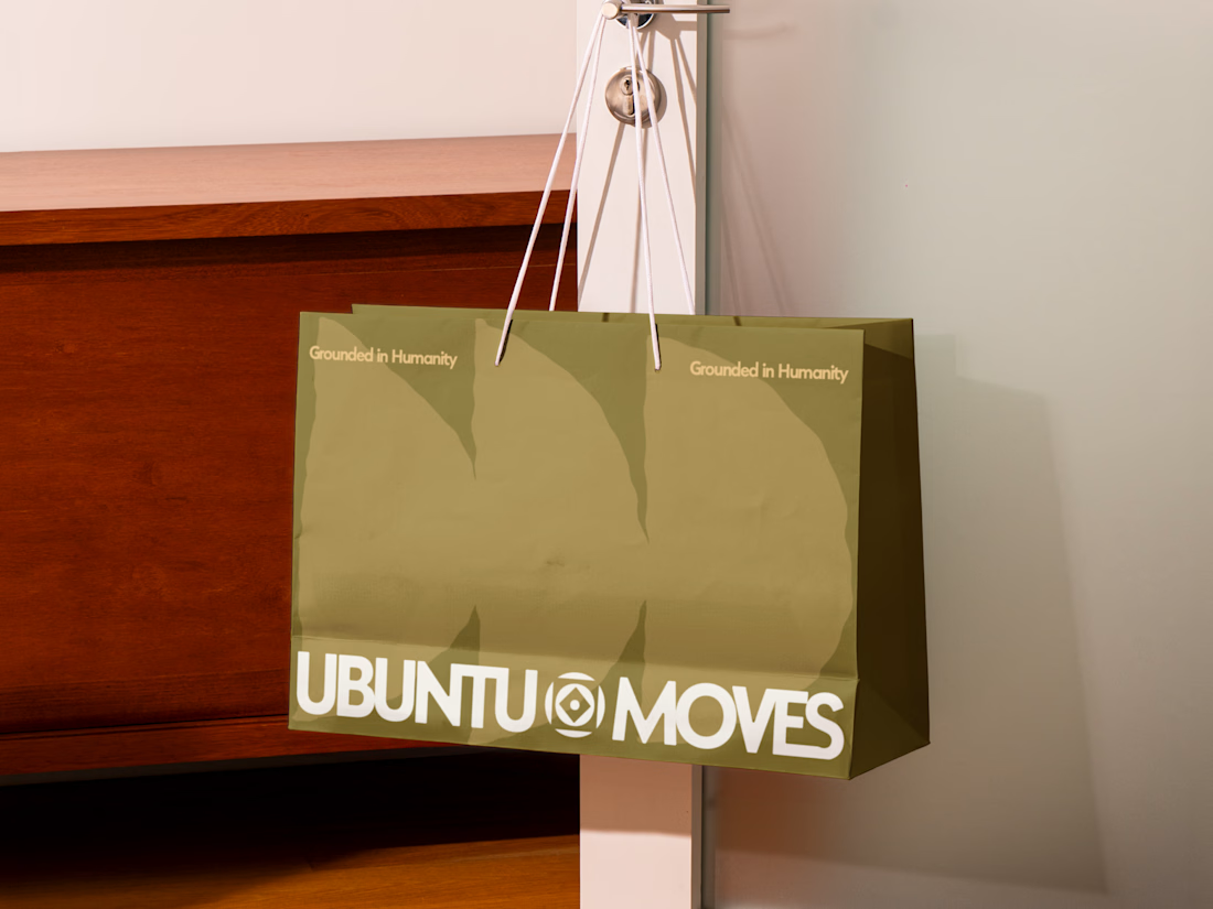
Grounded in humanity, made for movement.
Packaging and custom Framer website design for Ubuntu Moves, a wellness brand inspired by the belief that “I am because we are.”
Earthy colors, expressive patterns, and bold typography bring its sense of connection into the physical and digital experience.
Thanks @Can Girgin for the Framer development💫


The olive shopping bag with the wordmark split around that circular emblem looks great in the warm light, and the big tonal arches printed behind it add movement without shouting.

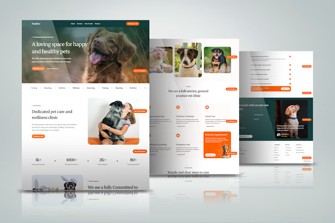
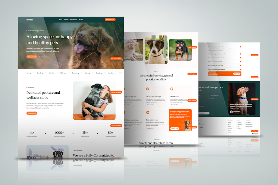
Designed and built a professional Framer website for a dog business website, focusing on clear service presentation, easy navigation, strong calls-to-action, testimonials, FAQs, and a responsive experience across devices



cool work
Designed and built a professional Framer website for a dog training website, focusing on clear service presentation, easy navigation, strong calls-to-action, testimonials, FAQs, and a responsive experience across devices