The network for creativity
Join 1.25M professional creatives like you
Connect with clients, get discovered, and run your business 100% commission-free
Creatives on Contra have earned over $150M and we are just getting started
Back to feedPost
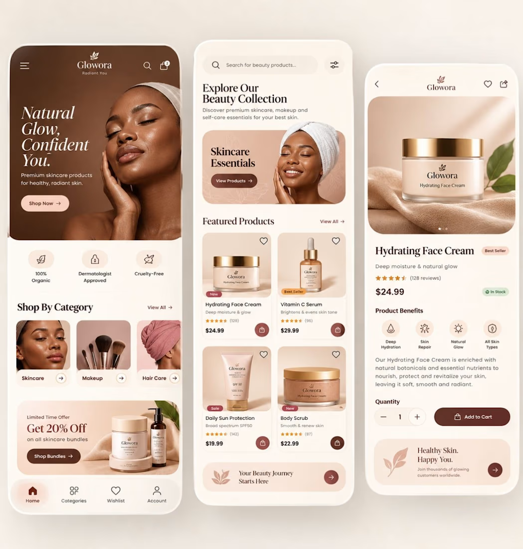
✨ Designed a premium skincare e-commerce mobile experience that blends luxury aesthetics + conversion-focused UX.
This concept was built to answer one question:
How do you make a beauty app feel as premium as the product itself?
What I focused on
• Warm nude/coffee colour palette for a luxury brand perception
• Editorial typography to create a high-end beauty feel
• Large product imagery that builds trust instantly
• Clean card hierarchy for faster product discovery
• One-tap purchase flow to reduce friction
• Benefit-driven product detail screen with strong visual cues
Screens included
• Home / Discovery
• Product listing
• Product detail / Add-to-cart
UX decisions that matter
✅ Strong above-the-fold value proposition
✅ Category shortcuts for faster navigation
✅ Social proof (ratings & reviews)
✅ Inventory status visibility
✅ Accessible spacing and touch targets
✅ Consistent visual system across all screens
In beauty commerce, users don’t just buy skincare.
They buy confidence, glow, and a feeling.
That’s why visual storytelling is just as important as usability.
Would love your feedback:
Which screen converts best — Home, Product Listing, or Product Detail?


Great Design!!

Thank you
The network for creativity
Join 1.25M professional creatives like you
Connect with clients, get discovered, and run your business 100% commission-free
Creatives on Contra have earned over $150M and we are just getting started
Trending

Claude
Claude has entered the design space. How are you using it?

Contra University
Learn from expert creatives how to earn more using next-gen AI tools.
Brand Design
The best brand designers are on Contra. Scroll to see what's trending in brand design. What are you building?
creativeaiflow
Creative AI workflows are evolving. What tools do you use, and what are their strengths and weaknesses?
freelancerlife
Freelancer life is wins, pivots, and everything in between. What’s yours right now?



Related posts

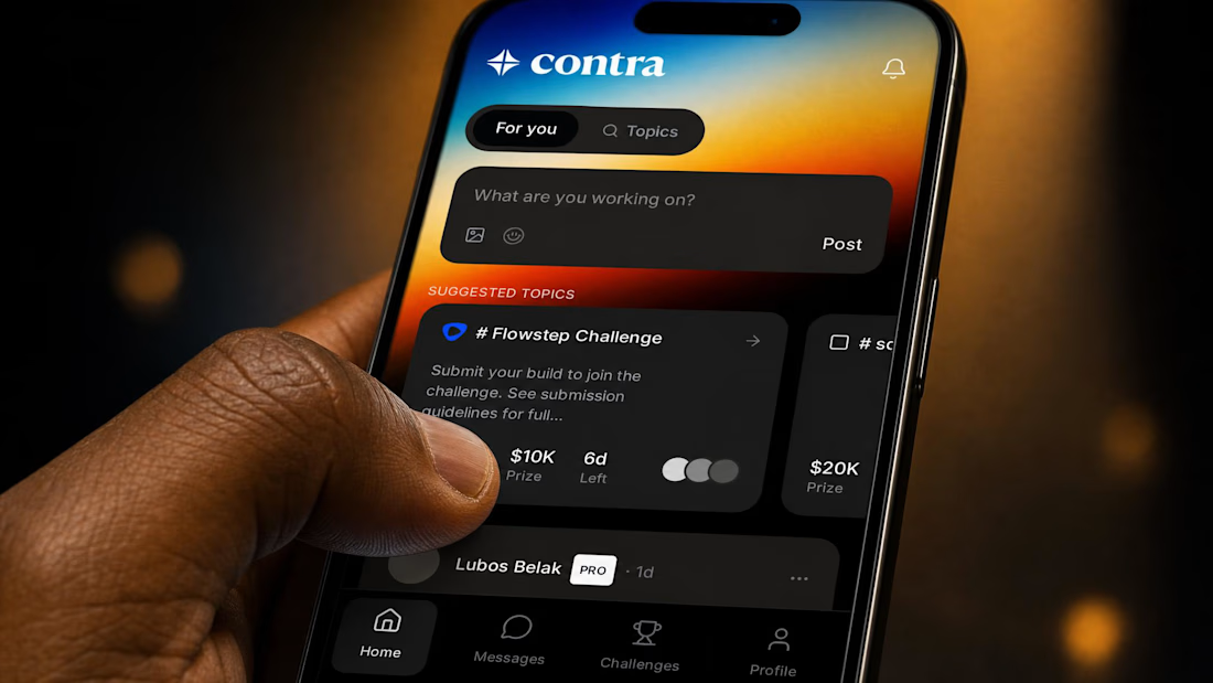
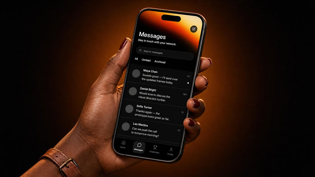
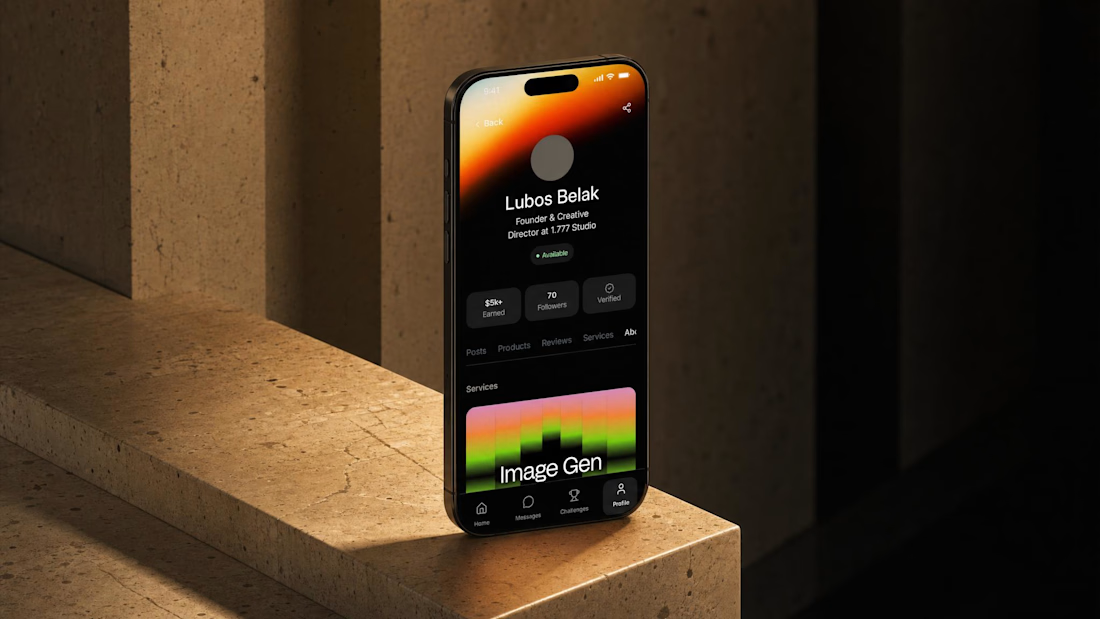
“The Contra mobile app!”
That was my immediate answer to Flowstep's challenge to build the product I've always wanted but never existed.
Together with Flowstep’s agent, I designed screens: Home, Challenges, Profile and Messages.
I exported the designs to Figma and began experimenting with assets from Contra’s brand identity system, created by Smith Diction (🤌).
I then brought these explorations back into Flowstep, added the finishing touches, and linked everything together to create a working prototype.



Very good odea and i like the execution. Fits the Contra's art style very well!

A closer look at the Zeyro landing page.
Designed to communicate a complex product with a clean visual hierarchy, clear messaging, and a conversion-focused experience.
#LandingPageDesign #SaaS #ProductDesign


The visual hierarchy and clear section separation look really smooth. Did you use Jitter to animate the hero interaction components for this shot?

Hi everyone! I'm Yuri, and this is my project for the Flowstep Challenge by Contra!
I have many volunteer friends around the world working in places where disasters have struck, and people need help. I often hear from them that they use different tools in their work, but they still really lack full automation to connect coordination centers with individual volunteers. This request inspired me to do this project!
I took a tool one of these volunteer organizations already uses and built out the parts it's missing:
- For coordinators (desktop) - all incoming requests with their statuses, warehouse state, the stats they actually need, and a map view of where every request is coming from.
- For volunteers (mobile) - a new request with its status, the full details, and a simple accept or decline.
Now, the fun part: how it was made. I ran Claude Code + Flowstep together over MCP. First, I wrote out a spec of everything the product needed to do and handed it to the setup. Then I went through the existing tool and documented its design system - this turned out to be the smartest thing I did, because it kept every screen consistent instead of feeling like ten different products. After that, I generated prompts in Flowstep, one dedicated prompt per user flow. I refined each screen with prompts, and honestly, most of the time it landed on the first or second try. The few tiny things left over I just nudged by hand right in Flowstep.
And I'm genuinely happy with how it came out. Doing all of this manually would've cost me a solid 6–8 hours. This took me a bit over two.
And the agent messages provided for the challenge were enough for me to finish. I was only 1 short - to adjust an icon on the last screen (hope you won’t blame for that).
🔗 The result of my work in Flowstep: https://app.flowstep.ai/file?activeFileId=0c294720-d873-4ced-b99c-e6f20f818209
Thank you all so much for checking it out, and I'd be grateful for your feedback and comments!
#FlowstepChallenge # #Flowstep #Claude #ClaudeCode #Weavy #UX/UI #ProductDesign #Saas #Dashboard


This CrisisCoord concept is brilliant.
The dashboard + mobile + warehouse flow feels so real and needed.
Love how you handled the urgency with the timers and priority system.
Great execution!