
Adesina Muiz
I design products people don't have to think about.
New to Contra
Adesina is ready for their next project!
It's not just beautiful visuals.
It's strategy.
Every pixel should have a purpose. Every section should tell a story. Every interaction should move users one step closer to taking action.
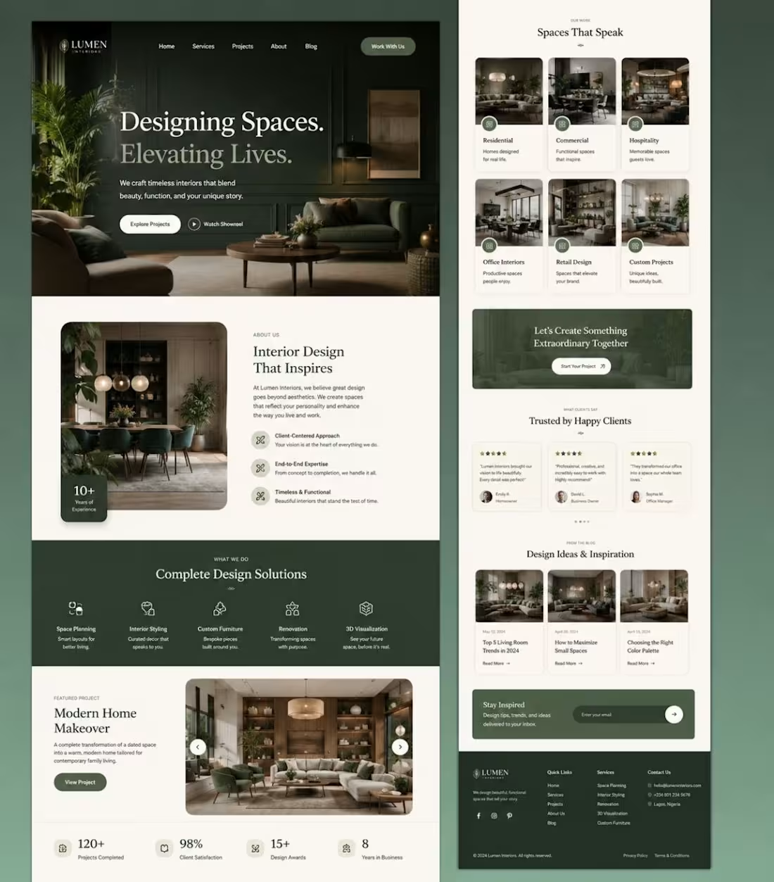
That's exactly what I focused on while designing this Luxury Interior Design Website UI.
Instead of following trends, I designed an experience that communicates trust, elegance, and sophistication from the very first scroll.
🎯 Design Goals
✔ Create a premium luxury brand identity
✔ Build trust within the first 5 seconds
✔ Guide visitors naturally through the customer journey
✔ Showcase projects without overwhelming the user
✔ Keep the interface clean, timeless, and conversion-focused
✨ Design Highlights
🌿 Elegant earthy green palette inspired by luxury interiors
🏡 Large immersive hero section with strong visual storytelling
📐 Clean grid system and balanced white space
🎨 Editorial typography for a premium feel
📸 High-quality project showcases
⭐ Social proof through testimonials
📱 Fully responsive layout
⚡ Conversion-focused CTAs throughout the experience
🎯 Scalable design system built in Figma
People don't buy products.
People buy confidence.
Great UI isn't decoration.
It's psychology.
It's branding.
It's business.
If your website doesn't create trust within seconds, your competitors already have the advantage.
💬 I'm curious...
Would this design make you trust an interior design company enough to contact them?
Or what would you improve?
Let's discuss in the comments. 👇
If you appreciate clean UI and thoughtful UX, feel free to Like ❤️, Comment 💬, and Repost 🔄 to support the work.
#UIUX #UXDesign #UIDesign #WebDesign
0
3
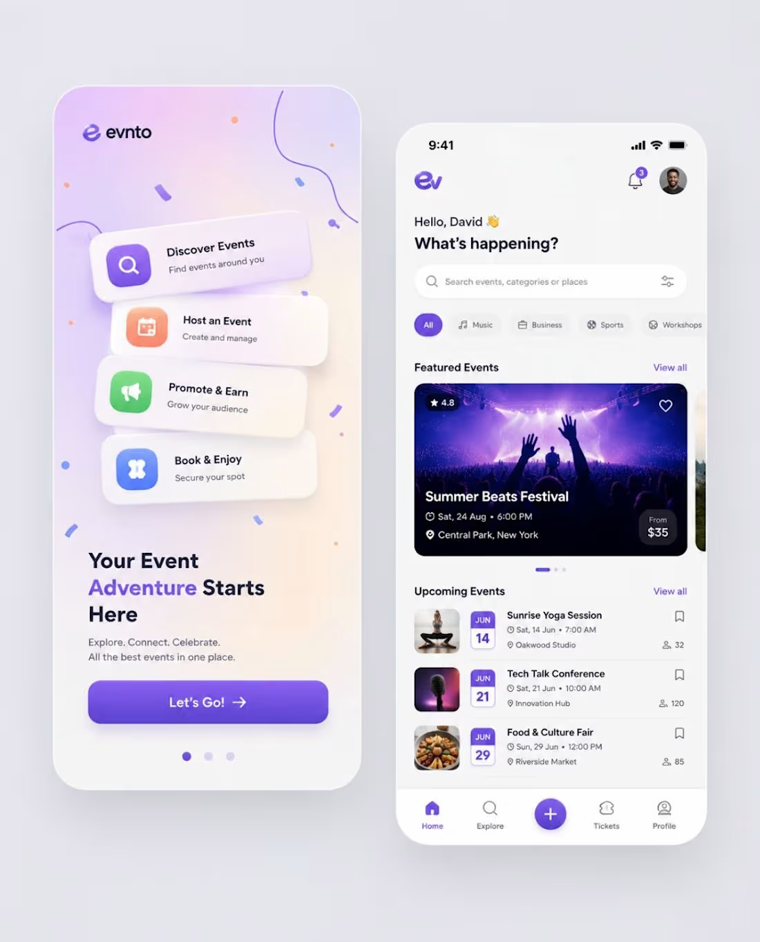
🎉 Designing an Event Discovery App That Makes Finding Experiences Effortless
Every great event starts with a seamless user experience.
I challenged myself to design a modern event discovery mobile app that helps users explore, book, and manage events with speed, simplicity, and delight.
The objective wasn't just to make it visually appealing—it was to create an interface that encourages exploration, increases engagement, and simplifies the booking journey.
✨ Key Design Highlights:
🎨 Clean, modern UI with a vibrant purple gradient identity
📱 Intuitive onboarding that communicates value instantly
🔍 Smart search and category filters for effortless discovery
🎟️ Conversion-focused event cards with key information upfront
📅 Organised upcoming events for better planning
⚡ Simple navigation with quick access to Explore, Tickets & Profile
💜 Soft shadows, rounded components, and balanced spacing for a premium feel
📐 Built using scalable components and Auto Layout in Figma
Great UI isn't only about aesthetics—it's about creating experiences users enjoy returning to.
💬 If this were your go-to event app, what's the one feature you'd love to see added?
Your feedback is always appreciated! 👇
2
14
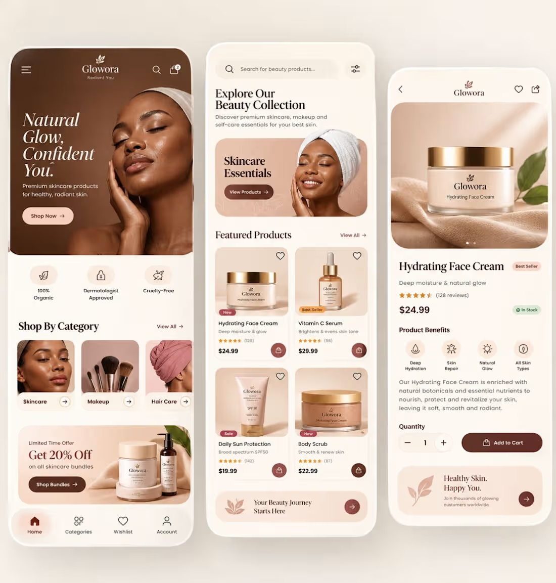
✨ Designed a premium skincare e-commerce mobile experience that blends luxury aesthetics + conversion-focused UX.
This concept was built to answer one question:
How do you make a beauty app feel as premium as the product itself?
What I focused on
• Warm nude/coffee colour palette for a luxury brand perception
• Editorial typography to create a high-end beauty feel
• Large product imagery that builds trust instantly
• Clean card hierarchy for faster product discovery
• One-tap purchase flow to reduce friction
• Benefit-driven product detail screen with strong visual cues
Screens included
• Home / Discovery
• Product listing
• Product detail / Add-to-cart
UX decisions that matter
✅ Strong above-the-fold value proposition
✅ Category shortcuts for faster navigation
✅ Social proof (ratings & reviews)
✅ Inventory status visibility
✅ Accessible spacing and touch targets
✅ Consistent visual system across all screens
In beauty commerce, users don’t just buy skincare.
They buy confidence, glow, and a feeling.
That’s why visual storytelling is just as important as usability.
Would love your feedback:
Which screen converts best — Home, Product Listing, or Product Detail?
2
2
35
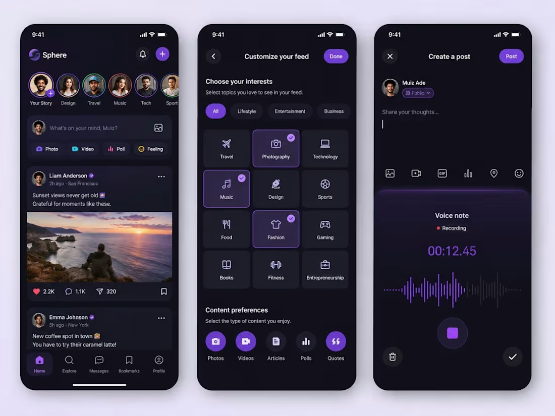
AI can generate beautiful social media screens.
But human designers create products people want to use every day.
I challenged myself to design a Social Media Mobile App that goes beyond aesthetics and focuses on human psychology.
Instead of simply arranging components, I optimized the experience for:
• Visual hierarchy
• User engagement
• Dopamine-driven interactions
• Content discovery
• Accessibility
• Retention-focused UX
3
3
41
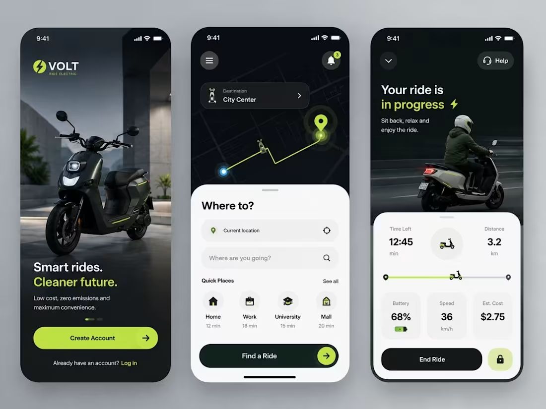
What if sustainable transportation felt this effortless? People don't choose apps because they're beautiful. They choose them because they feel simple, fast, and trustworthy. That's exactly the psychology behind my latest Electric Scooter (E-Scooter) Ride Booking Mobile App UI/UX Concept. Every screen was intentionally designed to reduce friction and improve user confidence:
A bold onboarding experience that communicates value in seconds.
Clean ride discovery with intuitive map interactions.
Smart destination selection that minimizes decision fatigue.
Real-time ride tracking with essential information at a glance.
Battery, speed, ETA, and pricing presented using a clear visual hierarchy.
A vibrant green accent color to reinforce sustainability, action, and safety.
Premium dark mode for improved focus and visual comfort. As designers, we're not just creating interfaces—we're shaping behavior. A great mobility app should help users make decisions effortlessly while building trust through every interaction. This concept combines minimalism, accessibility, and user psychology to create an experience that feels modern, intuitive, and enjoyable.
Now I'm curious... If you were using this app, which feature would matter most to you?
Faster booking
Better navigation
Live ride tracking
Seamless payments Drop your answer below!
If this design inspired you, leave a like.
Share your honest feedback in the comments.
Repost to help more designers and startups discover this concept.
Follow for weekly UI/UX, Product Design, SaaS, AI, and Fintech inspiration.
#UIUX #UIDesign #UXDesign #MobileAppDesign #ProductDesign #Figma #ElectricVehicle #EV #EMobility #RideSharing #ScooterApp #TransportationDesign #SmartMobility #GreenTech #SustainableDesign #AppDesign #DesignSystem #InteractionDesign #UserExperience #Startup #TechStartup #DesignInspiration #DailyUI #CreativeDesign #Portfolio #UXResearch #UIInspiration #MobilityTech #DigitalProductDesign #Innovation
3
90
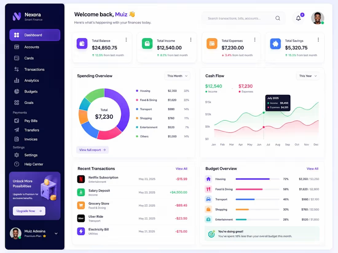
Smart Finance Dashboard UI/UX Design | Personal Finance & Analytics Dashboard. I'm excited to share my latest Finance Dashboard UI/UX Design Concept, created to help users manage their finances with clarity, confidence, and simplicity. This dashboard combines modern aesthetics with actionable financial insights, making it easier to track income, expenses, savings, budgets, and transactions—all from one intuitive workspace. Key Features:
Financial overview dashboard
Interactive spending analytics
Real-time cash flow visualization
Income, expenses & savings tracking
Recent transaction management
Budget monitoring & financial goals
Smart search and intuitive navigation
Clean, modern, and user-centric interface Every design decision focused on improving usability, reducing cognitive load, and presenting complex financial data in a simple, visually engaging way. Design isn't just about making products look good—it's about creating experiences that empower users to make smarter financial decisions.
I'd love to hear your thoughts! Which section do you find most valuable—the Spending Overview, Cash Flow Analytics, or Budget Overview?
Like if you found this inspiring.
Share your feedback in the comments.
Repost to support my work and help it reach more designers and founders.
Follow me for more UI/UX Design, SaaS Dashboard, Fintech, and Product Design content. #UIUX #UIDesign #UXDesign #DashboardDesign #FinanceDashboard #Fintech #SaaS #WebDesign #ProductDesign #Figma #AnalyticsDashboard #DataVisualization #PersonalFinance #FintechDesign #DesignSystem #UserExperience #InteractionDesign #WebApp #StartupDesign #CreativeDesign #Portfolio #UXInspiration #UIInspiration #DigitalProductDesign #DashboardUI
2
55
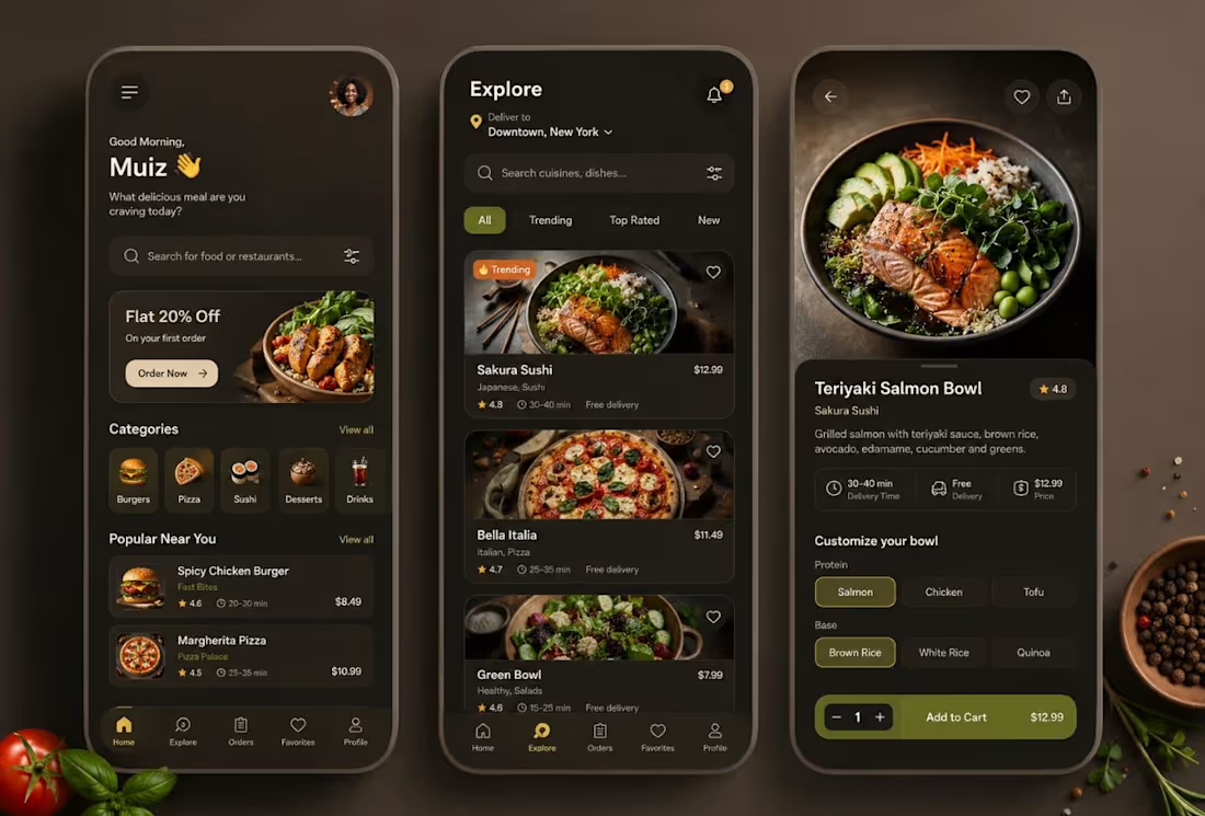
Crafted a Modern Food Delivery Mobile App UI/UX Concept
. I'm excited to share my latest Food Delivery Mobile App UI/UX Design, created to provide a seamless, intuitive, and visually engaging ordering experience. The goal was to combine a premium dark interface, mouth-watering food imagery, and an effortless user journey that makes discovering and ordering meals both fast and enjoyable.
Design Highlights
Personalized home dashboard
Smart food & restaurant search
Category-based meal discovery
Trending & top-rated restaurants
Interactive product customization
Smooth add-to-cart & checkout experience
Elegant dark mode with warm earthy tones
Clean, modern, and user-focused interface This concept emphasizes clarity, accessibility, and conversion-focused UX, ensuring users can browse, customize, and order their favorite meals with ease. I'd love to hear your thoughts!
Which screen stands out the most to you—Home, Explore, or Food Details?
Like if you enjoyed the design.
Leave your feedback or suggestions in the comments.
Repost to support my work.
Follow me for more premium UI/UX, Mobile App Design, and Product Design inspiration.
#UIUX #UIDesign #UXDesign #FoodDelivery #FoodDeliveryApp #MobileAppDesign #AppDesign #Figma #ProductDesign #DesignSystem #UserExperience #InteractionDesign #DarkUI #RestaurantApp #FoodTech #StartupDesign #CreativeDesign #DailyUI #UIInspiration #UXInspiration #Portfolio #VisualDesign #MobileDesign #DesignCommunity #DigitalProductDesign #figma
3
38
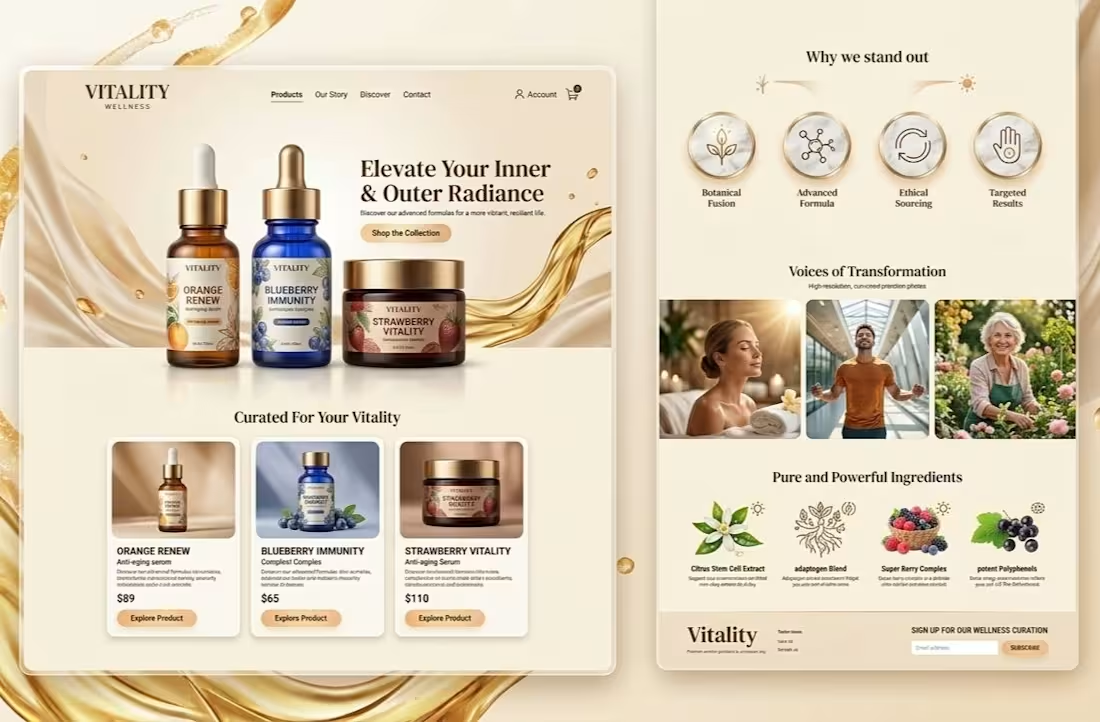
In the wellness industry, purchase decisions are driven by the psychological promise of transformation and the perceived purity of the brand. For Vitality, I designed a digital interface that bridges the gap between scientific efficacy and emotional aspiration. By utilizing a clean, organic aesthetic and prioritizing social proof, I crafted an environment where trust is established instantly, effectively turning curious visitors into committed customers. This approach demonstrates how intentional design can amplify brand authority and significantly increase conversion rates.
0
23
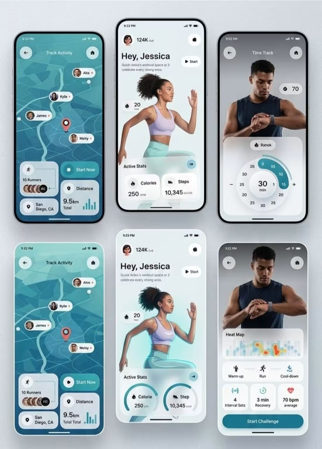
Users often approach financial platforms with high levels of anxiety and a need for immediate validation. By designing the Finova landing page to prioritize visual clarity and a sense of calm, I transformed a high-stress domain into an intuitive, empowering digital experience. This strategic focus on psychological "friction-reduction" and user confidence is the core value I bring to every product I build—turning complex functional needs into high-converting user journeys.
0
23
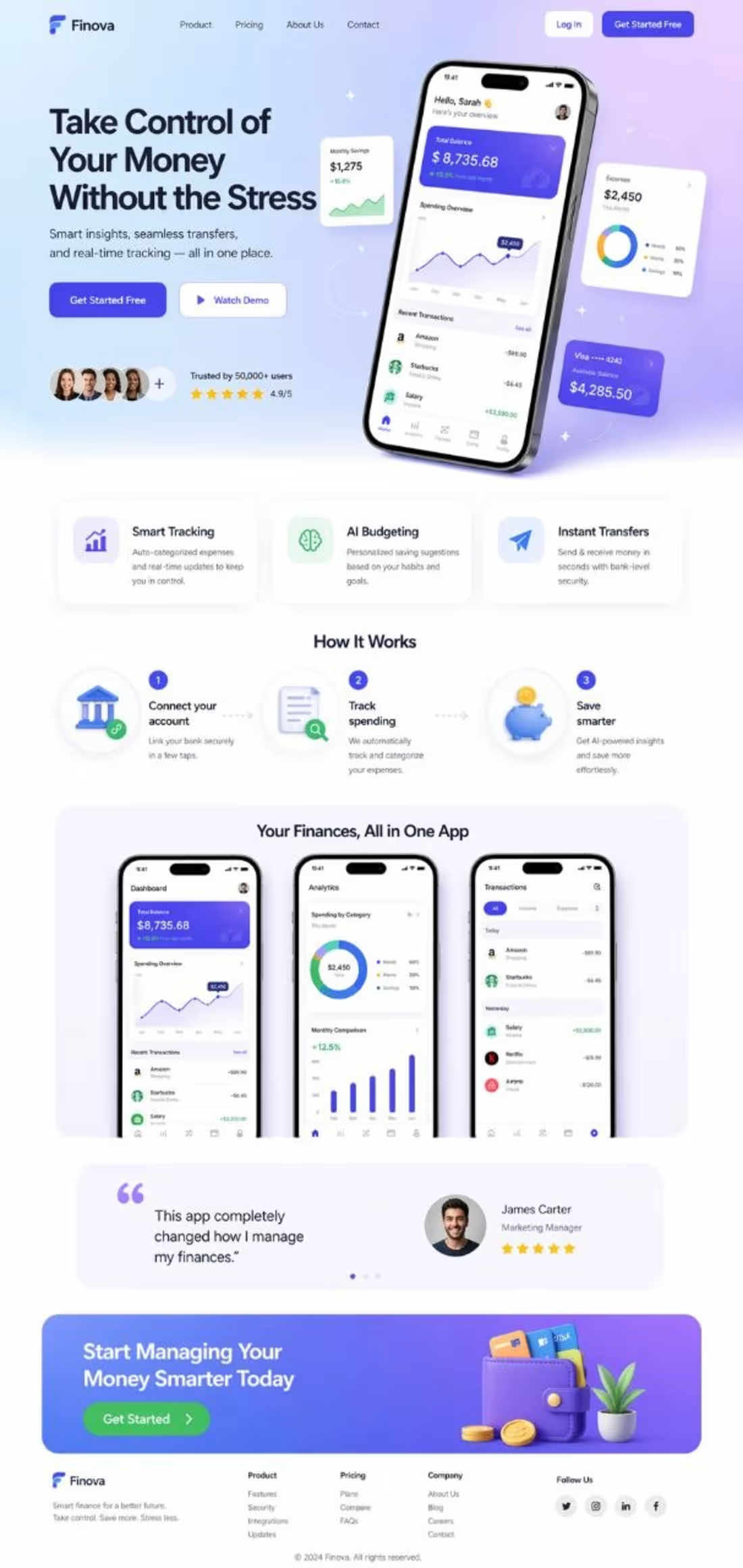
Web design for fintech isn't just about clean layouts; it’s about neutralizing user anxiety. For this Finova landing page, I applied the psychology of "calm design" using purposeful white space and intuitive information architecture to transform financial management from a stressful task into a frictionless, empowering experience. By visually reinforcing security and simplifying complex paths, I don't just increase clicks; I build the immediate, high-level trust necessary to turn visitors into long-term users.
0
27
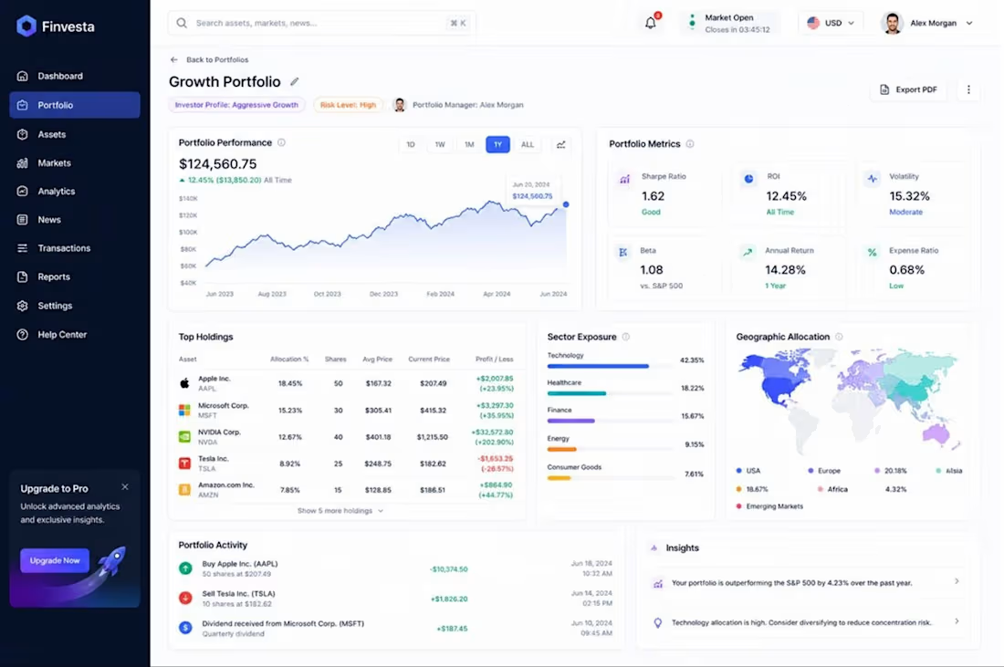
Complex financial dashboards often induce cognitive overload, which leads to user hesitation. For Finvesta, I engineered a high-density data environment that prioritizes clarity over clutter, utilizing hierarchical information architecture to turn overwhelming metrics into actionable financial intelligence. By aligning the UI with the mental models of sophisticated investors, I ensure that critical insights are instantly decodable, fostering a sense of mastery and trust that directly translates into higher platform adoption and user retention.
0
31
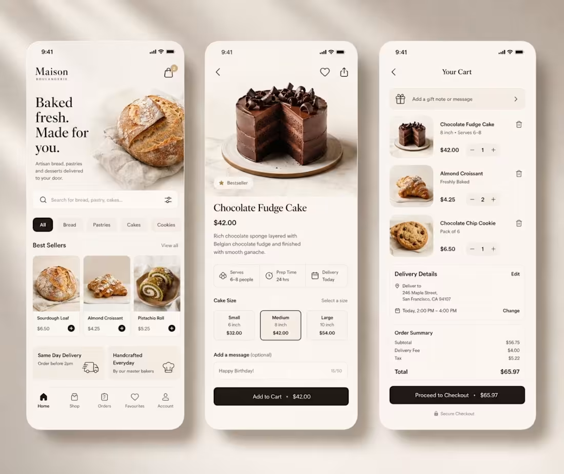
In the food and beverage industry, appetite is just as much visual as it is physical. For Maison Boulangerie, I designed an interface that triggers the "sensory experience" of the product before the customer even places an order. By leveraging high-fidelity imagery and a clean, uncluttered layout, I reduce the cognitive friction of decision-making, guiding the user toward a seamless conversion. This isn't just a menu; it is a psychological sales funnel that translates the premium quality of the bakery into digital convenience, effectively increasing average order value and customer satisfaction.
0
31
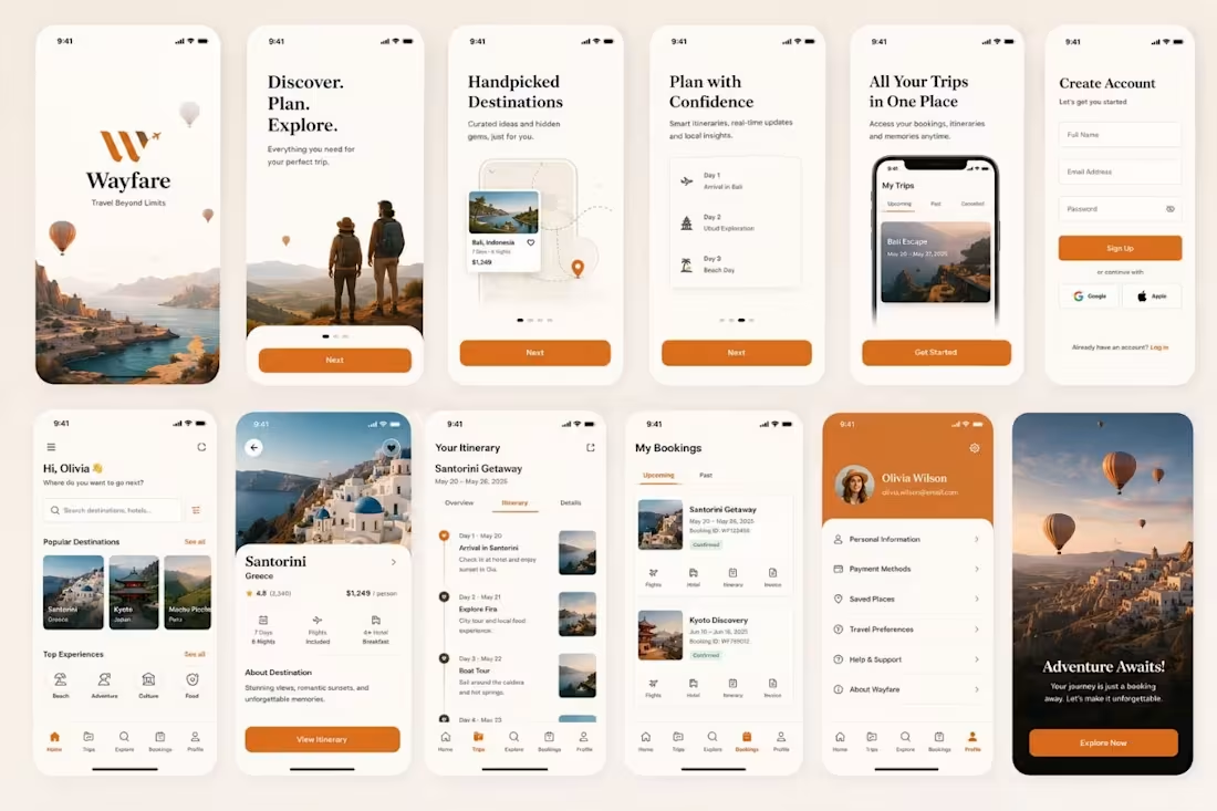
Travel planning is inherently overwhelming, often marred by "choice paralysis" and the anxiety of logistical gaps. For Wayfare, I engineered a digital journey that replaces this friction with anticipation and certainty. By structuring the information architecture to prioritize progressive disclosure and intuitive visual storytelling, I guide users effortlessly from the initial "dreaming" phase to secure booking. This design doesn't just display destinations; it minimizes the psychological barrier to commitment, transforming a stressful planning process into an aspirational, frictionless experience that drives higher conversion rates.
0
32
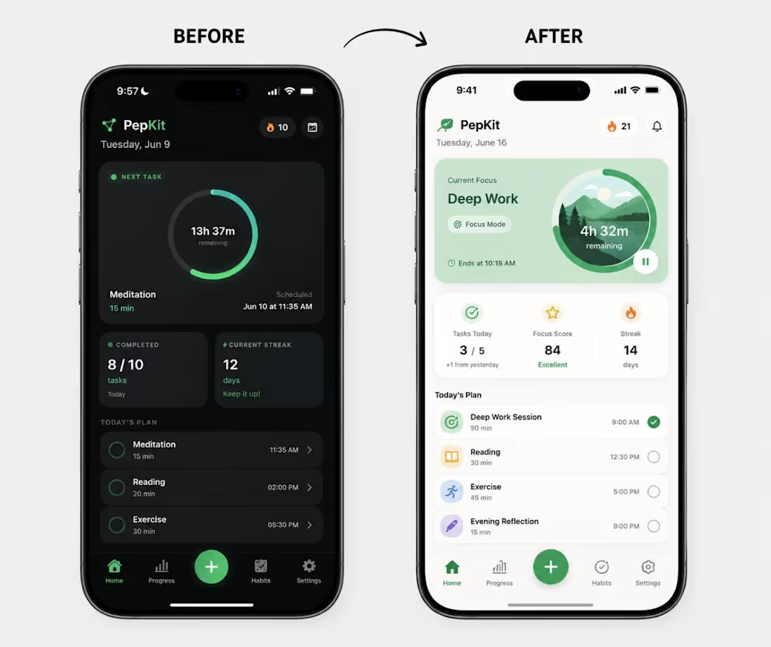
Productivity isn't just about functionality; it's about dopamine loops and clarity. I redesigned this interface to reduce the cognitive load of "to-do" fatigue, leveraging visual positive reinforcement to transform daily tasks into a satisfying path toward growth. When design aligns with human habit-forming psychology, it doesn't just look better—it drives higher user retention and daily engagement.
0
30
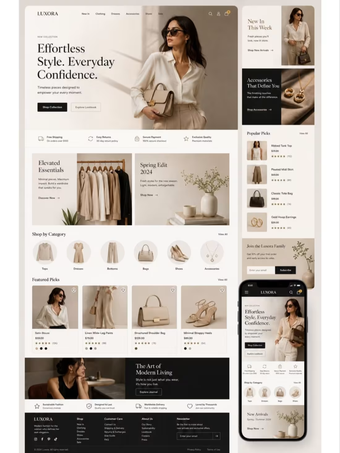
In e-commerce, design is the digital equivalent of a luxury boutique's ambiance. I build interfaces that use visual psychology to trigger desire and remove friction, turning casual browsers into confident buyers by crafting an experience that feels as premium as the products themselves.
0
30
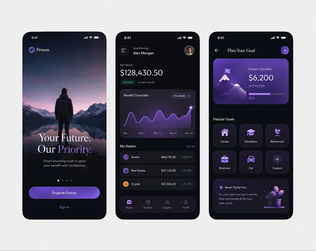
In the fintech space, users don’t just interact with an interface they interact with their own security and aspirations. When I designed Finova, my goal was to engineer a digital environment that mitigates the inherent anxiety of wealth management by fostering immediate, subconscious trust.
Good design reduces the psychological friction between a user and their goals. I build interfaces that transform complex financial data into a feeling of absolute control, turning simple app engagement into deep, lasting user trust.
0
29