The network for creativity
Join 1.25M professional creatives like you
Connect with clients, get discovered, and run your business 100% commission-free
Creatives on Contra have earned over $150M and we are just getting started
Back to feedPost

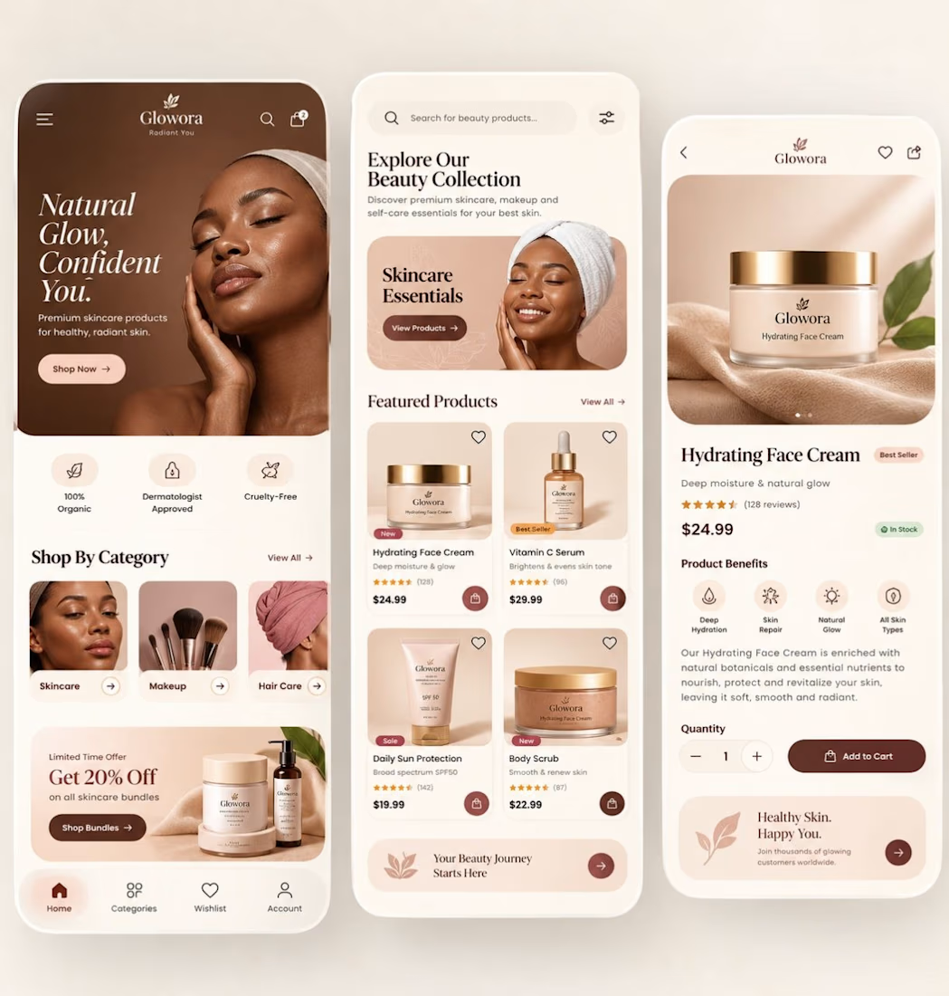
✨ Designed a premium skincare e-commerce mobile experience that blends luxury aesthetics + conversion-focused UX.
This concept was built to answer one question:
How do you make a beauty app feel as premium as the product itself?
What I focused on
• Warm nude/coffee colour palette for a luxury brand perception
• Editorial typography to create a high-end beauty feel
• Large product imagery that builds trust instantly
• Clean card hierarchy for faster product discovery
• One-tap purchase flow to reduce friction
• Benefit-driven product detail screen with strong visual cues
Screens included
• Home / Discovery
• Product listing
• Product detail / Add-to-cart
UX decisions that matter
✅ Strong above-the-fold value proposition
✅ Category shortcuts for faster navigation
✅ Social proof (ratings & reviews)
✅ Inventory status visibility
✅ Accessible spacing and touch targets
✅ Consistent visual system across all screens
In beauty commerce, users don’t just buy skincare.
They buy confidence, glow, and a feeling.
That’s why visual storytelling is just as important as usability.
Would love your feedback:
Which screen converts best — Home, Product Listing, or Product Detail?

The network for creativity
Join 1.25M professional creatives like you
Connect with clients, get discovered, and run your business 100% commission-free
Creatives on Contra have earned over $150M and we are just getting started
Trending

Claude
Claude has entered the design space. How are you using Claude Design?

Contra University
Learn from expert creatives how to earn more using next-gen AI tools.
creativeaiflow
Creative AI workflows are evolving. What tools do you use, and what are their strengths and weaknesses?
freelancerlife
Freelancer life is wins, pivots, and everything in between. What’s yours right now?












Related posts

Where moments become visual stories and the website should too.
Omnix.Studio's full web design, crafted by Orbix Studio. Four services, 120+ projects, 8+ years behind the lens, and clients like Deloitte, Fujifilm, Heineken, and Michelin all presented on a soft mint canvas that steps back so the photography can lead.
Clean. Considered. Confident.
Does this feel like a studio website worth booking a shoot from? 👇
Tools: Figma, Jitter
#WebDesign #PhotographyStudio #UIDesign #ContraFreelance #LandingPage #BrandDesign #OrbixStudio


Amazing work


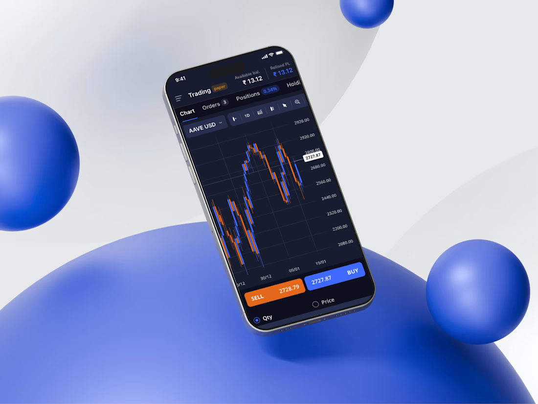
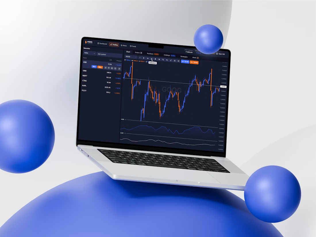
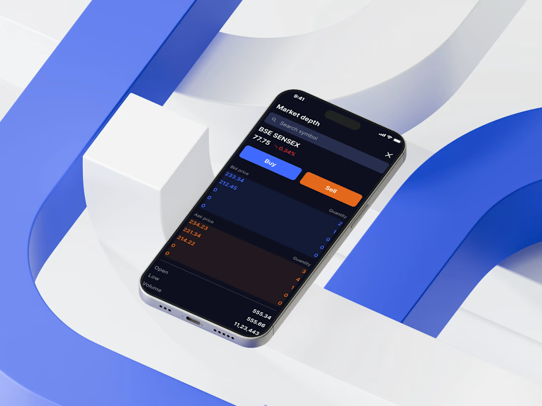
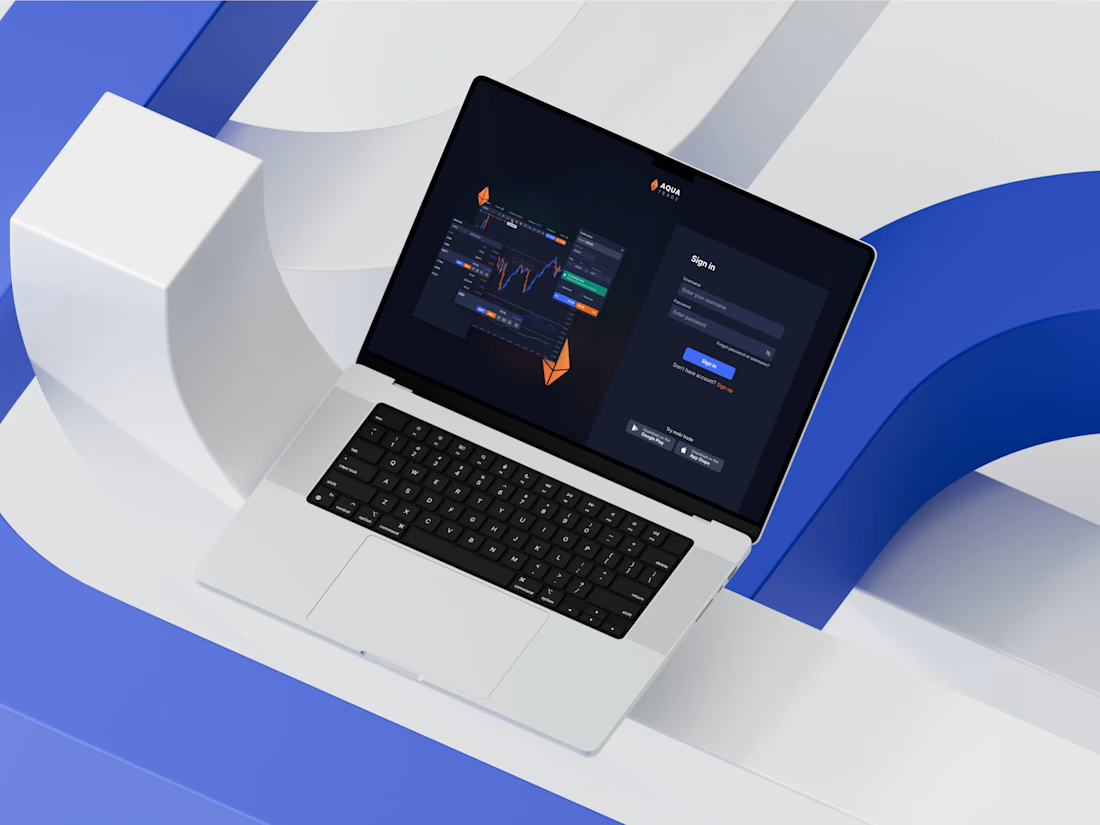
In our portfolio, we’ve got AquaTrade — a cross-platform trading terminal designed to simplify crypto and assets trading across mobile and web interfaces.
Building a fintech or complex digital product? Drop us a message, and let’s discuss how we can help bring your idea to life!



Amazing 🤩

Just wrapped Risen Strategic.
The site had to match that energy. Dark, cinematic, premium. A brand that feels like it belongs next to the big players even at launch stage.
Live site: https://www.risenstrategic.ai/



Upgoating this..... nice work man