The network for creativity
Join 1.25M professional creatives like you
Connect with clients, get discovered, and run your business 100% commission-free
Creatives on Contra have earned over $150M and we are just getting started
Back to feedPost

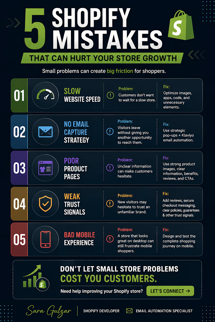
5 Shopify Mistakes I Look For When Reviewing an eCommerce Store
A Shopify store can look beautiful and still lose potential customers.
When reviewing a store, I look beyond the visuals and focus on the complete shopping experience.
Here are 5 common issues:
01 — Slow Website Speed
Performance affects the overall shopping experience.
02 — No Email Capture Strategy
Without a way to capture visitors, many opportunities disappear when they leave.
03 — Poor Product Pages
Customers need clear information, compelling presentation, and strong calls to action.
04 — Weak Trust Signals
Reviews, policies, secure checkout messaging, and other reassurance elements help build confidence.
05 — Poor Mobile Experience
A responsive store should feel effortless across different screen sizes.
My goal isn't simply to make a Shopify store look better.
It's to identify friction and create a smoother path from visitor → customer → returning customer.
I help eCommerce brands with Shopify development, theme customization, responsive design, performance optimization, conversion-focused experiences, and Klaviyo email automation.
Need help identifying what's holding your Shopify store back? Let's connect.

The network for creativity
Join 1.25M professional creatives like you
Connect with clients, get discovered, and run your business 100% commission-free
Creatives on Contra have earned over $150M and we are just getting started
Challenges
View all


Related posts


HAKD Health partnered with GreenBerry to migrate their existing WordPress website to Shopify, with subscriptions forming the central focus of the new ecommerce experience.
The project included the migration and restructuring of products, content and key pages, alongside the development of a responsive Shopify storefront designed to make discovering, purchasing and subscribing to HAKD Health products simple across mobile and desktop.
The new website provides a streamlined subscription journey while giving the HAKD Health team an easier way to manage products, recurring orders and website content. It also establishes a scalable foundation to support the brand’s continued growth.
https://hakdhealth.com/
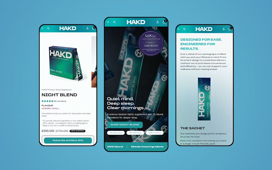

The subscription-first framing makes the migration feel grounded in the business model, not just the platform switch. The mobile product views also make the new shopping flow easy to understand at a glance.


@Figma to @Shopify with @Instant, feels like designing at light speed if you are fast enough, you can design each section while the next one gets built with
@Instant AI is the part I love the best while using AI, adding my human touch and personal taste
say NO to e-comm generic design flop
turn on sound 🔈


the faq block makes the page easy to use

E-commerce Website Redesign
A modern e-commerce website redesign focused on creating a cleaner, more engaging shopping experience while improving the overall visual structure and user journey.
The redesign combines strong product presentation, clear navigation, refined typography, and strategically placed calls-to-action to make it easier for visitors to discover products and move through the purchasing journey.
The interface was designed with responsiveness, usability, and conversion-focused layout in mind, creating a polished experience across desktop and mobile.
Focus: UI/UX Design • E-commerce Design • Website Redesign • Responsive Design • Conversion-Focused Design
Style: Modern • Clean • Minimal • User-Focused
Tools: Figma • Adobe Photoshop
#WebDesign #EcommerceDesign #UIDesign #UXDesign #WebsiteRedesign #ResponsiveDesign #Figma #ContraPortfolio