The network for creativity
Join 1.25M professional creatives like you
Connect with clients, get discovered, and run your business 100% commission-free
Creatives on Contra have earned over $150M and we are just getting started
Back to feedPost

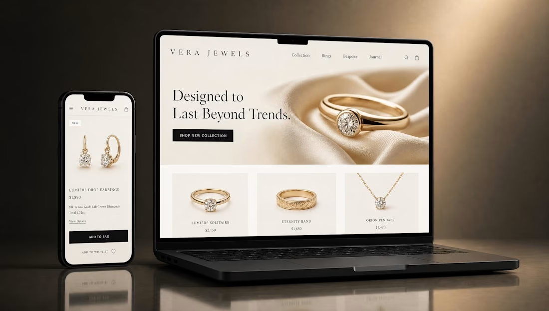
E-commerce Website Redesign
A modern e-commerce website redesign focused on creating a cleaner, more engaging shopping experience while improving the overall visual structure and user journey.
The redesign combines strong product presentation, clear navigation, refined typography, and strategically placed calls-to-action to make it easier for visitors to discover products and move through the purchasing journey.
The interface was designed with responsiveness, usability, and conversion-focused layout in mind, creating a polished experience across desktop and mobile.
Focus: UI/UX Design • E-commerce Design • Website Redesign • Responsive Design • Conversion-Focused Design
Style: Modern • Clean • Minimal • User-Focused
Tools: Figma • Adobe Photoshop
#WebDesign #EcommerceDesign #UIDesign #UXDesign #WebsiteRedesign #ResponsiveDesign #Figma #ContraPortfolio


The network for creativity
Join 1.25M professional creatives like you
Connect with clients, get discovered, and run your business 100% commission-free
Creatives on Contra have earned over $150M and we are just getting started





Related posts

I just released FAR ENOUGH, a free Framer template for luxury travel. 🌴
Minimal on the surface, a lot of motion underneath:
→ an endless drag-to-explore masonry grid
→ a 3D Instagram carousel
→ a scroll-driven curtain gallery
→ an image trail that follows your cursor
→ light and dark mode with one click
10 pages, 4 CMS collections, fully responsive, with a reduced-motion fallback. Every animation is editable in the properties panel, no code needed.
Made for travel studios, villas, retreats and anyone who wants a site that feels far away in the best way.
Free on the Framer Marketplace: https://www.framer.com/marketplace/templates/far-enough/
Live preview: https://farenough.framer.website
#Framer #FramerTemplate #WebDesign #FreeTemplate


Nice website bro

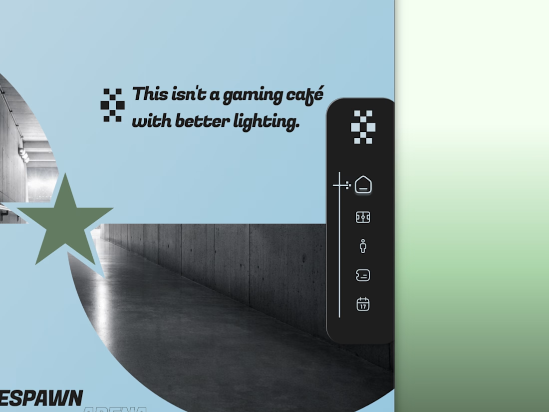
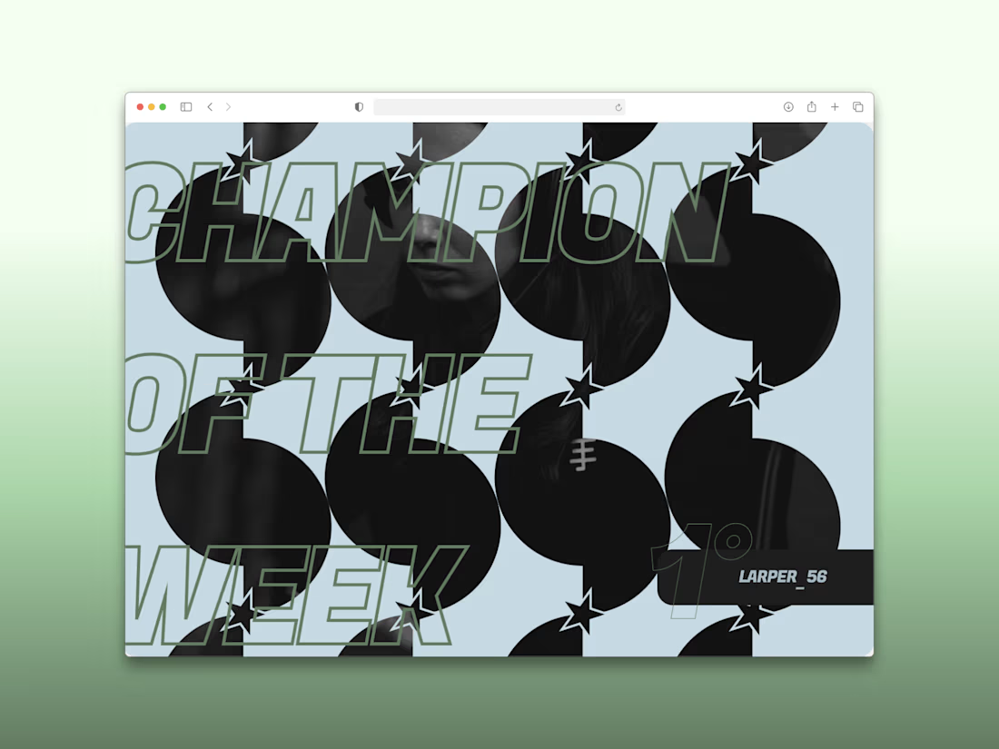
Every esports brand reaches for neon and a mascot.
RESPAWN ARENA reaches for a scoreboard.
Case study on the stadium-grade identity — typography, system, the whole build — dropping soon.



Congrats on the Awwwards nomination. Which part of the build was the toughest to get right?