The network for creativity
Join 1.25M professional creatives like you
Connect with clients, get discovered, and run your business 100% commission-free
Creatives on Contra have earned over $150M and we are just getting started
Back to feedPost
Taste Test
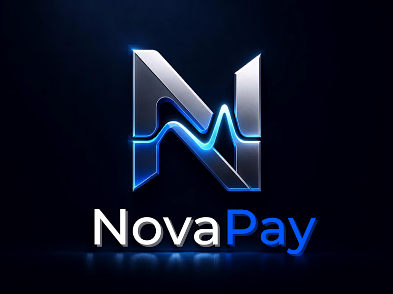
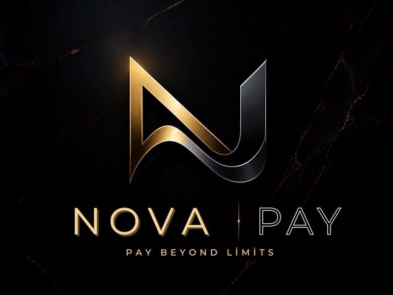
Which NovaPay identity fits a modern fintech brand better?


8 voted
44%
10 voted
56%
18 votes
Closed

Guys, drop your vote below!

Futuristic for me, the gold version reads more like a private bank or a jeweler than a payments app. Blue and silver still says money without borrowing luxury signals a fintech probably shouldn't lean on.
Thanks for the thoughtful feedback, MD Rafee! Absolutely — this version is built specifically for a crypto-native platform, where that neon blue/metallic contrast signals speed, security, and next-gen tech.
How do you usually approach branding for fintechs that bridge both...
I usually look for the space between trust and differentiation. For fintechs that bridge traditional finance and crypto, I’d keep the core visual language trustworthy, but introduce a sharper accent color or distinctive graphic system to make the brand feel more forward-looking.
...


Futuristic feels like the stronger fit for a modern fintech brand.
Thanks, Kabir! Completely agree — that futuristic style creates a strong connection with next-gen financial tech. Appreciate the feedback

Hmm… Futuristic blue mood , timeless logo , futuristic headline font , timeless caption font. Might be the best direction to give it a try tho 📥
Love this perspective! Balancing futuristic blue tones with classic typography really brings out the best in the design. Appreciate the insight!

Futuristic 🙌 Gold looks more like a Jewellery Store logo.
Appreciate your input! That's an interesting perspective on the gold finish. Glad you voted for Futuristic—what specific element in that version stood out to you most?
Can I be honest with you? I picked that one mostly because of the colors. If I were choosing the actual logo direction, I’d go with Option A and apply those colors to it. The structure of A feels stronger to me
The network for creativity
Join 1.25M professional creatives like you
Connect with clients, get discovered, and run your business 100% commission-free
Creatives on Contra have earned over $150M and we are just getting started

Challenges
View all


Related posts


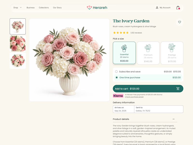
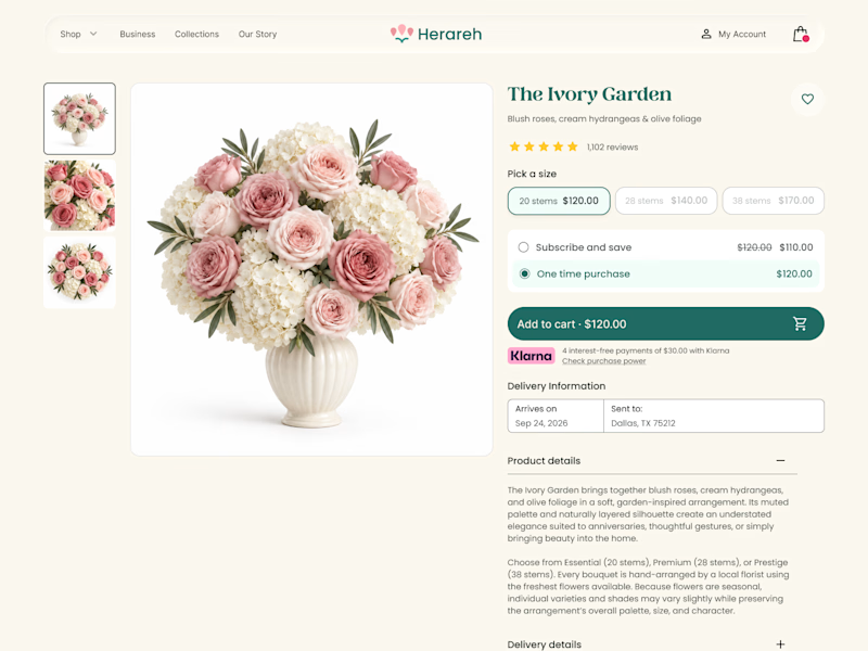

Icon cards for me, bouquets are such a visual purchase that a scannable icon beats reading "small/medium/large" every time. Did the compact chips version convert worse in testing, or are you still gathering data on that?

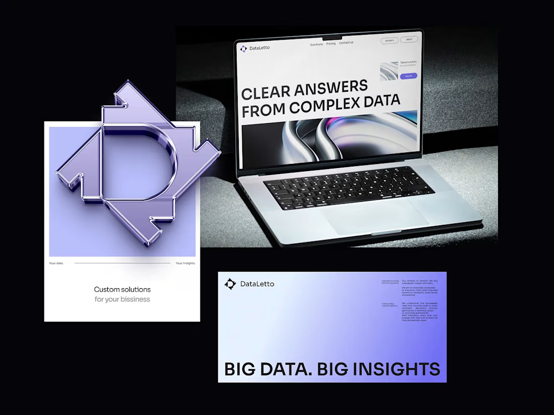

Outstanding 😊

What if a space brand didn’t just look futuristic — but felt like it was already living in the future?
For XPACE, the goal was to build a visual identity that could turn the idea of space exploration into a complete and immersive brand experience.
The identity combines a bold typographic system, a high-contrast visual language, and electric blue accents against deep black to create a futuristic presence that feels precise, technological, and unmistakably XPACE.
But the identity didn’t stop at the logo.
The system was extended across digital interfaces, web design, favicon and UI icons, access cards, board passes, and branded applications — creating a consistent experience across every touchpoint.
Every detail was designed to make XPACE feel less like a brand inspired by the future, and more like a brand built for it.
XPACE — Visual Identity System.
Looking to build a visual identity that goes beyond a logo?
Let’s create something with a world of its own.


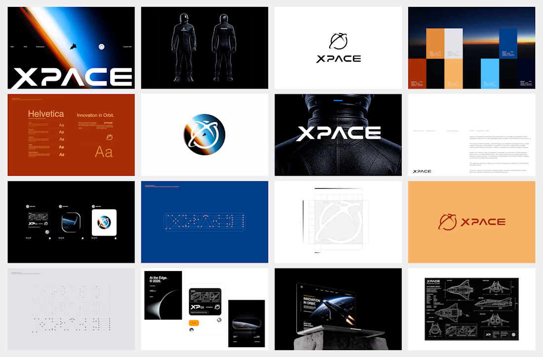

The identity system feels cohesive because the typography, electric blue accents, and image language all push in the same direction. Extending that logic into interfaces and packaging is what makes XPACE feel like a real world, not just a futuristic logo.