The network for creativity
Join 1.25M professional creatives like you
Connect with clients, get discovered, and run your business 100% commission-free
Creatives on Contra have earned over $150M and we are just getting started
Back to feedPost
Taste Test

Two mansions. One vote. Which luxury speaks to you?
I did the Art Direction for one. AI did the other.
AI wanted to give "Bold" a symbol.
I wanted to give it a meaning.
Only one survives — and your vote pulls the string. 🏰✨
Drop a comment: Golden Mansion or Golden Palace?
🔑 Instant digital download | High-resolution PNG | Transparent background | Commercial use license
🎨 Perfect for luxury branding, wedding invitations, premium wall art, Canva templates & printables
#LuxuryArtPrint #GoldenMansion #DigitalDownload #VictorianArt #InstantDownload #PremiumClipart #HomeDecorArt #LuxuryDesign #ArtDirection #AIvsHuman #DigitalArtist #WeddingInvitationDesign #PrintableWallArt #GoldClipart #ContraCreative
2 voted
100%
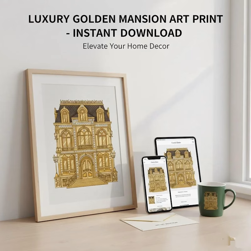
0 voted
0%
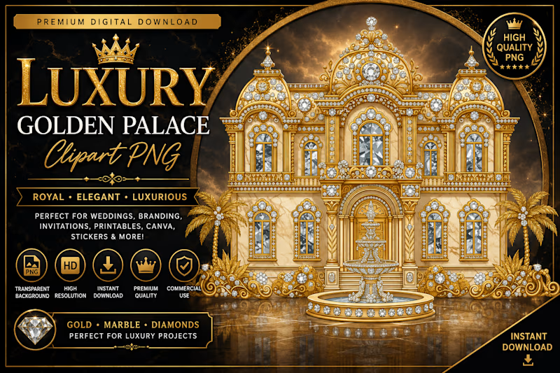
2 votes
Closed

Golden mansion all the way!
And this wasn't a tough decision either 😄
The network for creativity
Join 1.25M professional creatives like you
Connect with clients, get discovered, and run your business 100% commission-free
Creatives on Contra have earned over $150M and we are just getting started











Related posts

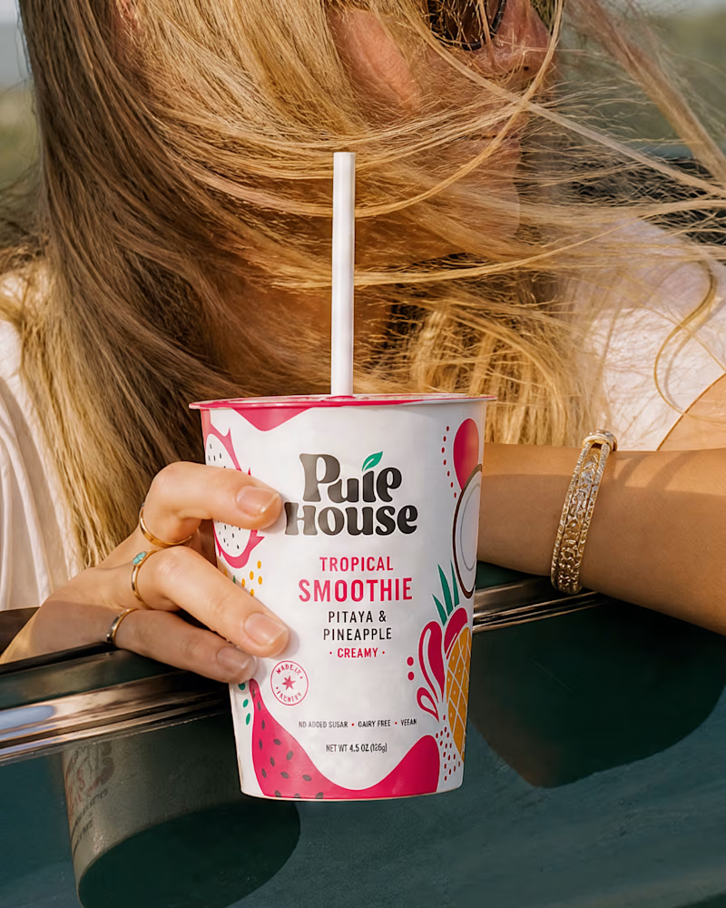
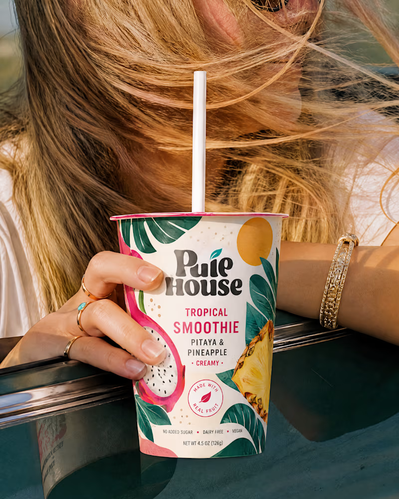
Exploring Two Branding Concepts
I explored two distinct visual directions for Pulp House, focusing on how color, composition, and design elements can shape a brand's identity.
This comparison reflects my approach to creating thoughtful, cohesive visuals that help businesses present their brands with confidence.
1 voted
5%
20 voted
95%
21 votes
Closed

Fun concepts, Mati!

Brand identity exploration
Which one do you think it fits better?
36 voted
77%

11 voted
23%

47 votes
Closed

Cobalt is great Gold is unique 🎉🎉🔥🔥


Same brand. Same palette. Two completely different proposals for a real estate developer.
A: An isotype built from blocks. Geometric, precise, the language of construction. It says we build.
B: Custom lettering with movement. Warmer, more editorial. It says we build places you’d want to live in.
36 voted
51%

35 voted
49%

71 votes
Closed

My vote is B, Milagros. Custom lettering with movement has real editorial warmth, which suits a developer selling places people actually want to live in.