The network for creativity
Join 1.25M professional creatives like you
Connect with clients, get discovered, and run your business 100% commission-free
Creatives on Contra have earned over $150M and we are just getting started
Back to feedPost

Logo Design Exploration: EVARA
I wanted to create a logo that feels luxurious, spiritual, and timeless while maintaining a strong premium brand identity.
The concept combines:
🔸 A radiant light representing transformation and guidance
🔸 Open hands symbolizing care, healing, and connection
🔸 Elegant gold typography to communicate trust and exclusivity
I explored multiple variations across light and dark backgrounds to test versatility and brand presence.
💭 I'd love your feedback:
Which version do you prefer — Light Background or Dark Background?
Does the logo communicate luxury, spirituality, or both?
If EVARA were a real brand, what service would you expect it to offer based on this logo alone?
Your feedback helps me improve as a designer and refine my branding approach.


The network for creativity
Join 1.25M professional creatives like you
Connect with clients, get discovered, and run your business 100% commission-free
Creatives on Contra have earned over $150M and we are just getting started



Related posts


Which homepage would make you more likely to explore the platform?
HackStack features bold typography, teal gradients, and a centered layout focused on AI tools and automation. DataVistaHQ uses purple accents, a split layout, and a prominent dashboard preview to introduce its business intelligence platform.
I would like your perspective on the visual design, clarity, and first impression. Which approach communicates its value more effectively and makes you want to take the next step?
Vote for your preferred design and share what influenced your choice: the colors, headline, layout, dashboard preview, or overall presentation.
#WebDesign #AIWebsites #UIUXDesign #SaaSDesign #TransformedDesign


2 voted
17%

10 voted
83%

12 votes
Closed

Visually, I lean toward DataVistaHQ, but the cognitive load is really high. The value proposition and the stats feel like they're competing for attention.
On the other hand, HackStack has a much better visual hierarchy. The value proposition and CTA group immediately give me a...

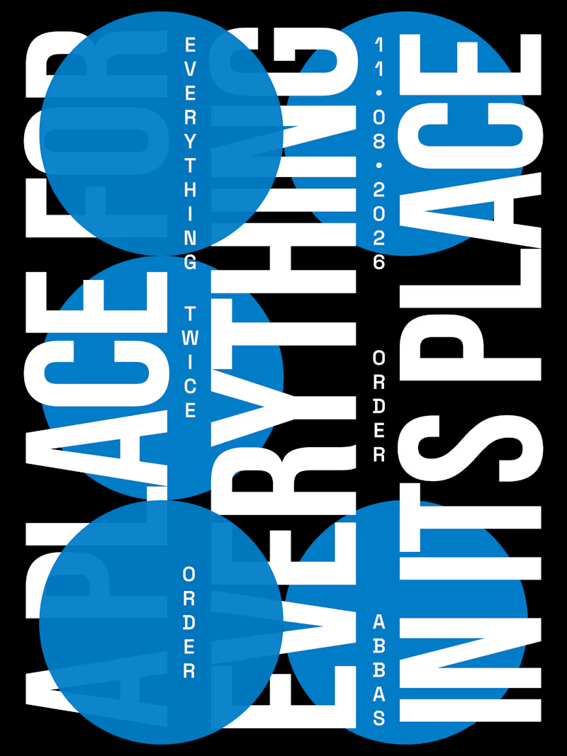
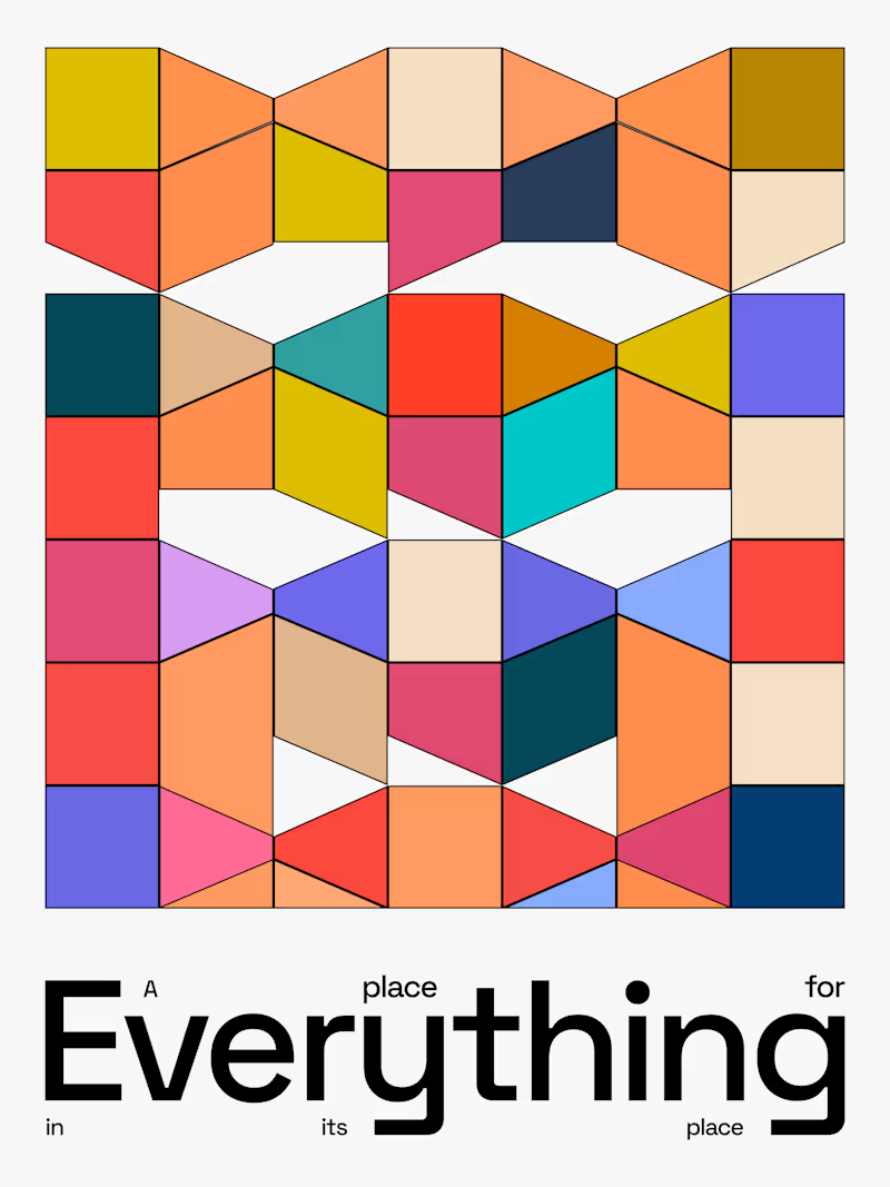
Day-02 of Poster Design
Style: Swiss International | Word: Order
The Quote i used i from benjamin franklin.
"A place for everything, everything in its place."
If someone ask you a question that 'define design in a single quote'
This is the perfect one to say.
Which design do you like?


3 voted
38%
5 voted
62%
8 votes
Closed


A beautiful website isn't necessarily a website that converts.
I've seen websites that look visually impressive but make it difficult for visitors to understand what the business offers, find important information, or take the next step.
Good website design should do more than look good.
It should:
- Communicate your business clearly.
- Build trust within seconds.
- Make navigation effortless.
- Work smoothly on mobile devices.
- Guide visitors towards taking action.
Whether it's a new website or a redesign, every design decision should have a purpose.
Your website is often your first impression. Make it count.
What is the first thing you look for when visiting a business website ?


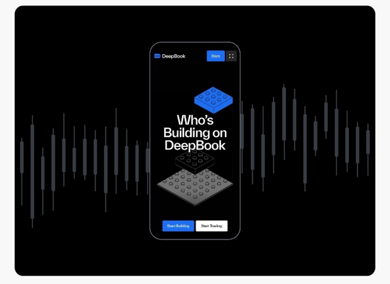

honestly the phone number. if i cant tap to call on the first screen im gone. who are you building for mostly, local businesses?