The network for creativity
Join 1.25M professional creatives like you
Connect with clients, get discovered, and run your business 100% commission-free
Creatives on Contra have earned over $150M and we are just getting started
Back to feedPost
A beautiful website isn't necessarily a website that converts.
I've seen websites that look visually impressive but make it difficult for visitors to understand what the business offers, find important information, or take the next step.
Good website design should do more than look good.
It should:
- Communicate your business clearly.
- Build trust within seconds.
- Make navigation effortless.
- Work smoothly on mobile devices.
- Guide visitors towards taking action.
Whether it's a new website or a redesign, every design decision should have a purpose.
Your website is often your first impression. Make it count.
What is the first thing you look for when visiting a business website ?


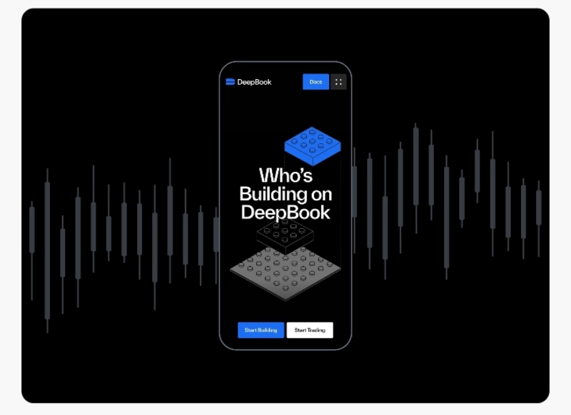

Design is so unique

honestly the phone number. if i cant tap to call on the first screen im gone. who are you building for mostly, local businesses?

Exactly! Making the phone number easy to find and tap is such a simple detail, but it can make a big difference.
I'm mainly focused on building websites for small businesses and service-based businesses, helping them establish a stronger online presence and turn visitors into customers.
The network for creativity
Join 1.25M professional creatives like you
Connect with clients, get discovered, and run your business 100% commission-free
Creatives on Contra have earned over $150M and we are just getting started



Related posts

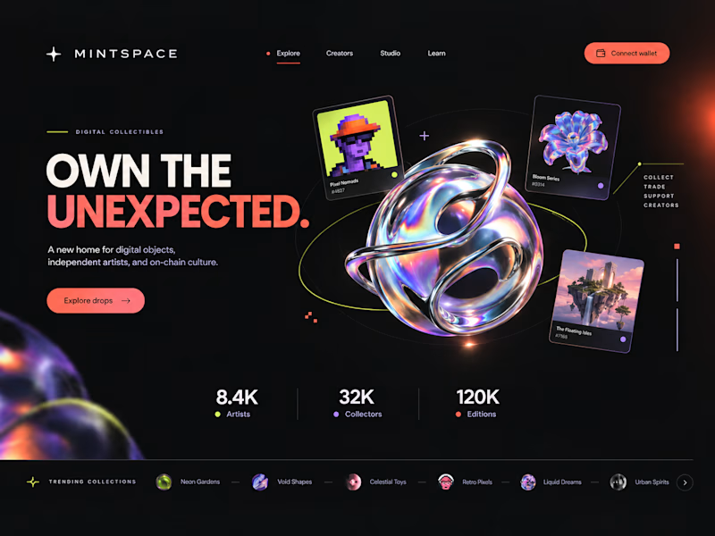
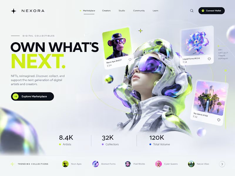
Two directions. One NFT marketplace.
Which visual direction would you choose?
🖤 A — Dark & Futuristic
🤍 B — Bright & Minimal
Both explore the future of Web3, but with completely different visual identities.
Drop your vote in the comments: A or B?
#UIUXDesign #WebDesign #NFT #Web3 #ProductDesign
10 voted
29%
25 voted
71%
35 votes
Closed

Strong design, well done

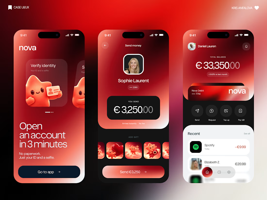
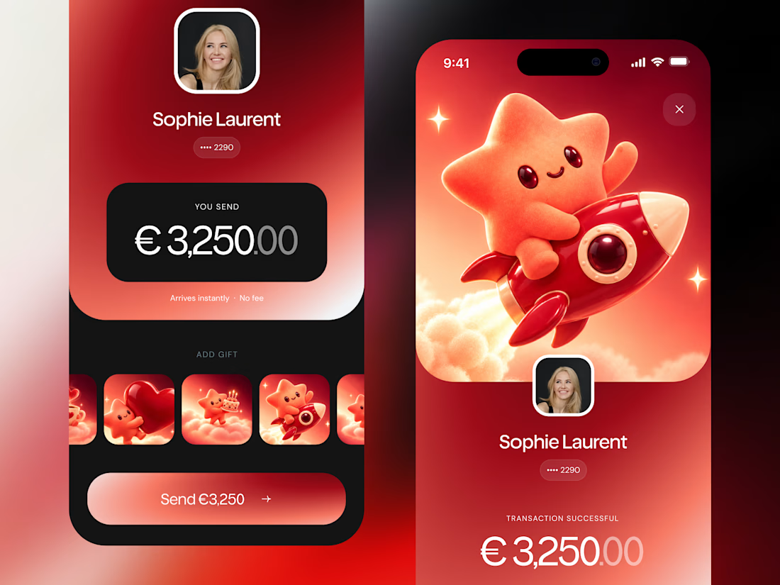
What if sending money felt a little more like giving a gift?
For Nova, I explored a banking app that brings payments, cards, and a bit of personality together. You can check your balance, browse recent transactions, send or request money, top up, and pay bills.
My favorite part is the digital postcard feature. Before sending a transfer, you can add a little illustrated card—a heart, a birthday greeting, or a playful character. A simple way to make birthday money or a thank-you feel more personal.
I carried that same 3D character into onboarding, pairing it with bold red gradients and large, clear payment details. There’s room for play, while the recipient and amount stay easy to check.
Would you add a postcard to a transfer? I’d love to know what occasion you’d use it for.




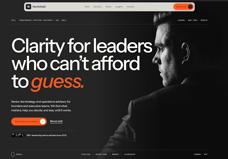
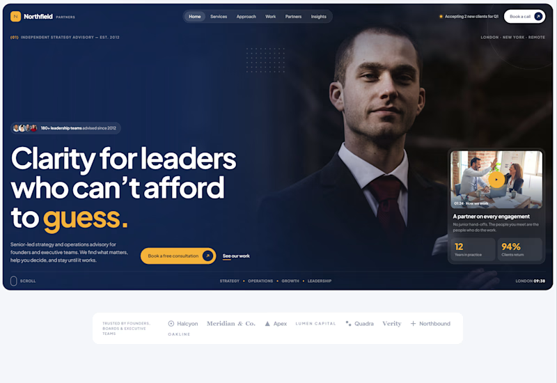
Exploring two different hero directions for a new project.
Same message, two completely different visual approaches.
Which one makes a stronger first impression?
A or B? Curious to hear your thoughts!

36 voted
90%
4 voted
10%
40 votes
Closed

Both are strong. I lean towards the dark version, because the orange accent on the italic "guess." pops and the profile portrait gives it a more editorial, confident feel. The navy one reads a bit more corporate, which could suit a more conservative audience. Nice exploration!