The network for creativity
Join 1.25M professional creatives like you
Connect with clients, get discovered, and run your business 100% commission-free
Creatives on Contra have earned over $150M and we are just getting started
Back to feedPost

I've been looking at a lot of architecture websites lately, especially how studios present their work online.
One thing I kept noticing is how much the experience depends on pacing.
Large photography, restrained typography, generous space, and very little getting between you and the project.
I kept those things in mind while designing SELA Studio.
I wanted the website to feel calm and architectural, with the work carrying most of the visual weight.
Photography is given room to breathe, typography stays deliberately restrained, and the layouts change depending on the kind of content being presented rather than forcing every project into the same structure.
I approached motion in a similar way.
Instead of adding animation everywhere, I used GSAP to control pacing, guide attention and make transitions between sections feel more considered.
The idea was to create something that feels closer to moving through an architectural publication than browsing a traditional portfolio grid.
Project imagery stays at the center of the experience, while the interface steps back and supports it.
SELA is a fictional private architecture studio, but a lot of the decisions behind the website came from studying how architecture practices present projects, photography and their overall point of view online.
I designed and developed the full experience with Next.js, Tailwind CSS and GSAP, from the visual direction and responsive layouts to the interactions and project presentation.
I'm really happy with how this one came together.
🔗 Live site:
https://selastudio.vercel.app/
For architects and studio teams, what makes you want to keep exploring a project when you visit an architecture website?


The network for creativity
Join 1.25M professional creatives like you
Connect with clients, get discovered, and run your business 100% commission-free
Creatives on Contra have earned over $150M and we are just getting started
Related posts


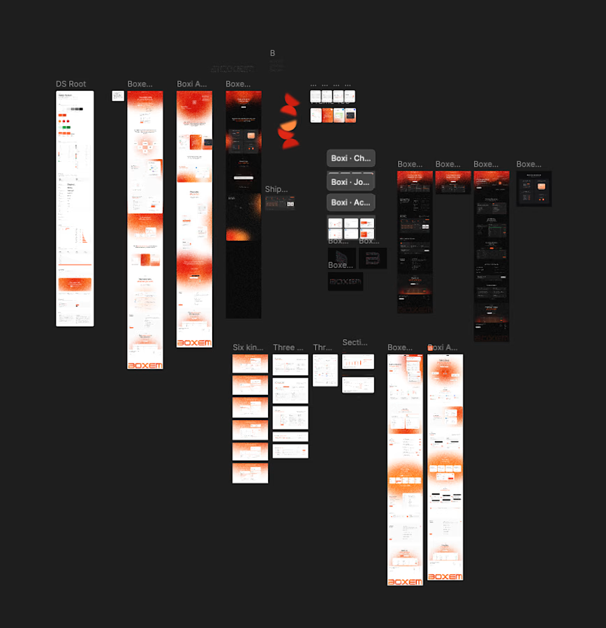
3 Page landing btw. Somehow ended up with dark versions, light versions, a whole DS and like 6 card explorations.
Is this overexploring or is this just the job? Genuinely asking. 🧠


Stunning


