The network for creativity
Join 1.25M professional creatives like you
Connect with clients, get discovered, and run your business 100% commission-free
Creatives on Contra have earned over $150M and we are just getting started
Back to feedPost
Taste Test
Working on a new post.
Which background do you prefer?
Dark or white?
15 voted
47%

17 voted
53%

32 votes
Closed


I forgot to illustrate the eyebrows. 🤔
eyebrows or no eyebrows?

Great one
Thank you 🙏🏽

Stunning visuals
Glad you like it 🔥

Great Work.
Thank you. 👊🏽

Glad you like it. 👍🏽

Amazing work, I prefer the White Background because it marks look Magnificent
Appreciate the feedback, Sunday! Glad you like it. 🔥

the black background make it more sharp and visible
Thank you for voting, Adegbite! 💪🏽

Epictetus v2

the black background makes it more sharp i prefer the black
Appreciate the feedback, Ajiboye. Thank you!
The network for creativity
Join 1.25M professional creatives like you
Connect with clients, get discovered, and run your business 100% commission-free
Creatives on Contra have earned over $150M and we are just getting started


Related posts

A white-label client needed one page that gives students all three
products at once, with the value clear at a glance. I put that job
on the hero: the headline sets the direction, and three numbered
links lead straight into each product.
Which background would you pick, the copper dark or the gold and olive blend?


5 votes
Ends in 1h

Copper dark — its richer depth suits the offer.

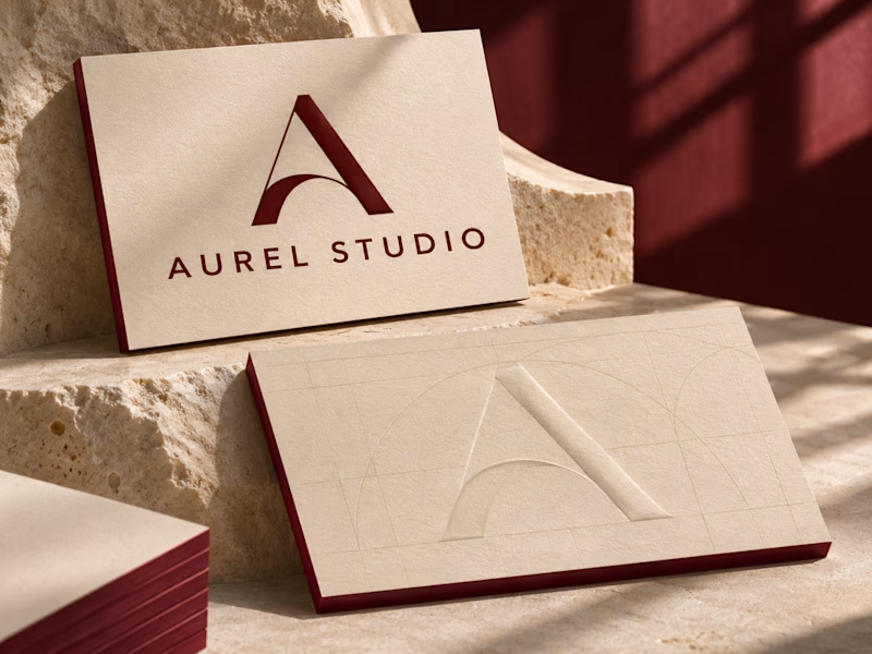
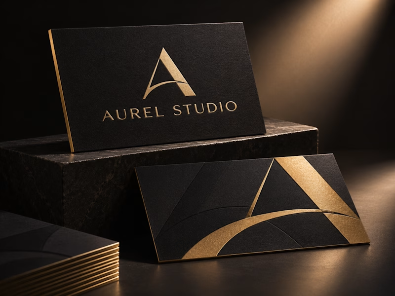
Aurel Studio · Luxury Business Card Concept
I have explored two print finishes for the same monogram. Black & Gold pairs champagne foil with gilded edges, while Ivory & Oxblood uses a raised monogram and deep red edges to highlight the paper’s texture.
Which finish would you choose for your brand?
0 votes
Ends in 1d

I'd go Ivory & Oxblood. Black & Gold reads as luxury at first glance, but it's the category default, while the raised monogram with those red edges feels more ownable and rewards being held in the hand.

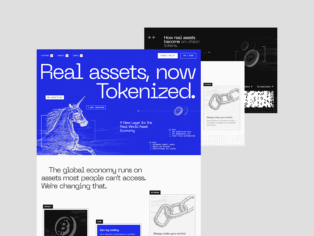
NOISED combines a dark editorial look with a data-driven marketplace experience.
Want to create something like this?
Let's Talk!