The network for creativity
Join 1.25M professional creatives like you
Connect with clients, get discovered, and run your business 100% commission-free
Creatives on Contra have earned over $150M and we are just getting started
Back to feedPost

Project Overview:
Complete design of the identity, packaging, and promotional materials for KELPA (Ocean-infused skincare). The design uses beach and marine themes with a color palette of sand, lime green, and deep ocean blue.
Note: AI tools were used to generate the backgrounds for the car livery and the sand display island mockups.
Scope of Work:
Logo & Typography: Crafted the main logo featuring an integrated seaweed leaf icon and tagline.
Packaging Design: Graphics for the full product line – cosmetic jars, pump bottles, tubes, and cardboard boxes with abstract marine patterns.
Print & Editorial: Layout design for a product catalog / magazine double-page spread.
Merchandise: Design of woven fabric keychains with carabiners and a custom cosmetic pouch.
Promo & Advertising: Concept for a full vehicle wrap, a custom sand-embedded display stand, and macro logo close-ups for online marketing.


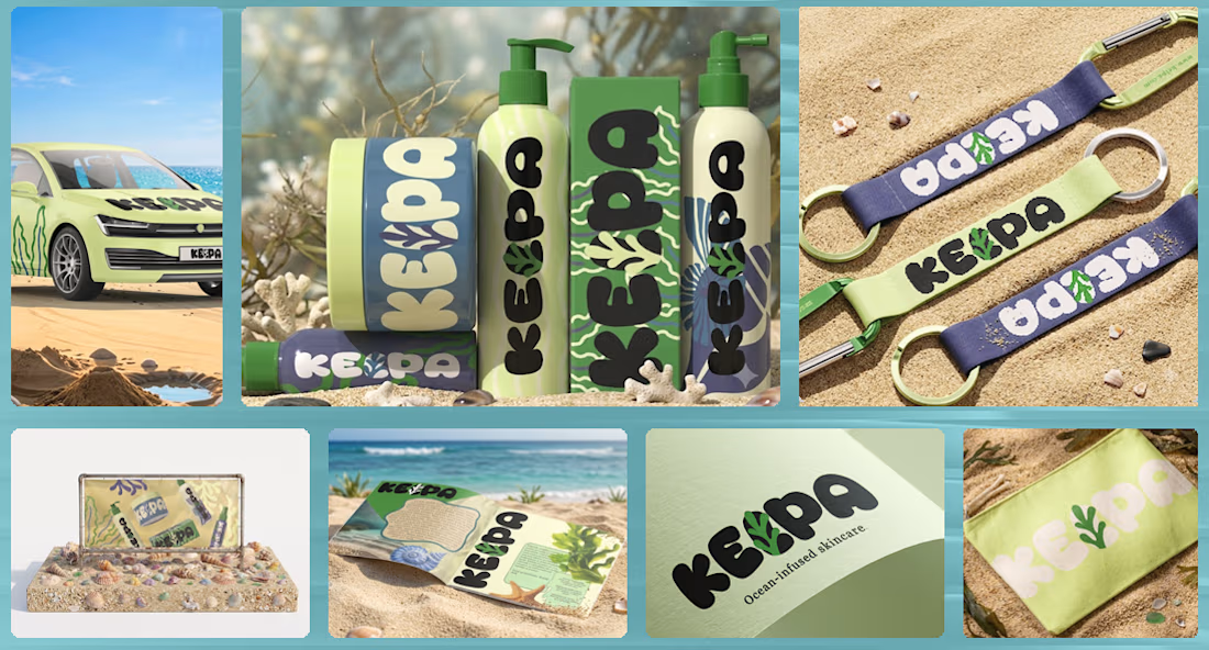

Loved the branding. Especially the products look so adorable and very summer vibe!
The network for creativity
Join 1.25M professional creatives like you
Connect with clients, get discovered, and run your business 100% commission-free
Creatives on Contra have earned over $150M and we are just getting started











Related posts




Clean and confident work! The green gradient with the mark feels very modern for fintech - trustworthy but not boring. The app screens look really polished. Curious how you landed on this mark, does it represent growth / movement?

A natural and premium packaging concept inspired by the purity of wildflower honey and the beauty of nature. The design combines warm honey tones, textured paper, bold typography, and a clean label layout to create an authentic, handcrafted feel.

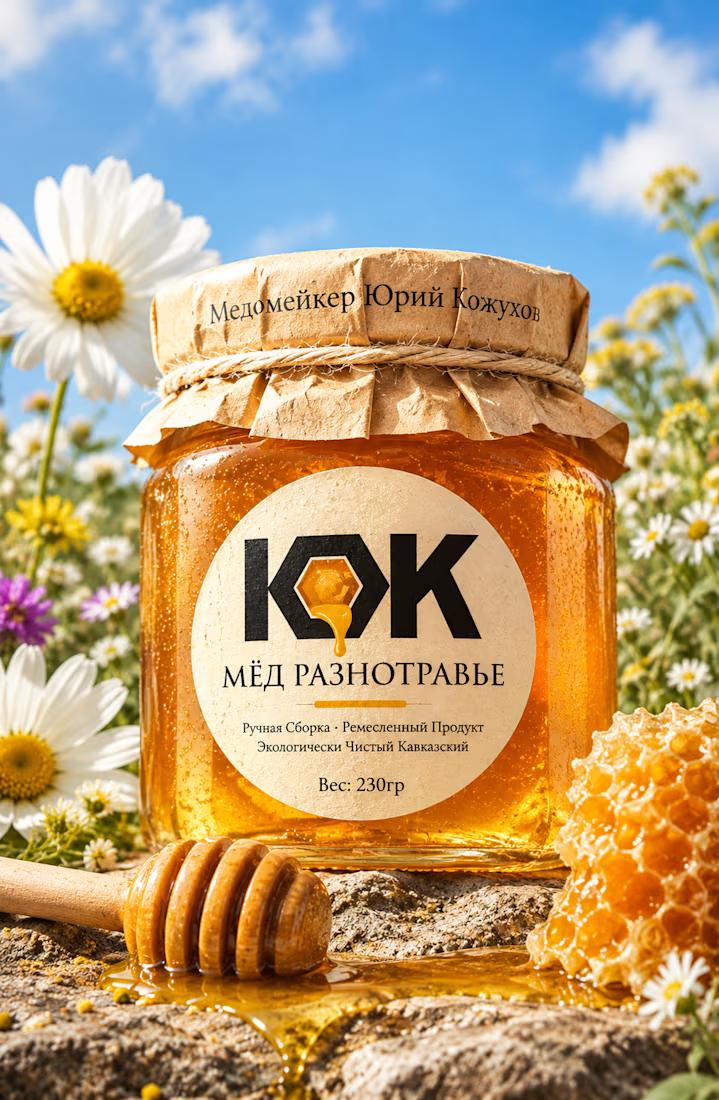

The honey drop sitting inside the O of the wordmark is a delightful detail, Umar. Textured paper plus that bold type really sells the handcrafted feel. This would stand out beautifully on a shelf.

Same design. Which palette? 👀
You picked your favorite preview last time. This time, I’m putting the colors to the vote.
One body-care packaging concept, with the same typography and composition:
A · Rose Cream, Strawberry Sorbet + Plum Jelly
B · Lime Mousse, Coconut Cream + Plum Jelly
Which would you choose and what does it make you feel about the brand?
Both palettes use colors and matching ingredient textures from DCS 654, my library of 654 dessert-inspired colors.
Take a closer look: dcs.mariya.design
7 voted
44%
9 voted
56%
16 votes
Closed

B is absolutely stunning 🎉🎉🎉🎉
Great job Mariya❤️