The network for creativity
Join 1.25M professional creatives like you
Connect with clients, get discovered, and run your business 100% commission-free
Creatives on Contra have earned over $150M and we are just getting started
Back to feedPost
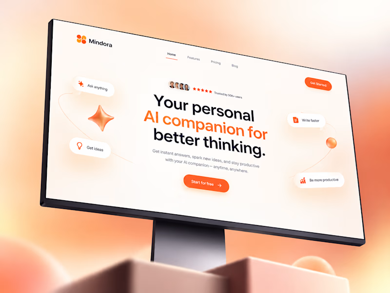
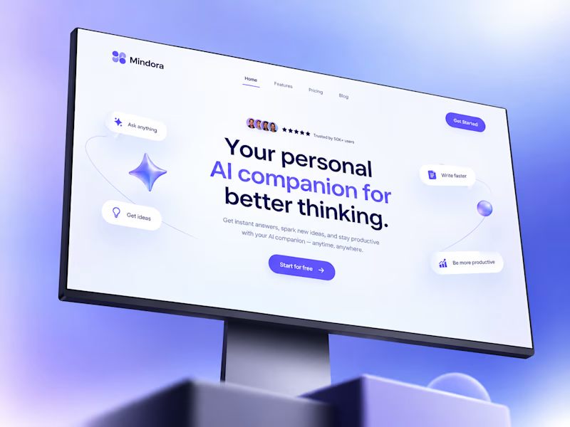
Taste Test
Exploring color variations for the Mindora AI companion landing page.
Layout, typography, and 3D elements stayed identical.
I only changed:
- the gradient background, - accent color, -and button styling to test how color changes brand perception.
Which direction would you choose for an AI product?

5 voted
71%
2 voted
29%
7 votes
Closed

Amazing work

Thank you😍

I’d go with the direction that feels calm, modern, and trustworthy while still giving the CTA a strong visual contrast. For an AI companion, the colors should create an emotional connection without making the interface feel overwhelming. Great experiment—small color changes can really shift brand perception.
Thank you
Finding that balance between personality and usability was the fun part

This is a great study! Love how you kept layout identical and just tested colors.
The orange gradient makes it feel so warm and friendly for an AI companion. Perfect choice for "better thinking". Smart way to A/B test without redesigning everything.
Inspiring work!
Thank you, Sometimes the smallest changes create the biggest impact.
Absolutely! Small details make all the difference - loved your post too!

sunset spark
🙌 😊

this is amazing work
Thank you
Absolutely! Small details make all the difference - loved your post too!
The network for creativity
Join 1.25M professional creatives like you
Connect with clients, get discovered, and run your business 100% commission-free
Creatives on Contra have earned over $150M and we are just getting started



Related posts


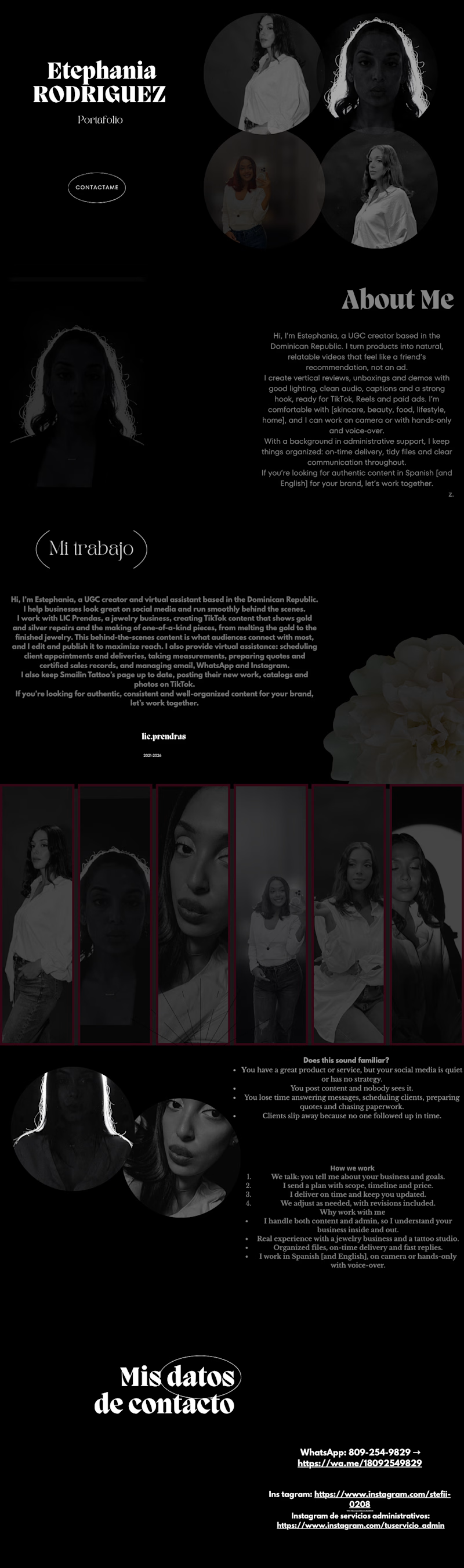
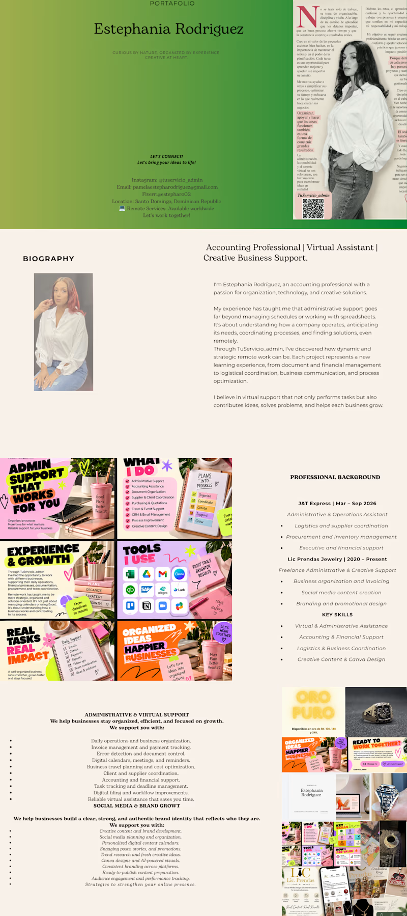
My portfolio has evolved! ✨ Here’s the old version alongside the new one—which is your favorite? 👀 Let me know in the comments and share to help others discover my work! 💚
4 voted
33%
8 voted
67%
12 votes
Closed

The new version looks like a great step forward! Love seeing how your style and creativity evolve over time. 💚✨

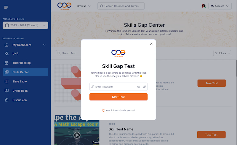
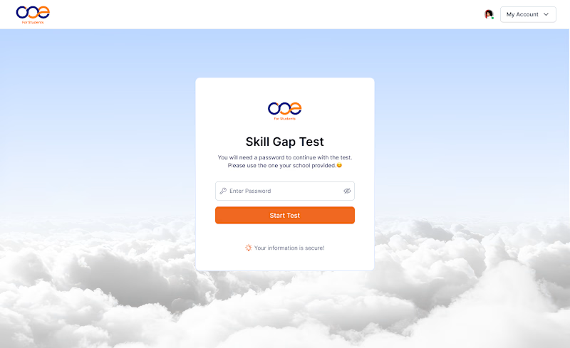
Which Skill Gap Test experience would you choose? 👀
I designed two different experiences for the same Skill Gap Test.
Option A: A modal inside the dashboard — users stay in context.
Option B: A dedicated page — a cleaner, distraction-free experience.
If you were using this platform as a student, which experience would you prefer?
A or B? Why? 👇
#UIDesign #UXDesign #ProductDesign
4 voted
36%
7 voted
64%
11 votes
Closed

Dedecated Page is more professional and minimalistic ❤️

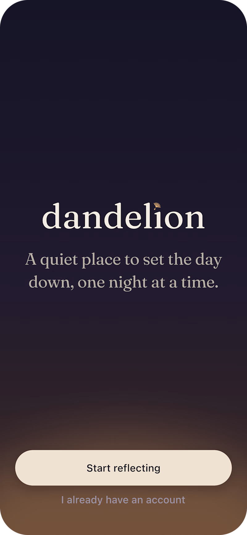
Currently, I'm working on the onboarding screens for Dandelion, a nightly journalling app 🌙
Which one would you tap “Start reflecting” on after a long day?


2 voted
25%
6 voted
75%
8 votes
Closed

This is nothing but impressive. only love this