The network for creativity
Join 1.25M professional creatives like you
Connect with clients, get discovered, and run your business 100% commission-free
Creatives on Contra have earned over $150M and we are just getting started
Back to feedPost

How do you brand a business that doesn’t fit into one box?
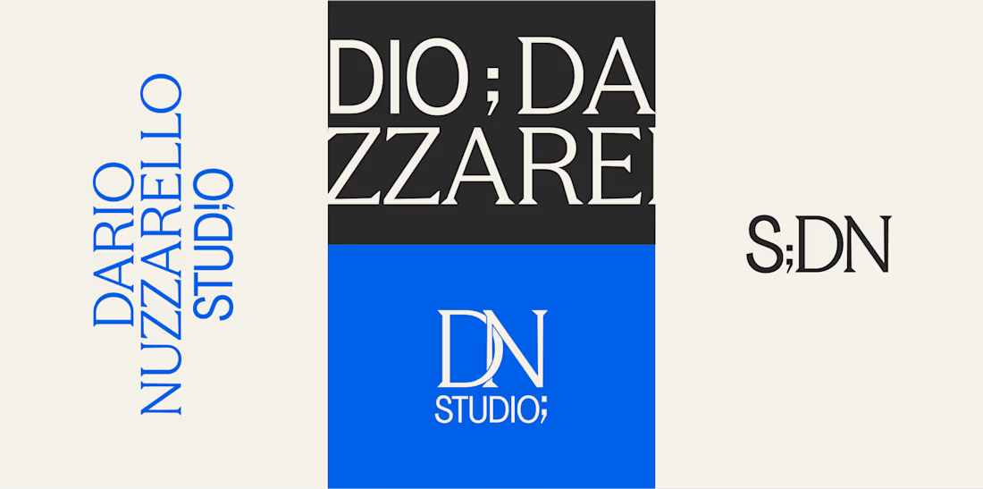
Dario Nuzzarello built a Studio that works across engineering, IT, strategy, and software. The challenge was creating a typographic identity that could bring all those disciplines together without limiting the brand to just one.
I wanted to avoid making it feel overly technical or cold. Since Dario’s work is highly custom and interdisciplinary, the identity needed to feel precise and structured while still being human and approachable.
Sometimes, the best solution is finding the right type, proportions, and details to make a name stand on its own.
What do you think about the final result?

The network for creativity
Join 1.25M professional creatives like you
Connect with clients, get discovered, and run your business 100% commission-free
Creatives on Contra have earned over $150M and we are just getting started








Related posts

Bland is a choice.
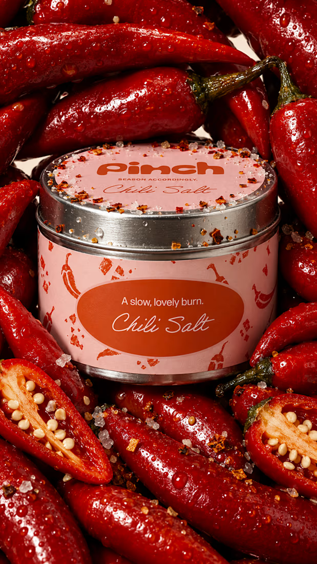
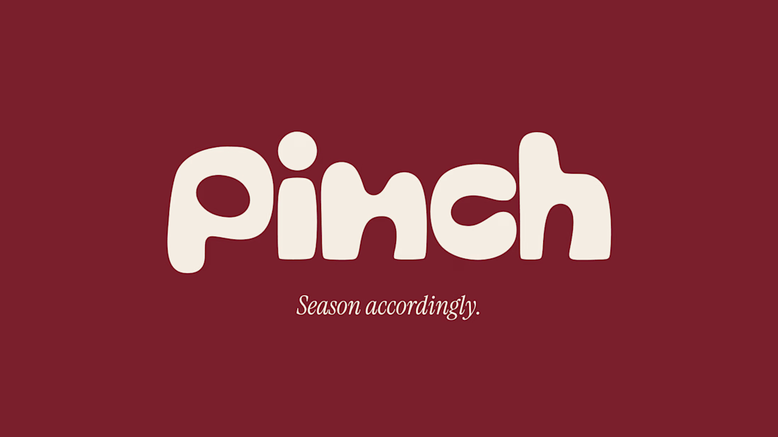
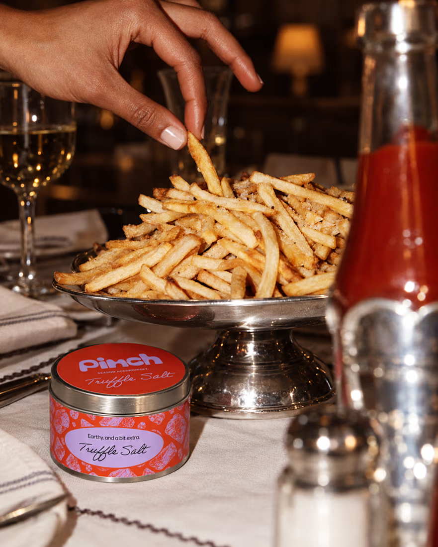
Pinch is a concept brand for a mid-high salt line made to live on the counter, not in the cupboard. Five flavors, five two-color tins, one refillable keepsake people leave next to the bar cart.
I built the full identity: wordmark, lid lockups, hand-stamped pattern system, tone of voice, and art direction.
More from the system coming soon.



Cool work 🔥

The client really liked Barcelona typical floor tiles, so I presented these logo options. Which one you liked the most?
4 voted
13%
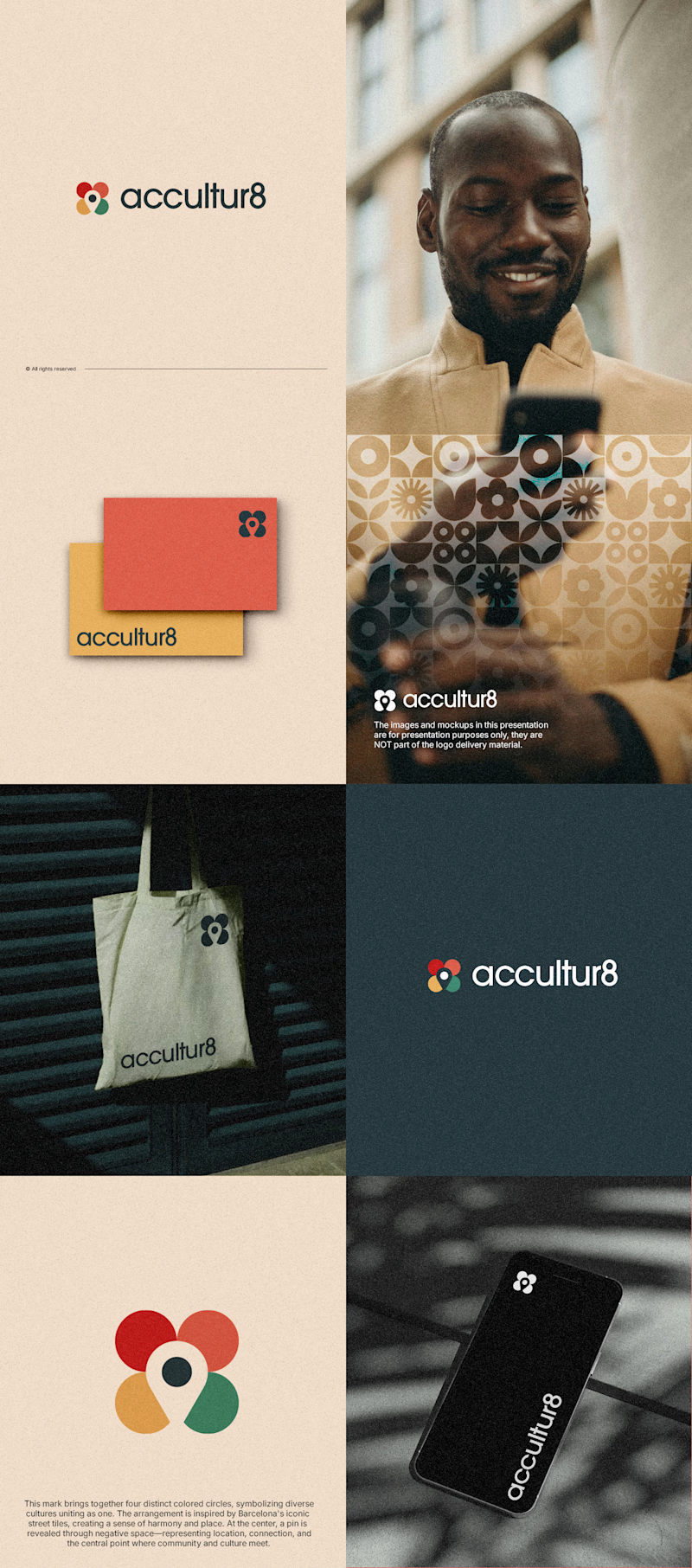
26 voted
87%
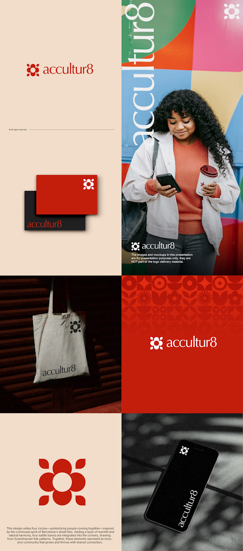
30 votes
Closed

Love option 2, which one do you like most ?

NURV® now has a home on the web 🟠
Same cream canvas, same dot-matrix numerals, same single orange. Scroll it and nine dots in the margin fill up one by one.
Pool to plate to pill, nine scenes, one system.