The network for creativity
Join 1.25M professional creatives like you
Connect with clients, get discovered, and run your business 100% commission-free
Creatives on Contra have earned over $150M and we are just getting started
Back to feedPost

A closer look at the menu page of Bordo — a Luxury Restaurant @Framer Template.
Designed to showcase your dishes with elegance, beautiful imagery, and a refined layout, making every detail of your menu part of the dining experience.
Explore Bordo:
https://templita.com/framer-templates/bordo


The menu page is usually where restaurant sites fall apart, so it's great to see it treated as a showcase. How do you handle long menus on mobile?

The menu imagery makes every dish feel luxurious.
The network for creativity
Join 1.25M professional creatives like you
Connect with clients, get discovered, and run your business 100% commission-free
Creatives on Contra have earned over $150M and we are just getting started





Related posts

Still obsessed with my first Framer template 👀
Editorial layouts, immersive visuals, and a little wanderlust built into every section.
Grab ElseWhere for freee!! 🌍
[Click Here]


The services menu from the Adara website, a residential architecture and planning practice in London.
One of our favourite details on this project. A tiny piece of a much bigger build, and it got the same attention as the hero.

The fact that you can view a visualization for each service right away is super cool. Another point to consider is what percentage of users will actually see this visualization, given that the navigation opens in a rather unpredictable way. I don’t mean this aggressively at all,...

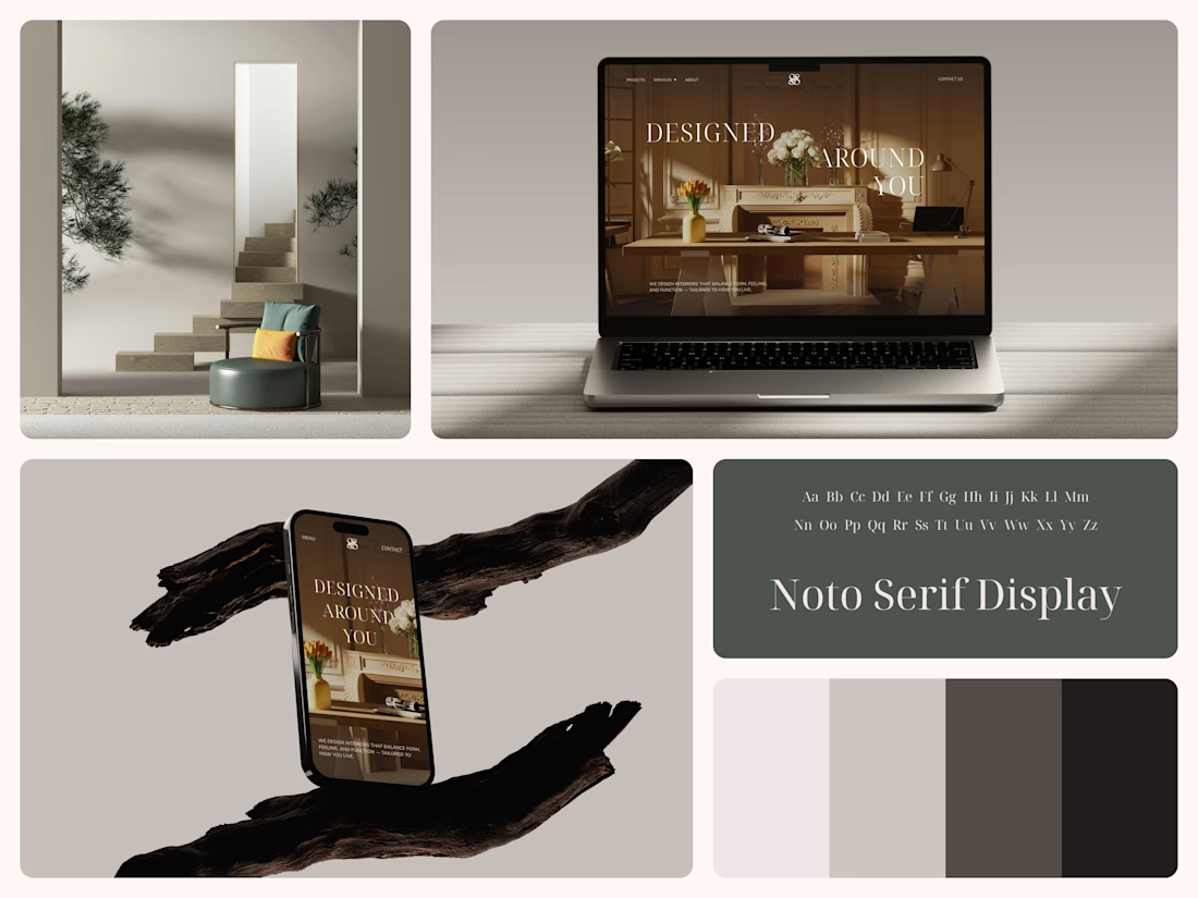
Interior Design Website
The white flowers on the mantel overlap the headline.
Thin Noto Serif Display capitals step down across one warm photo of a paneled room, so the space stays in view between the words. On the phone, the three words stack in a centered column, with Menu and Contact on either side of the monogram.
The palette runs from soft white to near black, which leaves the color to the photo: orange tulips and warm light on the walls.
The headline reads "Designed Around You", and the hero takes it literally, with the wall behind the type and the flowers in front of it.
Designed by the Hue & Machine team.
#InteriorDesign #InteriorStudio #WebsiteDesign #HomepageDesign #WebDesign #ResponsiveDesign #Typography #EditorialDesign #UIDesign #FigmaDesign


Nice!