The network for creativity
Join 1.25M professional creatives like you
Connect with clients, get discovered, and run your business 100% commission-free
Creatives on Contra have earned over $150M and we are just getting started
Back to feedPost

Giant shoutout to my daughter Brooke for bringing this concept to life—so proud of how this turned out! 👏✨
We loved collaborating on this brand mark for Broadway Babies. Balancing that playful energy for kids with a clean, stage-inspired backdrop was such a fun creative challenge for us, and seeing the final vector details locked in makes every bit of iteration worth it.
Nothing beats working together on a project when there's a clear vision and trust in the process.
How’s everyone handling silhouette spacing and type hierarchy on multi-character logos lately? Always curious how other designers approach keeping these detailed figures balanced without losing legibility! 🎨👇
The network for creativity
Join 1.25M professional creatives like you
Connect with clients, get discovered, and run your business 100% commission-free
Creatives on Contra have earned over $150M and we are just getting started




Related posts

Which WANDER logo would you choose?
A travel brand doesn’t just need a logo —
it needs a visual identity that makes you want to explore.
So I explored 2 different directions for the same brand
Bold & Minimal
Vote in the poll.
And Tell me what made you choose it in the comments.
#LogoDesign #BrandIdentity #GraphicDesign #LogoInspiration #VisualIdentity

11 voted
92%
1 voted
8%
12 votes
Closed

Minimal for me. The W drawn as a winding mountain path is doing double duty, letterform and route in one, exactly what a travel brand wants. Bold is clean but the swoosh W tells a little story before you read a single word.

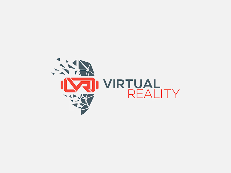
Which Virtual Reality Vector Logo You Guys Like Most?
These 100% Handmade Vector Logos Are Also Available For Purchase With Exclusive Copyrights Transfer Ownership, Feel Free To Contact Us.
7 voted
70%
3 voted
30%
10 votes
Closed

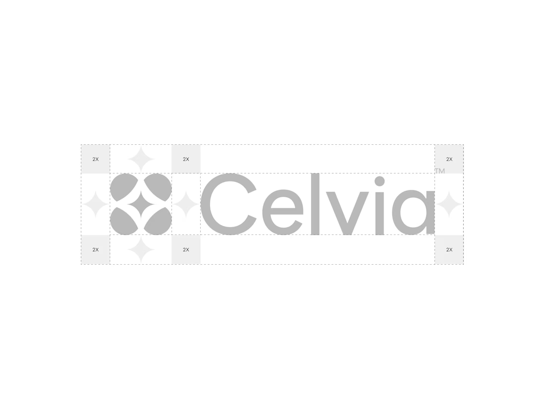
A closer look at the Celvia logo system.
Exploring the construction, spacing, proportions, and how the identity adapts across different brand applications.
Celvia is a skincare brand built around the intersection of biotechnology and nature, so the goal was to create an identity that feels scientific, clean, modern, and approachable.

Beautiful! So clean