The network for creativity
Join 1.25M professional creatives like you
Connect with clients, get discovered, and run your business 100% commission-free
Creatives on Contra have earned over $150M and we are just getting started
Back to feedPost

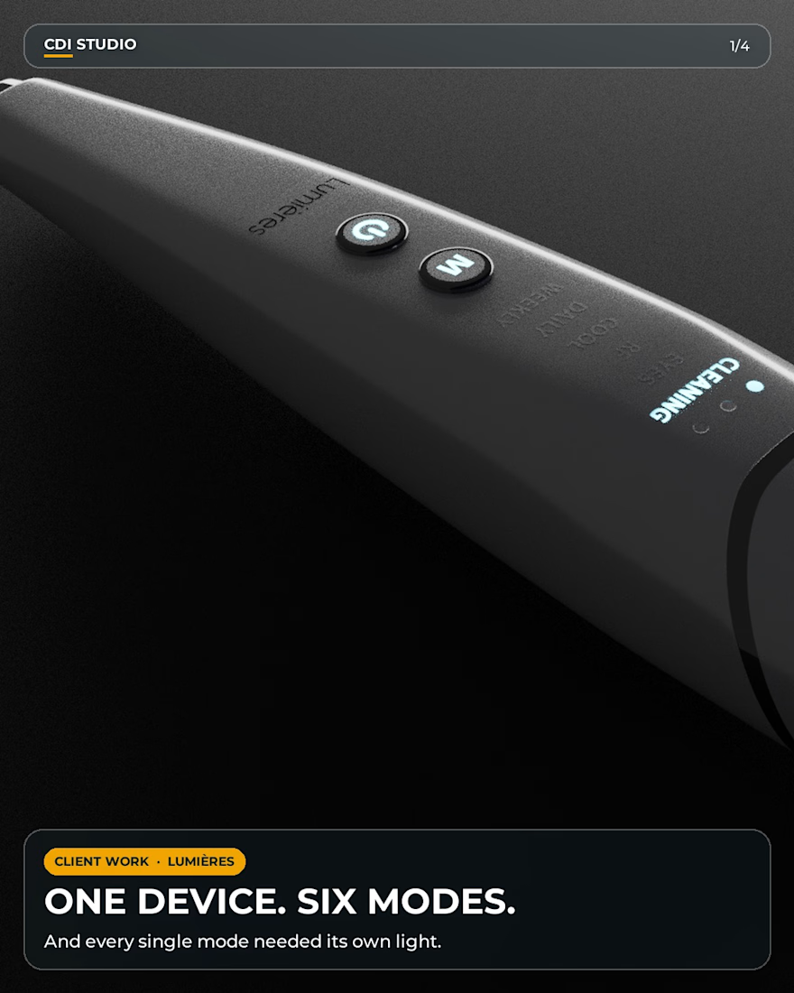
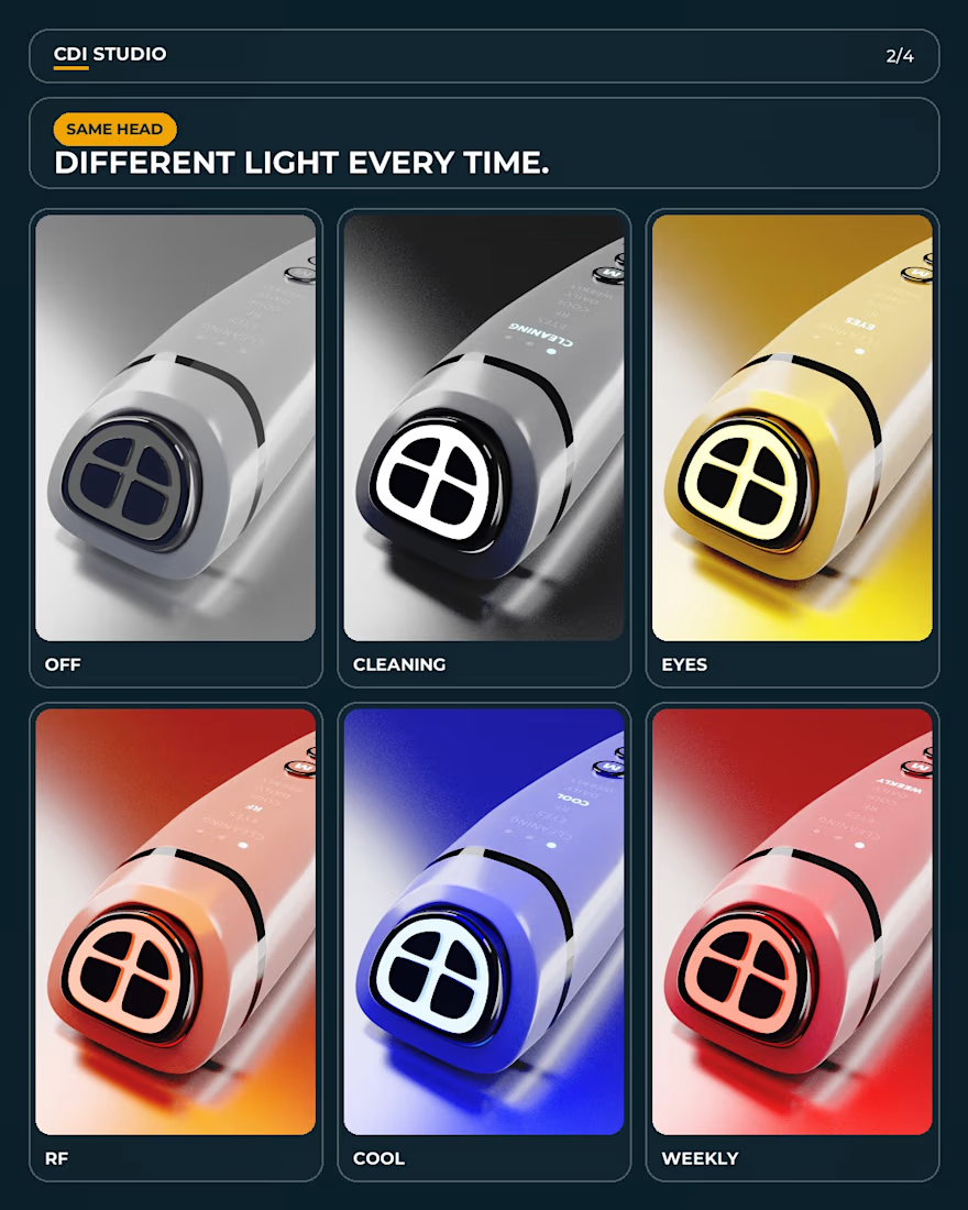
One device, six modes, and every mode needed its own light.
3D product renders and skin cross sections for Lumières, a skincare device. Cleaning, eyes, RF, cool, daily, weekly. Same head, a different light each time.
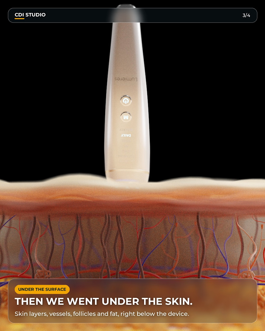
Then we went under the skin. Skin layers, vessels, follicles and fat, right below the device.
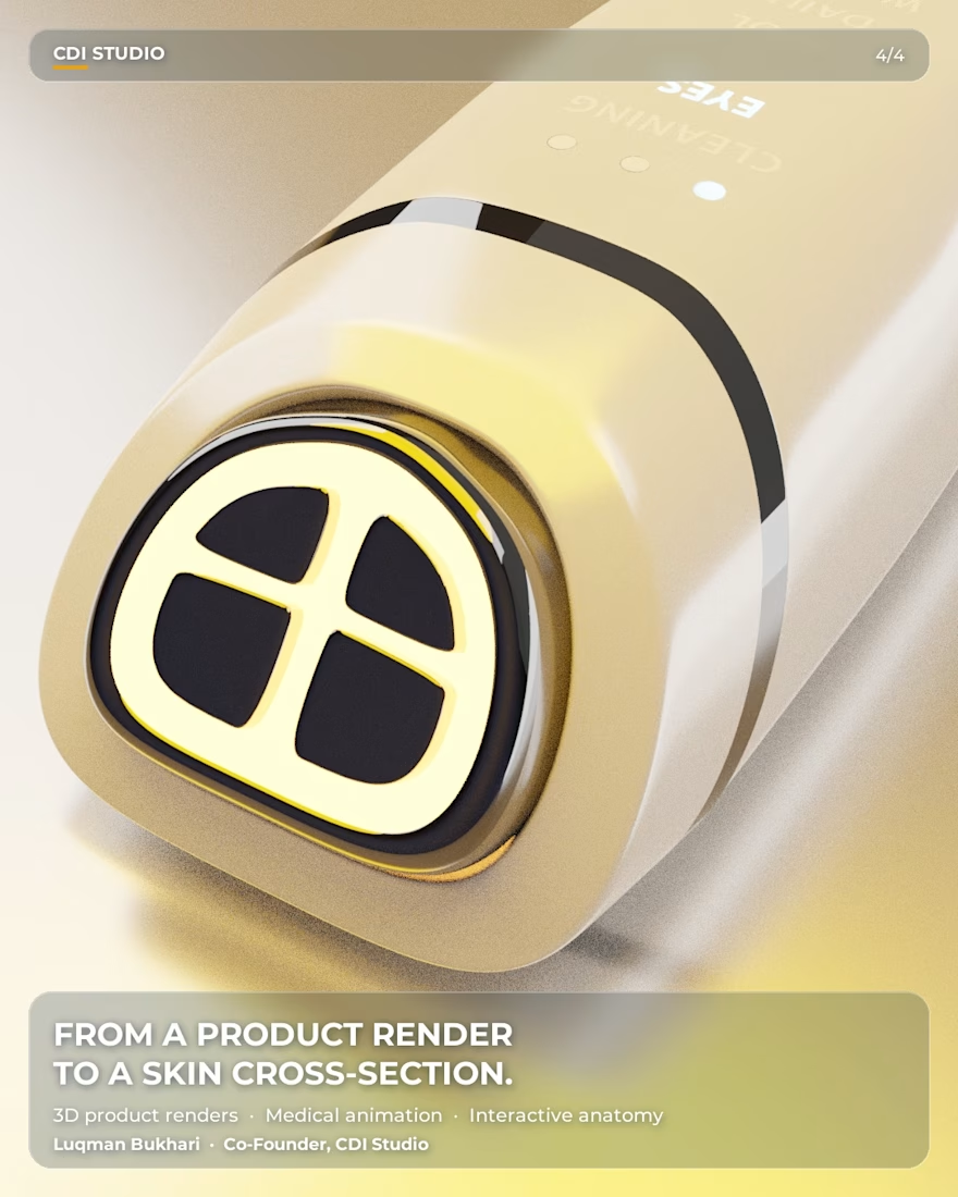
From a product render..... to a skin cross section, in one project.
Next up: web and app.


The network for creativity
Join 1.25M professional creatives like you
Connect with clients, get discovered, and run your business 100% commission-free
Creatives on Contra have earned over $150M and we are just getting started



Related posts

People don’t just want a banking app. They want to feel in control of their money.
Great fintech design doesn’t just look premium. It makes money feel simpler, safer, and easier to control.
Meet Ziko, a mobile banking concept where every interaction is designed to reduce friction and build trust.
What wins your trust first: 🔒 Security, ✨ Simplicity, or ⚡ Speed?


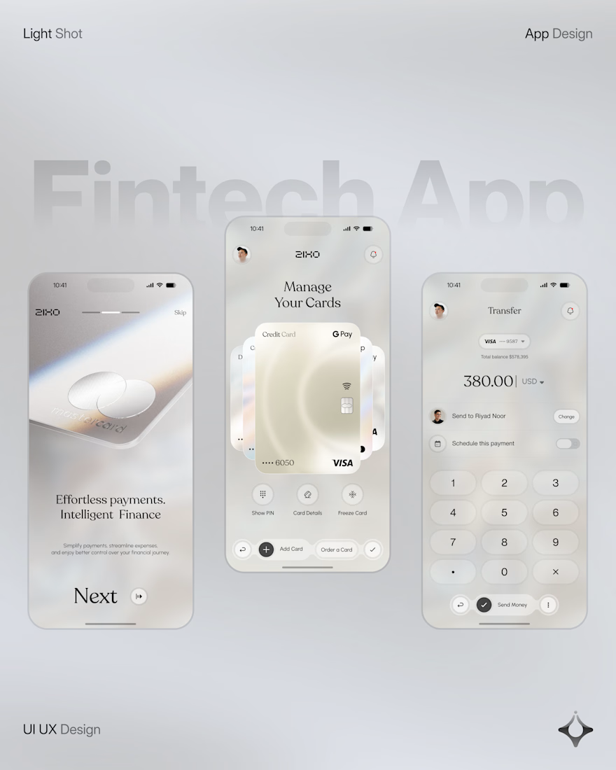
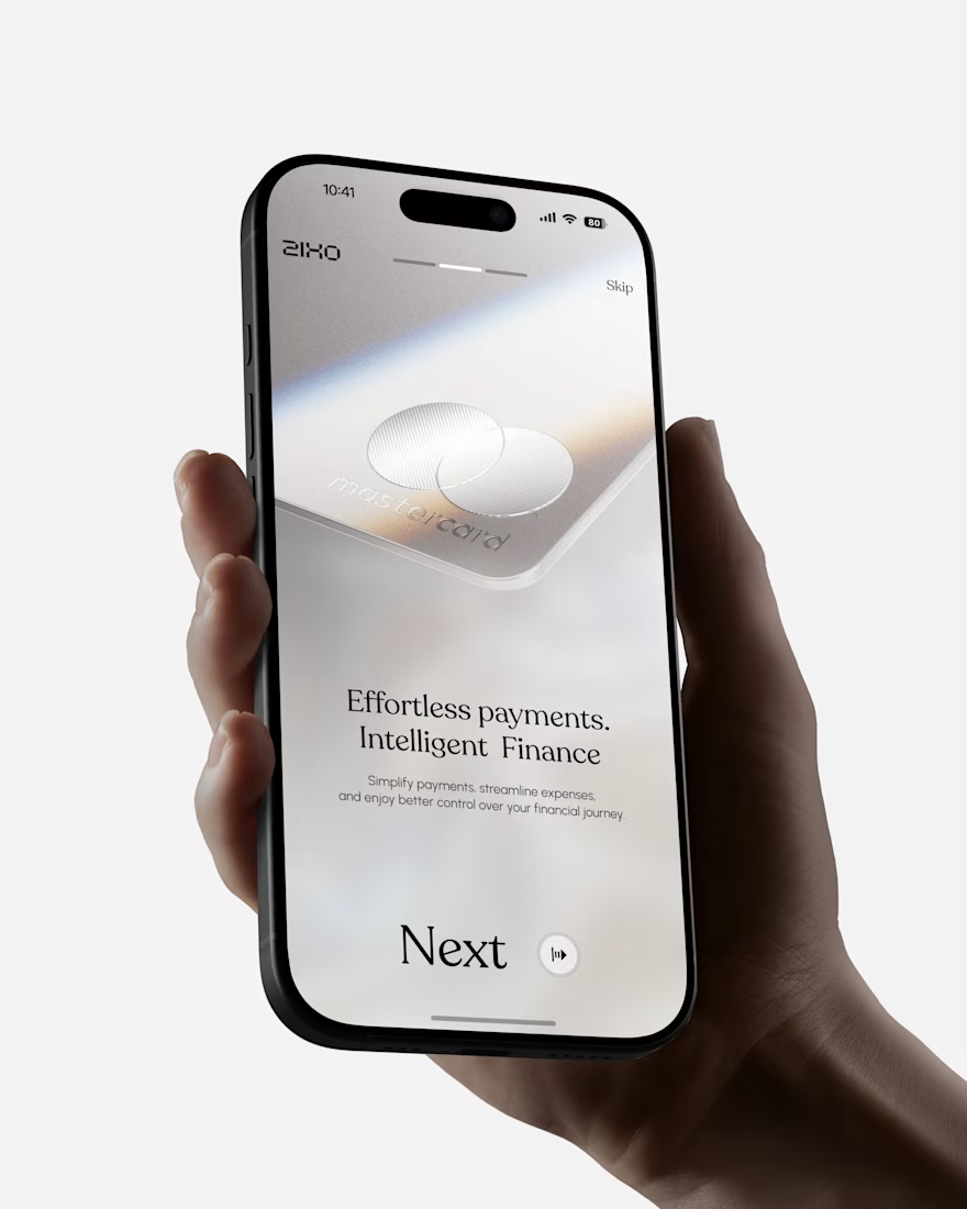
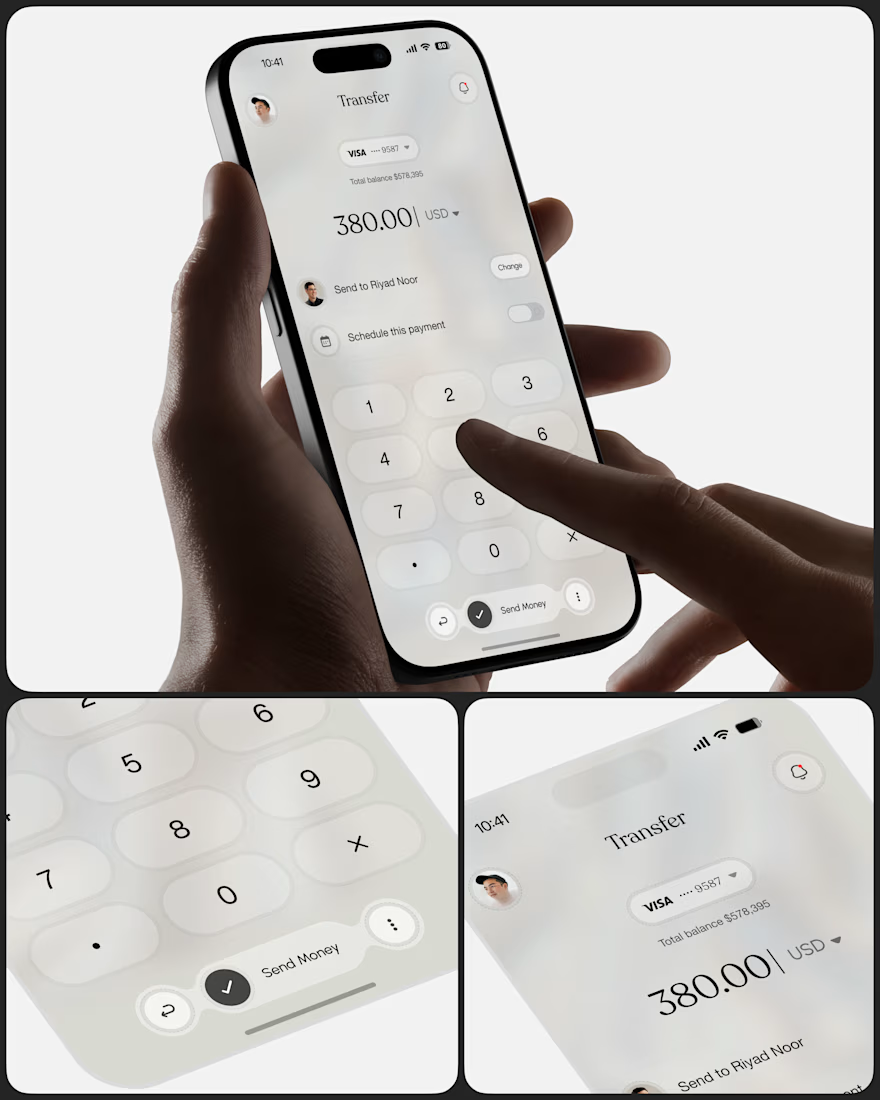
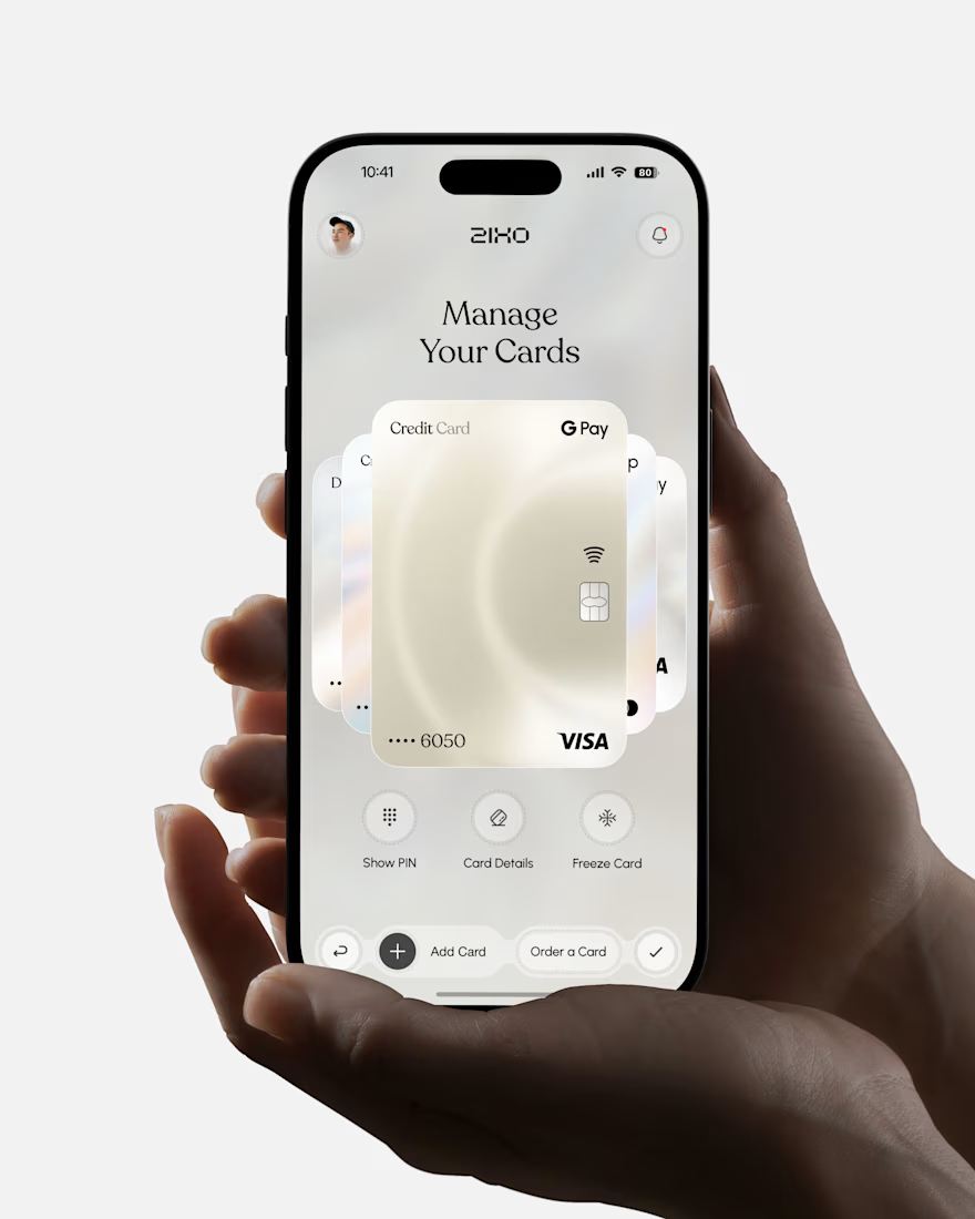

Absolutely love this Fintech App design! The minimal soft 3D elements with the clean UI is such a premium combo — feels very Apple-like and trustworthy. The interaction "designed to reduce" cognitive load really shows in the execution. Super polished work, that "Effortless payments. Intelligent Finance." screen is my fav!


Which packaging color catches your eye first?
6 voted
46%
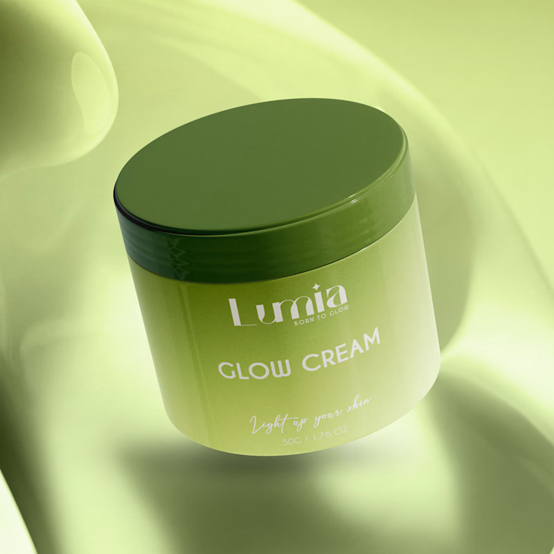
7 voted
54%
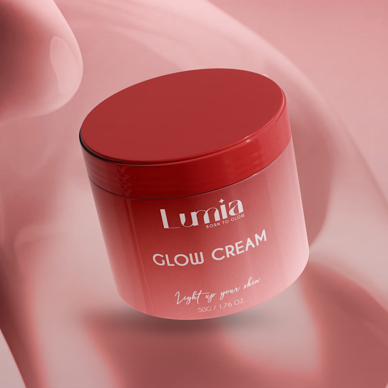
13 votes
Closed

The green version catches my eye first: the dark olive lid gives the lighter jar a clear focal point. I would also test the small white label text at thumbnail size, since the soft lighting reduces its contrast in both versions.


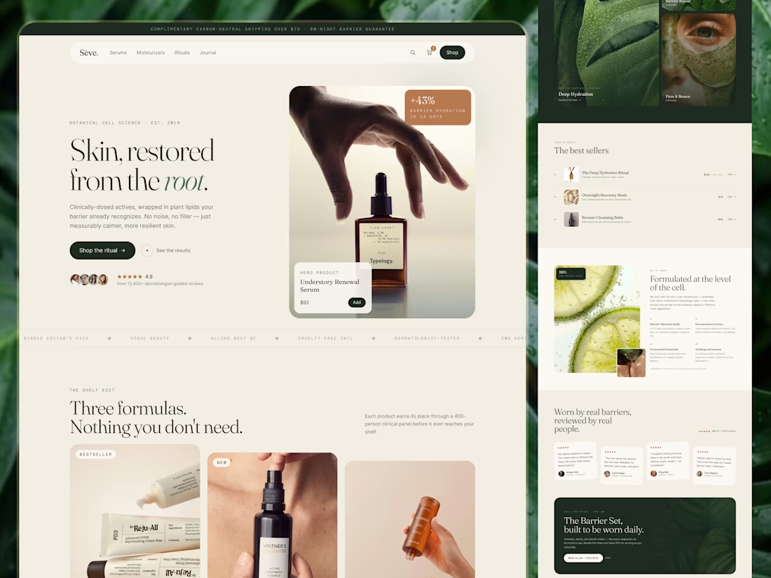
Skincare E-commerce Website · UI/UX · Responsive Design
Skincare shopping can quickly become overwhelming. With multiple products, ingredient lists, reviews, and routines to consider, customers need more than attractive product photography. They need a clear way to explore their options.
For Sēve., the design direction focuses on creating a calm, editorial shopping experience that makes skincare discovery feel more considered.
Design focus:
- Responsive website design
- Product and category discovery
- Ingredient-focused content sections
- Best-selling product presentation
- Customer review and trust sections
- Clear navigation and shopping CTAs
- Consistent visual hierarchy across screen sizes
Visual direction
Warm neutrals and deep green create a calm, premium atmosphere. Editorial typography and carefully structured content keep the interface refined without making it feel difficult to navigate.
Project goal
Create a responsive skincare e-commerce experience that balances visual appeal with clear product discovery and a more confident shopping journey.
Services
UI/UX Design · E-commerce Website Design · Responsive Web Design · Digital Experience Design
🏀 Full Design Showcase – Better View on Dribbble.
✅ https://dribbble.com/shots/27835463-Skincare-E-commerce-Website-UI-UX-Responsive-Design
Building something similar?
Visumind Creative works with growing brands on E-commerce, Websites, UI/UX, Brand Identity, and Development.
Contact us to discuss your next project or request a free website/UX audit.

This is very clean i like it so much