The network for creativity
Join 1.25M professional creatives like you
Connect with clients, get discovered, and run your business 100% commission-free
Creatives on Contra have earned over $150M and we are just getting started
Back to feedPost

Editorial and Branding Studies inspired by my recent visit to Mt. Rainier National Park. Full project on my website!


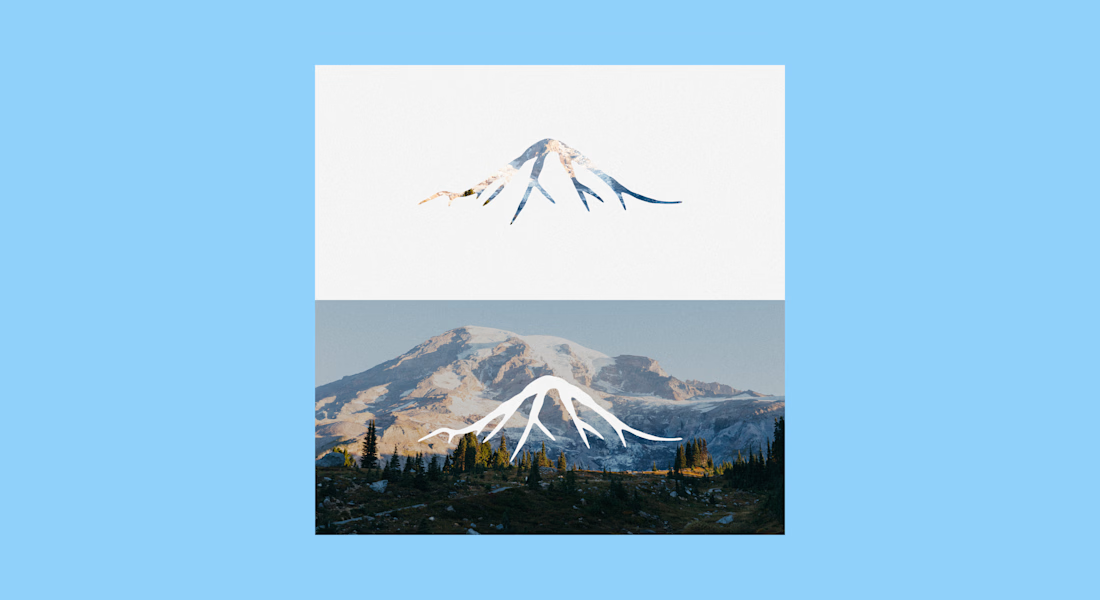
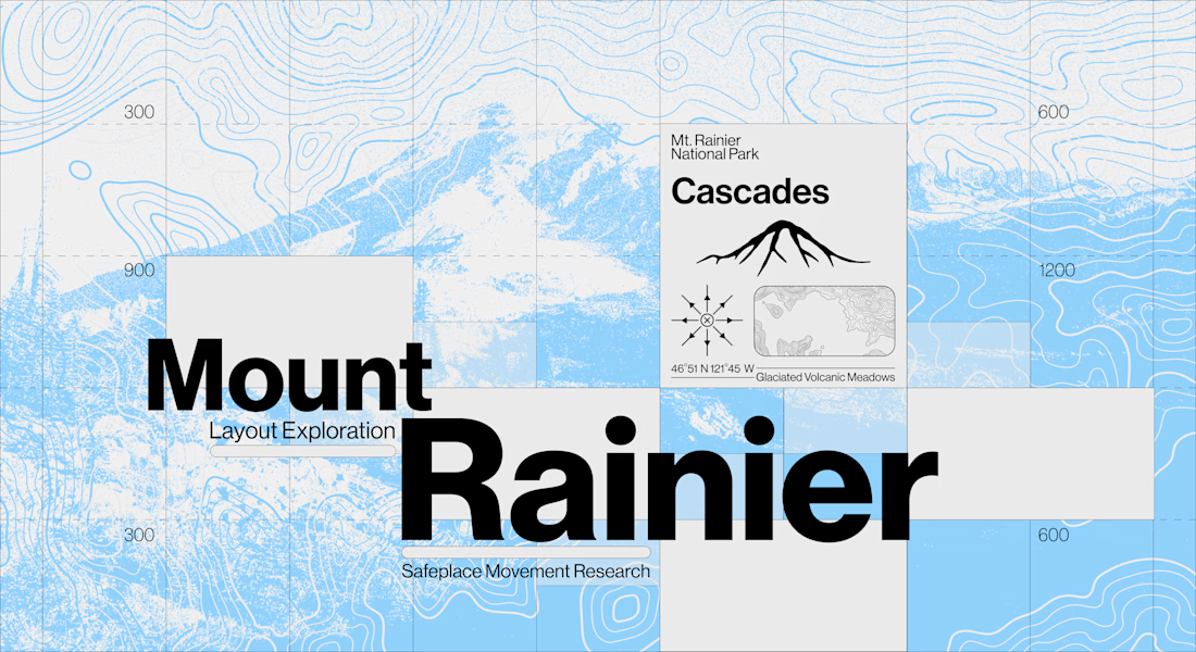

Nobody briefs the constraints out of a self-initiated study, which is usually why this kind of work is what gets someone hired for the paid version. The topographic layer is carrying the place so completely that the grotesk on top gets to stay neutral — a clean division of...
The network for creativity
Join 1.25M professional creatives like you
Connect with clients, get discovered, and run your business 100% commission-free
Creatives on Contra have earned over $150M and we are just getting started




Related posts

Someone told me my work was strong on visuals, thin on systems.
So I built an entire aerial-hardware brand to prove them wrong — name, identity, product photography, two working motion specs. From one logo mark.
Website live here


Its incredible! Where is that "someone". 😆


Hot take: aesthetics and clinical results should walk hand in hand.
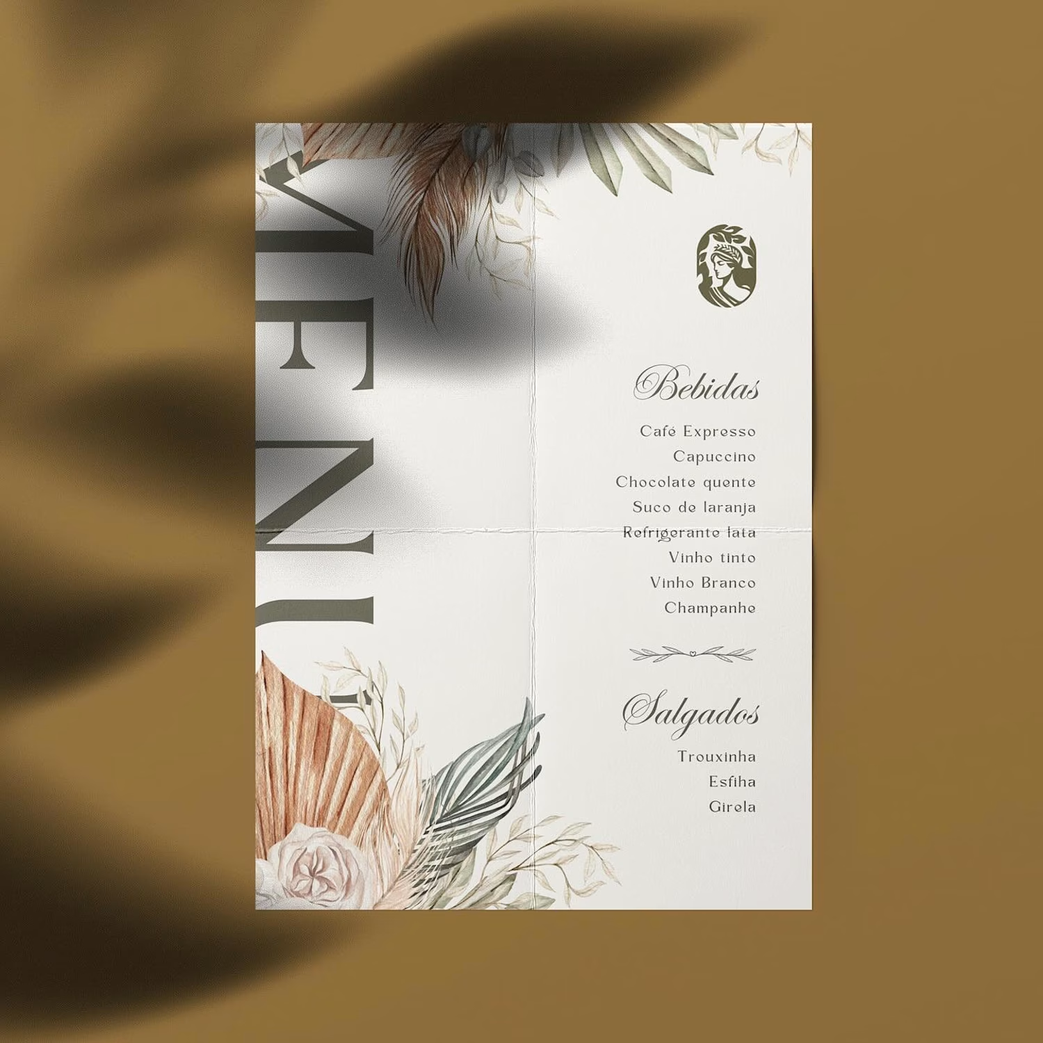
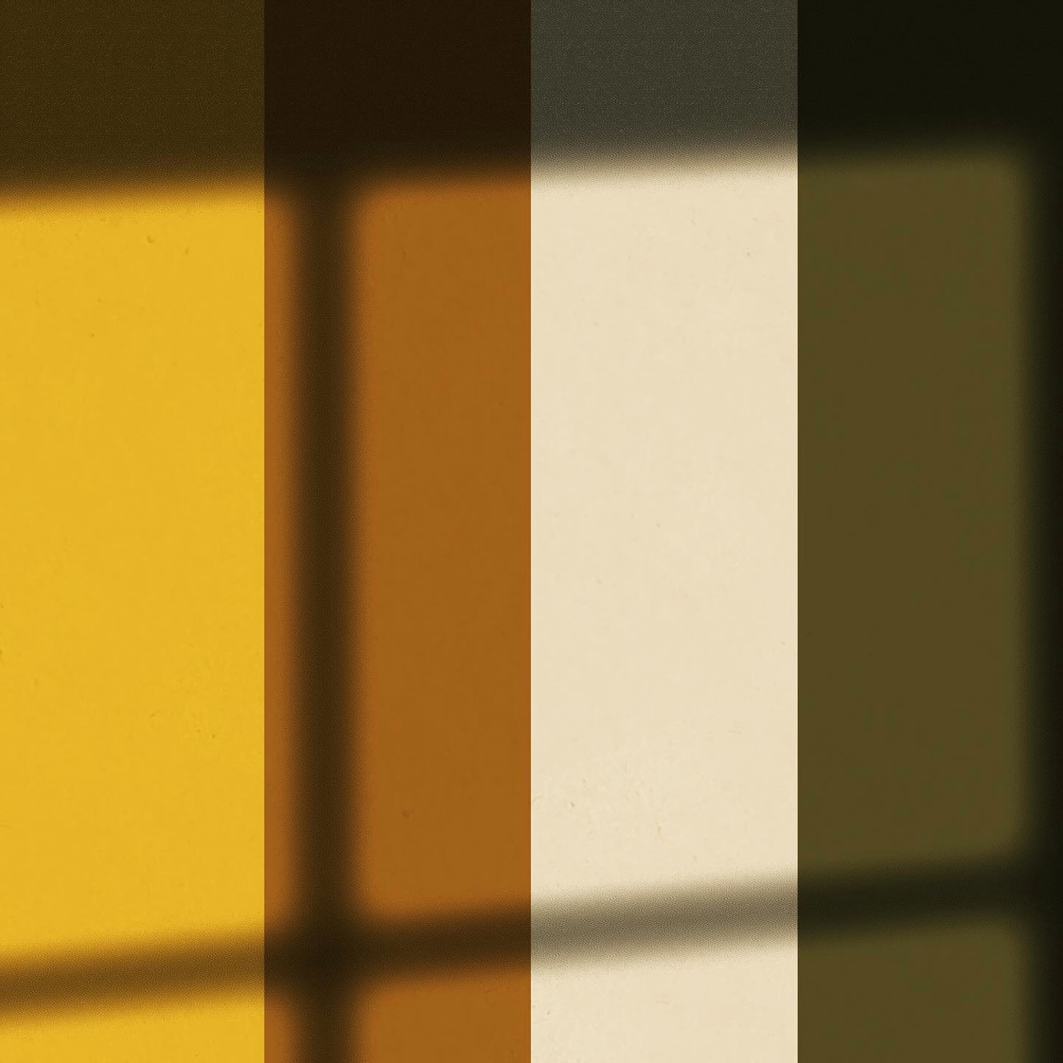
Most brands in this space lean into cold, sterile whites or aggressive dark tones. It reads functional, but it also feels like something you'd hide in a medicine cabinet, not display on your vanity.
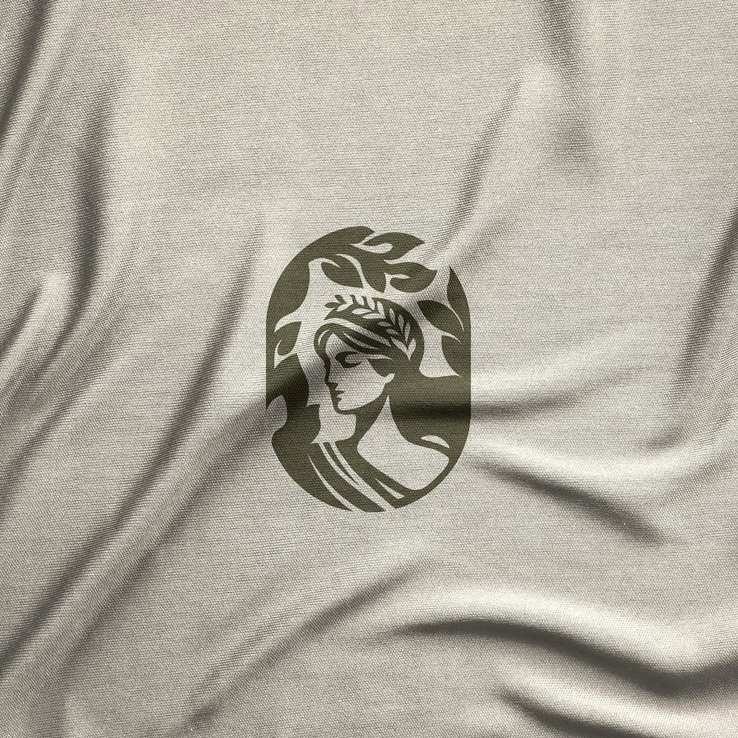
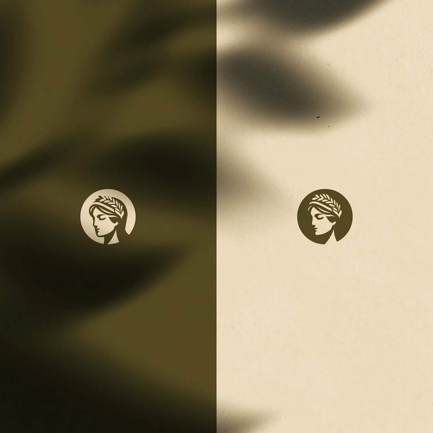
For this rebrand, we anchored the identity in classical beauty and organic sophistication. By combining warm earthy tones, botanical cues, and timeless iconography, we moved away from the "pharmacy product" feel into true high-end personal care.
It was a deliberate shift: positioning the brand not for someone who feels like they are treating a flaw, but for someone investing in a premium daily ritual.
Would a piece like this deserve a spot on your display shelf?



This is brilliant!

Love at first grid!
A short 2D motion study taking the Amorado logo from its construction grid to the final mark. Animated entirely in Spline.
A fictional identity concept for Amorado.

