The network for creativity
Join 1.25M professional creatives like you
Connect with clients, get discovered, and run your business 100% commission-free
Creatives on Contra have earned over $150M and we are just getting started
Back to feedPost
Taste Test
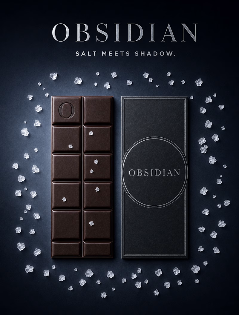
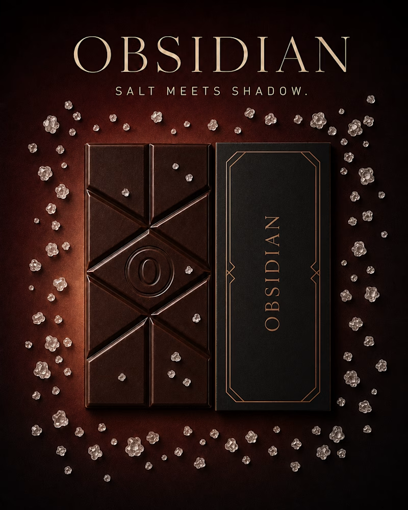
The same bar, dressed for two different rooms.
One wears warmth — copper light, deco lines, an ember glow beneath the dark.
The other goes cold and precise — steel, silver, a single circle holding the name like a seal.
Same salt, same shadow. Only the temperature of the luxury changes.
Which one would you unwrap? 👇
#brandconcept #packagingdesign #artdirection
10 votes
Ends in 9h

My gut says The Eclipse edges it, that scattered salt against pure black feels more premium than the warm copper tone. But I could see The Ember winning on shelf visibility. Which one's actually pulling ahead in the votes?


Yeah, The Eclipse leans colder and more editorial, that scattered salt on pure black does a lot of the premium work. The Ember's copper is the louder one on a shelf though, so it kind of depends whether you're designing for the feed or the store. Curious which way you'd lean if you had to ship one.

I like how the same concept creates two completely different moods. Both directions feel well considered.

Going for The Eclipse
The network for creativity
Join 1.25M professional creatives like you
Connect with clients, get discovered, and run your business 100% commission-free
Creatives on Contra have earned over $150M and we are just getting started










Related posts

Which icon style do you like?
11 voted
69%
5 voted
31%

16 votes
Closed


Depends on the overall theme off the web/app. But i will go with the option 1 if overall. Good work!
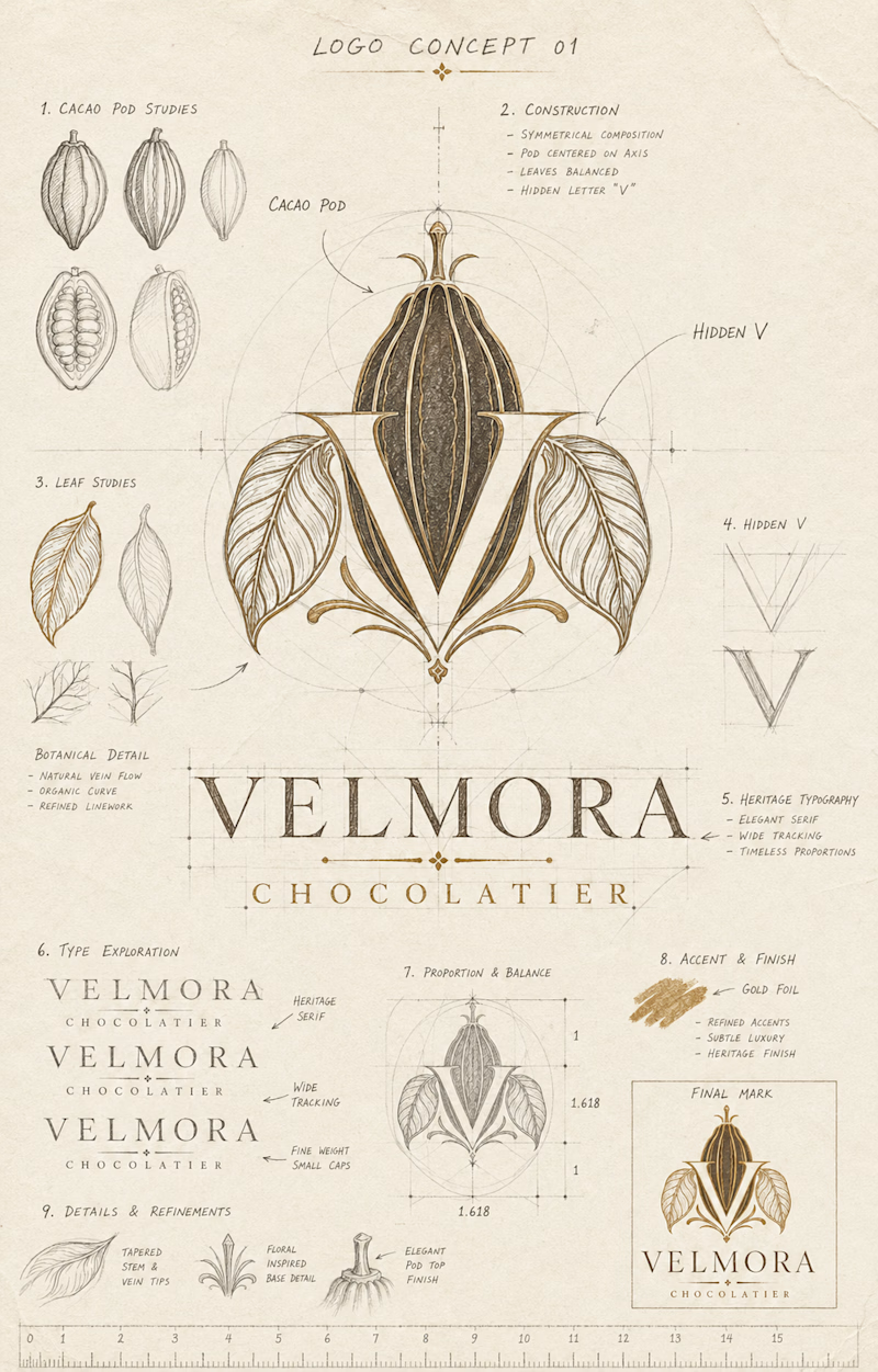
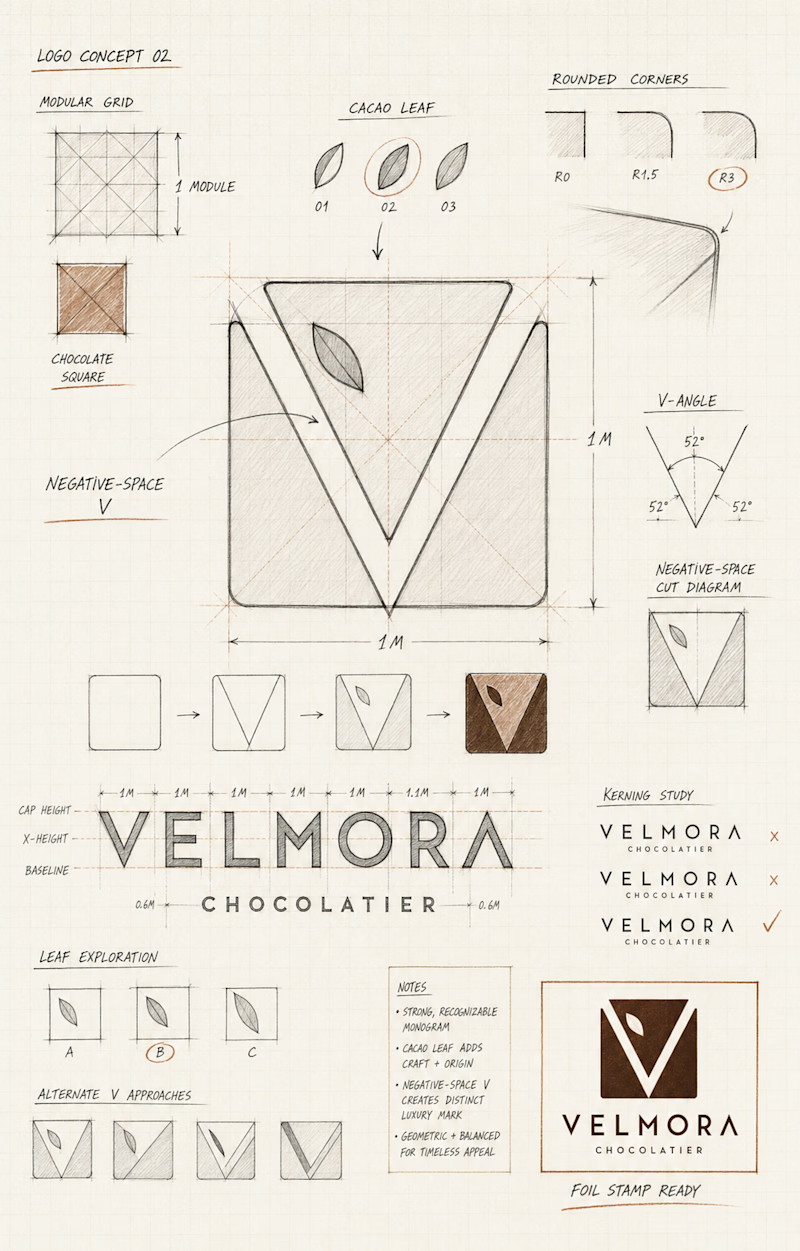
Same brand, two ways to build a mark.
One is heritage — cacao pod studies, hand-drawn leaves, gold foil and golden-ratio construction, a hidden V nested inside botanical detail. It says "old house, real craft, generations of it."
The other is geometry — modular grid, 52° angles, a negative-space V cut from a chocolate square, one leaf floating in the gap. It says "modern maker, quiet confidence, nothing wasted."
Both hide the same letter. One reveals it through ornament, the other through absence.
Which V would you stamp in foil? 👇
#logodesign #brandidentity #packagingdesign
2 voted
67%
1 voted
33%
3 votes
Closed

as much as i love the minimalism in the module take, maison feels like a no-brainer to me–– there's such a strong understanding of the product displayed down to its origins. i find that's so rare with even luxe chocolate brands' visuals, & you've executed it in a way that...
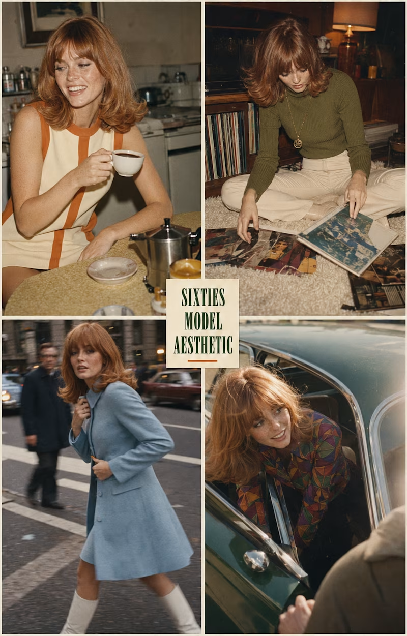
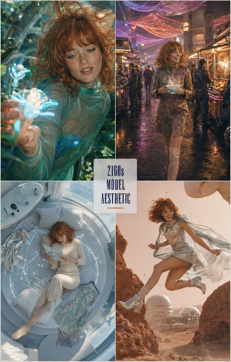
Two hundred years apart, same girl.
One belongs to the sixties — grainy film, mod stripes, coffee in a tiny kitchen, records on the floor, a blue coat crossing a busy street.
The other belongs to the 2160s — iridescent fabric, neon night markets, a sleep pod above the clouds, red dust and glass domes.
The clothes change. The light changes. The gesture never does — the same laugh, the same tilt of the head.
Style is a moving target. Presence isn't.
Which century would you shoot her in? 👇
#editorialdesign #fashionconcept #artdirection
2 voted
40%
3 voted
60%
5 votes
Closed
2160 is speaking to my soul, omg. both look fantastic, though!
Trending

Claude
Claude has entered the design space. How are you using Claude Design?

Contra University
Learn from expert creatives how to earn more using next-gen AI tools.
creativeaiflow
Creative AI workflows are evolving. What tools do you use, and what are their strengths and weaknesses?
freelancerlife
Freelancer life is wins, pivots, and everything in between. What’s yours right now?