The network for creativity
Join 1.25M professional creatives like you
Connect with clients, get discovered, and run your business 100% commission-free
Creatives on Contra have earned over $150M and we are just getting started
Back to feedPost

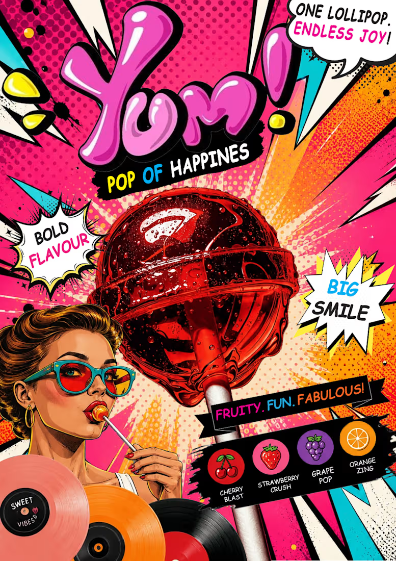
Lollipop Candy Poster Design | Colorful Pop Art


The network for creativity
Join 1.25M professional creatives like you
Connect with clients, get discovered, and run your business 100% commission-free
Creatives on Contra have earned over $150M and we are just getting started
Challenges
View all


Related posts

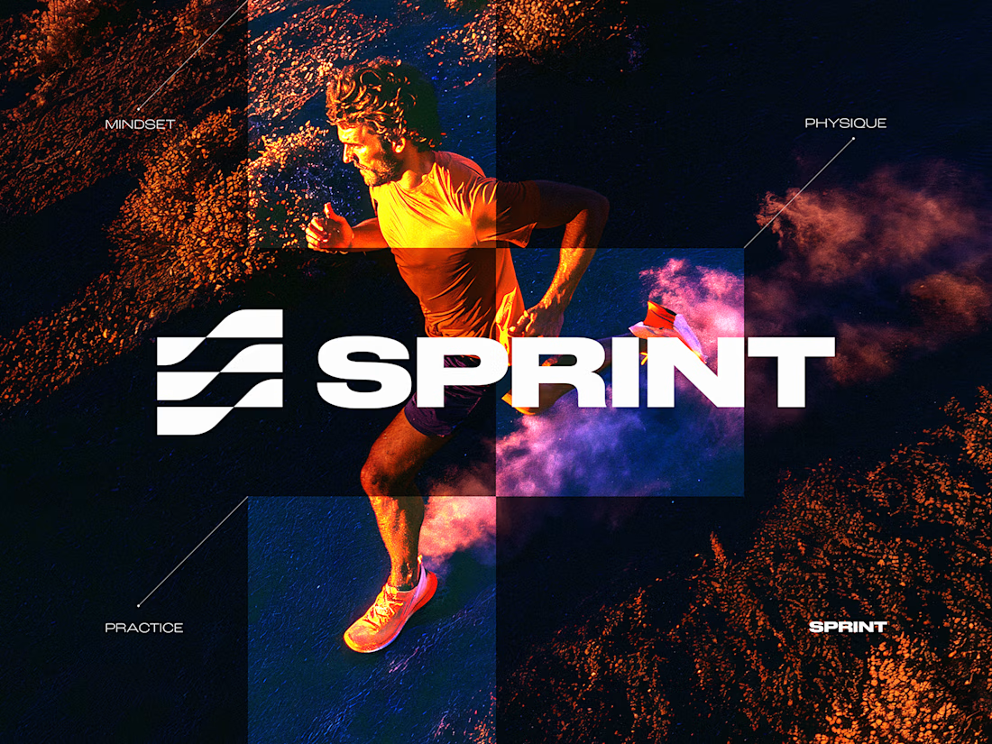
SPRINT — Experimental Brand Visual
A visual experiment built around an unused logo concept from a recent branding project.
The design was created manually, while exploring how AI-driven aesthetics are increasingly influencing contemporary visual language, even when AI itself isn’t part of the design process.
Logo design, art direction and visual exploration.



💯

Is sketching part of your creative workflow or we've forgotten what it feels to be human?
Depending on the projec's scope, I normally like to explore my ideas on paper before I come up with the best solution.
And no, they're not perfect.
They are rough and messy, my goal is so...

KpiClock — animated hero with Unicorn Studio
Static hero backgrounds are easy to scroll past. So for KpiClock's marketing site, I built a living one — a soft, flowing gradient that moves on its own behind the headline, made with Unicorn Studio.
It's lightweight, runs smoothly right in the browser, and gives the whole hero a calm, premium feel without pulling attention away from the message or the CTA. Subtle motion, big difference.


The balance between animating the background and keeping the CTA readable is a common friction point. Subtle movement works well here because it draws the eye without competing with the core message.