The network for creativity
Join 1.25M professional creatives like you
Connect with clients, get discovered, and run your business 100% commission-free
Creatives on Contra have earned over $150M and we are just getting started
Back to feedPost

Been working on this one for a while, and it’s finally here 🤩
For this skincare line, I wanted to create something that felt fresh, simple and genuinely different from what we usually see in the category. The whole identity was built around one thought:
"Skincare isn’t rocket science"
No complicated routines. No unnecessary beauty clichés. No trying to make skincare feel more complicated than it is.
Just 1 to 5. Five simple steps to good skin.
I took an architectural approach to the identity, using structure, proportion, typography and a clear visual system to make the idea feel as simple as the product philosophy itself.
Really happy with where this one landed.Check it out


The network for creativity
Join 1.25M professional creatives like you
Connect with clients, get discovered, and run your business 100% commission-free
Creatives on Contra have earned over $150M and we are just getting started








Related posts

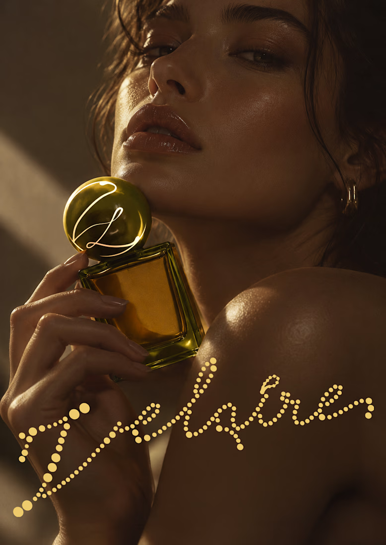
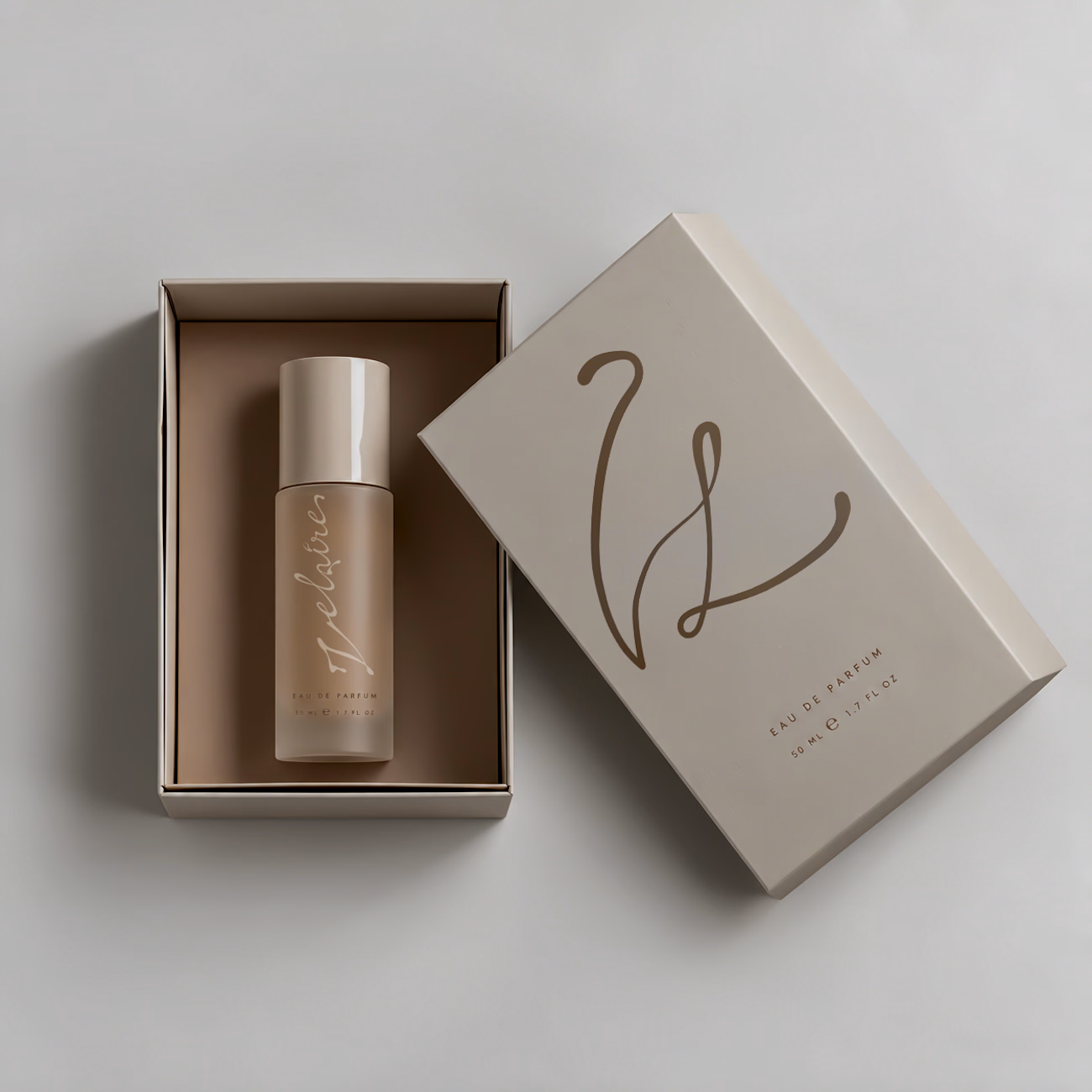
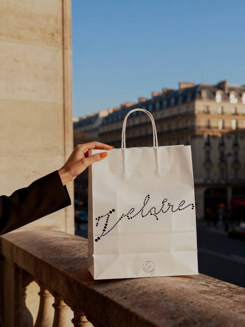
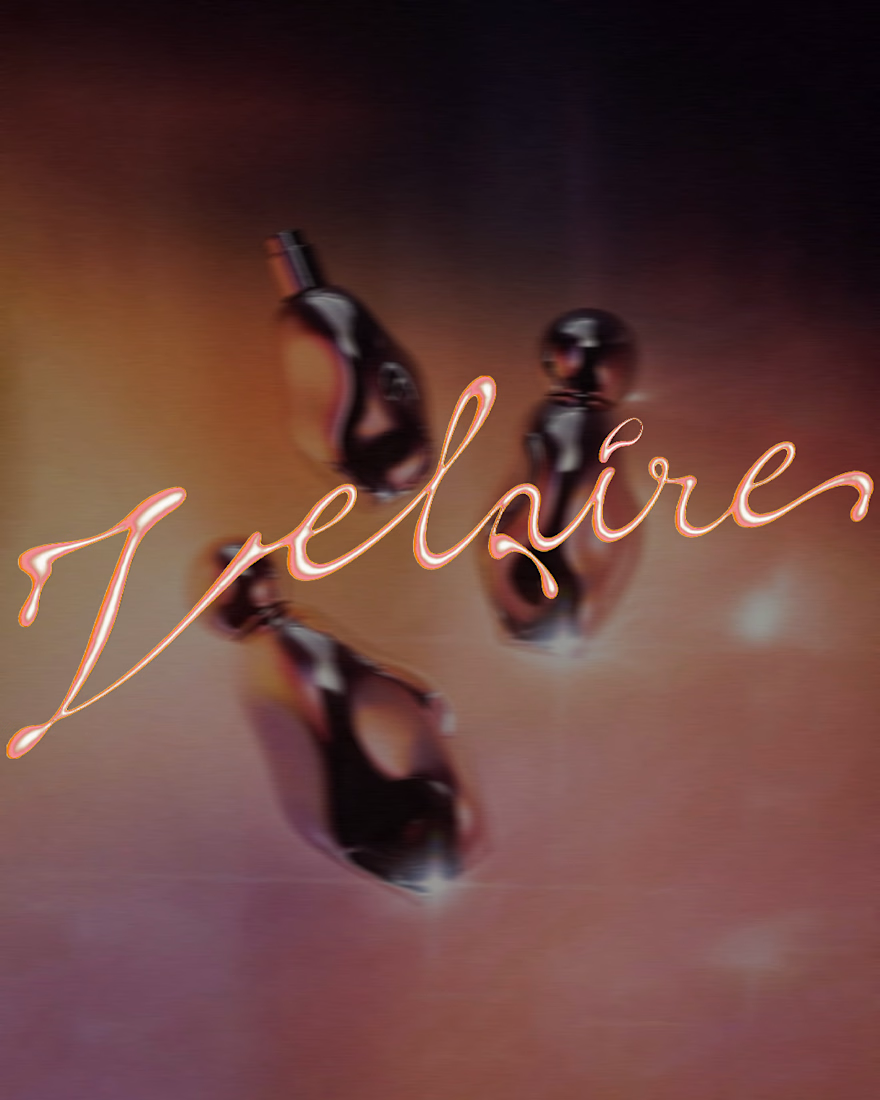
VELAIRE — Beauty & Fragrance Visual Identity
A self-initiated identity exploring custom lettering, sensual art direction and a refined visual system across packaging, editorial and digital applications.
Currently open to freelance and remote collaborations in branding, music, fashion and culture.
Visual Identity · Art Direction · Logo Design · Campaign Design
#VisualIdentity #ArtDirection #BrandDesign #LogoDesign #GraphicDesign



Great brand identity Yaren that's really luxury 🔥🔥

Juice & Beverage Shopping App UI/UX Design
A fresh and modern juice and beverage shopping app designed to deliver a smooth and engaging shopping experience. Featuring vibrant product visuals, intuitive navigation, interactive animations, and a clickable prototype, this design makes it easy for users to explore beverages and enjoy a seamless ordering journey.
The project combines clean UI, thoughtful UX, and engaging micro-interactions to create a visually appealing and user-friendly mobile shopping experience.


A premium landing page concept for a luxury sauna brand, focused on warm visuals, refined typography, and a smooth interactive experience.

Great landing page 🎉🎉🔥🔥