The network for creativity
Join 1.25M professional creatives like you
Connect with clients, get discovered, and run your business 100% commission-free
Creatives on Contra have earned over $150M and we are just getting started
Back to feedPost

Challenge
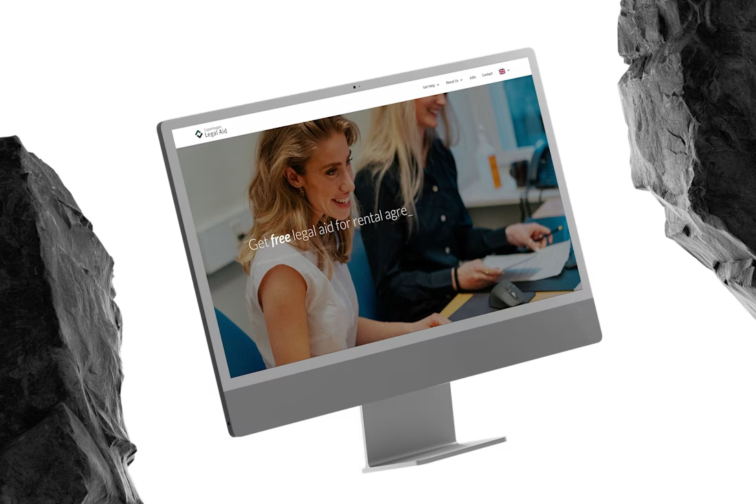
Copenhagen Legal Aid's outdated Wix site made it hard for people to find the information they needed before visiting the office — a real problem when your users are often in stressful legal situations.
The solution
Redesigned and developed in Figma and Webflow alongside a visual designer, with GSAP animations and custom code and 301 redirects. Built for clarity and easy navigation, with a full English version for non-Danish speakers.
Result
A fast, accessible site that helps people get the right information before they walk through the door.


The network for creativity
Join 1.25M professional creatives like you
Connect with clients, get discovered, and run your business 100% commission-free
Creatives on Contra have earned over $150M and we are just getting started

Challenges
View all


Related posts


So excited to see Creative Intelligence 2026 by @Contra Labs out in the world!
At @Heed Collective , we had the pleasure of designing both the website and the report. We’re incredibly grateful for this collaboration!
Our creative exploration started with a question:
What does Creative Intelligence mean today?
We believe it lives at the intersection of creativity and analysis, imagination and insight.
We translated this into a visual story that begins in space — vast, dreamy, full of possibility — and gradually moves closer to Earth, grounding imagination in something tangible and human.
Huge congrats to the whole team, @Erin Horner, @Ben Huffman, @Mark Vassilevskiy, @Alex Karpodinis, @Stacy · Heed Collective, @Heed Collective , and the entire @Contra Labs team 👏


Incredible work, congrats!


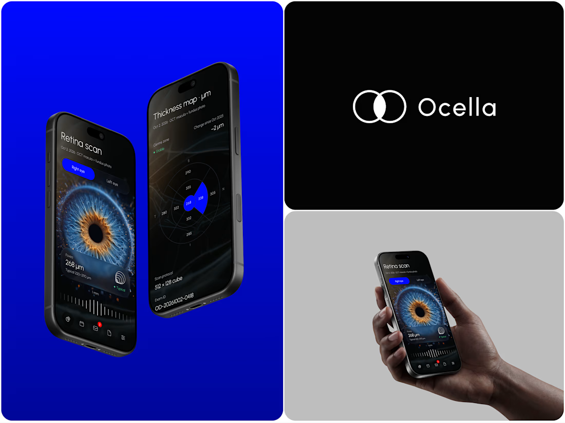
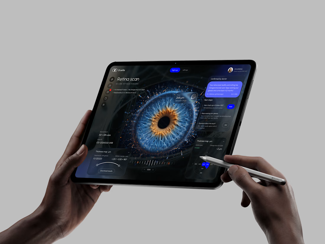
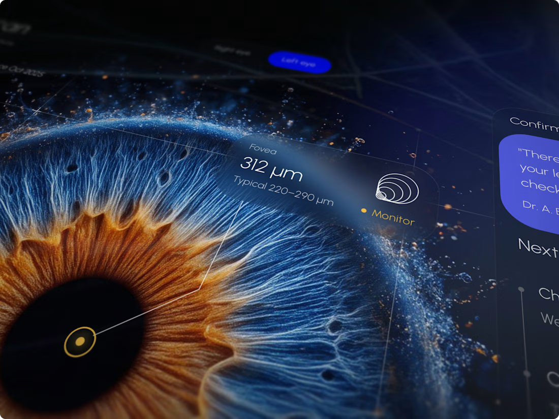
Ocella Eye Exam Results Portal
Clear results build trust. Patients know what their exam means and what to do next, and doctors spend less time explaining the same numbers.



I never see design like this before thats unique 🎉🎉🔥🔥

One of my favorite projects this year: a full migration of ecopiatech.com from a legacy PHP CMS to Webflow.
Ecopia builds AI-generated 3D maps, and their site had a lot going on. Smooth scroll, parallax, character reveals, a fullscreen menu with an animated tile grid, timeline carousels, before/after sliders. The brief was simple: rebuild it 1:1.
So instead of eyeballing it, I went into the live site's CSS and measured everything. Easing curves, delays, durations, even the "random" text reveal turned out to be a 6-step delay cycle per word. Then I rebuilt it in Webflow so it feels exactly like the original, but now the team can update everything on their own.
On the content side:
220+ blog posts, news and case studies moved into Webflow CMS
Before/after sliders, videos and map embeds inside rich text, handled with simple shortcodes the editors can use
250 redirects mapped and verified so no old URL breaks
HubSpot forms restyled to match the brand, plus tracking set up for launch
The fun part of projects like this is the details nobody notices when they're done right.
Take a look: https://www.ecopiatech.com/


