The network for creativity
Join 1.25M professional creatives like you
Connect with clients, get discovered, and run your business 100% commission-free
Creatives on Contra have earned over $150M and we are just getting started
Back to feedPost

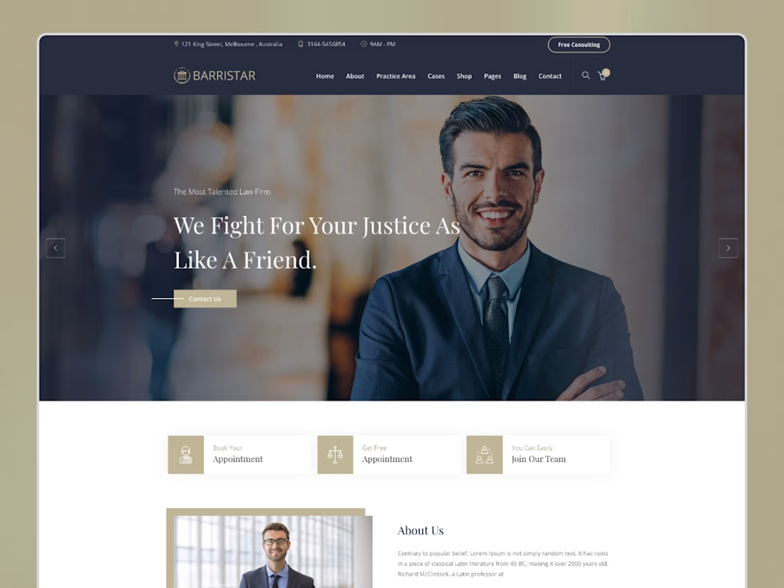
Meet Barristar – Law Firm & Lawyer Framer Template
A clean and professional Framer template designed for law firms, lawyers, attorneys, and legal consultants.
Showcase your practice areas, team, services, case studies, testimonials, and contact information with a modern and responsive design.
Built for Framer and easy to customize.
Barristar — A professional website for legal professionals.


The network for creativity
Join 1.25M professional creatives like you
Connect with clients, get discovered, and run your business 100% commission-free
Creatives on Contra have earned over $150M and we are just getting started








Related posts

New concept project: Keppel Motors
An editorial website for a vintage German car shop that doesn't exist. I invented the shop, the cars and the voice, then built the site for real.
A few things I focused on:
- All the photos were made with AI, using the same look throughout so they feel like one shoot.
- Smooth, simple animations that fit the brand, plus a loading screen that flows right into the homepage.
- I made sure it works on mobile as well and it's its own experience not just a shrunk-down version of a desktop site
Designed in Figma, built in Framer.
If you have a project in mind, I'd love to hear about it.


I designed and developed this landing page for Stereo Fest: Eclipse, the upcoming youth event for @caminodevida.
The visual concept comes from a simple truth: the moon has no light of its own, it only reflects the light of the sun.
In the same way, we weren’t made to generate our own light, but to reflect Jesus.
The cool part: as you scroll, you control the movement of the moon. Right at the core phrase, the eclipse happens, showing that in the darkness, the Glory of God is revealed.
Check it out here: stereofest.com

That's really special it feels like space war game landing page great job Misael🔥🔥🔥

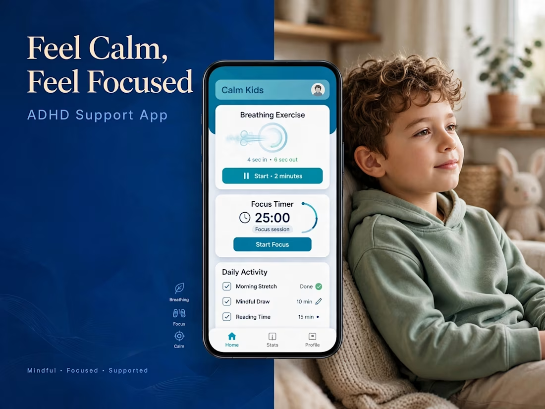
Feel Calm, Feel Focused — ADHD Support App
A simple and supportive platform for parents & practitioners to help children with ADHD build healthier daily habits.
Turning clinical framework into calm, friendly UX.
Focus on: Daily focus, mood check-in, routine tracking, parent insights.
The image grid does the explaining
Tool: Figma, Framer, Jitter
Built for calm, not chaos.

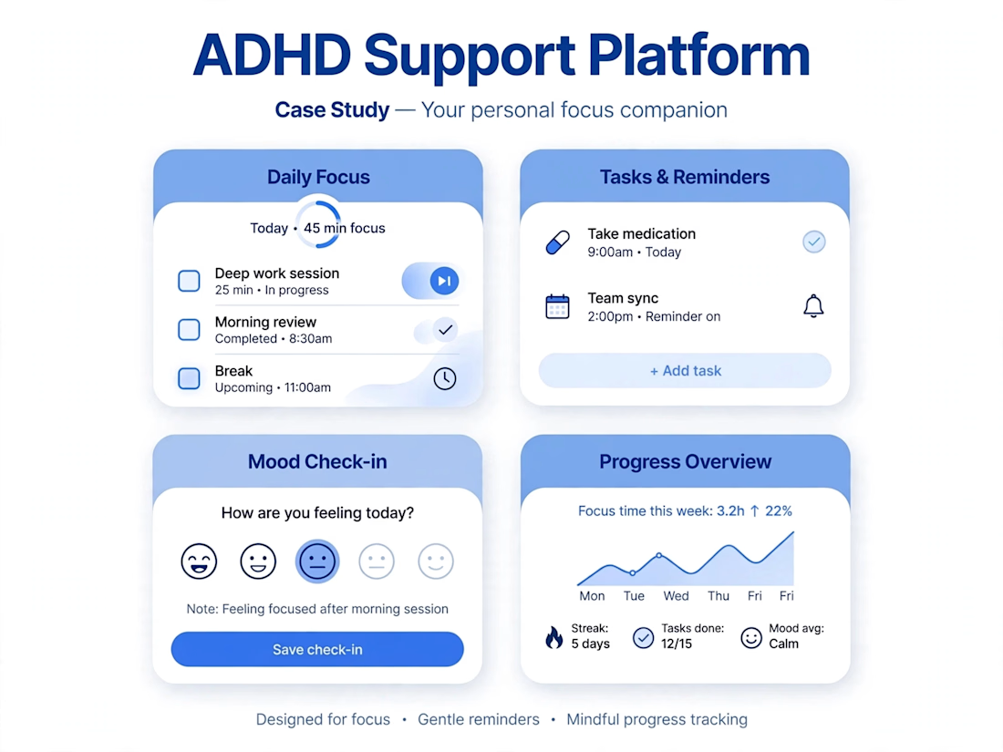

For the focus timer, I'd store the finish time so it doesn't drift when the app goes into the background. Should a session keep running when someone switches apps, or pause?


