The network for creativity
Join 1.25M professional creatives like you
Connect with clients, get discovered, and run your business 100% commission-free
Creatives on Contra have earned over $150M and we are just getting started
Back to feedPost
Client said: "It looks cheap."
It wasn't cheap. It was just off-balance.
Here's what I changed:
Tightened the spacing - M and S were floating apart
Matched the weight - S was thinner than M at small size
Fixed the gold - #D4AF37 on black, #B8963E on white
Same letters. Same idea. Now it looks expensive.
That's the difference between a logo and a brand.


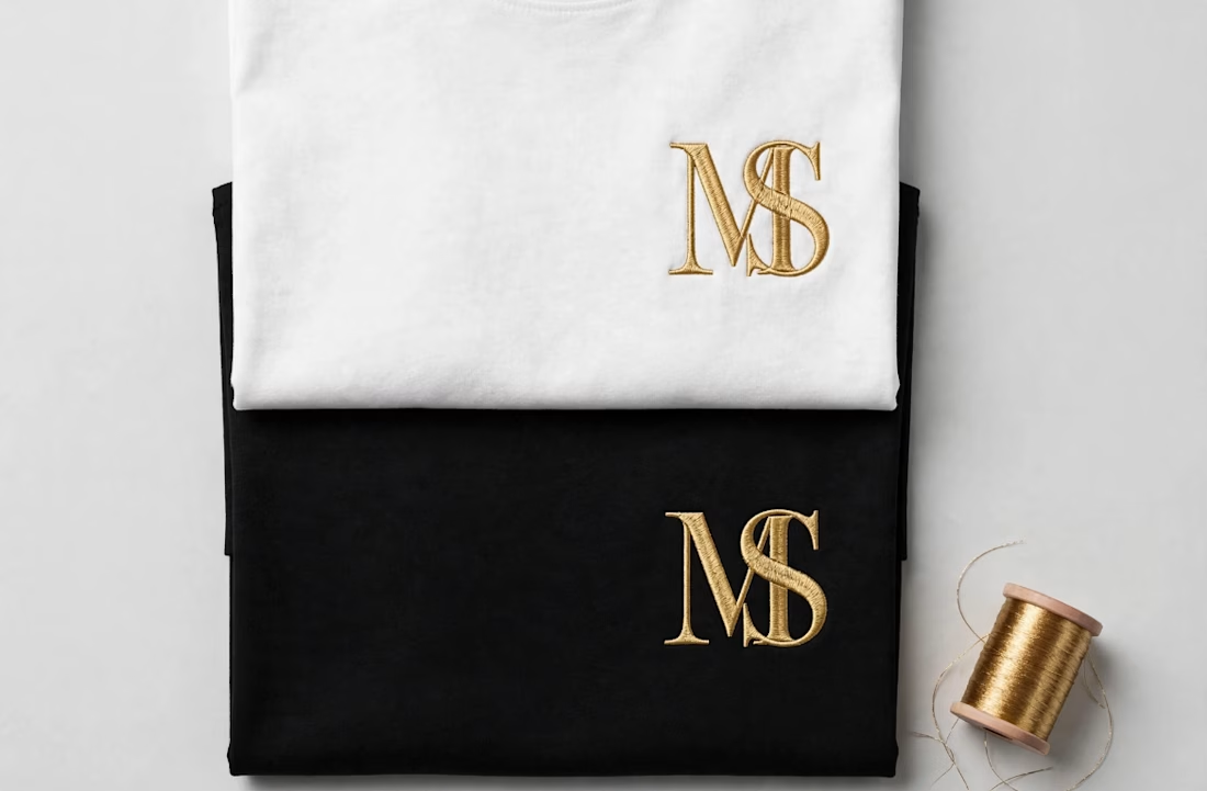

Small spacing tweaks go far.

Exactly! That was the whole fix. Most people think they need a new logo, but it's usually just 2-3px of spacing and matching the weight. Thanks for spotting it 🙏
The network for creativity
Join 1.25M professional creatives like you
Connect with clients, get discovered, and run your business 100% commission-free
Creatives on Contra have earned over $150M and we are just getting started





Related posts




Why do logos look uneven even when they have the same size?
Every logo has a different shape, proportion, and visual weight. A wide wordmark can appear smaller than a compact symbol, while a bold logo may dominate a thinner one - even when their dimensions are technically identical.
That’s why logo sections shouldn’t be aligned by numbers alone.
Adjusting each logo optically, using a consistent visual area, balanced spacing, and a shared baseline helps every brand feel equally represented.
The goal isn’t to make every logo exactly the same size.
It’s to make them feel equally important.
Because visual consistency is based on perception, not just pixels.
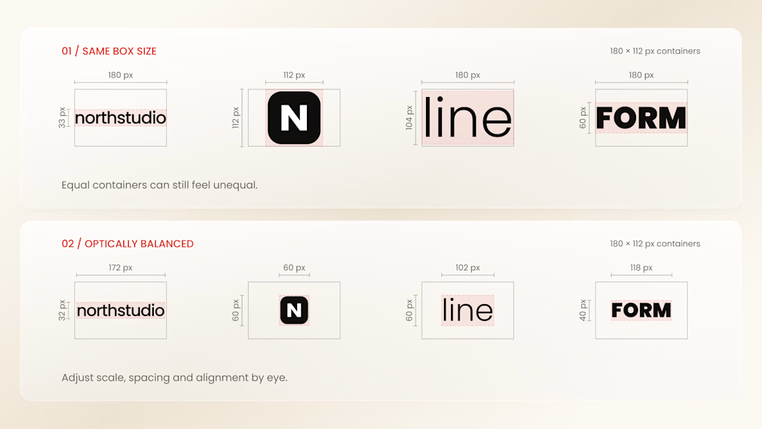


Thanks for the information you shared

Need a second pair of eyes 👀
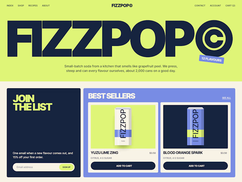
I'm designing the online store for FizzPop, a craft soda brand: all-natural sodas, sparkling waters and botanical tonics.
Flower Fizz(A): eggshell, tiger orange and deep ultramarine, with flower shapes and stacked colour swatches for the flavours
Corner Shop(B): lime, soft blues and navy, editorial layout with a giant wordmark and menu-style flavour tiles
38 voted
44%
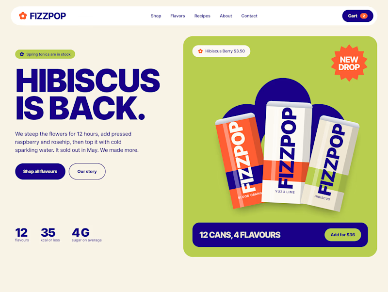
48 voted
56%
86 votes
Closed
