The network for creativity
Join 1.25M professional creatives like you
Connect with clients, get discovered, and run your business 100% commission-free
Creatives on Contra have earned over $150M and we are just getting started
Back to feedPost
Taste Test

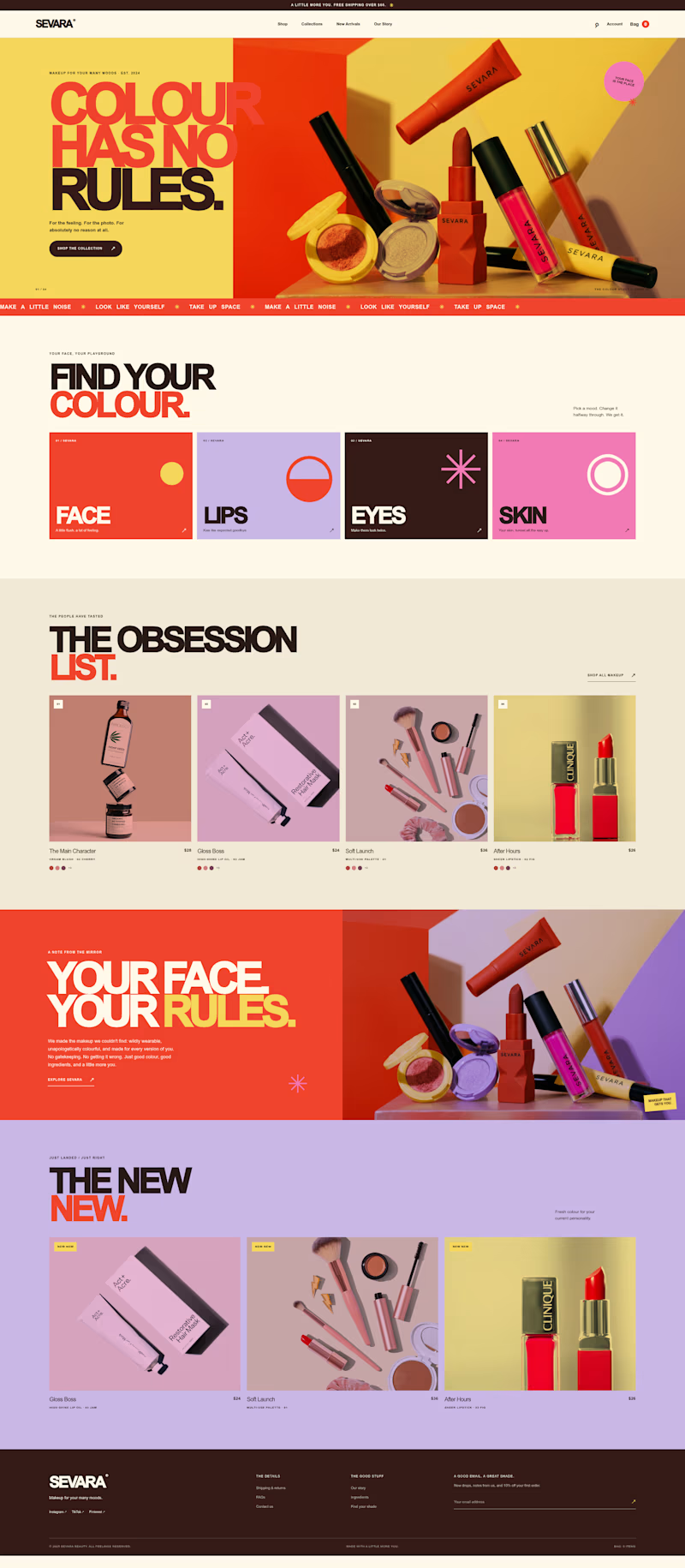
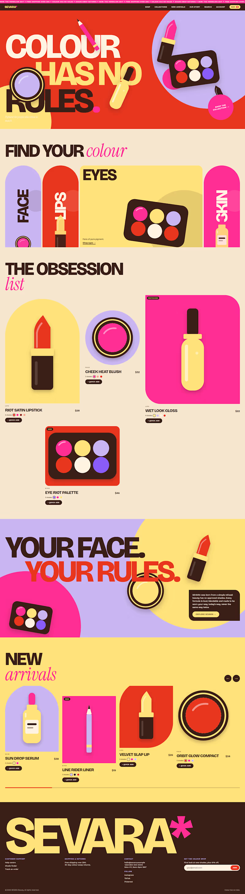
I explored two different visual directions for SEVARA, a bold beauty e-commerce landing page concept built around "Colour Has No Rules":
🅰️ Option A (Editorial & Photography-Driven): Structured split-screen grids, real product studio photography, and clean e-commerce cards.
🅱️ Option B (Playful & Illustrative): Custom flat vector cosmetics, asymmetric geometric framing, and interactive category accordions.
Same brand palette, totally different vibe. Which direction works better for a modern cosmetics storefront? 👇
Poll Options:
Option A — Clean Editorial & Real Photography
Option B — Playful Illustrations & Asymmetric Grids


1 vote
Ends in 1d
The network for creativity
Join 1.25M professional creatives like you
Connect with clients, get discovered, and run your business 100% commission-free
Creatives on Contra have earned over $150M and we are just getting started



Related posts


Which brand showreel preview design would you choose - Silver & Ropes or Purple Stones? ⚡
Lynksen is cooking something fire...
and we need your expert eyes on this one 🔥😎
Vote and tell why! 👇


12 voted
24%
37 voted
76%
49 votes
Closed

Going with Purple Stones. It feels more distinctive and memorable for a showreel, Silver & Ropes is clean but a bit safer.

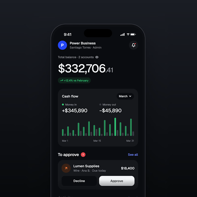
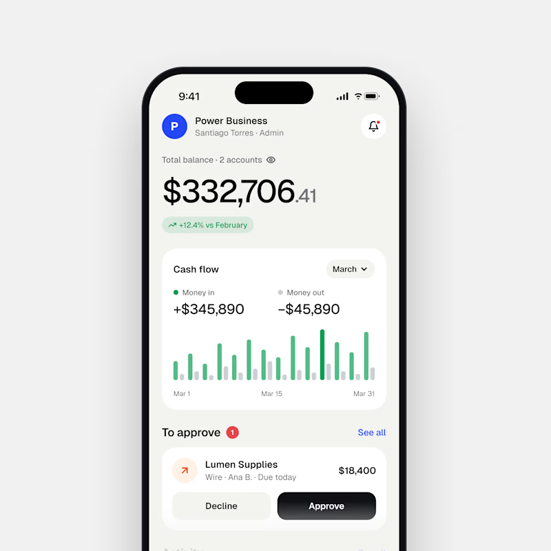
Dark Mode 🖤 or Light Mode 🤍?
Which one matches your vibe? 👀
15 voted
54%
13 voted
46%
28 votes
Closed

Both are nice clean designs...for me,Dark mode!

Portfolio update: I couldn't decide on a look, so I built both.
A or B? manucabezas.com

11 voted
69%
5 voted
31%
16 votes
Closed

dev mode on dark looks 👌🏻✨