The network for creativity
Join 1.25M professional creatives like you
Connect with clients, get discovered, and run your business 100% commission-free
Creatives on Contra have earned over $150M and we are just getting started
Back to feedPost

VERUM — Logo design
Two letters. One door.
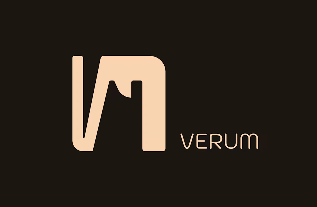
VERUM begins with a V and ends with an M. The mark joins them into a single form: the V's left stem and diagonal flow straight into the M's arch. The whole name, held in one shape.
Look at the negative space. Between the letters, a doorway opens, topped with a pitched roof. For a real estate and interior studio, the brand quite literally invites you in.
How it was built
→ One corner radius, repeated across every curve. The mark feels calm and engineered, never decorated.
→ A heavy monogram paired with a light, wide monoline wordmark. The contrast gives it presence without noise.
→ Two colours only: warm sand on deep brown. The palette of materials, not trends.
Why it holds its own
→ Recognisable at 16px as a favicon and at 3 metres on a façade.
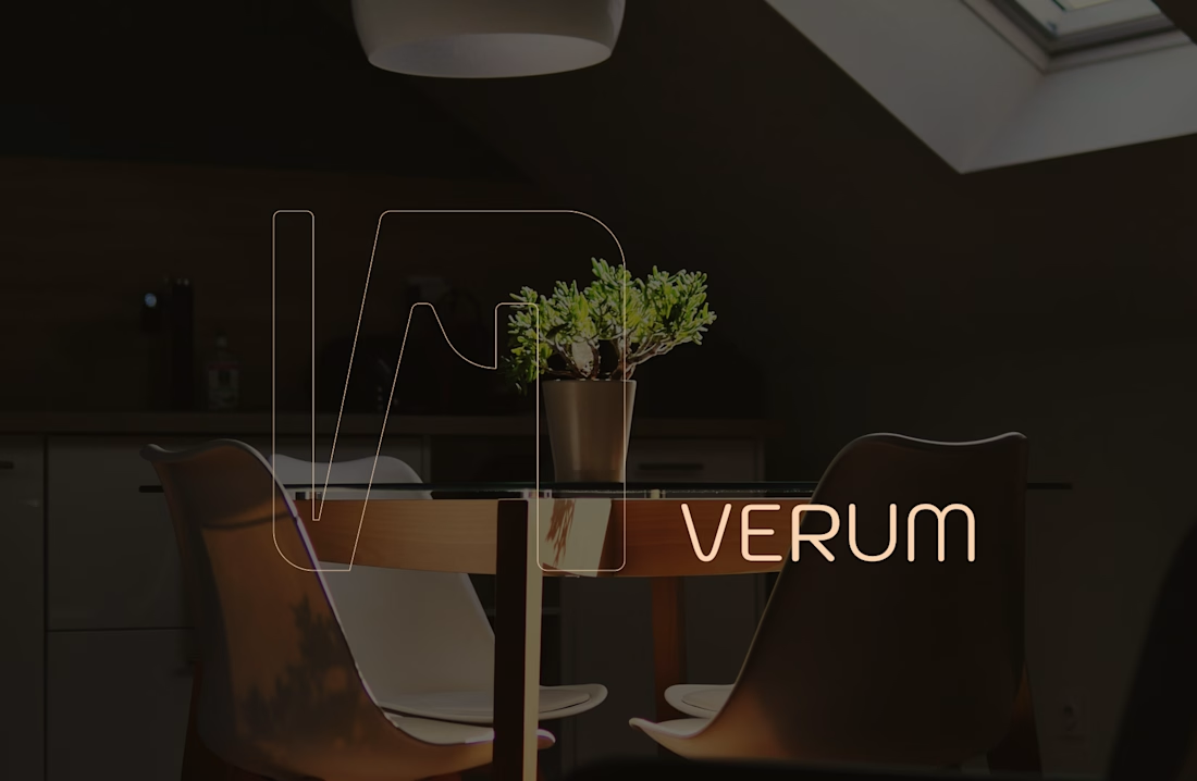
→ Works solid, reversed or as a single hairline over photography.
→ Quiet enough to sit beside the biggest names in the industry, distinct enough not to disappear among them.
Strong brands don't shout. They're simply unmistakable.

The network for creativity
Join 1.25M professional creatives like you
Connect with clients, get discovered, and run your business 100% commission-free
Creatives on Contra have earned over $150M and we are just getting started
Related posts


Keeping the Halloween-inspired concepts coming! 🕯️✨
This time, we're sharing Ovelle — a luxury candle e-commerce website with warm tones, elegant typography, and a moody editorial aesthetic. Would love to hear your thoughts! 🎃




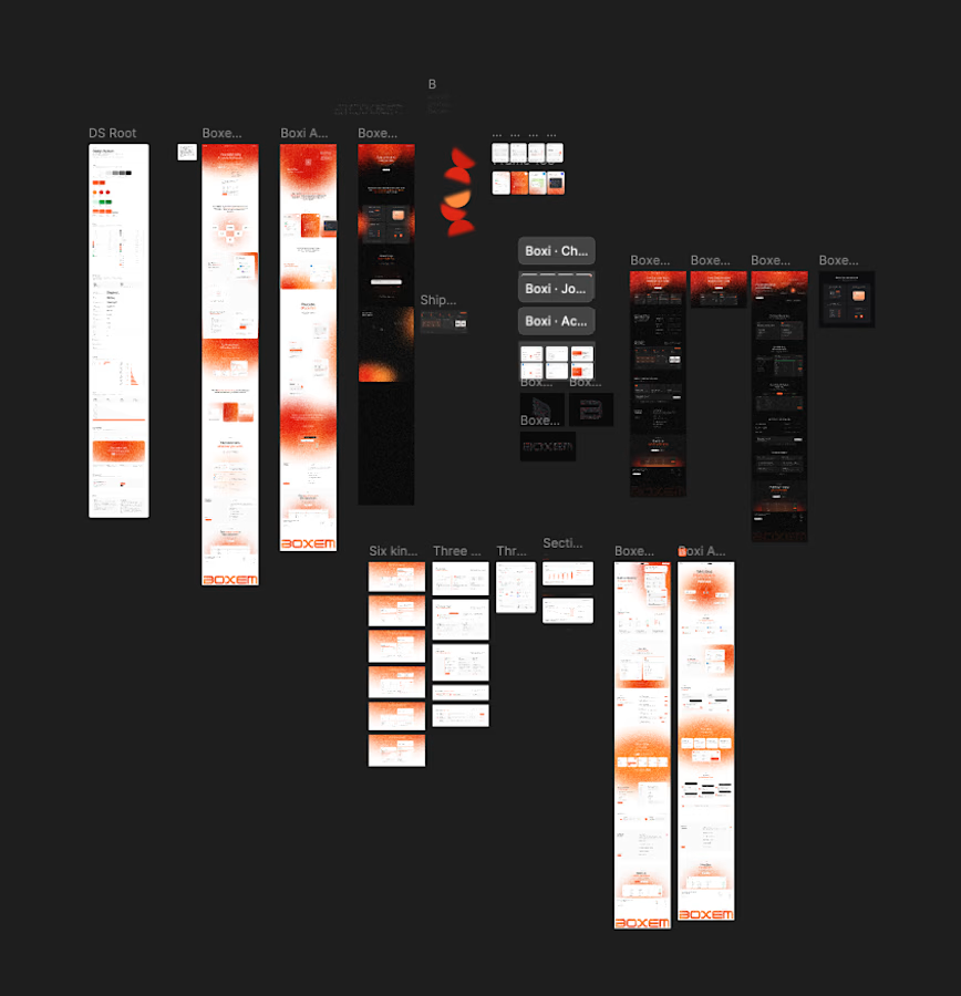
3 Page landing btw. Somehow ended up with dark versions, light versions, a whole DS and like 6 card explorations.
Is this overexploring or is this just the job? Genuinely asking. 🧠

Man, this is wonderful and modern


