The network for creativity
Join 1.25M professional creatives like you
Connect with clients, get discovered, and run your business 100% commission-free
Creatives on Contra have earned over $150M and we are just getting started
Back to feedPost
Taste Test

Reworked and refined the motion of an existing character animation of a company.
I spent time on the little things that are not really 'visible' but make a character feel more alive.
the pupil has a subtle pseudo curved effect using Rive path scripting. There’s a slight delay between the tilt, a bit of squish. You might not consciously notice these details, but they make a difference in how expressive the character feels.
(disney's principles are timeless)
what do you guys think : D
9 votes
Ends in 1h

After absolutely is better and more alive 🎉🔥


the slight delay on the pupil is the whole difference, after version wins for me

"After" looks way better. The tiny squish and bouncy delay make the character feel happy and alive instead of stiff.
The network for creativity
Join 1.25M professional creatives like you
Connect with clients, get discovered, and run your business 100% commission-free
Creatives on Contra have earned over $150M and we are just getting started

Challenges
View all


Related posts




A feels more professional ❤️

My first preloader code component for Framer became a huge hit and ranked #1 in the paid Loaders category on the Framer Marketplace. I received so many sales from it in just a few days, so I decided to create another one.
As usual, I packed multiple options into a single code component. This time, you can choose from 4 different preloader styles.
These are 2 of the 4 options. Which one is your favorite? Check out the live preview here
14 voted
50%
14 voted
50%
28 votes
Closed

Wave on image is svg filter ?


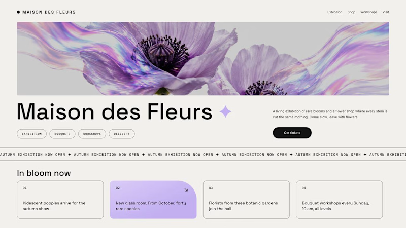
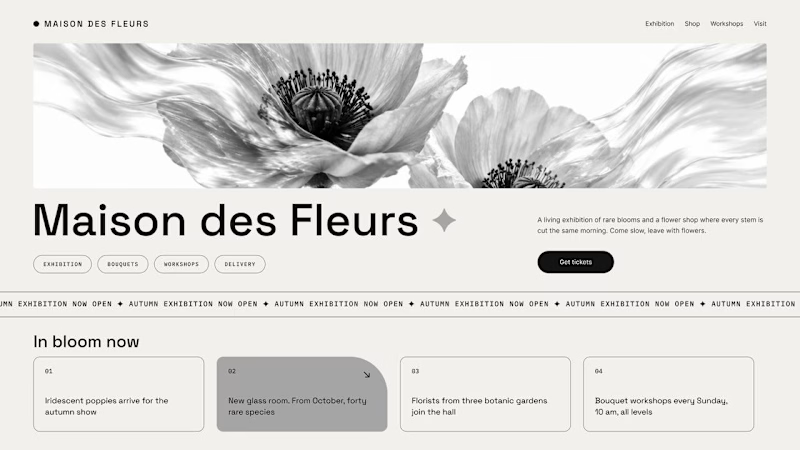
Should a flower shop ever go black and white?
Same flower house, same layout. We only took the color out.
1. Full color. The iridescent petals do the selling: lilac, pink, a little shimmer. The photo is the brand, and every accent on the page borrows from it.
2. Monochrome. No color at all. Shape, texture and typography have to carry everything, and the page suddenly reads like a gallery catalogue.
Color sells the flower. Monochrome sells the exhibition.
Which one would get you through the door?
67 voted
91%
7 voted
9%
74 votes
Closed

The problem with monochrome is that, throughout computer history, it has conditioned users to associate gray and monochrome with being disabled, dysfunctional, or something to ignore and avoid.