The network for creativity
Join 1.25M professional creatives like you
Connect with clients, get discovered, and run your business 100% commission-free
Creatives on Contra have earned over $150M and we are just getting started
Back to feedPost
Taste Test

🦁Two LED sign mockups for a geometric lion shield logo, same dark gaming room, same backlit wall mount, same angular lion mark. Two different color treatments that completely change the energy.
Which one's going behind your chair? 👇

19 voted
42%
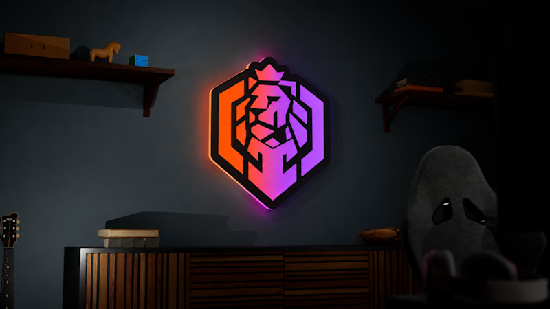
26 voted
58%
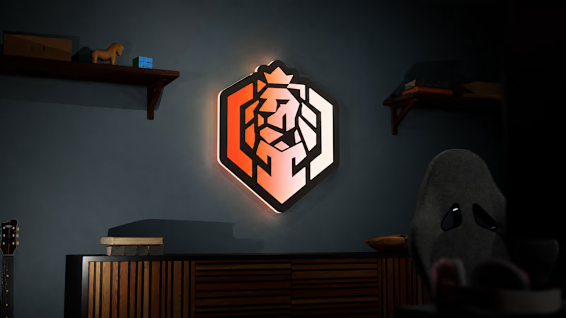
45 votes
Closed

Warm fade for me. 🦁 The amber tones feel bolder and more premium.
Thanks Farook!

Neon gradient reads more like a statement piece behind a gaming setup, warm fade feels more livable day to day. Genuinely torn. Did the client already have a vibe in mind, or are they letting the room decide?

Warm fade, for a contrarian reason: most gaming rooms are already swimming in purple-blue RGB, so the neon version melts into the ambient light around it. The amber reads as its own object in that space, and it flatters the gold in the lion's geometry instead of fighting it.

warm fade has a stronger identity, imo!


the lion shield looks strong. warm fade gets my vote

warm fade for me

Fade does it for me, it's cleaner and more premium!! 🔥

Awesome!


which one did the client pick?

Neon Gradient for me. That purple glow against the dark room hits different, especially for a gaming setup.

Neon gradient is good

For a dark gaming room I’d definitely go with purple - this color just instantly feel digital and gaming to me 🎮

the one with the purple and orange shade btw both look premium


Neon one looks good.

Warm Fade gets my vote. The warm tone sits better in the dark room and the shield reads clearly at a glance. Neon Gradient has energy but competes with the mark.


Nice work!

Neon gradient for me. Love it
The network for creativity
Join 1.25M professional creatives like you
Connect with clients, get discovered, and run your business 100% commission-free
Creatives on Contra have earned over $150M and we are just getting started

Challenges
View all


Related posts


So excited to see Creative Intelligence 2026 by @Contra Labs out in the world!
At @Heed Collective , we had the pleasure of designing both the website and the report. We’re incredibly grateful for this collaboration!
Our creative exploration started with a question:
What does Creative Intelligence mean today?
We believe it lives at the intersection of creativity and analysis, imagination and insight.
We translated this into a visual story that begins in space — vast, dreamy, full of possibility — and gradually moves closer to Earth, grounding imagination in something tangible and human.
Huge congrats to the whole team, @Erin Horner, @Ben Huffman, @Mark Vassilevskiy, @Alex Karpodinis, @Stacy · Heed Collective, @Heed Collective , and the entire @Contra Labs team 👏


Incredible work, congrats!


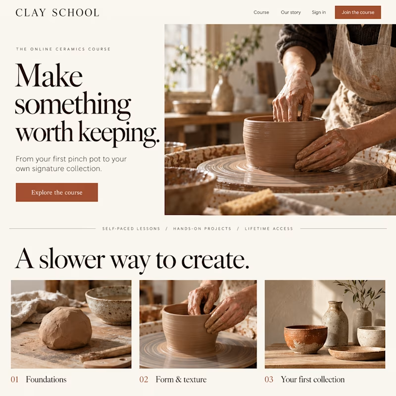
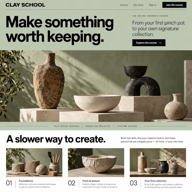
Which design would make you more likely to join this ceramics course?
Two new AI-generated Kajabi landing-page concepts for Clay School: warm editorial or modern gallery. Same course, two different directions. Pick your favorite below.

18 voted
46%
21 voted
54%
39 votes
Closed

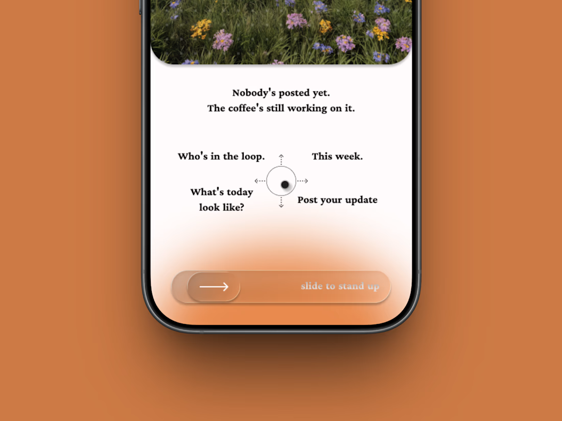
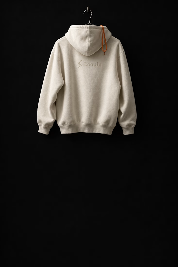
The 9am standup, replaced by a thumb.
Loopin (a self intiated project): brand, campaign, merch, app and site for an async standup tool that arrives at 7am and asks you to slide to stand up.