The network for creativity
Join 1.25M professional creatives like you
Connect with clients, get discovered, and run your business 100% commission-free
Creatives on Contra have earned over $150M and we are just getting started
Back to feedPost

Working on new brand identity
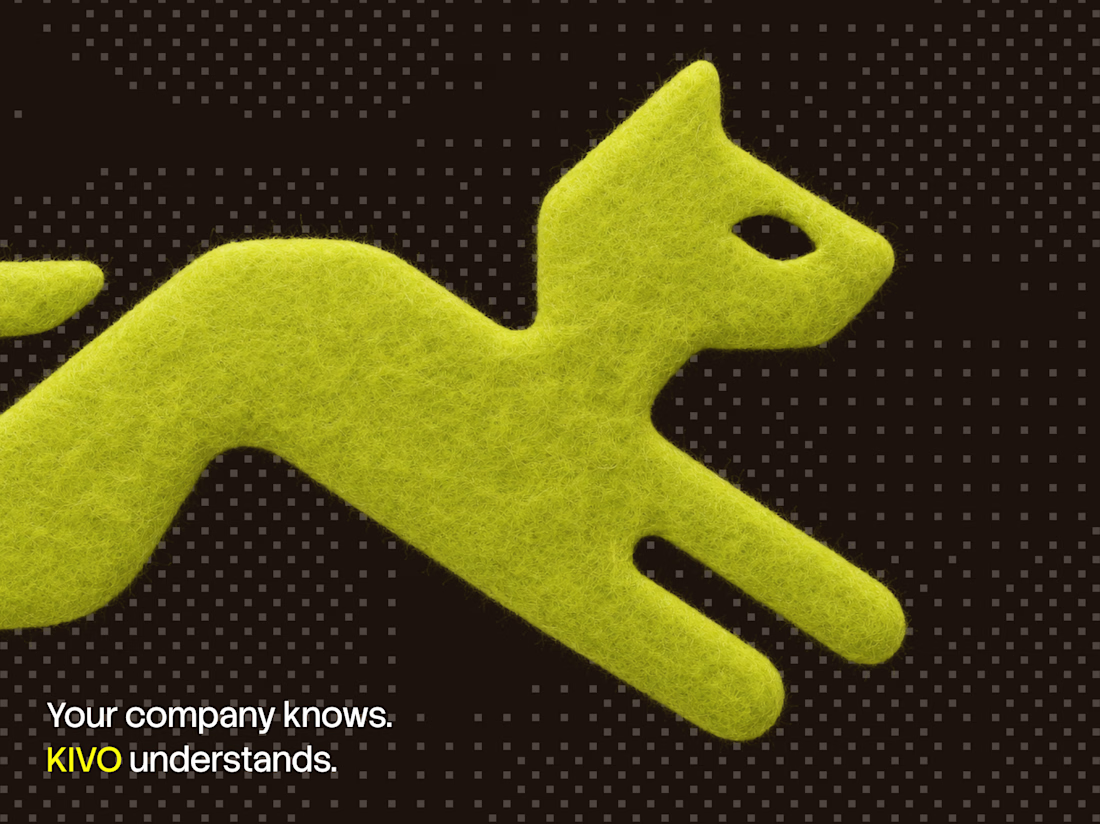

love the textural element here.
The network for creativity
Join 1.25M professional creatives like you
Connect with clients, get discovered, and run your business 100% commission-free
Creatives on Contra have earned over $150M and we are just getting started







Related posts

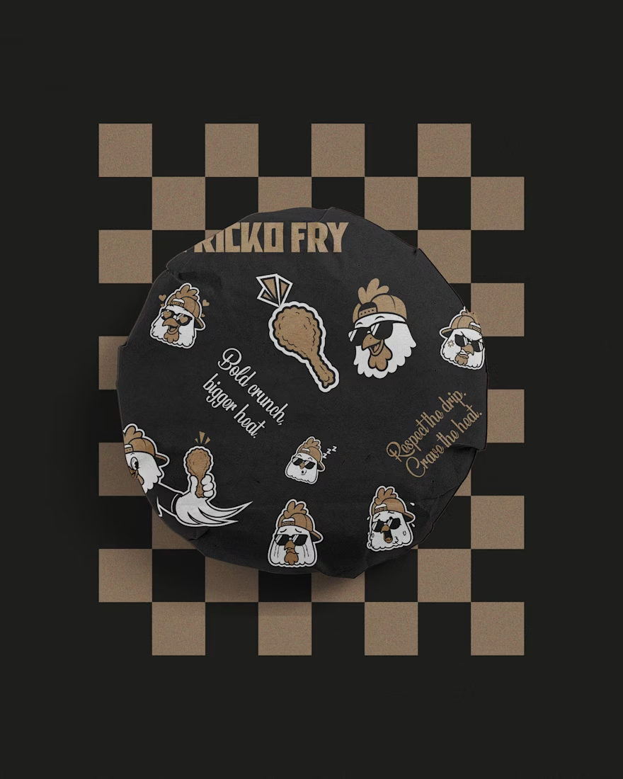
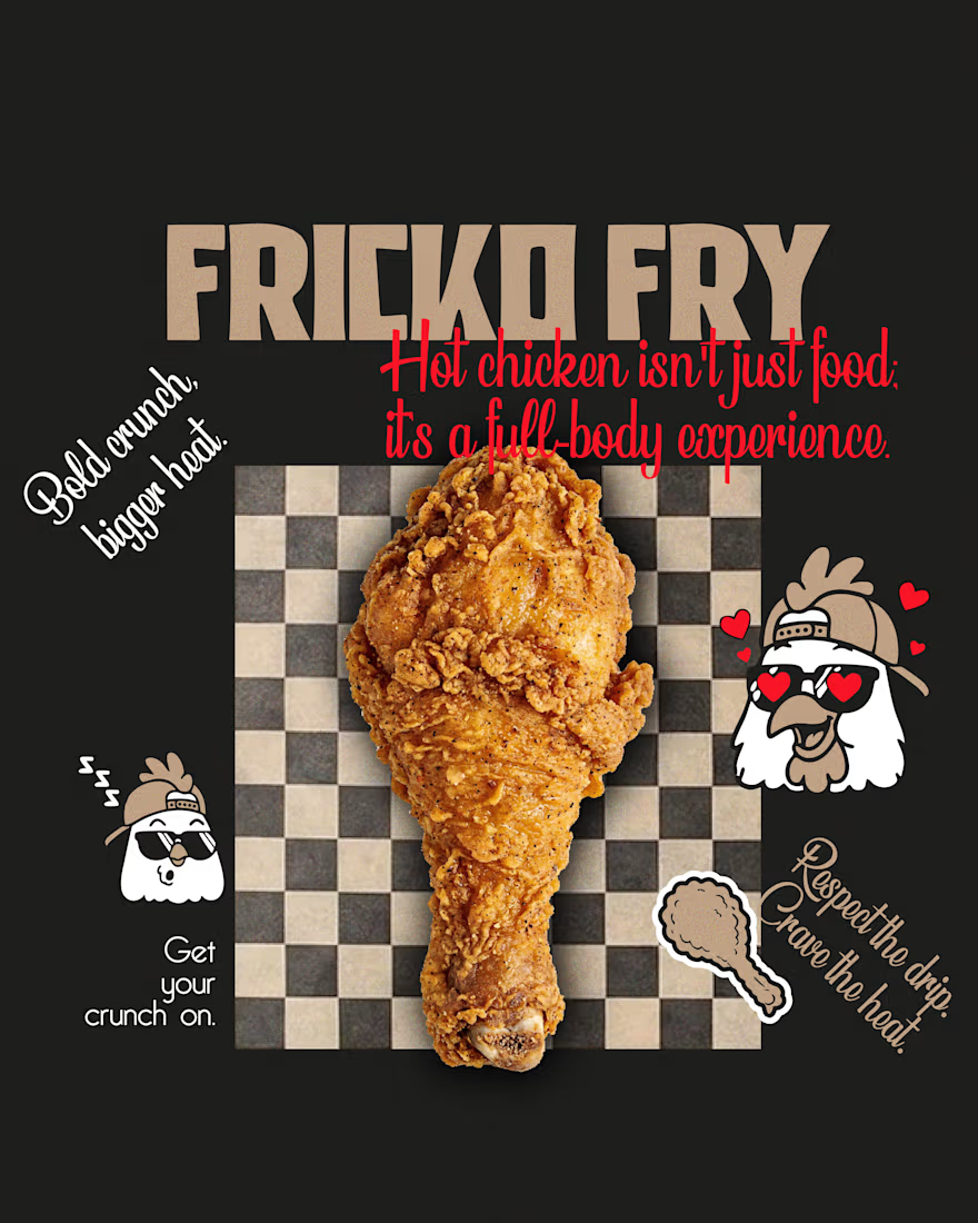
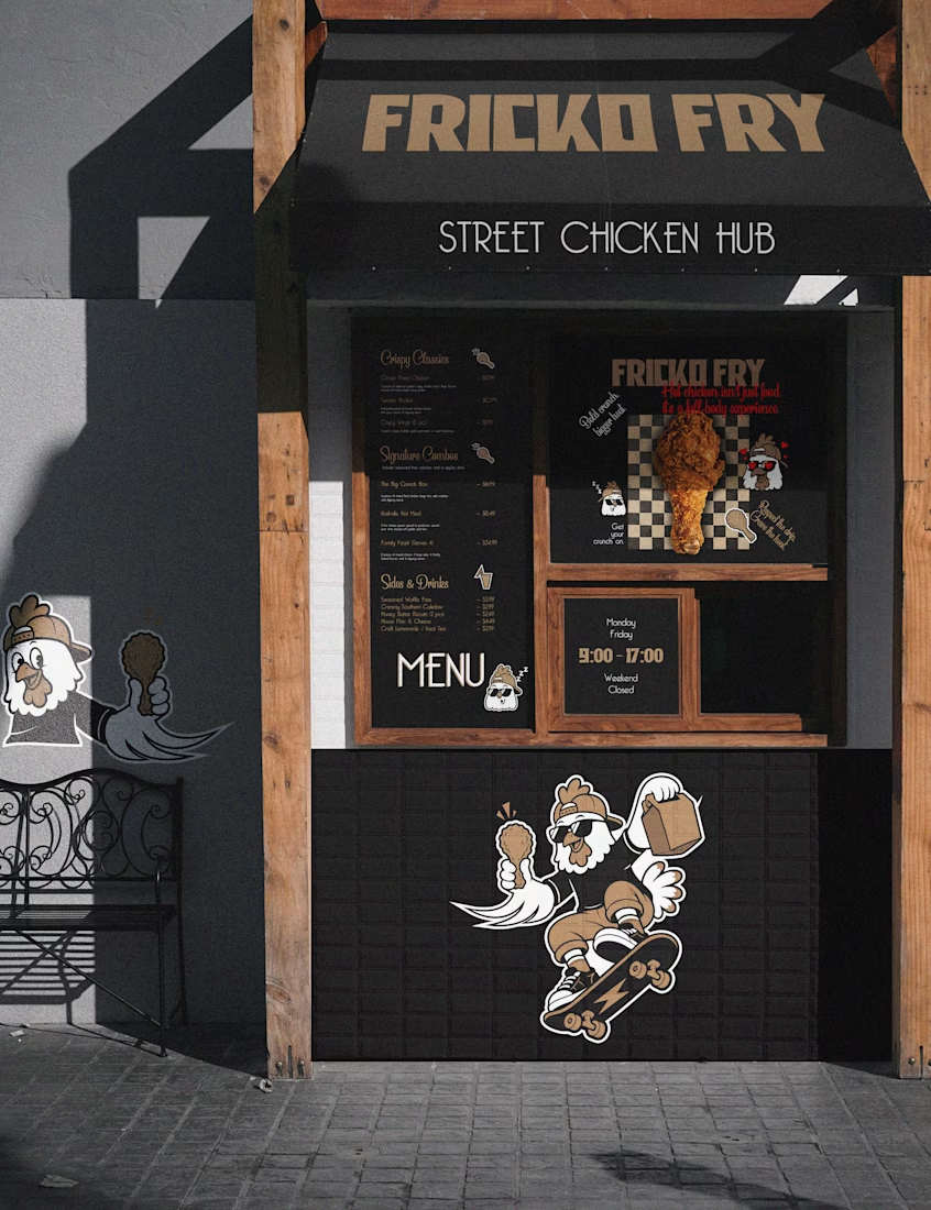
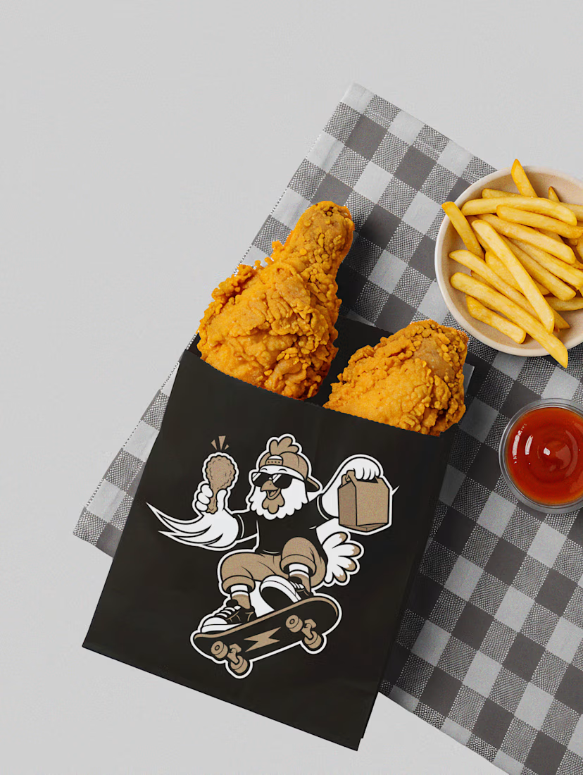

The whole identity feels fun and distinctive.

I've got one open spot. 👀
Starting October, I have room for one new brand. Two ways we can work together:
🎨 Brand identity
Logo, colors, type, the whole feel. For brands that are done blending in.
📱 Social media on retainer
Monthly posts that look and sound like you, so you can stop stressing about what to post.
My sweet spot? Brands that are a little weird, a little bold, and don't want to look like everyone else in their feed.
If that's you send me a quick message
Only one spot, so first come, first served.
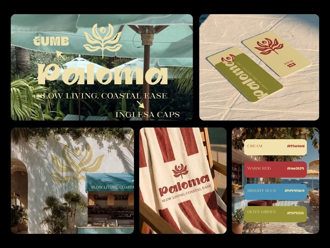
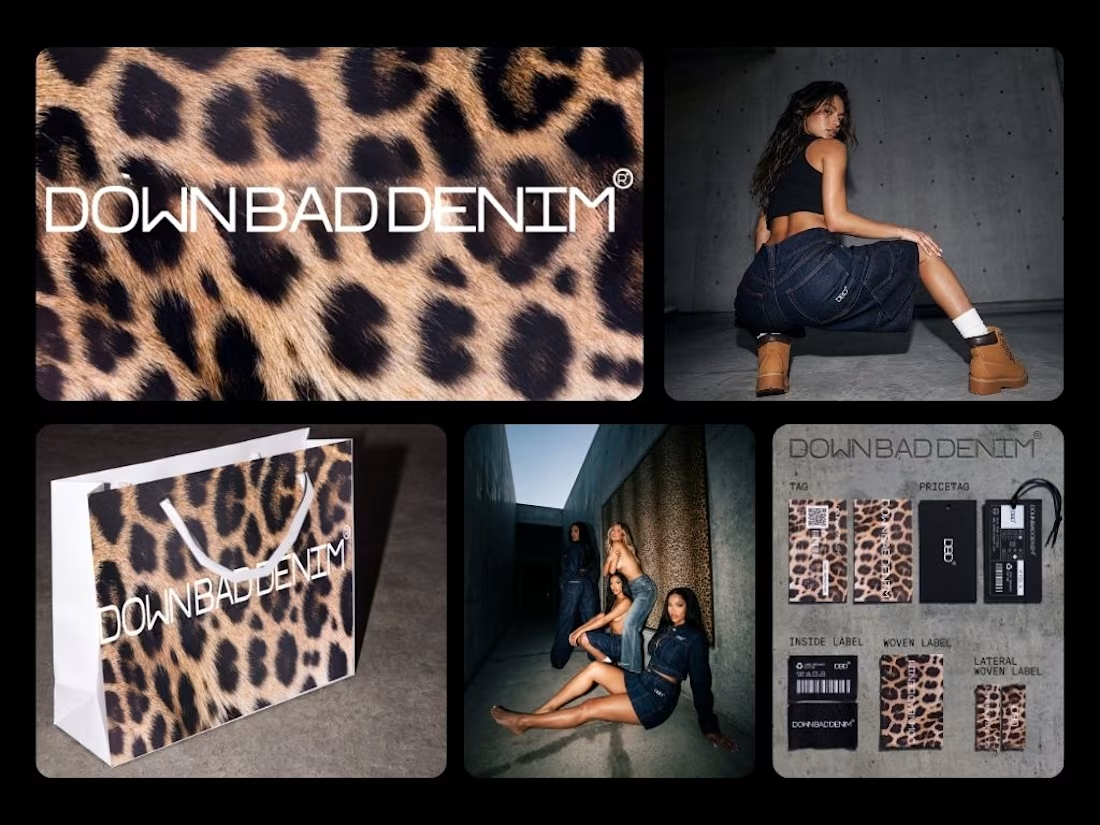


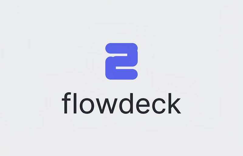
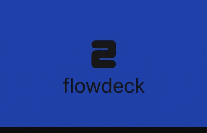
FlowDeck Logo Refinement — Which Direction Feels Stronger?
I’m exploring two visual directions for a developer-focused brand identity and would love some design feedback.
Option A: Blue + Black + White
A higher-contrast direction designed to give the identity more flexibility across light and dark interfaces.
Option B: Blue + Black
A more restrained direction with a simpler, more focused color system.
I’m evaluating both based on visual balance, versatility, scalability, typography, and how well the identity could work across a developer product and its marketing materials.
Which direction would you choose — A or B?
I’d especially appreciate feedback from designers on the color system, logo balance, and overall brand feel.
4 voted
100%
0 voted
0%
4 votes
Closed

Option A..Black which is a very deep color cannot work well on a Dark blue also.
Weldone