The network for creativity
Join 1.25M professional creatives like you
Connect with clients, get discovered, and run your business 100% commission-free
Creatives on Contra have earned over $150M and we are just getting started
Back to feedPost

Kit builder design for safety gears company


The network for creativity
Join 1.25M professional creatives like you
Connect with clients, get discovered, and run your business 100% commission-free
Creatives on Contra have earned over $150M and we are just getting started
Challenges
View all


Related posts

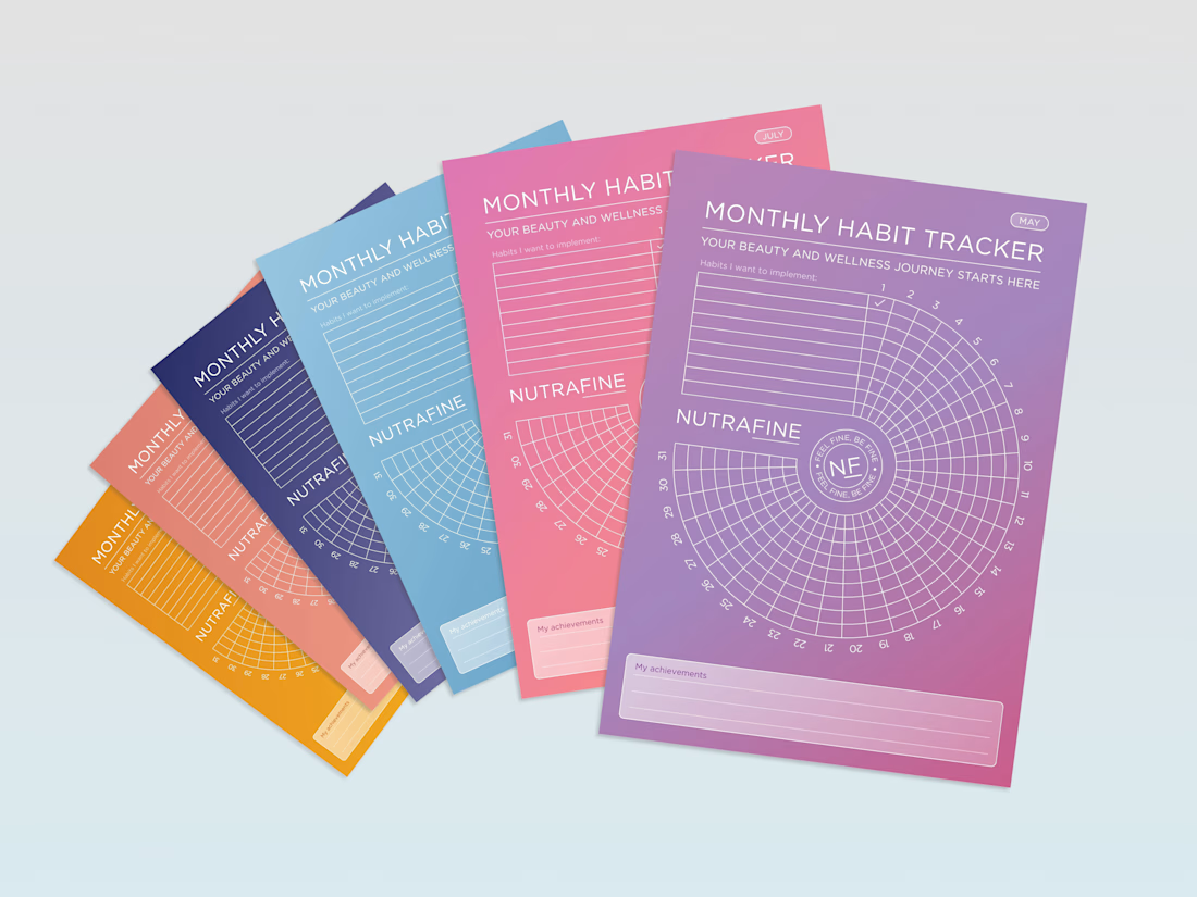
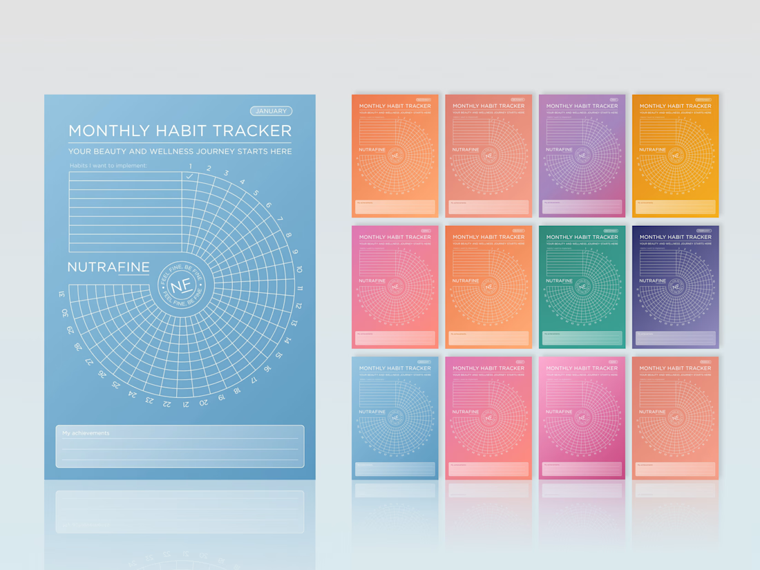
Can a habit tracker feel like a brand experience, not just a table?
For Nutrafine’s corporate gifting, each month is tied to one SKU, using the same colour as its packaging. It’s more colour than I would usually choose, but the depth of the palette, white linework and typography make the system hold together.
The bigger idea was to make the tracker itself feel less expected. Instead of a grid, we built a spiral, turning a practical tool into something more playful, memorable and distinctly Nutrafine.
#BrandDesign #CorporateGift #WellnessBranding #BrandExperience #CreativeDirection



Love these!


New Case 🙈
This time it’s BUDOVA — a next-gen real estate platform we designed from the product UX to the full brand identity and visual system.
Would love to hear what the Contra community thinks — what stands out to you most in this direction: Product Demo or Product Overview?

16 voted
41%
23 voted
59%
39 votes
Closed

PRO Design 😍

An experiment exploring how to visually communicate design impact through a draggable before/after slider. Built to test the interaction and motion feel of scrubbing between two states of a design, it uses a small format to show transformation at a glance 😊


The compact format is doing a lot of work—the draggable reveal makes the improvement immediately legible, while the consistent card rhythm keeps the comparison easy to scan.