The network for creativity
Join 1.25M professional creatives like you
Connect with clients, get discovered, and run your business 100% commission-free
Creatives on Contra have earned over $150M and we are just getting started
Back to feedPost

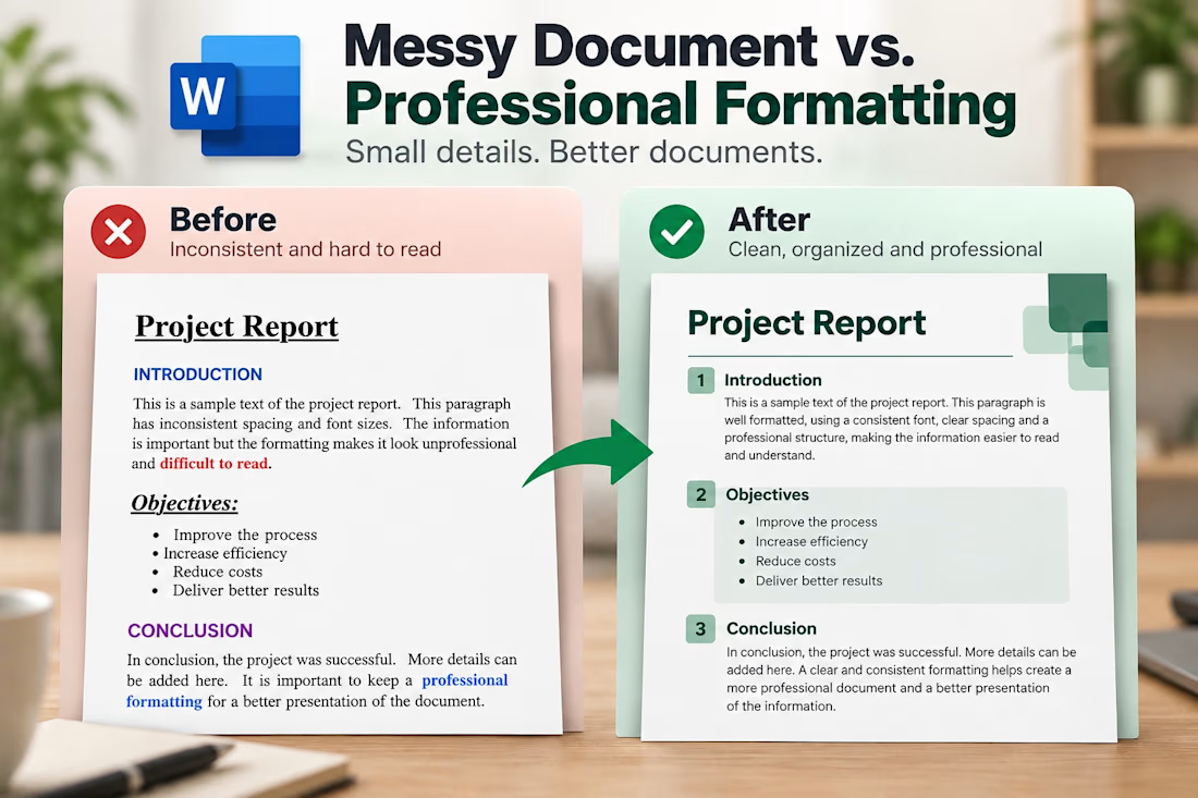
📋 5 Common Document Formatting Mistakes That Make Files Look Unprofessional
A document can contain great information and still look unprofessional because of poor formatting 📄
Here are 5 common mistakes to avoid:
🔤 1. Inconsistent fonts
Use consistent fonts and sizes to create a clear visual hierarchy.
📏 2. Irregular spacing
Keep margins, paragraph spacing, and alignment consistent.
🗂️ 3. Poor heading structure
Use clear headings to make information easier to navigate.
📊 4. Messy tables
Align content properly and keep column widths consistent.
🎨 5. Too much formatting
Avoid excessive colors, borders, and bold text. Keep it clean and readable.
✨ Remember: Professional formatting isn't just about appearance. It makes information easier to read, understand, and use.
Which of these mistakes do you see most often?


The network for creativity
Join 1.25M professional creatives like you
Connect with clients, get discovered, and run your business 100% commission-free
Creatives on Contra have earned over $150M and we are just getting started



Related posts

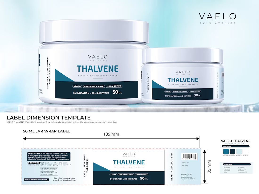
A client once sent me a dieline with the wrong measurements. I finished the design and sent it, and the printer returned the file. I fixed it and sent it again. Since then, I check the dieline before I start.
After 8 years of designing packaging and labels, I made THALVENE, a skincare jar and label concept, to show how I work: 50 ml and 30 ml jars, a lid label, a back label, and print-ready files with bleed and safe margins.
Has a printer ever sent your label file back? If you own a skincare or private label brand in the US or Europe and sell in online stores or on your own site, see the full case study in the first comment.
#SkincarePackaging #PrivateLabel #LabelDesign
skincarepackaginglabeldesignprivatelabelPackaging DesignBrand DesignGraphic DesignAdobe DimensionAdobe IllustratorAdobe Photoshop




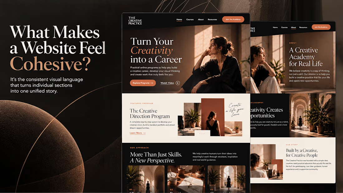
What makes a website feel cohesive?
It’s not just the colors.
It’s not just the typography.
And it’s definitely not about making every section look the same.
A cohesive website is built when every visual decision feels like part of the same story, from typography and imagery to spacing, buttons, cards, and even the smallest details.
The goal isn’t repetition.
It’s creating a visual language that people recognize and remember.
That’s when a website starts to feel like a brand, not just a collection of sections.

Well put, Serge. Consistent spacing, buttons and cards do more for that feeling than making sections match, and they are usually the first things to drift as a site grows.

Most “it feels off” is measurable.
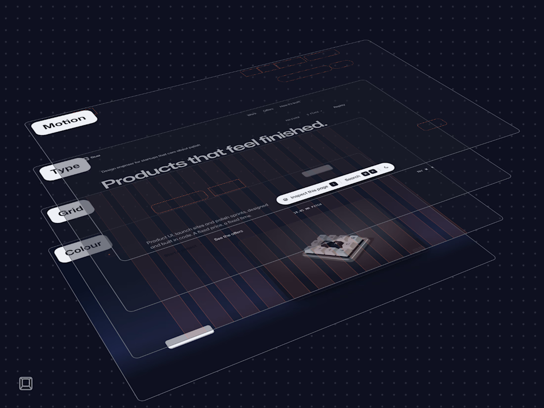
My site has an Inspect mode on every page. It takes the page apart into the four layers where polish lives, measured live in your browser:
Colour: every line of text against the colour actually behind it, with a margin over WCAG AA.
Grid: the columns and gutters, every edge on a 4 px step.
Type: one variable font, and nothing you read set under 16 px.
Motion: every control answers in 150 to 250 ms, and only transform and opacity move.
The same rules run in CI on every change, so a fix can’t quietly come undone. That’s the bar I bring to client work: numbers you can check, not “looks good to me”.