The network for creativity
Join 1.25M professional creatives like you
Connect with clients, get discovered, and run your business 100% commission-free
Creatives on Contra have earned over $150M and we are just getting started
Back to feedPost

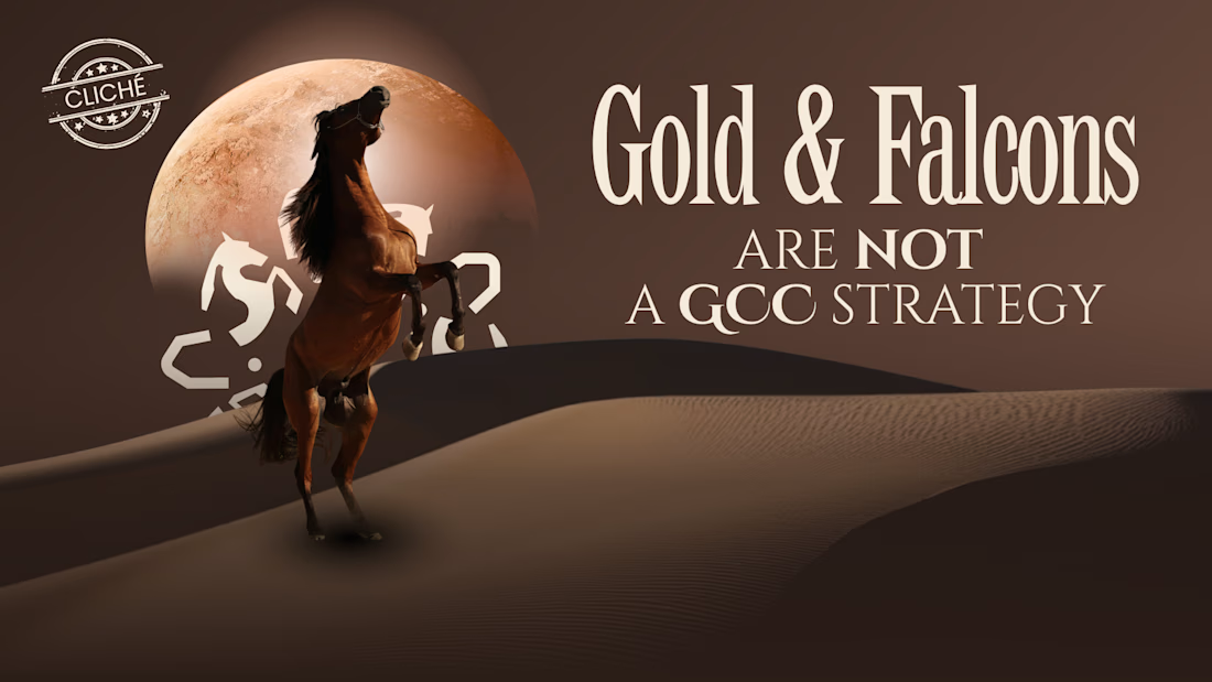
Gold, falcons, and a translated tagline aren't a GCC strategy. They're a global strategy wearing local props.
1. THE PROPS TEST
If the only thing that changed between your global deck and your GCC deck is the imagery, that's not localization. Swap gold for silver and it still says nothing different.
2. WHAT ACTUAL LOCALIZATION LOOKS LIKE
For a fashion week positioning project in Oman, the insight wasn't "add more heritage visuals." It came from an actual Omani proverb: "the one who rushes eats his soup raw." That's not decoration. That's the entire brand logic: fashion in the Gulf isn't rushed, it's earned.
3. THE FIT TEST
Decorated: "We adapted the deck for Riyadh."
Localized: "We built the deck around what the region already believes: patience is power, identity is non-negotiable, substance over spectacle."
A region doesn't need your brand translated. It needs your brand to actually believe something it already does.
The network for creativity
Join 1.25M professional creatives like you
Connect with clients, get discovered, and run your business 100% commission-free
Creatives on Contra have earned over $150M and we are just getting started







Related posts

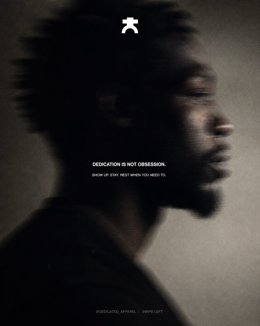
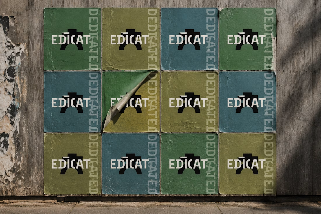
I took the face off the brand.
A square block on a shoulder bar. One arch for legs. No eyes, no smile, no pose.
Then I cut the wordmark down to EDICAT and let a single hard light do the rest.
Discipline isn’t a performance. It’s a stance.

this is such strong work & a brilliant concept to build, kudos to you!

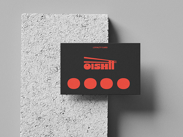
Ramen Brand Identity
Oishii is a self-initiated branding project exploring the visual identity of a modern ramen brand. The concept combines Japanese-inspired aesthetics with a contemporary visual approach, creating a distinctive and cohesive identity across brand applications.
The project explores visual direction, typography, colour, and brand elements to build a memorable identity for a food brand.


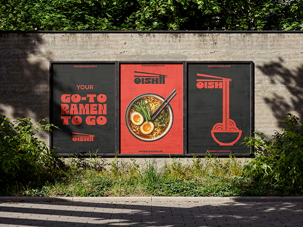
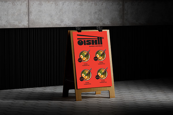
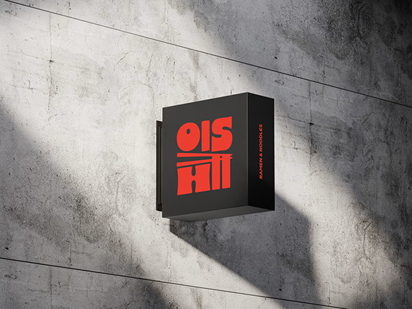


Love the mix of Japanese-inspired style and modern branding. The identity feels cohesive and memorable.

How do you brand a business that doesn’t fit into one box?
Dario Nuzzarello built a Studio that works across engineering, IT, strategy, and software. The challenge was creating a typographic identity that could bring all those disciplines together without limiting the brand to just one.
I wanted to avoid making it feel overly technical or cold. Since Dario’s work is highly custom and interdisciplinary, the identity needed to feel precise and structured while still being human and approachable.
Sometimes, the best solution is finding the right type, proportions, and details to make a name stand on its own.
What do you think about the final result?
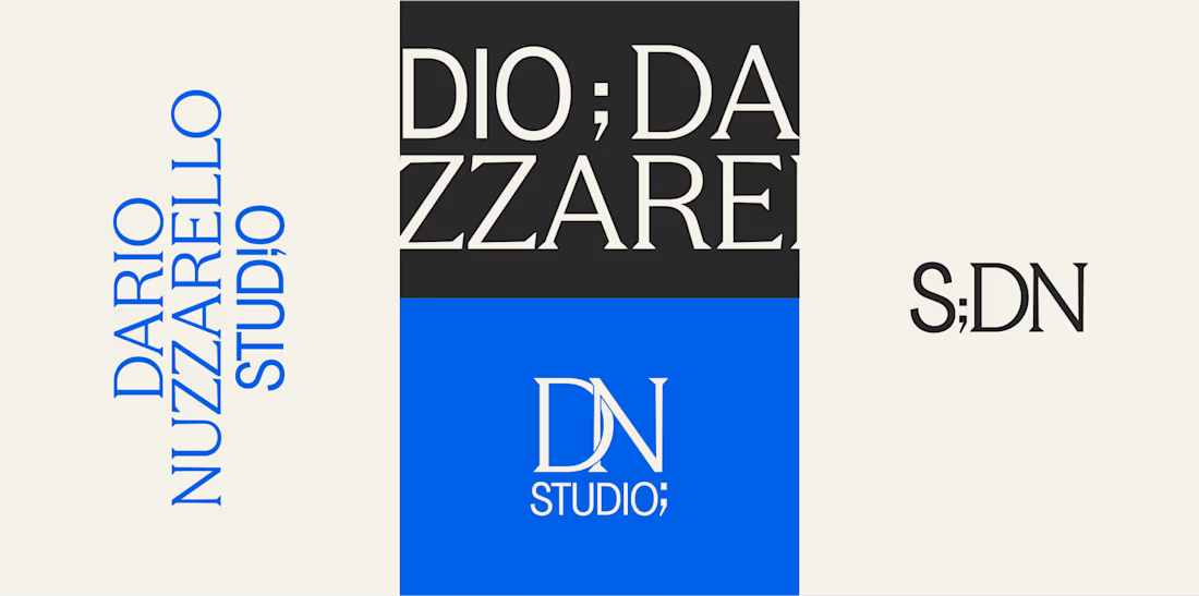

A studio that spans engineering, IT, strategy and software is a naming and typography problem more than a logo problem, so leading with type was the right call. Precise but human is a hard line to walk. Did Dario push for a symbol at any point?