The network for creativity
Join 1.25M professional creatives like you
Connect with clients, get discovered, and run your business 100% commission-free
Creatives on Contra have earned over $150M and we are just getting started
Back to feedPost

Flow box multi-mode switch is using the two-mode switch which is the light and dark plus two more mode from the brand palette, making them represent season too, this is made for client to have more control over there screen.


The network for creativity
Join 1.25M professional creatives like you
Connect with clients, get discovered, and run your business 100% commission-free
Creatives on Contra have earned over $150M and we are just getting started





Related posts

Take a vampire, a grim reaper and a bat for a midnight ride through a haunted town. Hold to boost over broken track, brake before the big hills, and grab candy to refill your boost. Push your luck too far and your passengers end up splattered across the screen.


Cute!!




Professional work


Building a pet SaaS hero
Soft visuals, bold typography, and a clear conversion path, designed to make the product feel as friendly as the pets it helps
Built in Framer
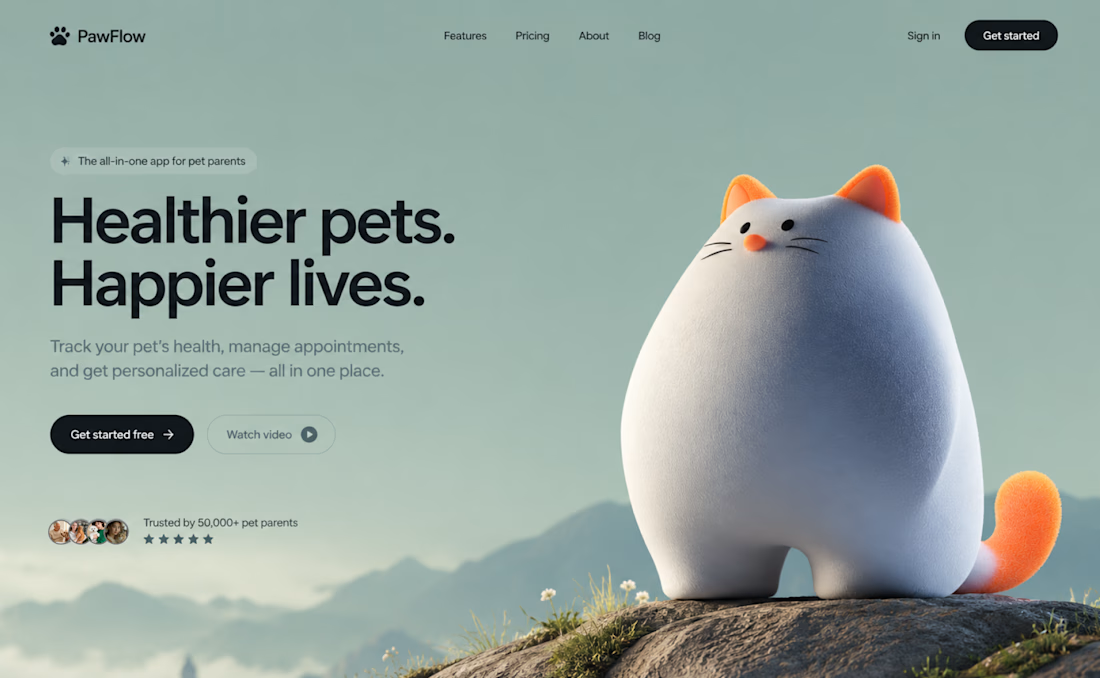

The dark CTA stands out against the soft sage background, even with the cat taking center stage. How are you handling the cat and headline on mobile: stacked or a tighter crop?