The network for creativity
Join 1.25M professional creatives like you
Connect with clients, get discovered, and run your business 100% commission-free
Creatives on Contra have earned over $150M and we are just getting started
Back to feedPost

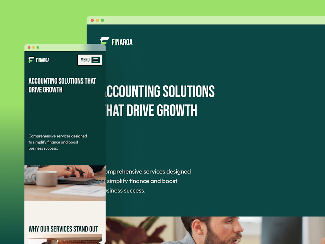
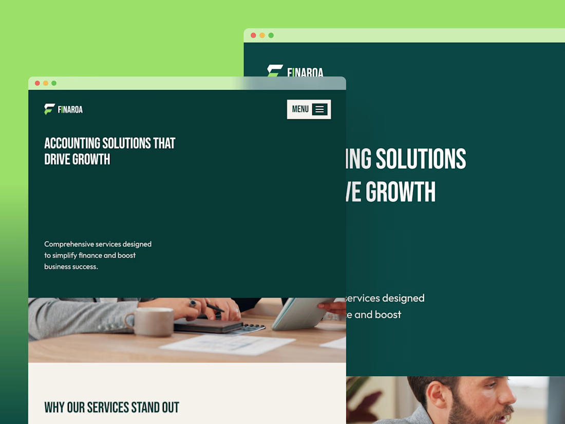
Make your financial brand feel clear, credible, and professional.
Finaroa helps finance-focused businesses present their services with confidence.
Get Finaroa FREE → https://framer.link/d9wkbm4

The network for creativity
Join 1.25M professional creatives like you
Connect with clients, get discovered, and run your business 100% commission-free
Creatives on Contra have earned over $150M and we are just getting started











Related posts

Good branding isn’t just about how a logo looks. It’s about what it represents.
Sharing one of our recent projects: NEXU, a fintech brand identity built around connection, trust, and opportunity.
The idea was to create a visual identity that makes finance feel more human and approachable. The symbol brings together the gesture of reaching out and the strength of a bridge, representing the connection between people, capital, and opportunity.
From the logo concept to the broader visual identity, every detail was designed to communicate confidence, clarity, and progress.
It’s always rewarding to see how a simple visual idea can tell a much bigger story.
Would love to hear what you think!
Check it out
#BrandIdentity #LogoDesign #Fintech #BrandDesign #ContraCommunity


finance feeling human is the hard part, glad someone is trying it

Innovative branding with graphic design, web design and creativity to help your brand grow with ease




Strategic SaaS Naming: Building a Scalable B2B Fintech Brand Name
Developed KENTRO, a strategic naming concept for a B2B financial SaaS platform designed to help finance teams improve control and predictability around earned revenue.