The network for creativity
Join 1.25M professional creatives like you
Connect with clients, get discovered, and run your business 100% commission-free
Creatives on Contra have earned over $150M and we are just getting started
Back to feedPost
FLIGHTLY - Travel Booking Mobile App
JFK → LHR. That's the whole screen. Everything else is secondary.
Travel apps have a density problem. Flight time, gate, baggage allowance, boarding pass, seat selection, airline perks, meal options, loyalty points - all competing for attention on a 6-inch screen. Most apps solve this by adding tabs. I solved it by subtracting everything that isn't the next thing you need.
The information hierarchy: route (JFK → LHR) is the largest element because it confirms you're looking at the right flight. Time and date sit below because those are the second question. Baggage allowance is a glanceable icon row because nobody reads "7 kg carry-on, 20 kg checked" they just need to see the numbers.
"Ready to fly?" on the launch screen with a single blue Start button. Three words and one action. That's confidence in the product.
#MobileDesign #UIDesign #TravelApp #AppDesign #DarkUI #3DDesign #ProductDesign #UXDesign #iOSDesign #FigmaDesign
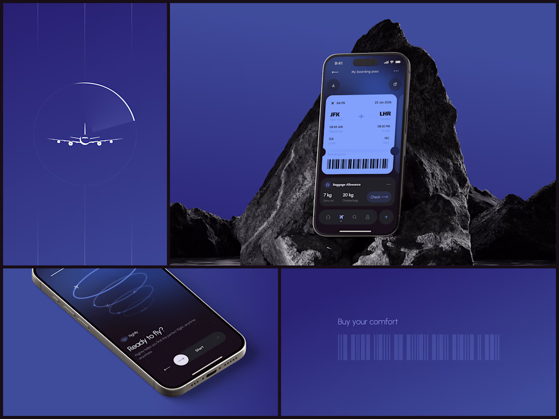
the dark + blue palette feels premium without even trying too hard ✈️
The network for creativity
Join 1.25M professional creatives like you
Connect with clients, get discovered, and run your business 100% commission-free
Creatives on Contra have earned over $150M and we are just getting started
Related posts
Cool
The mobile app for Edge Hound is now live on the App Store 🎉
Not a chatbot with a finance theme, but actually a Bloomberg Terminal built for retail investors and traders.
Trade ideas with reasoning behind them, sentiment analysis, news and social buzz, deep fundamental analysis and more.. and we're just getting started 🔥
Currently supports Stocks, Forex and Commodities. Crypto and ETFs are coming soon.
Looks cool
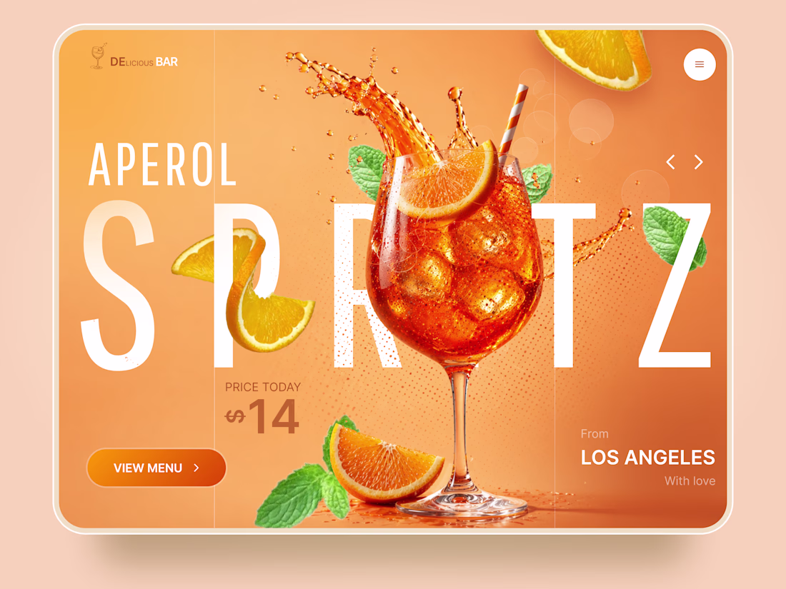
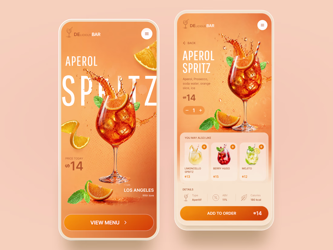
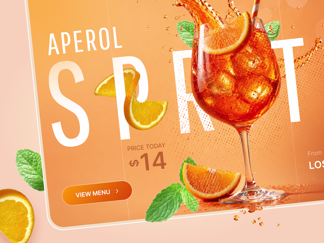
Aperol Spritz — Premium Cocktail Ordering Experience for Modern Bars 🍊
We designed a vibrant mobile experience for a premium cocktail bar concept centered around one of the world's most iconic drinks — the Aperol Spritz.
The goal was to transform a simple drink menu into an immersive product experience where the cocktail itself becomes the hero of the interface. Large-scale typography, dynamic compositions, and realistic product visuals create an atmosphere that feels closer to a luxury beverage campaign than a traditional restaurant app.
Special attention was given to:
• immersive hero screens with bold editorial typography and product-first storytelling;
• premium visual direction combining realistic cocktail renders with energetic splash effects and layered compositions;
• intuitive ordering flow with quantity controls and contextual recommendations;
• cross-device experience designed for both mobile ordering and large-format digital displays;
• complementary product suggestions to increase average order value and encourage discovery;
• warm, vibrant color palette inspired by the Aperol brand identity and summer cocktail culture.
The result is a visually rich hospitality experience that blends branding, storytelling, and commerce into a seamless ordering journey — helping bars and beverage brands turn products into experiences customers remember.
Looking to create a premium digital experience for your restaurant, hospitality, or consumer brand? Let's build something memorable together! 🍹
So cool! 😍
Trending
Claude
Claude has entered the design space. How are you using Claude Design?
Contra University
Learn from expert creatives how to earn more using next-gen AI tools.
MagicPath
The canvas is infinite, and exploration is becoming the workflow. How are you using MagicPath?
creativeaiflow
Creative AI workflows are evolving. What tools do you use, and what are their strengths and weaknesses?
freelancerlife
Freelancer life is wins, pivots, and everything in between. What’s yours right now?