The network for creativity
Join 1.25M professional creatives like you
Connect with clients, get discovered, and run your business 100% commission-free
Creatives on Contra have earned over $150M and we are just getting started
Back to feedPost
I created this brand kit to establish a bold, recognizable visual system for Amplify Social.
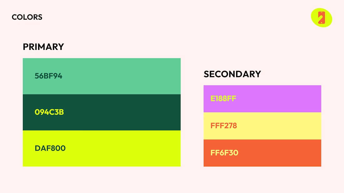
I defined the color palette to feel energetic and high-contrast, balancing deep greens with bright lime and playful secondary accents like purple and orange. This gives the brand flexibility while still feeling consistent across digital and social applications.
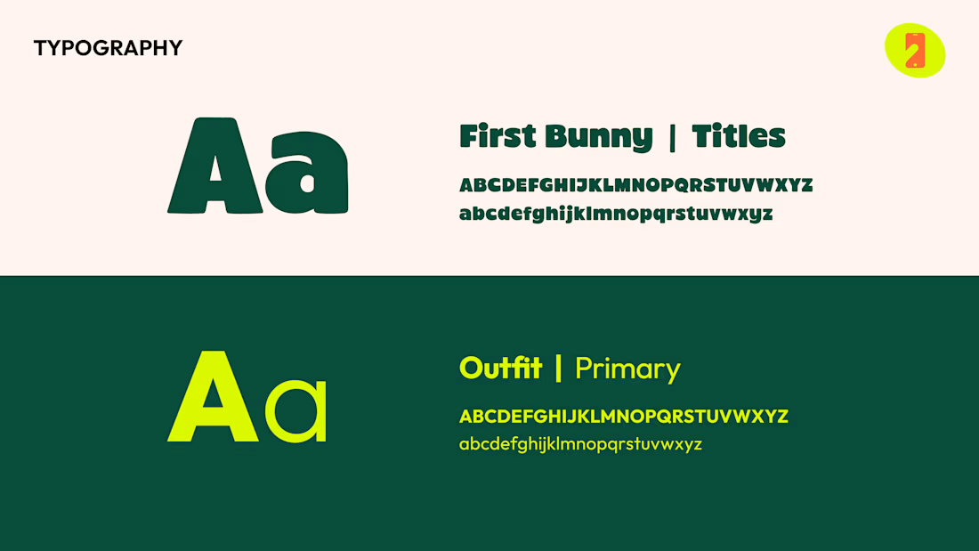
I selected typography that supports both personality and clarity. A strong, expressive display font is used for headlines to create impact, paired with a clean, highly legible typeface for everyday use. This balance allows the brand to feel distinct without sacrificing usability.
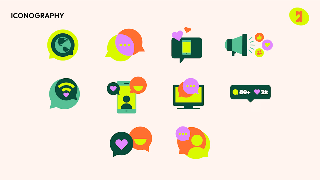
I designed a custom icon system to support content across social, marketing, and product touchpoints. Each icon uses simple shapes and layered color to feel cohesive with the overall brand while still being flexible enough for different use cases.
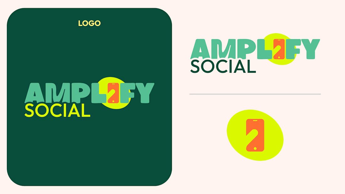
I also developed the logo and supporting variations to ensure it works across different formats and backgrounds. The mark is simple and memorable, with a visual element that ties back into the brand’s focus on communication and digital interaction.
This system was built to scale, giving the brand clear guidelines while allowing room for creative expression across campaigns and content.
The network for creativity
Join 1.25M professional creatives like you
Connect with clients, get discovered, and run your business 100% commission-free
Creatives on Contra have earned over $150M and we are just getting started
Related posts
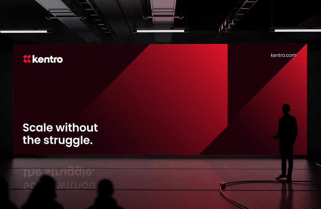
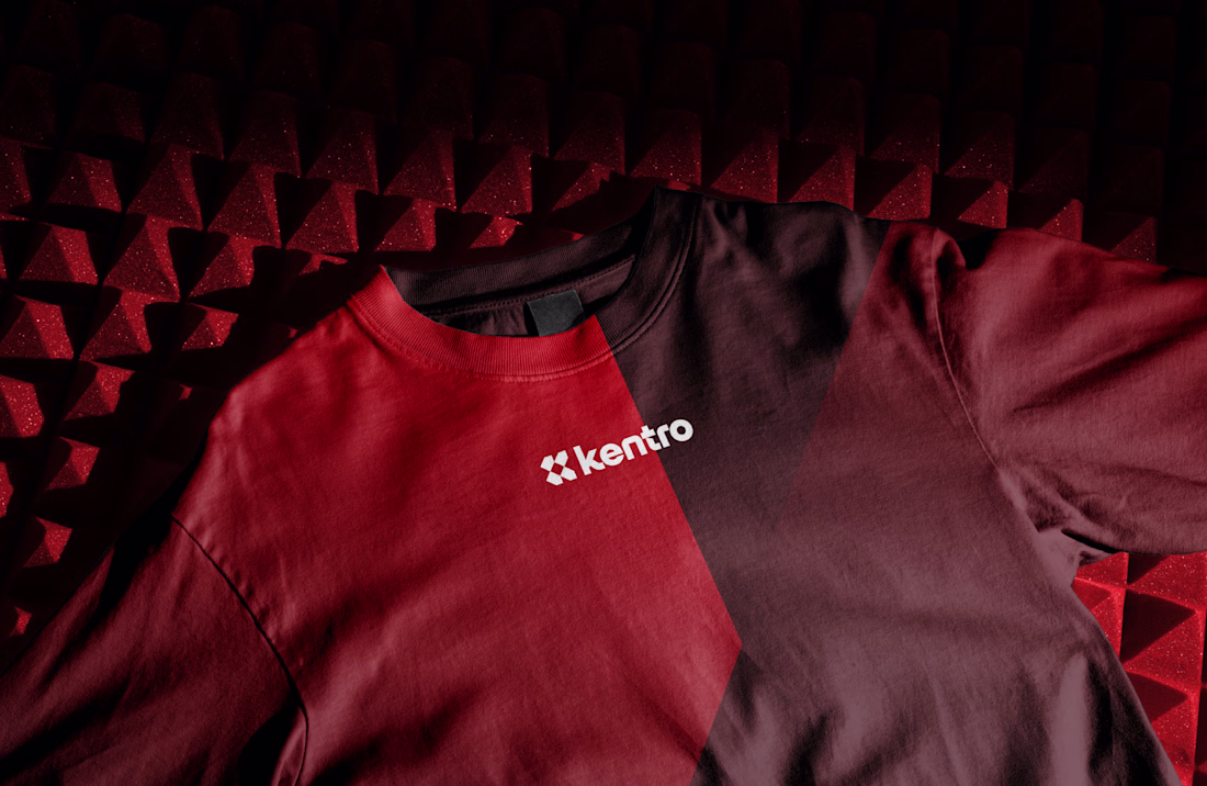
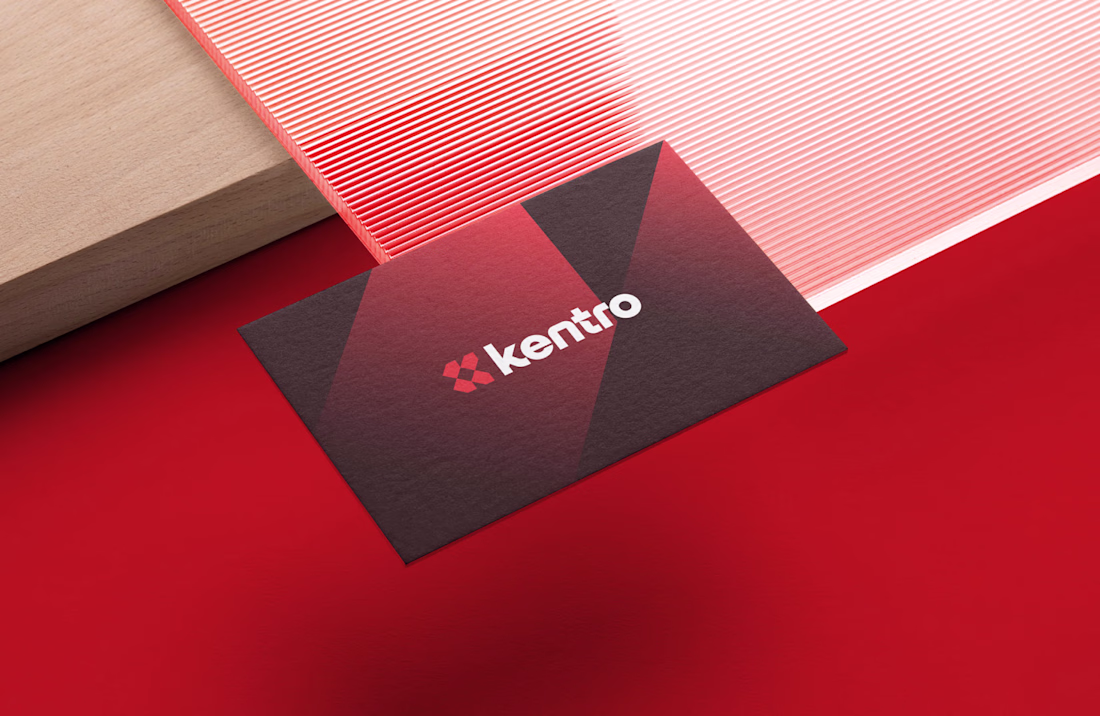
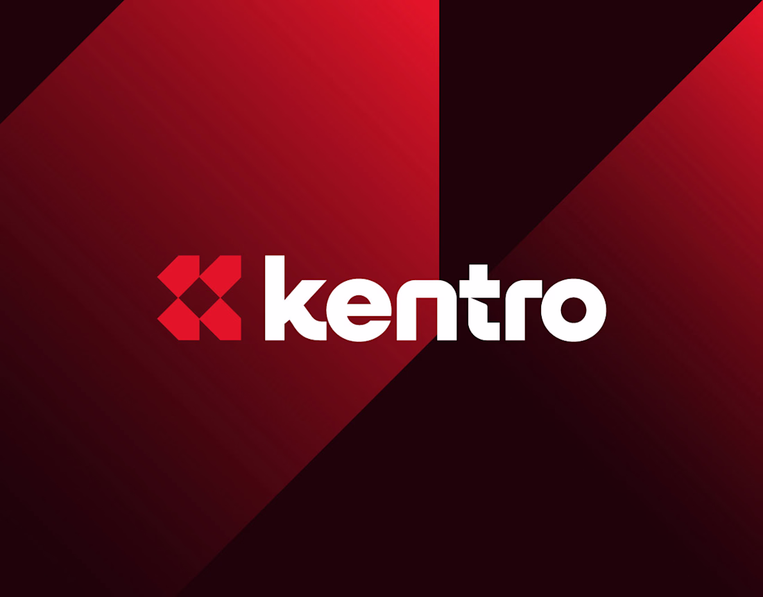
Kentro — Unlock growth with intelligent automation.
The logomark combines the letter K with forward-facing arrows, creating a clean geometric symbol that represents growth, progress, and continuous acceleration. The goal was to build an identity that feels modern, intelligent, and confident, reflecting how automation helps businesses move faster and scale with purpose.
Simple in form, memorable in execution, and designed to perform across every touchpoint.
What was the first thing you noticed in the mark: the "K" or the arrows? 👀
Nice balance between visuals and explanation.
How do you design a brand that represents growth… without relying on the usual leaf or tree icon? 🌱🤔
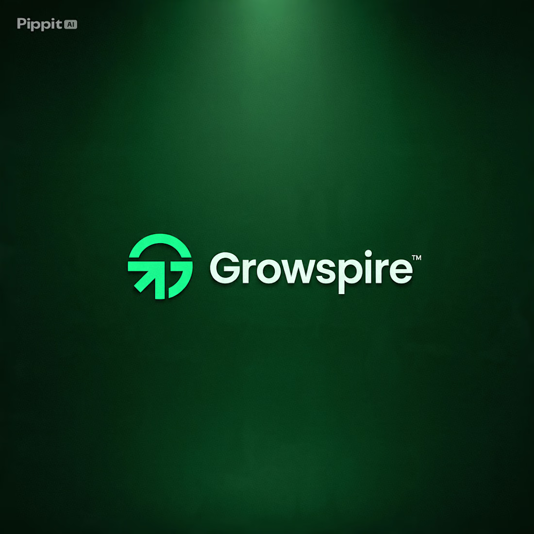
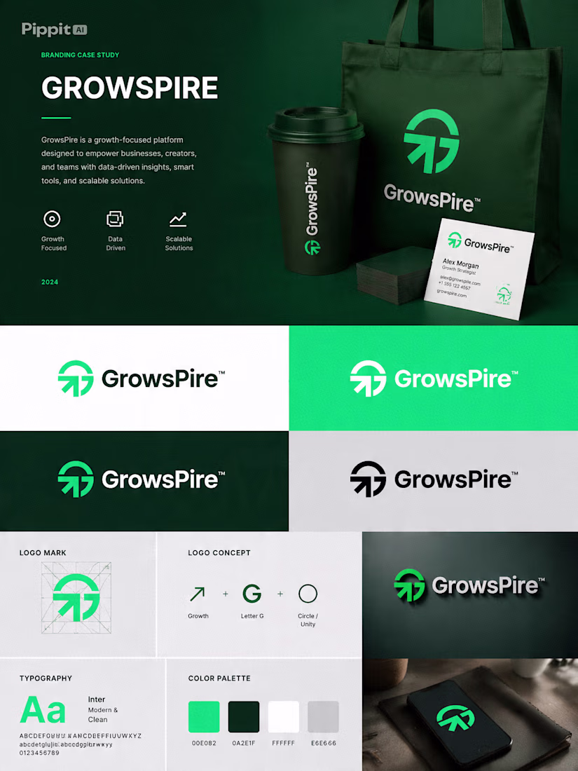
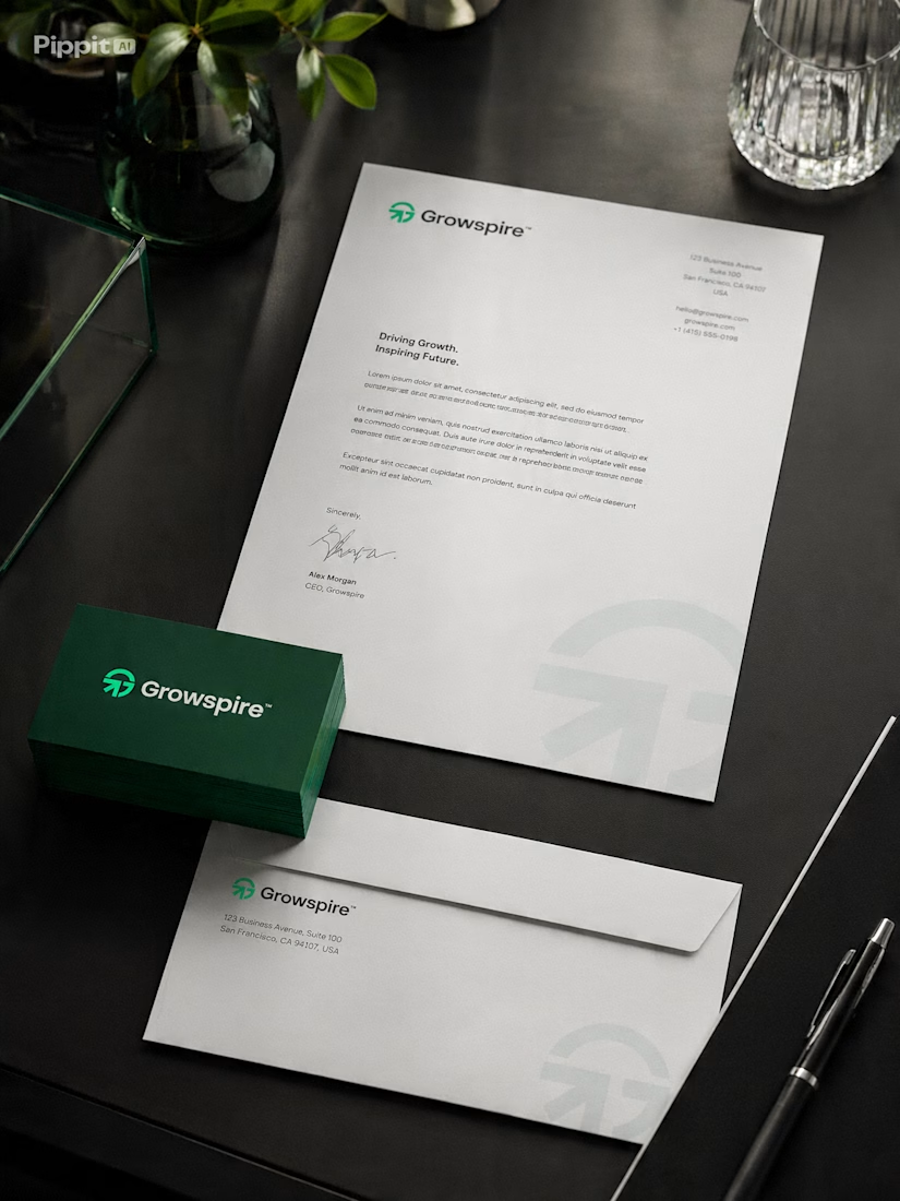
That's the creative challenge I explored with Growspire.
Growth is often visualized through plants, but I wanted this identity to feel more strategic, modern, and future-focused rather than predictable. Instead of following common symbols, I focused on upward movement, clean geometry, balanced proportions, and a minimal mark that communicates ambition, progress, and momentum.
Every curve and angle was carefully refined to create a logo that feels timeless, scalable, and instantly recognizable across digital and print applications.
This is more than just a logo—it's the foundation of a brand built to inspire confidence, innovation, and long-term growth.
I'd love to hear your thoughts... If you had to communicate growth without using a leaf, what symbol or concept would you start with? 💬🌿
Great work
A playful logo reveal created for the Bark Punk brand.
Designed a bold and memorable logo for an alternative bar, focusing ona distinctive visual identity that reflects the venue's unique personality and atmosphere.
This logo is absolutely insane - bold, energetic, and instantly memorable. The color, shape, and wild character work perfectly together.
Trending
Claude
Claude has entered the design space. How are you using Claude Design?
Contra University
Learn from expert creatives how to earn more using next-gen AI tools.
fifaworldcup2026
The World Cup is here and the whole world's watching. How are you designing for the world stage?
creativeaiflow
Creative AI workflows are evolving. What tools do you use, and what are their strengths and weaknesses?
freelancerlife
Freelancer life is wins, pivots, and everything in between. What’s yours right now?