The network for creativity
Join 1.25M professional creatives like you
Connect with clients, get discovered, and run your business 100% commission-free
Creatives on Contra have earned over $150M and we are just getting started
Back to feedPost
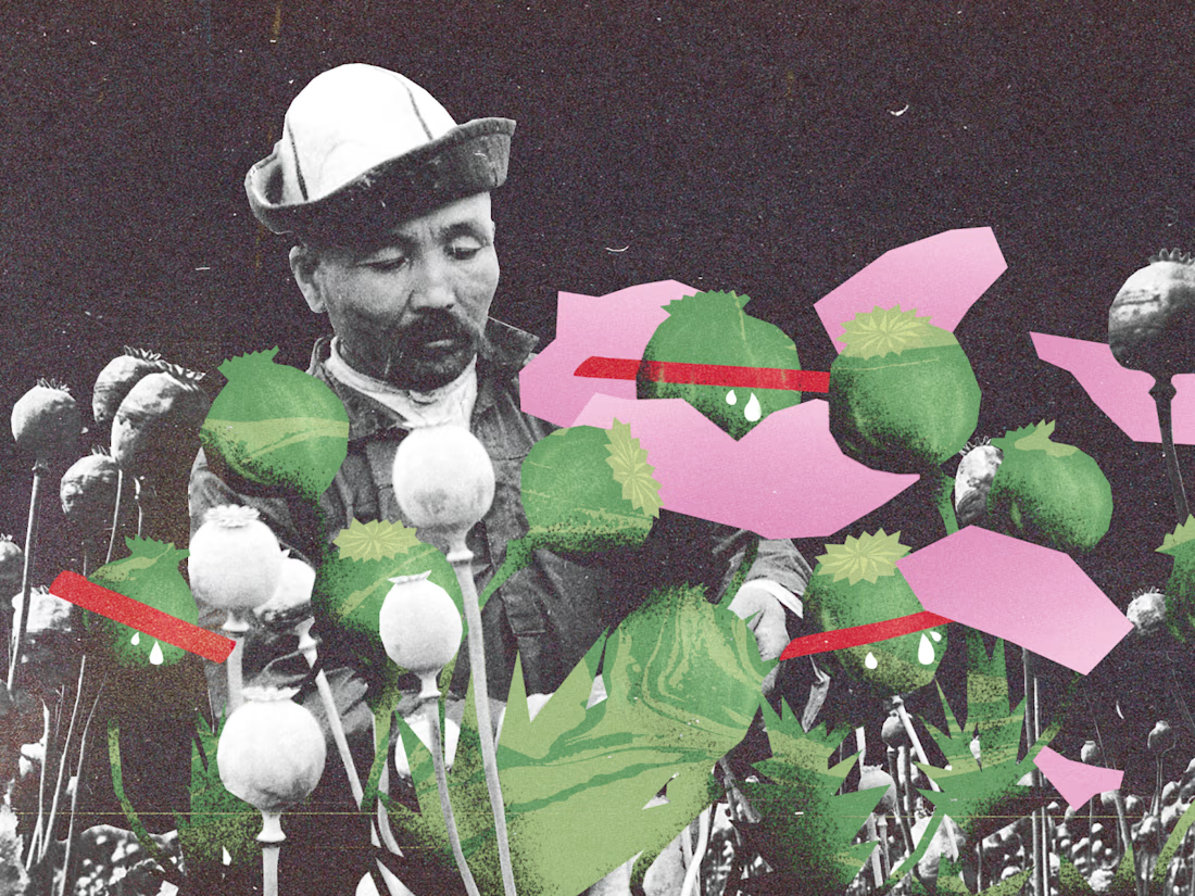
Three editorial collages from my archive.
I combine archival photography, bold graphic shapes, and grainy textures. These pieces were built digitally, with the rough edges and layered feel of printed cutouts.
Open to editorial illustration and cover commissions.




Love this!

Thank you!

Thanks, Alaa! Really appreciate it!

The grainy texture you added really gives the digital pieces the tactile vibe of a physical cutout.
Thanks, Johnson! I think we’re craving a bit more tactility in digital design. I know I am — I love when something on a screen feels like you could actually touch it.
The network for creativity
Join 1.25M professional creatives like you
Connect with clients, get discovered, and run your business 100% commission-free
Creatives on Contra have earned over $150M and we are just getting started
Related posts


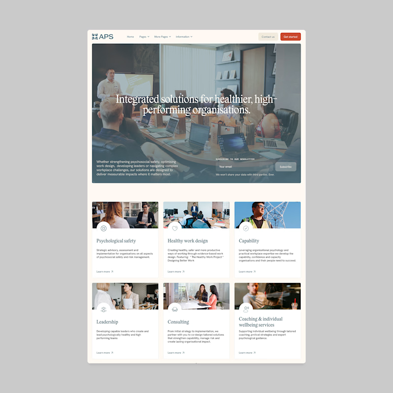
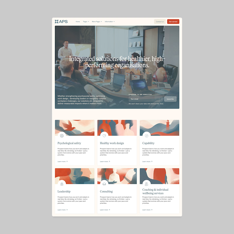
Designers, which direction would you go with: photography or illustration?
83 voted
69%
37 voted
31%
120 votes
Closed

I'll prefer photos, specially talking about organizations in your page, human faces and real scenarios can have a better effect in this case.

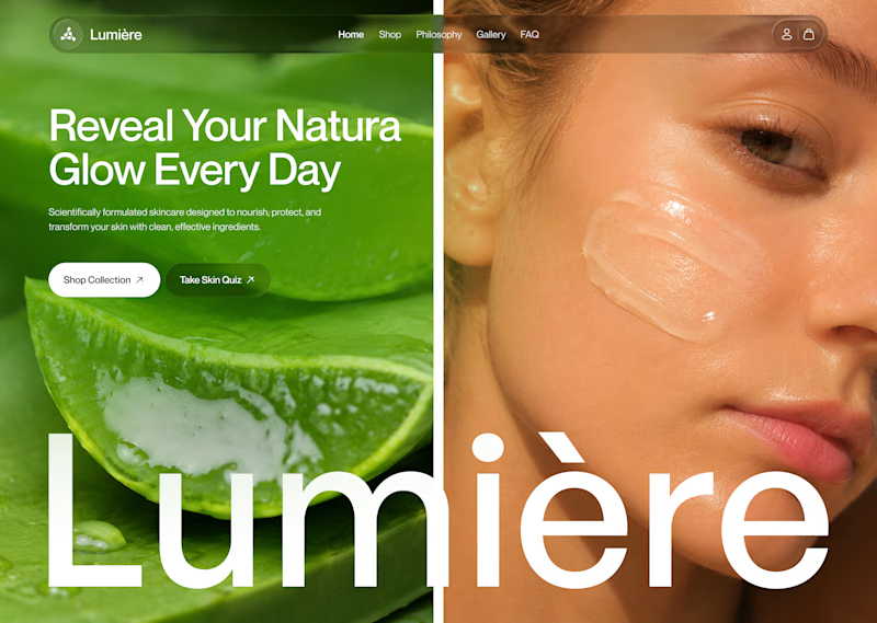
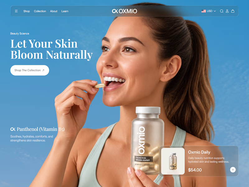
Your design has 3 seconds to earn attention. Which skincare brand wins?
A leads with confidence, energy, and aspiration. B builds trust through nature, freshness, and simplicity.
Great design doesn’t just look good. It makes people feel the brand before they read a word.
A or B? Which would make you stop scrolling?


30 voted
52%
28 voted
48%
58 votes
Closed


B without questions

🍨 Meet MORA — artisanal gelato with a softer side.
Bold typography, creamy tones, and playful flavor-inspired packaging designed to make every scoop feel special.
Explore the full project on my Contra profile and let me know your thoughts!
#BrandIdentity #PackagingDesign #FoodBranding #GraphicDesign #BrandDesign

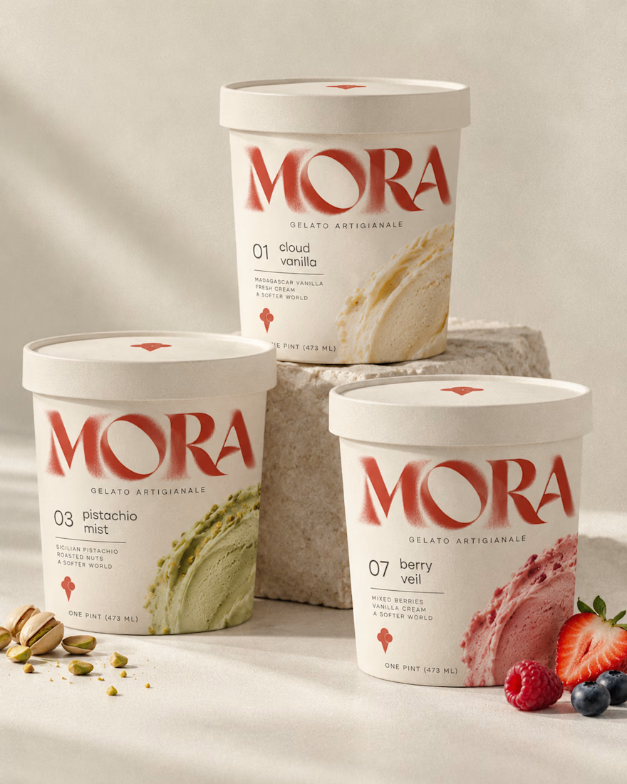
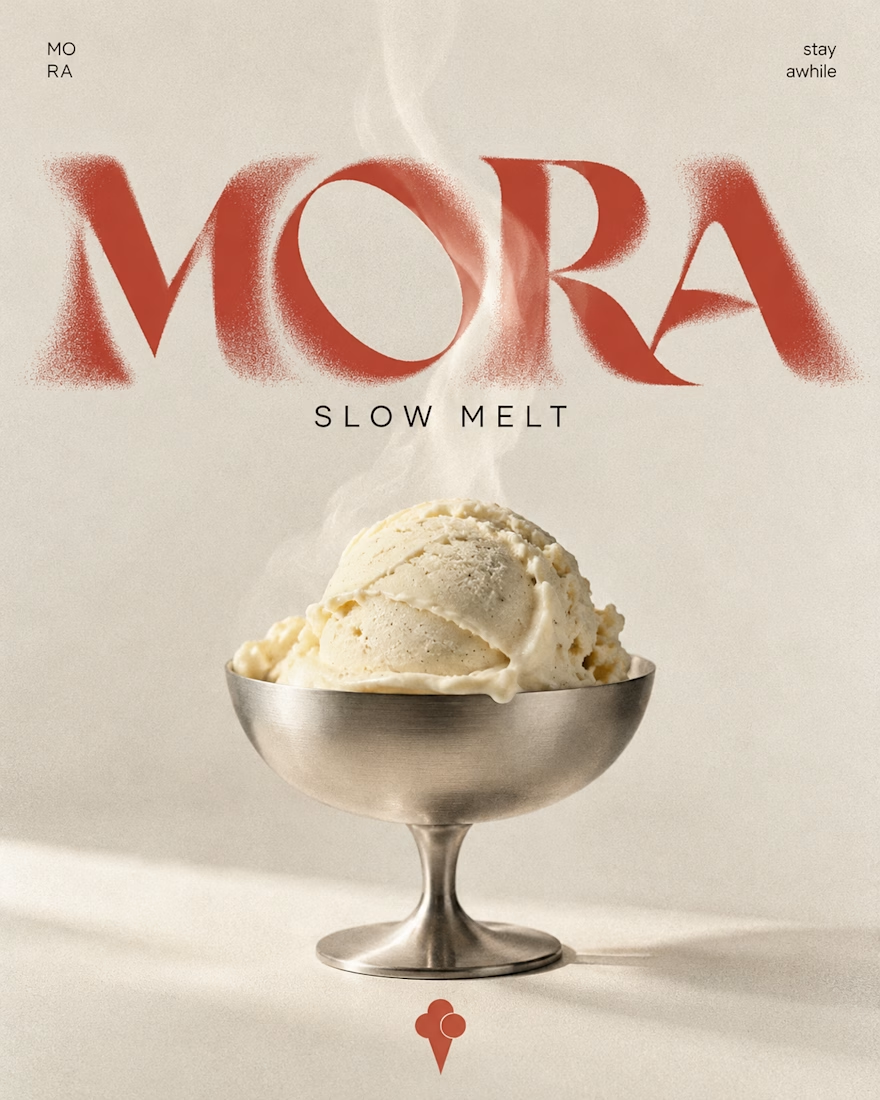
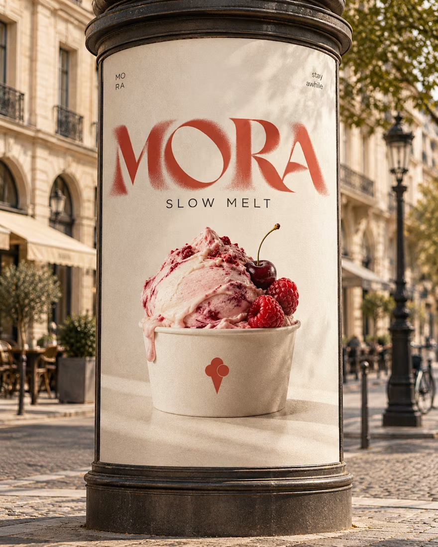

Love this MORA identity! 🍦 The bold typography against the creamy tones is such a perfect balance - feels artisanal yet playful. The flavor-inspired packaging with the watercolor smears for cloud vanilla / berry veil is a really nice touch, makes each scoop feel special as you...