The network for creativity
Join 1.25M professional creatives like you
Connect with clients, get discovered, and run your business 100% commission-free
Creatives on Contra have earned over $150M and we are just getting started
Back to feedPost
Taste Test

Dark and dramatic or light and editorial: which feels more crafted?
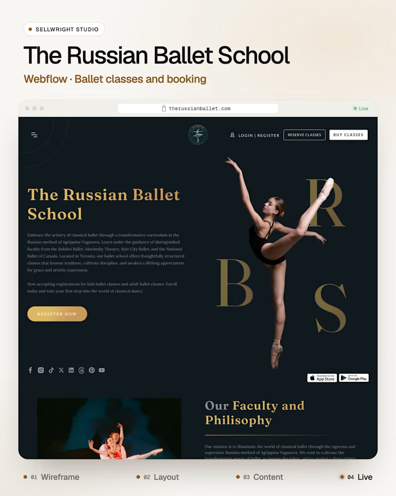
The Russian Ballet School (Webflow), classical ballet classes, in an elegant dark theme.
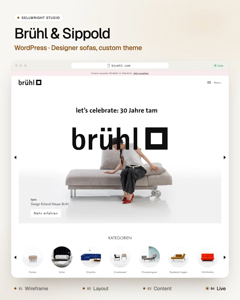
Brühl & Sippold (WordPress), designer sofas and armchairs on a custom theme with video-rich product pages.
Both sell craft, ballet and handmade sofas, so the site has to feel made with care.
Which one feels more premium to you?
Live: therussianballet.com · bruehl.com
More builds: instagram.com/sellwrightstudio · youtube.com/@sellwrightstudio
2 votes
Ends in 17h

For me, dark & dramatic wins hands down.
The Russian Ballet School in dark feels so premium and timeless, like a real theatre. Light would lose that drama.
And Brühl & Sippold looks super clean! Love how you handled the video-rich product pages on a custom theme. Both are craft,...
Thanks Sagar! Same feeling here, the dark theme gives the ballet site that stage-lit look and lets the photos carry it. On Brühl & Sippold the product videos do most of the selling, so the pages give them room. Thanks for voting!
The network for creativity
Join 1.25M professional creatives like you
Connect with clients, get discovered, and run your business 100% commission-free
Creatives on Contra have earned over $150M and we are just getting started



Related posts

Which ORBIT pulls you in: the quiet one or the loud one? ✨
One name, two directions. Same idea, an object in motion around a center.
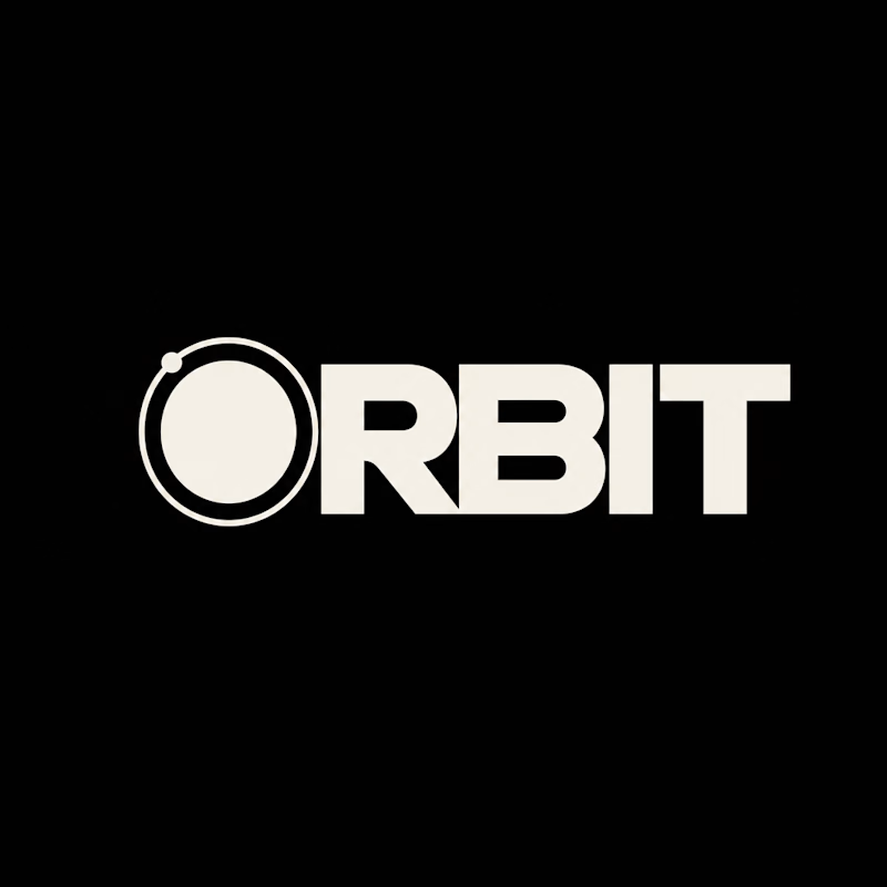
A → Heavy extended sans on black. The orbit is built into the O, a ring with a single satellite. Compact, graphic, impossible to ignore.
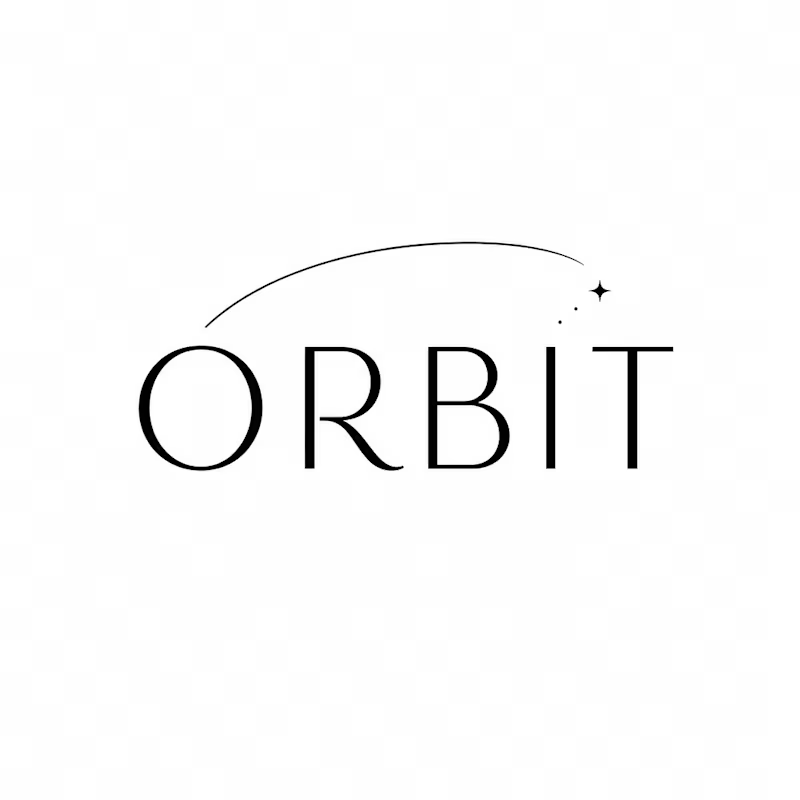
B → Light, high-contrast serif with a hairline arc and a tiny spark. The orbit is a gesture, a trail you almost miss. Elegant, airy, a little mysterious.
If you ask me, I'd pick A.

36 voted
80%
9 voted
20%
45 votes
Closed

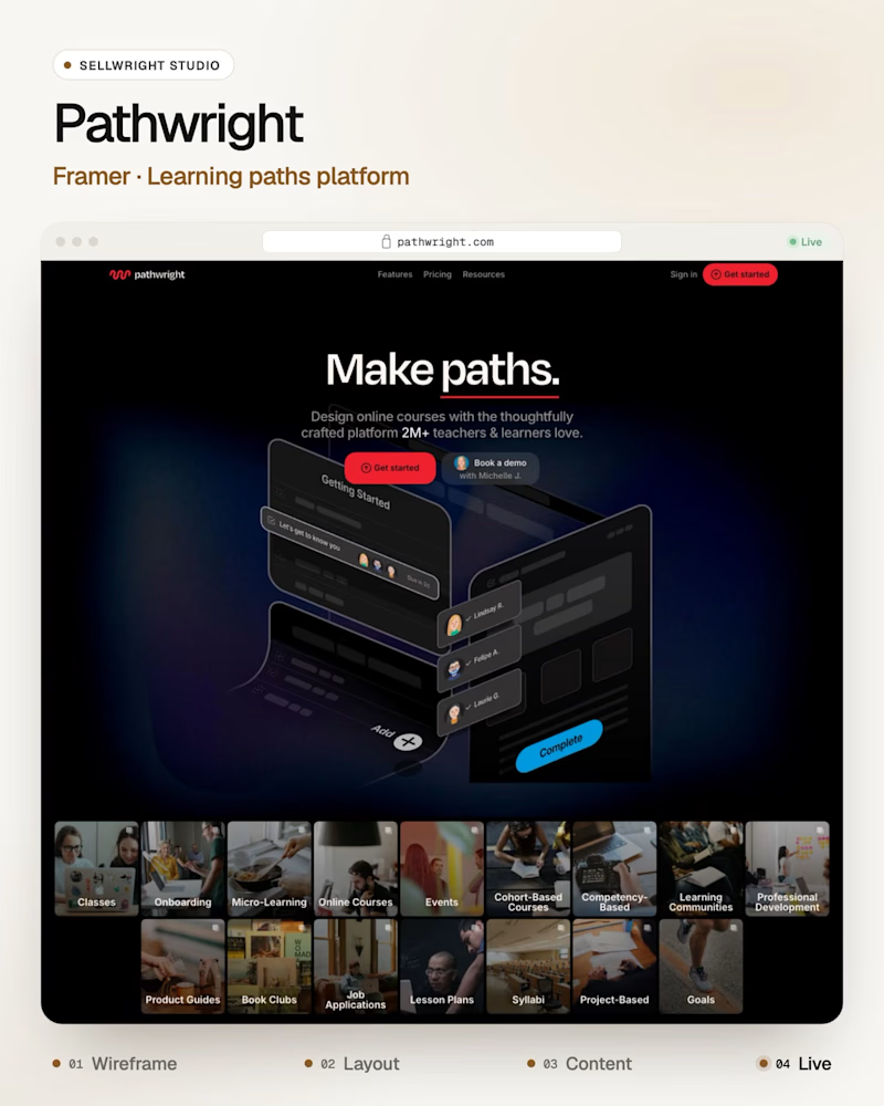
Dark or light: which SaaS homepage makes you scroll?
A: Pathwright (Framer), guided learning paths for teachers and teams.
B: Embedify (Next.js), a tool that turns ideas into web pages and knowledge bases.
Both heroes have one job: show the product before the first scroll.
Which one gets you there first, and why?
Live: pathwright.com · embedify.io
More builds: instagram.com/sellwrightstudio · youtube.com/@sellwrightstudio
3 voted
50%
3 voted
50%

6 votes
Closed

I’d go with B! A clean, visual layout can make a product feel more engaging while keeping the message clear.

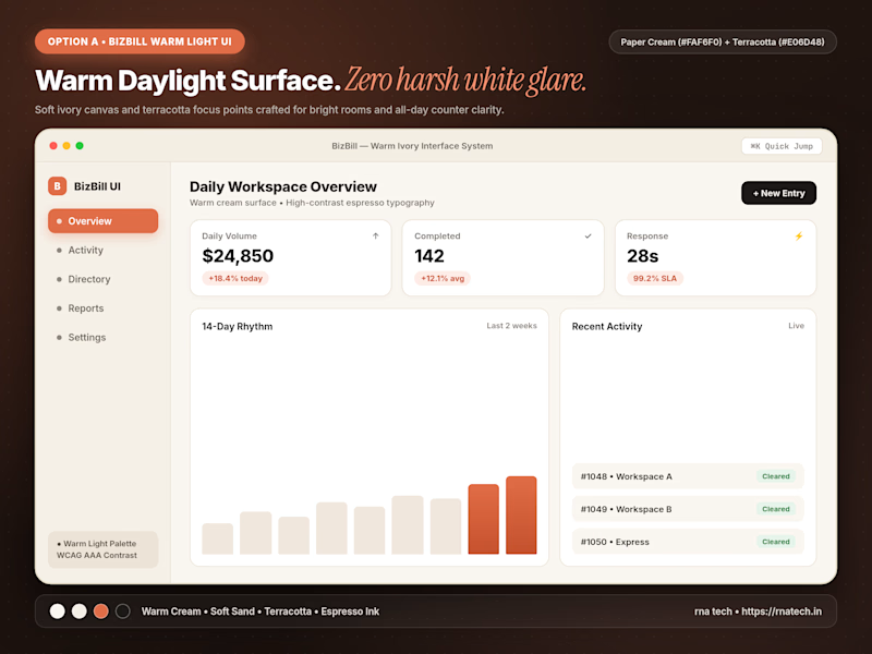
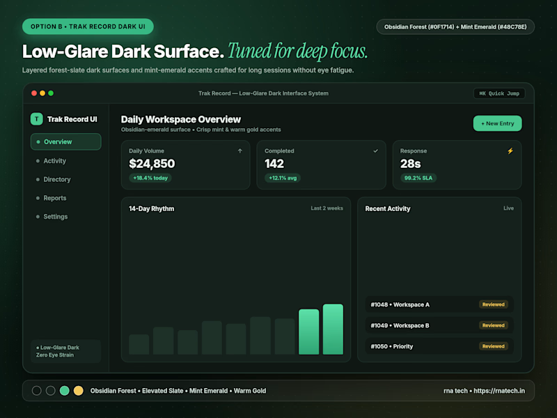
Quick poll for builders & designers here: When you're designing a data-heavy dashboard that people keep open for 6+ hours a day, do you default to Warm Light Mode or Low-Glare Dark Mode first?
4 voted
67%
2 voted
33%
6 votes
Closed
I’d start with warm light mode for a clean, comfortable look, but low-glare dark mode is a great option for long working hours too!