The network for creativity
Join 1.25M professional creatives like you
Connect with clients, get discovered, and run your business 100% commission-free
Creatives on Contra have earned over $150M and we are just getting started
Back to feedPost
Project name: Figma Signal
Description:
Every great product starts with research. The problem? That research happens outside Figma forty-seven browser tabs, scattered opinions, no clear direction. By the time people open Figma, they've often already decided to build the wrong thing.
Figma Signal fixes that. Type your idea and it scans real communities (Reddit, G2, ProductHunt) for real signals pain points, demand, opportunity. Then it generates a validated product concept and hands you wireframes ready for Figma Make.
The flow: Signal Discovery → Pain Analysis → Opportunity Detection → Product Concept → Wireframe Generation → Figma Make handoff → Workspace.
From idea to first frame, in minutes never leaving Figma.
Built entirely with Figma Make for the Config Makeathon.
Tools used: Figma Make
Problem solved: Designers and founders often start designing before validating whether a problem is worth solving leading to wasted weeks on the wrong product. Figma Signal closes that gap by bringing evidence-based product discovery directly into the Figma ecosystem, before the first frame is ever created
Live project link : https://iframe-pivot-40510464.figma.site
Community file link : https://www.figma.com/community/file/1646785934239369753/figma-signal
Social post link : https://x.com/Abrham192337030/status/2064953502309257686


Great idea!

Thank You Very Much

Smart Idea , It is actually solves our problem
Tnx Kidi
The network for creativity
Join 1.25M professional creatives like you
Connect with clients, get discovered, and run your business 100% commission-free
Creatives on Contra have earned over $150M and we are just getting started



Related posts

A website hero and motion identity concept for Cycle.
The experience takes the viewer through seven historical eras in one continuous forward journey, while the logo, camera path and core composition remain consistent.
The concept explores how a static identity can become a living digital experience through motion, environment and interaction.
Workflow included Spline, Claude via MCP, Midjourney and SeaDance.
Available for brand identity, motion and digital design projects.


I fall in love, It is like Encarta, but 1000% better

New case study for the brand and digital work we did for Seeper Studios.
Go Check it out


Evolving a brand with almost 30 years of history is the hard version of brand work. You have to keep what people already trust while making it feel current. Nice job balancing both.

Photographer Portfolio Website
"Capturing light, emotion, and the moments you never want to forget." That line set the tone, and the layout follows it.
The hero is one motion-blurred portrait washed in red. The photographer's name runs across the bottom in a condensed white face, so large the screen cuts it off. The photo keeps its soft focus, and the name still reads first.
Thin grid lines split the page into narrow columns, and the small copy sits justified inside them. The loose photo gets a strict structure to lean on.
A single round red button with an arrow sits right on the letters and marks where to go next.
Designed by the Hue & Machine team.
#WebDesign #Photography #PortfolioWebsite #EditorialDesign #Typography #UIDesign #ProductDesign #CreativeDirection #ResponsiveDesign #FigmaDesign


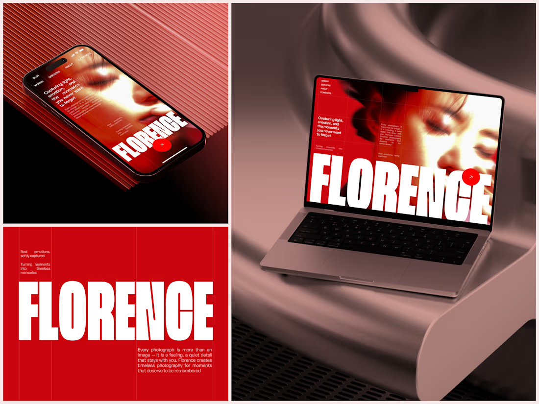

The heavy condensed white FLORENCE over the red portrait is bold, and keeping the same red across phone, laptop and type tile makes the case study read as one system. Did the red come from the photographer's own work, or was it your call?


