The network for creativity
Join 1.25M professional creatives like you
Connect with clients, get discovered, and run your business 100% commission-free
Creatives on Contra have earned over $150M and we are just getting started
Back to feedPost



The network for creativity
Join 1.25M professional creatives like you
Connect with clients, get discovered, and run your business 100% commission-free
Creatives on Contra have earned over $150M and we are just getting started

Challenges
View all


Related posts


You are the best

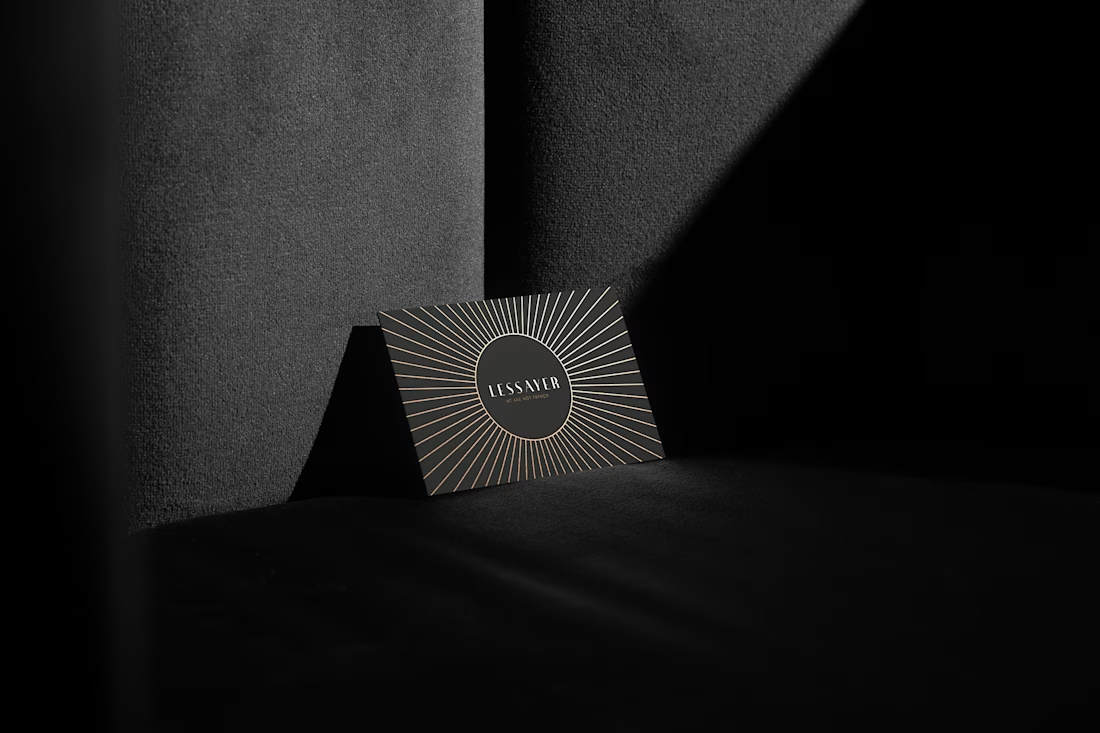
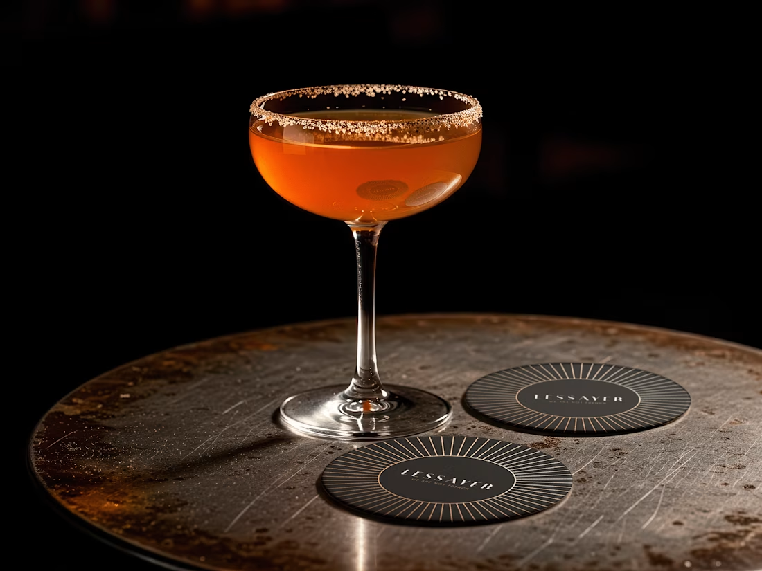
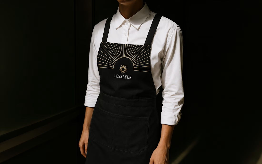
Lessayer
Where Belle Époque elegance meets contemporary minimalism.
The identity started with a simple challenge: how can a luxury pastry brand feel refined and timeless without relying on predictable visual codes?
The answer became a single geometric symbol combining three ideas a crown, a sliced cake, and a subtle reference to the New Zealand sun.
One mark. Three meanings. One distinctive identity.
Here’s a first look at the logo construction and stationery system.
Full case study coming tomorrow.


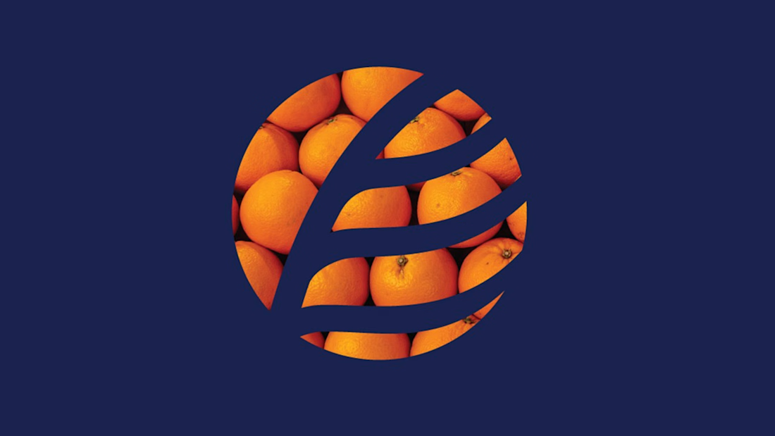
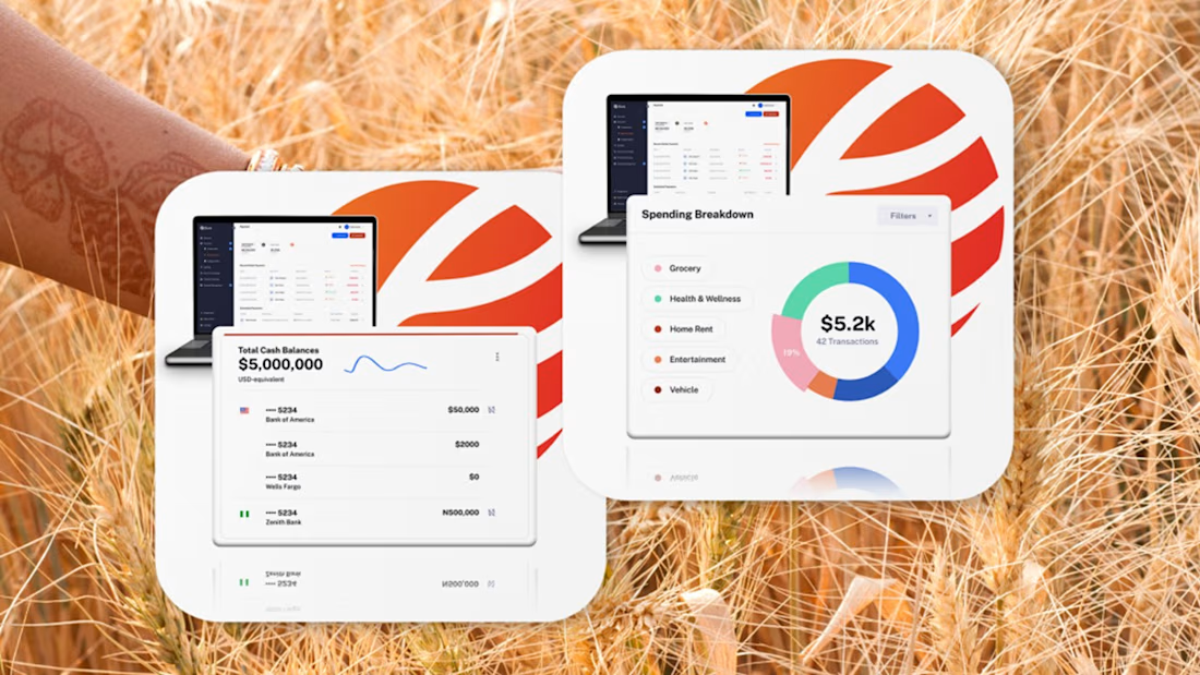
Fintech for agriculture doesn’t have to look earthy, heavy or industrial.
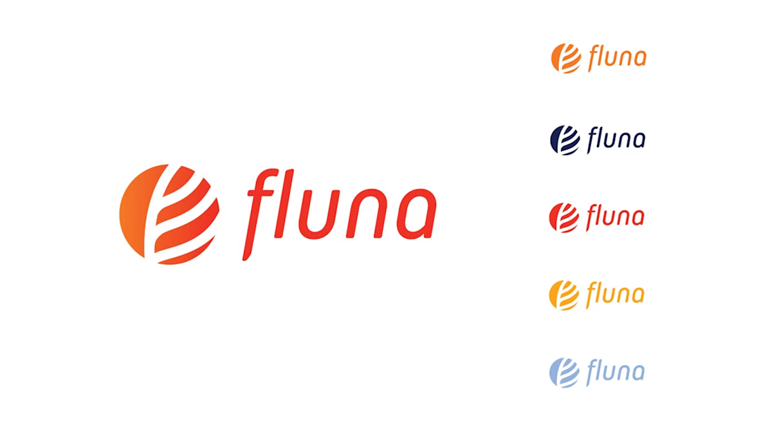
With Fluna, the goal was to create something more premium, distinctive and forward-looking, while still feeling relevant to the market it serves.
What I value most about this project is its longevity. I created this identity four years ago, and the client is still using the logo and visual system today.
For me, good taste in branding is not about following a visual trend. It’s about making choices that still feel right years later, and building a system strong enough to evolve with the company.
#BrandIdentity #BrandDesign #CreativeDirection #FintechBranding




Great work 👍