The network for creativity
Join 1.25M professional creatives like you
Connect with clients, get discovered, and run your business 100% commission-free
Creatives on Contra have earned over $150M and we are just getting started
Back to feedPost

What makes a bakery brand feel warm before a customer even tastes anything?
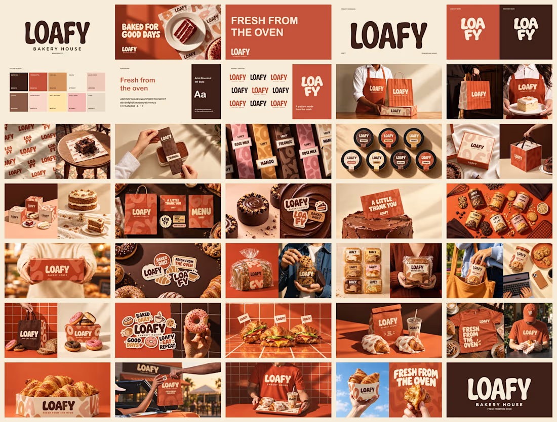
For LOAFY Bakery House, the answer was baked into every design decision. The identity pairs a chunky, rounded custom wordmark with a warm palette of espresso brown, terracotta, caramel and cream, so the brand reads like the product: soft, fresh and generous.
A few decisions behind it:
The wordmark does the heavy lifting. Its rounded letterforms echo fresh dough, and it stacks into a compact LOA/FY mark for small spaces like stickers, stamps and cup sleeves.
The pattern is made from the mark itself, repeated across wrapping paper, boxes and bags, so even the packaging paper is unmistakably LOAFY.
And the system covers the whole bakery experience: cake boxes, coffee cups, menus, aprons, tote bags and drive-through moments, all speaking the same warm language.
Fresh from the oven is not just the tagline, it is the design brief.
Designers, when a food brand leans this warm and playful, where is the line before it stops feeling premium? Curious where you draw it.
#BakeryBranding #BrandIdentity #LogoDesign #PackagingDesign #BrandDesigner


The network for creativity
Join 1.25M professional creatives like you
Connect with clients, get discovered, and run your business 100% commission-free
Creatives on Contra have earned over $150M and we are just getting started











Related posts




Clean and confident work! The green gradient with the mark feels very modern for fintech - trustworthy but not boring. The app screens look really polished. Curious how you landed on this mark, does it represent growth / movement?

A natural and premium packaging concept inspired by the purity of wildflower honey and the beauty of nature. The design combines warm honey tones, textured paper, bold typography, and a clean label layout to create an authentic, handcrafted feel.

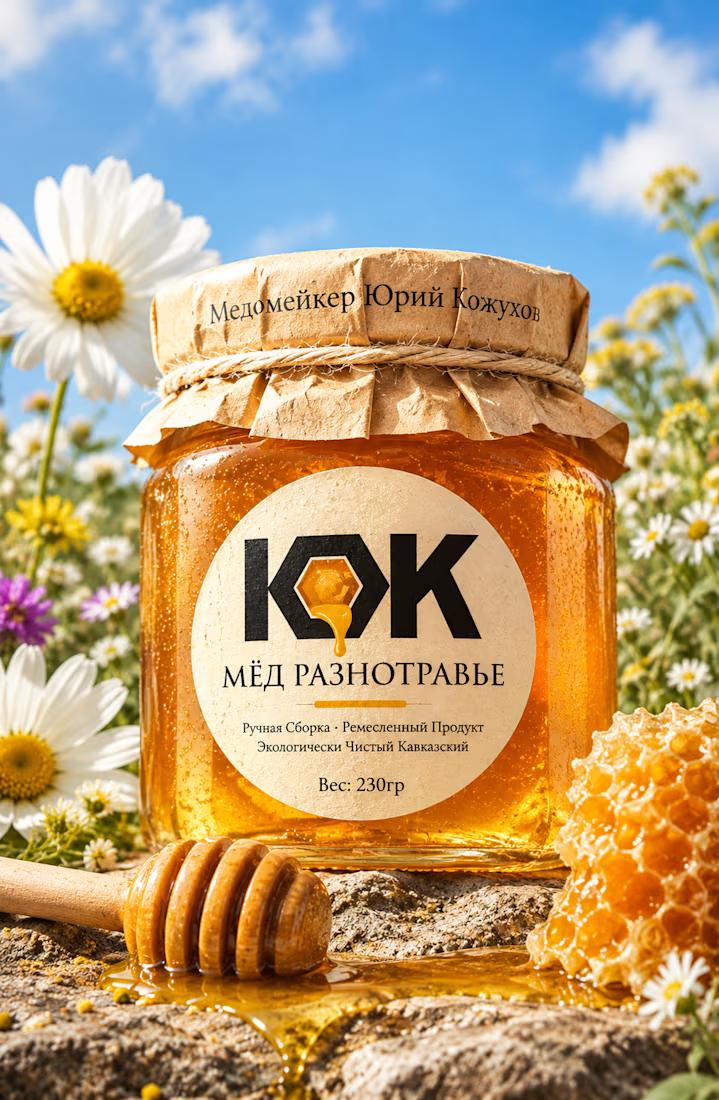

The honey drop sitting inside the O of the wordmark is a delightful detail, Umar. Textured paper plus that bold type really sells the handcrafted feel. This would stand out beautifully on a shelf.

Pakeging Design Brand Design Product Design