The network for creativity
Join 1.25M professional creatives like you
Connect with clients, get discovered, and run your business 100% commission-free
Creatives on Contra have earned over $150M and we are just getting started
Back to feedPost

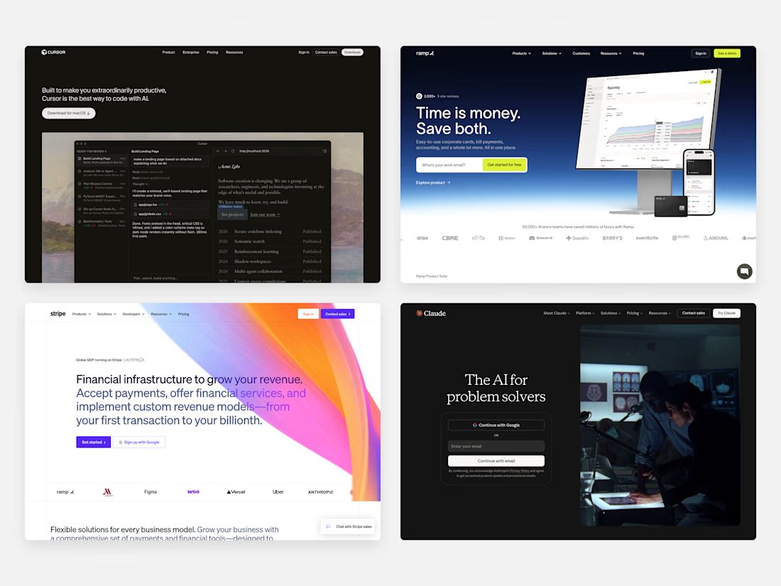
I see SaaS companies make the same mistakes in their websites.
They either get too cute with the heading, over design with colors/animations, or have vague jargon making up their copy.
If someone is looking for tools to solve their problems and have to read your headline 3-4 times to understand it, they’re going to bail and look elsewhere.
The above-the-fold her section has one job: make the visitor feel understood in as little time as possible.
With these companies below, they are mentioning the benefit (save money/time) or mentioning who it’s for (problem solvers), all while the design is beautiful and simple.
These companies understand who they are, the problem they solve, and who their audience is.
When you have clarity like this it becomes easy to convert customers, because they feel like it’s the perfect product for them.
The network for creativity
Join 1.25M professional creatives like you
Connect with clients, get discovered, and run your business 100% commission-free
Creatives on Contra have earned over $150M and we are just getting started
Related posts
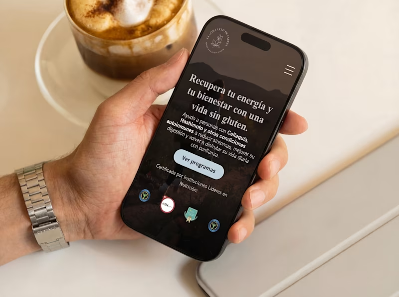
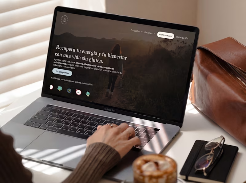
Making some tweaks to one of my law firm retainer client's site to optimize for conversions
Which version do you think looks/functions better?
23 voted
43%
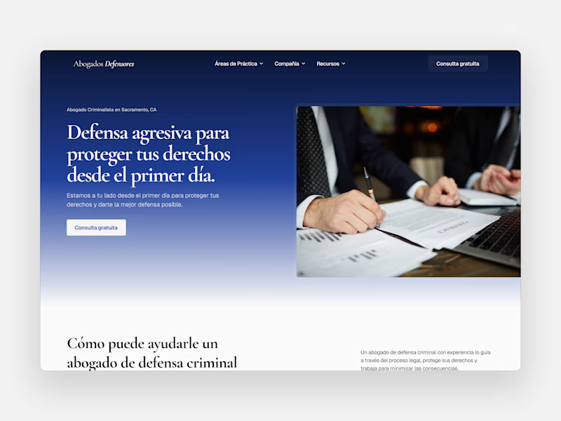
31 voted
57%
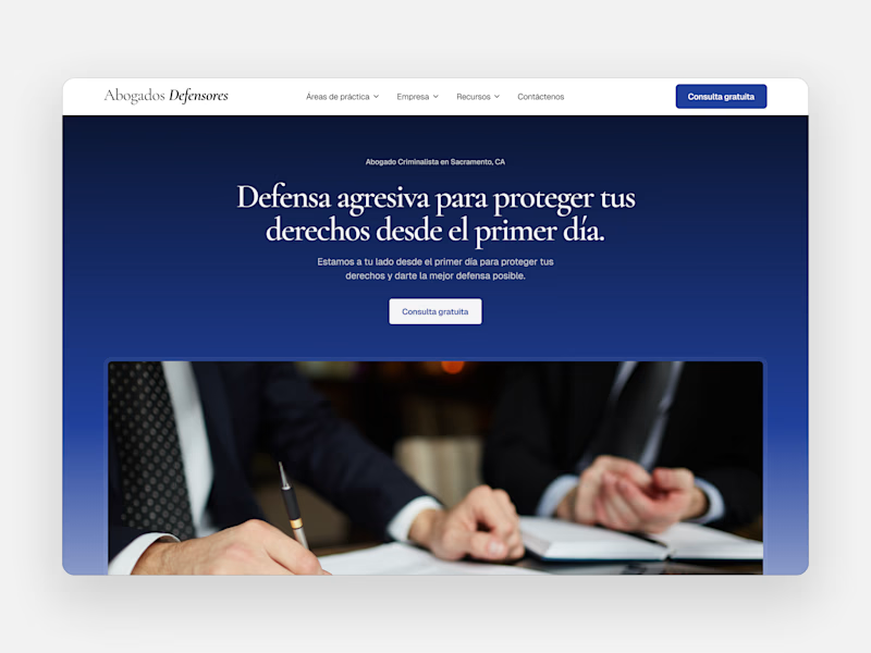
54 votes
Closed

Option B feels more bold and authoritative, perfect energy for a criminal defense firm. Nice work on both though!


A new case is in the works, which thumbnail speaks to you more?
33 voted
36%
59 voted
64%
92 votes
Closed
Desktop feels more premium and editorial! That moody lighting and the laptop setup looks really polished.
Here's the first 3 things I analyze on a low-converting website:
value proposition & messaging
user flow & friction
trust signals
I quickly explain each one below
🧵
value proposition & messaging
Does the site clearly explain who it’s for, the problem it solves, and the outcome visitors get within seconds?


Trending
aivideo
AI video tools are moving at warp speed. Which ones are you experimenting with?
illustration
Handcrafted illustration is bubbling up across the web. What are you drawing lately?
aidesignflow
AI tools are redefining design work. What's your current workflow?
returntonature
Spring is a reset for creativity. What’s inspiring you outside the screen right now?
freelancerlife
Freelancer life is wins, pivots, and everything in between. What’s yours right now?