The network for creativity
Join 1.25M professional creatives like you
Connect with clients, get discovered, and run your business 100% commission-free
Creatives on Contra have earned over $150M and we are just getting started
Back to feedPost

A little behind the scenes from a project I’m currently working on.
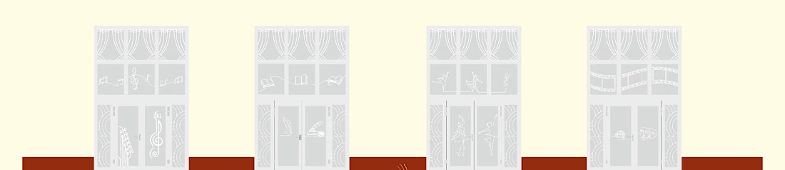
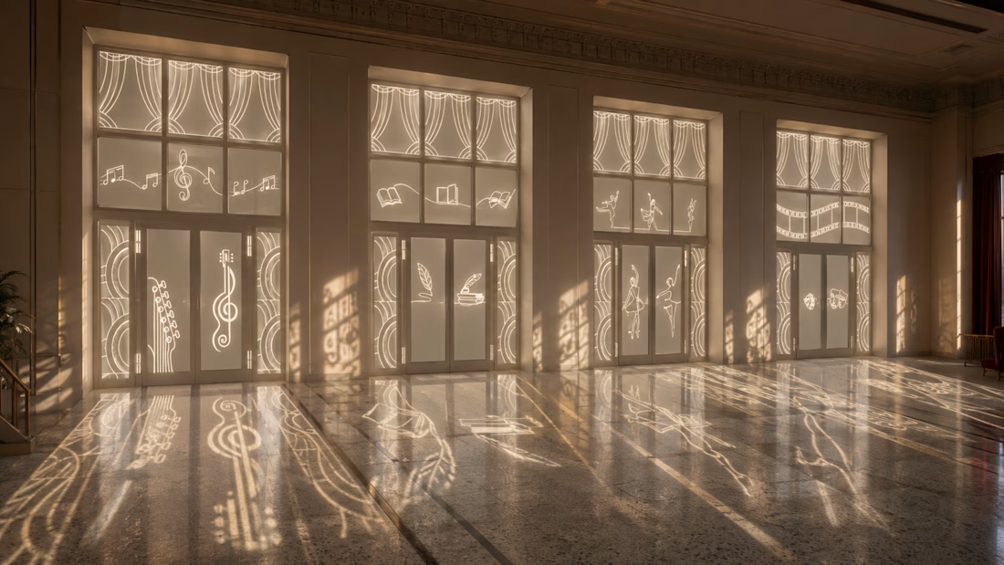
I’m designing a series of glass decorations for a city cultural center, with a goal that sounded simple at first: keep it subtle and elegant, but make the final result feel monumental.
The challenge was to achieve that without relying on printed graphics — letting the material itself become part of the design.
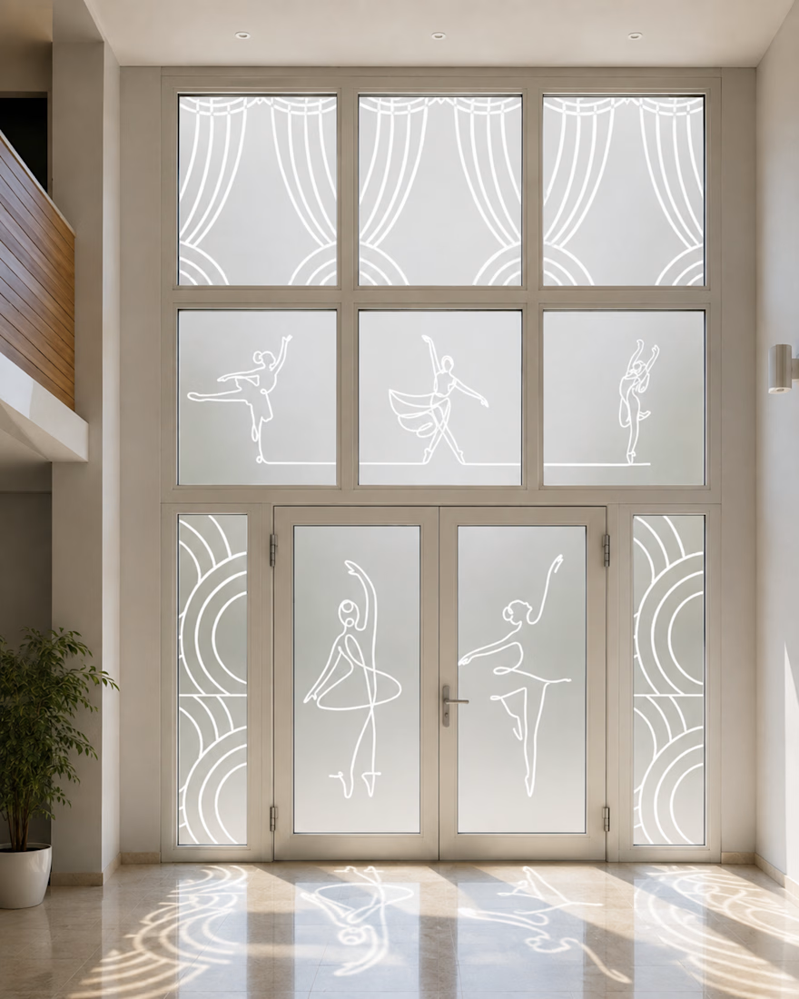
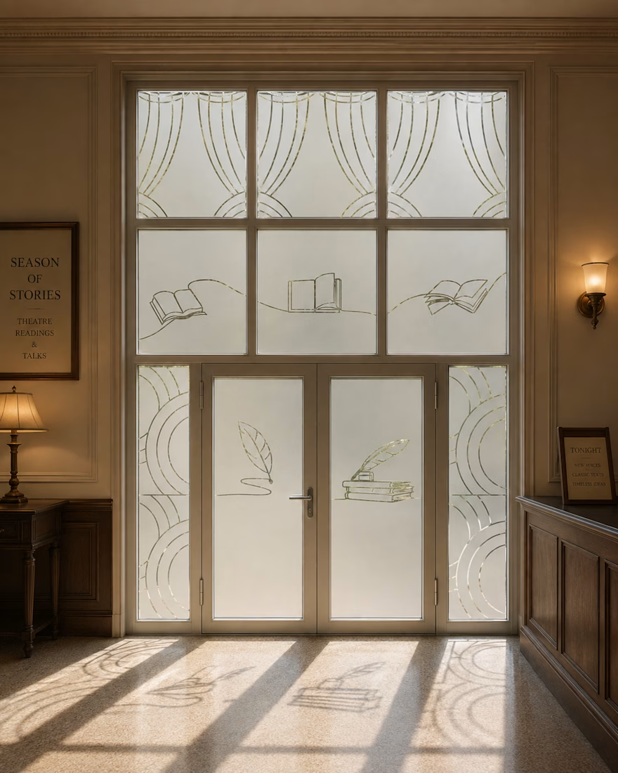
After a lot of testing, I decided to work with plotter-cut frosted / dusted glass film. Instead of printing the artwork onto the glass, the graphic elements are cut out of the frosted surface, allowing natural light to pass through them.
I’m currently developing different visual themes around music, literature, dance, theatre and other areas of culture.
What I find most exciting is that the design won’t stop at the glass itself. As sunlight passes through the cut-outs, the graphics will continue inside the space as light and shadow — changing throughout the day.
Still very much a work in progress, and I’m testing a few different directions.
I’d love to hear your take: would you keep the whole system purely frosted and monochrome, or introduce a subtle second material — for example, a small amount of gold vinyl?


The network for creativity
Join 1.25M professional creatives like you
Connect with clients, get discovered, and run your business 100% commission-free
Creatives on Contra have earned over $150M and we are just getting started











Related posts

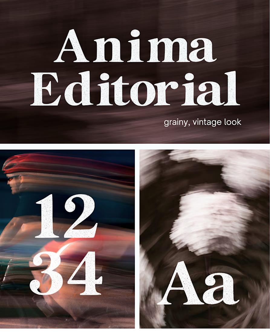
I created this font & it is free to download and use in your free or paid projects. Enjoy 🚀 find it at https://twaperdigital.com/anima-editorial



I like this font
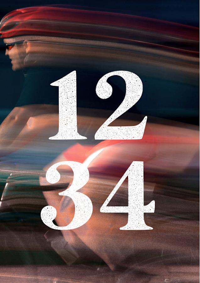
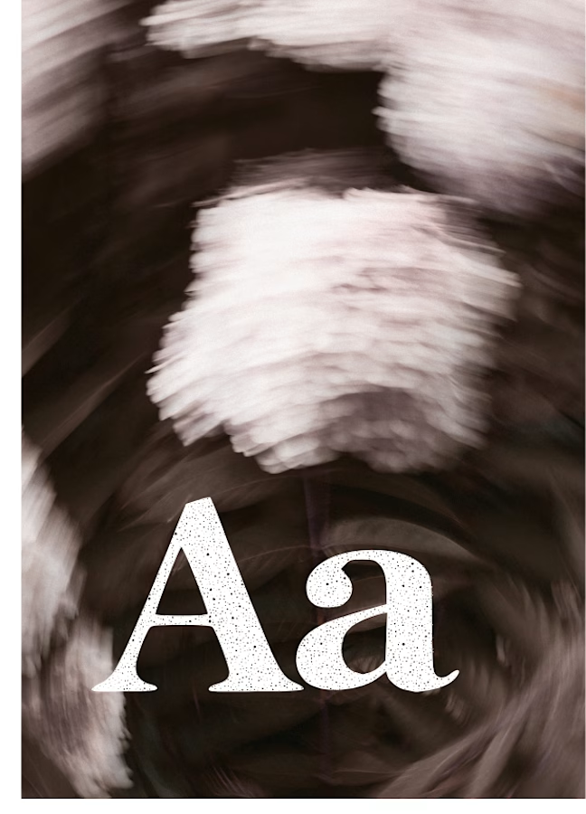
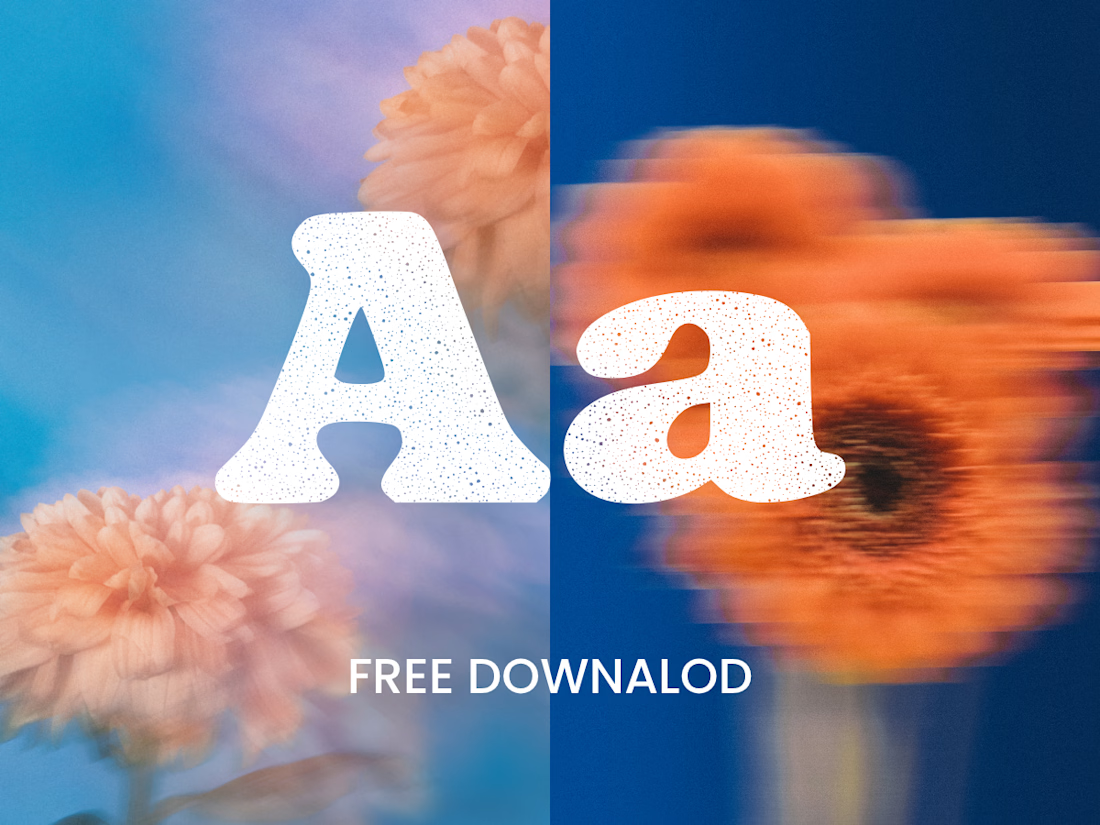
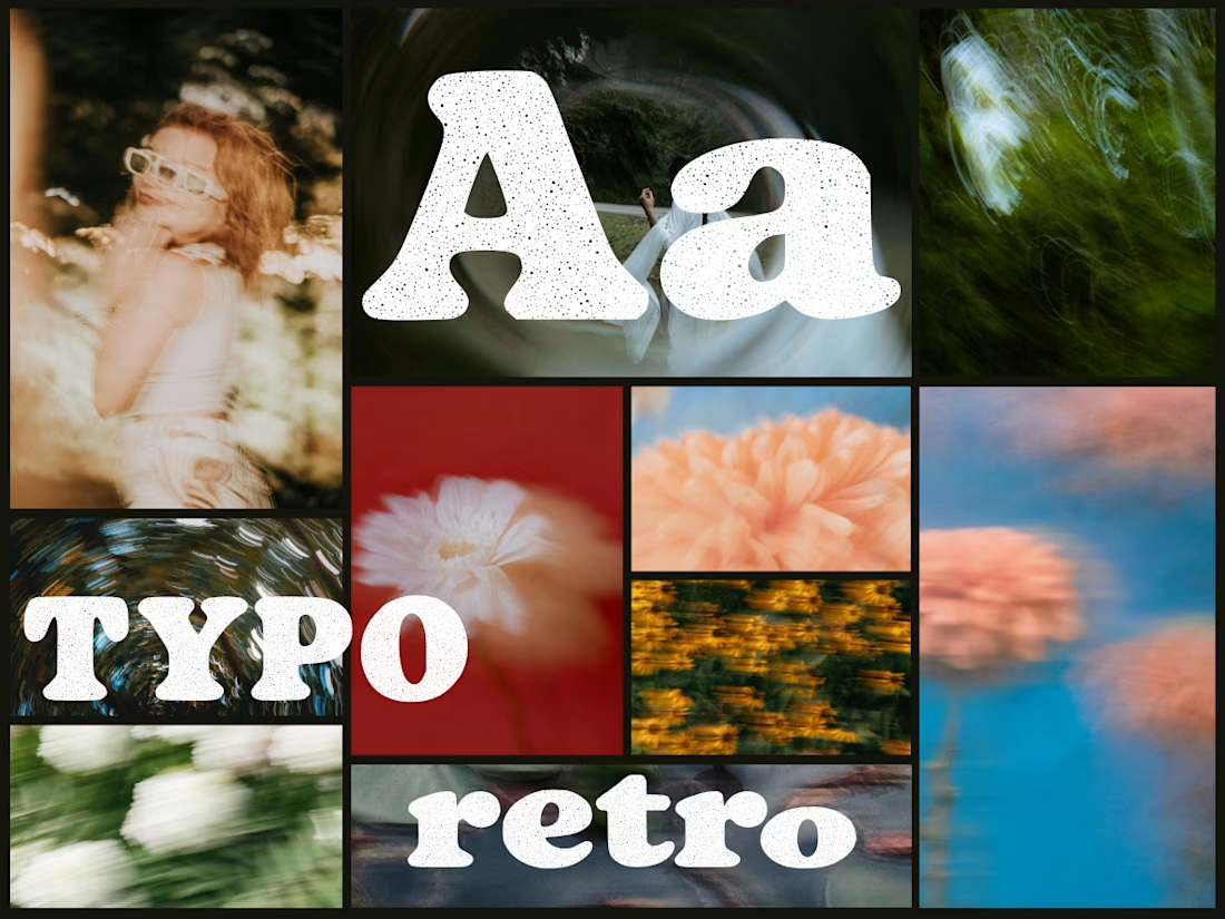
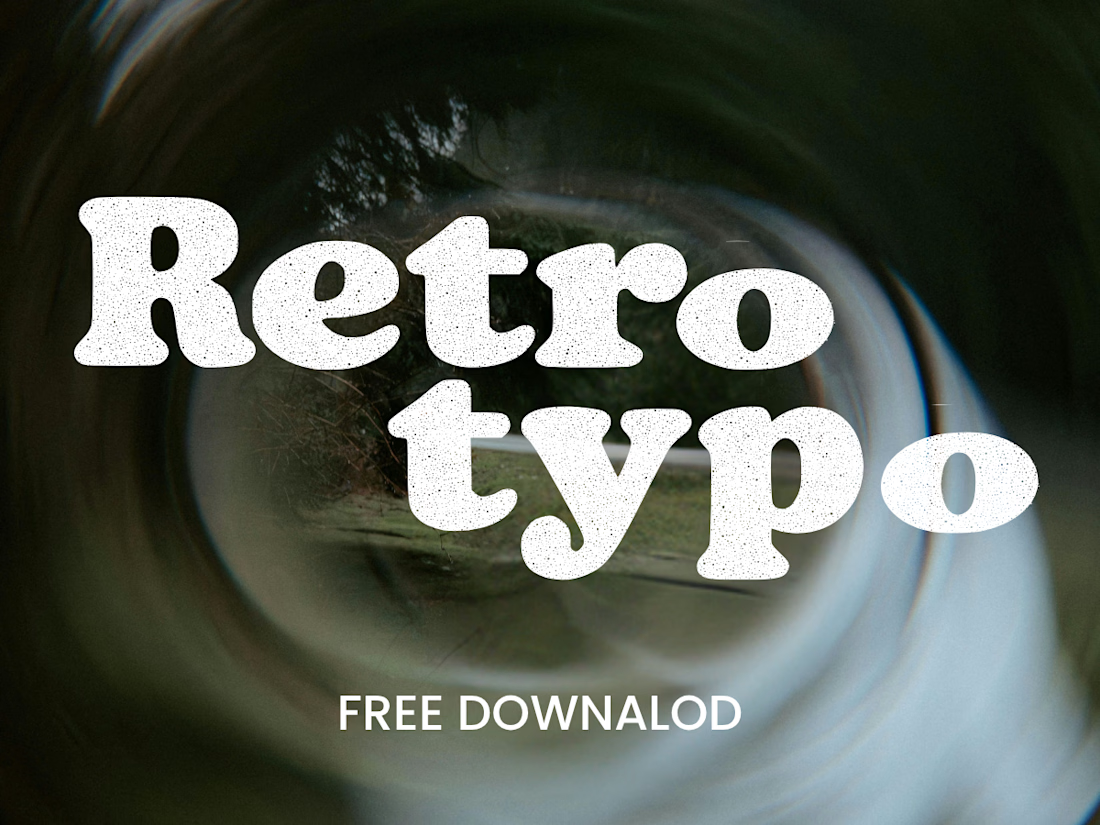
Anima is a self-initiated type design project inspired by vintage print, worn ink and analog photography.
The collection includes two experimental serif typefaces: Anima Editorial, with elegant proportions and contrasting strokes, and Anima Retro, with softer, bolder shapes. Both feature grain built into the letterforms.
I developed the creative direction, custom fonts and promotional artwork, combining AI-assisted exploration with font development. The campaign pairs textured typography with motion-blurred photography to capture a warm, nostalgic mood. FREE DOWNLOAD AT https://twaperdigital.com/anima-retro

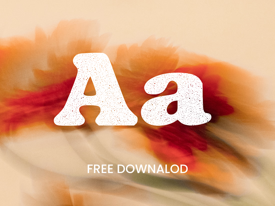

Great job Denisa the font style background and it's effects are great 🎉🎉🎉🎉
keep going Denisa🔥🔥🔥🔥

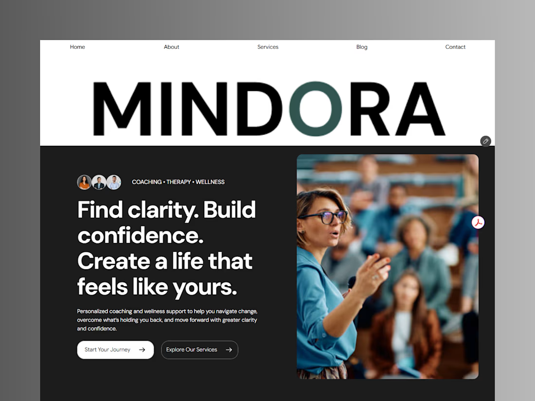
Introducing Mindora — a Life Coaching & Wellness Framer Template.
I designed Mindora for life coaches, wellness professionals, and personal growth brands looking for a calm, modern, and welcoming online presence.
Inspired by clarity, confidence, and meaningful growth, Mindora features a thoughtful layout, dedicated service sections, a blog for sharing valuable insights, and a clean visual style designed to help brands connect with their audience.
Built with Framer, it's a customizable starting point for creating a professional coaching or wellness website.
Explore Mindora and bring your next website idea to life.
Kindly check it out the template: https://www.framer.com/marketplace/templates/mindora-life-coach/



Great work